July 8th, 2024
8 Proven Best Practices for Better Data Visualization
By Zach Fickenworth · 6 min read
While data itself is universal, its interpretation isn’t. Instead, it hinges on context and clarity. That’s why data visualization plays such an essential role. It helps make complex data sets more understandable.
But not every data visualization is good data visualization.
One wrong move and your core message might get lost in translation. However, follow the data visualization best practices when creating your visuals, and there should be no wrong moves.
Understanding the Basics of Data Visualization
First, what is data visualization?
It’s precisely what it sounds like – transforming data into a visual format.
Now, as far as the format goes, there are many options to go with. Which will work the best primarily depends on the data’s purpose and attributes. Bar charts, scatter plots, pie charts, treemaps, and line charts are just some of the most commonly used formats.

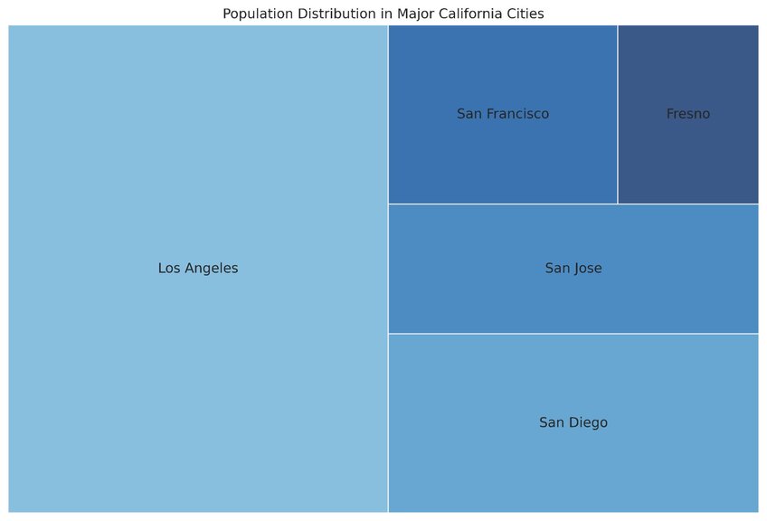
Example treemap chart showing the population sizes of five major cities in California. Each block’s size is proportional to the city’s population. Created with Julius AI
Data Visualization Best Practices in 2024
Data visualizations should check three basic boxes:
- Usefulness.
- Truthfulness.
- Visual appeal.
These eight practices can help you display data in a way that adheres to these principles:
1. Establish a clear goal from the get-go
2. Always keep your target audience in mind
3. Choose the right data visualization type for the job
4. Keep the visual data simple and digestible
5. Keep the data logically organized and coherent
6. Make your data tell a story
7. Make your data visualizations inclusive
8. Follow the best graphic design practices
#1 - Establish A Clear Goal from the Get-Go
The data visualization process aims to visualize data in an informative yet engaging way. Of course, this should also be your goal with data visualization. But this should only be your general goal, a guiding light, if you will.
Additionally, you should set a specific goal for your visualization and keep it in mind from the very first decision you make. For instance, your goal can be to compare quantitative data across different marketing channels. This single goal will (or at least should) influence the choice of format, color palette, and labeling decisions. In a word – everything!
#2 - Always Keep Your Target Audience in Mind
Always remember one thing – your data visualization won’t exist in a vacuum. Real people will view it. And these people have varying levels of knowledge and expertise.
Your goal?
Make sure that your intended audience understands the visualization, whether they’re C-suite executives or the general public.
Like with the visualization’s goal, its target audience should influence most of the decisions made during the visualization process. The level of detail included in the visualization, the choice of visual elements, and the choice of messaging are just some of them.
#3 - Choose the Right Data Visualization Type for the Job
As mentioned, there’s more than one data visualization type. And remember one thing – the one-size-fits-all approach will never apply to data visualization. Use the wrong type, and your whole visualization will become useless or, even worse, mislead your audience.
Here’s a brief overview of some dos and don’ts with the most popular data visualization types:
- A pie chart will excel in showing parts of a whole. However, it can’t display changes over time.
- With a bar chart, you can easily compare different categories of data but won’t have much luck showing relationships between variables.
- Use a line chart (also known as a line graph) to connect several distinct data points, but avoid it when these points don’t follow a sequence.
The message is clear – think about your choice carefully, as it can make or break your data visualization.
#4 - Keep the Visual Data Simple and Digestible
The whole point of visualizing data is to make it easier to understand. So, why would you clutter your visualization with unnecessary elements?
When it comes to successful data visualization, a winning combination has three elements:
- Clear design.
- Concise data.
- Easily digestible message.

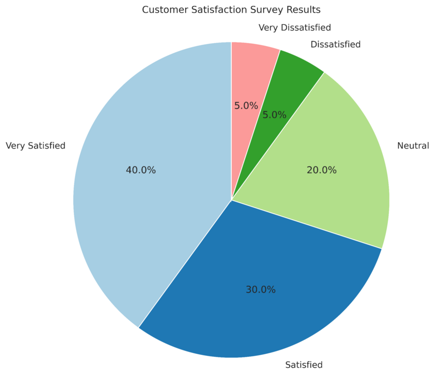
Example pie chart displaying customer satisfaction survey results. Created with Julius AI
#5 - Keep the Data Logically Organized and Coherent
Keeping your visualization simple and digestible won’t do much if the data is all over the place. Chaos also won’t help the data analysis process, that’s for sure! So, make sure your visualization is also well-organized and coherent.
What does this mean?
It means adhering to a logical hierarchy (when there is one), ensuring the most important information catches the viewer’s attention first, and presenting data in a manner that makes sense intuitively.
#6 - Make Your Data Tell a Story
Data visualization should do more than just present numbers; it should tell a story. And that’s just the beginning. The story you tell should also be crystal clear. This is the only way to ensure your viewer knows exactly what action is expected from them afterward.
Now, you can tell a story through data in numerous ways. Two of these ways to remember are playing with color and providing context.
For the color, you simply need to make all the right color choices to highlight important information and create the right association (e.g., red means urgency). As for context, providing some background information and additional explanations can do wonders for your visualization’s storytelling ability.
#7 - Make Your Data Visualizations Inclusive
Sure, it might be tempting to base your color choices solely on their aesthetic appeal. However, if you do so, you’re probably excluding a substantial number of people from fully appreciating your visualizations. This includes people with color blindness and other visual impairments.
We’ll make an educated guess that this isn’t something you want to do.
For that reason, use color palettes that are accessible to all users. And don’t just stop at colors. Employ other visual cues (e.g., patterns and labels) to convey information to make your visualization fully inclusive to people struggling with colors.
#8 - Follow the Best Graphic Design Practices
There’s no doubt about it – data is the single most important element of data visualization. But from a visual perspective, this visualization is just another form of graphic design. This means that graphic design principles also apply to the data visualization process. So, keep them in mind when creating your visualization.
This includes carefully choosing your fonts and color schemes, using size strategically and color purposefully, and ensuring consistency throughout the design.
Save Time & Stress by Leveraging Julius AI for Your Data Visualization
As you can see, creating effective data visualizations is no easy task. Luckily, there’s a better way to do this. And best of all? This way it doesn’t involve racking your brain about data visualization best practices!
Just use Julius AI.
