August 15th, 2024
29 Best Types of Charts and Graphs for Data Visualization
By: Alysha Gullion · 8 min read
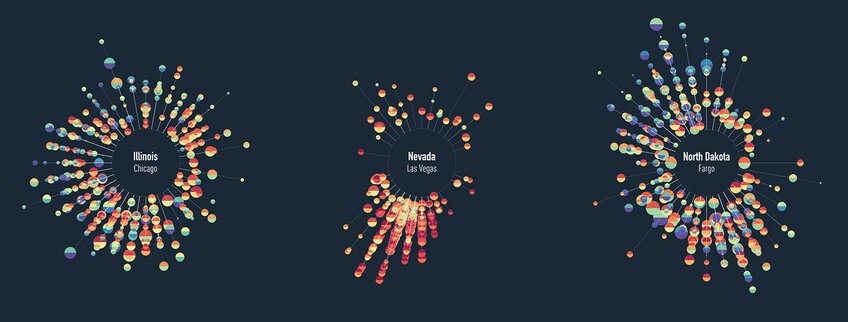
Selecting the right chart is crucial for effective data presentation. The choice depends on your data type, audience, and intended message. For example, line charts work well for time trends, while pie charts show proportions. Complex visualizations like correlation heat maps may not suit audiences unfamiliar with data science. This article will outline various graph types and their typical uses, noting that some graphs may fit multiple categories but will be mentioned only once for simplicity. By understanding these options, you can choose the most impactful way to present your data.
How to Find Data for Graphs and Charts
Trying to find high-quality, interesting data for creating charts and graphs is always difficult. We used the following open-source repo of datasets for all of the graphs and charts in this post: vincentarelbundock.github.io. Other options for finding datasets include Kaggle, which is a prominent data science community and data repository, or the UC Irvine Machine Learning Repository.
How to Create Charts and Graphs
Various tools cater to different needs in chart and graph creation. Excel is widely used in business for its simplicity. Tableau is favored by data analysts for interactive visualizations. Researchers often use SPSS for complex statistical graphs, while data scientists prefer R for its programming flexibility. For those seeking a more intuitive approach, Julius offers a unique alternative. Supporting both Python and R, Julius allows users to generate graphs using plain language descriptions, making it accessible to both beginners and experienced users. When choosing a tool, consider your technical skills and visualization requirements.
Comparison Charts
Comparison charts or graphs are used to compare quantities across different categories. Their purpose is to highlight the differences and similarities within data sets, making it easier for viewers to draw conclusions about the variations amongst various groups.
You can find the code associated with these charts by visiting our community forum.
1. Bar/Column charts
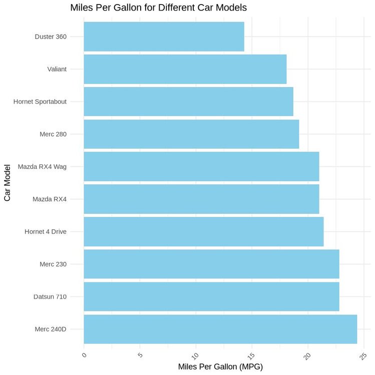
Bar and column charts provide clear comparisons between discrete categories (i.e., car models) based on a quantitative measure (e.g., miles per gallon, MPG). They are widely used as they offer a quick and effective way to visualize differences amongst categorical variables. The difference between bar and column charts is based on their orientation: bar charts display their bars horizontally, while column charts display them vertically.
The data used in this visualization can be accessed here. This data frame consists of 32 observations on 11 numeric variables and was collected in 1974 from Motor Trend US magazine. It details fuel consumption of 10 different motor vehicles. We will create a bar chart to compare miles per gallon between each car model.
R Example
Python Example
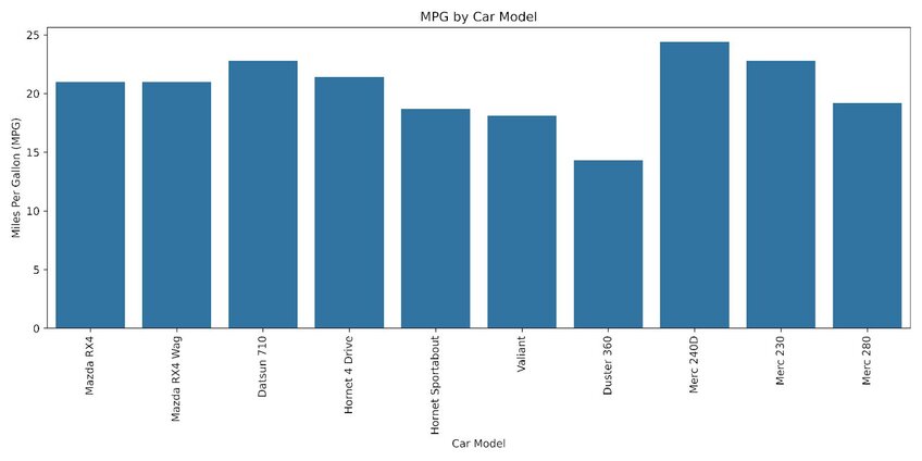
The images above compare the fuel efficiency of each car model. The graph shows that the Mercedes-Benz 240D outperforms its counterparts in terms of miles per gallon.
2. Grouped/Clustered Bar Chart
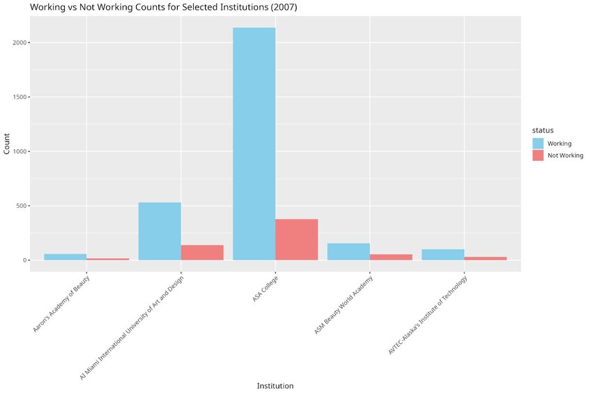
Grouped or clustered bar charts are used to compare frequencies, counts, or other measures across multiple categories and groups.
For this visualization, we will be using a dataset from the College Scorecard, which contains college-by-year data on how students are doing after graduation, available here. This data frame contains 48,445 rows and 8 variables. We will create a grouped bar chart to compare the counts of working vs. not working for five institutions in the year 2007.
R Example
Python Example
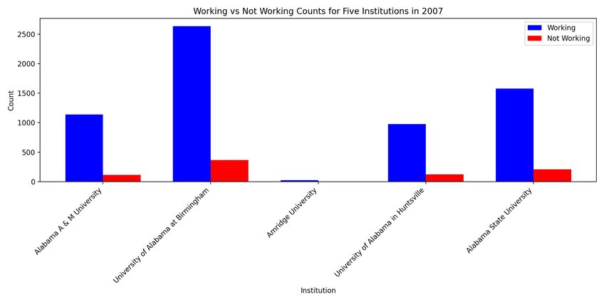
In the images above, we can see that graduates from ASA college tended to have a substantially higher count of ‘working’ individuals compared to the other institutions.
3. Dumbbell Plot
Often mistaken for a type of bar chart, the dumbbell plot differs by displaying two values for each category rather than one. It shows two points connected by a line, which displays the minimum and maximum values of data points for each category. Dumbbell plots are useful for displaying variability, distributions, and confidence intervals within categories.
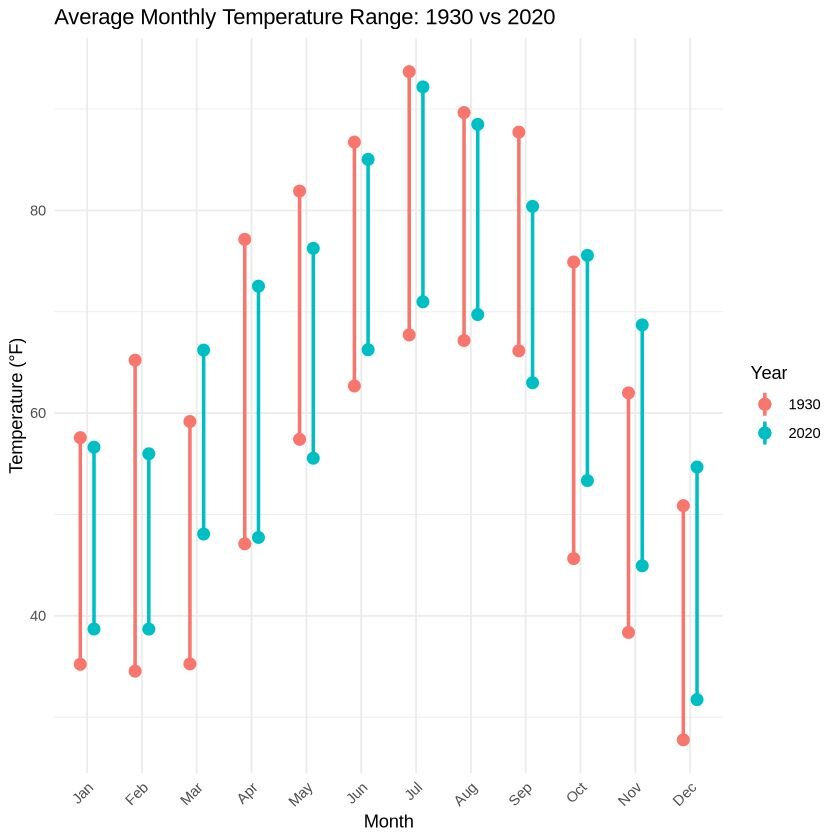
For this visualization, we will be using a dataset that contains daily temperatures (minimum and maximum) for Clemson, South Carolina from January 1st, 1930 to December 31st, 2020 (33,148 observations). The dataset can be accessed here.
For simplicity, we will focus on the year 1930 and 2020, which contains 365 observations each. We will plot the average minimum and maximum temperature for each month in the year 1930 and 2020.
R Example
Python Example
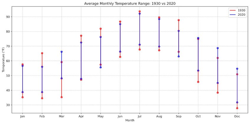
Overall, the trend suggests that 2020 experienced higher temperatures compared to 1930. For yearly averages, 2020 had a higher average minimum temperature (52.43°F vs 48.68°F in 1930) but a slightly lower average maximum temperature (72.77°F vs 73.90°F in 1930).
4. Radar Chart
Radar charts are useful for displaying multivariate data in a way that is easy to compare across different variables. However, some users may find this chart difficult to interpret depending on the information and message presented.
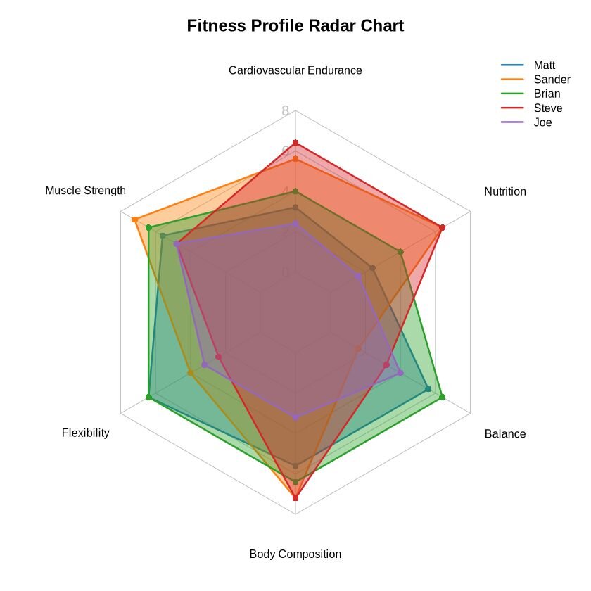
For this example, we are going to plot the fitness scores of five individuals. The assessed fitness components included: cardiovascular endurance, muscle strength, flexibility, body composition, balance and nutrition. Each component was ranked from a scale of 1 to 10, with 10 being the highest and 1 being the worst. The dataset can be accessed here.
R Example
Python Example
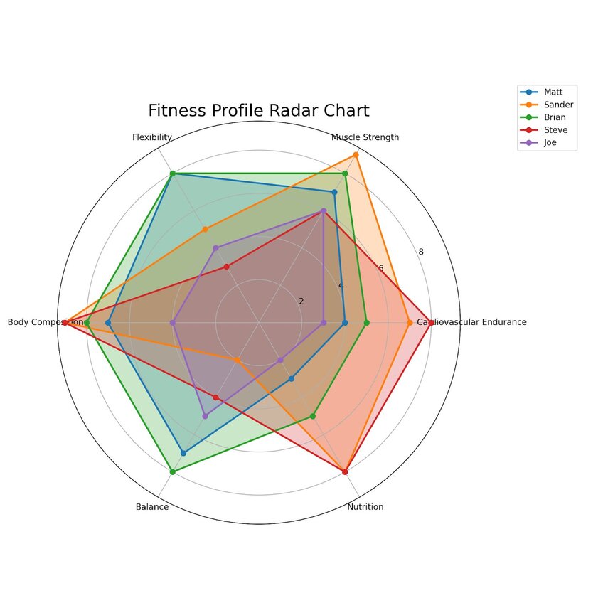
These radar charts show how each individual's fitness varies across the six components, providing an overall comparison on a single plot.
5. Dot Plot
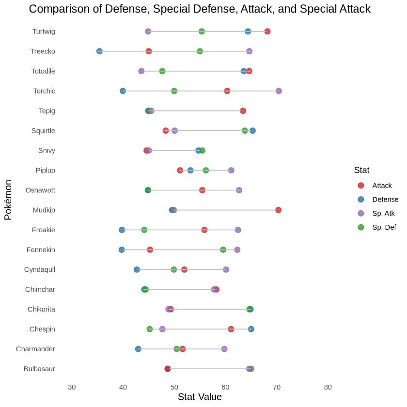
Dot plots show one or more qualitative values for each category, allowing for comparison across multiple values within and between categories. They provide an informative visualization, effectively condensing information in an easy to read format.
For this visualization, we will use a dataset containing the stats of starter Pokémon and from Generations I through VI (19 entries). This dataset can be accessed here.
R Example
Python Example
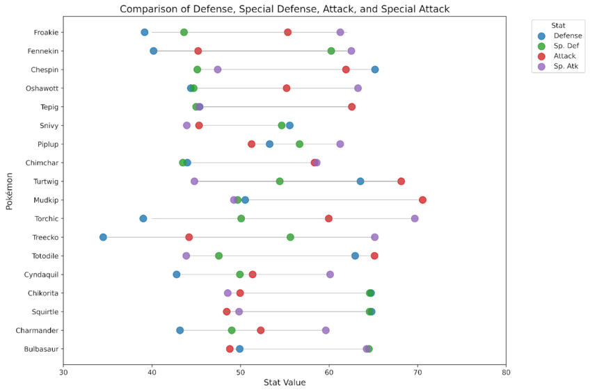
In the images above, we can see the different stats for the starters from generations I through VI. Who will you choose? I always choose Mudkip, he is my favourite.
Correlation Charts
Correlation graphs are used to visualize relationships between variables, showing how one variable changes in relation to another. They show the strength and direction of these relationships, which is important in fields like statistics, economics, and data science.
You can find the code associated with these charts by visiting our community forum.
6. Heatmap & Correlation Matrices
Heatmaps and correlation matrices are great visualizations that are simple for readers to understand. They use a colour gradient to represent the value of variables in a two-dimensional space. They are good tools for identifying patterns, variable-variable relationships, and anomalies in complex datasets.
For this visualization, we will use a dataset called ‘cerebellum_gene_expression2, accessible here. We will randomly choose 20 genes and create a correlation matrix to visualize gene expression rates via a heatmap.
The original dataset can be accessed through this file, which is an example dataset provided by the tissueGeneExpression package from the genomicsclass GitHub repository. It contains 500 genes, randomly selected from a dataset of 22,215 entries.
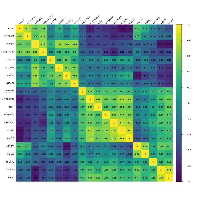
The image above displays the correlation matrix for 20 randomly selected genes. In the matrix, yellow indicates a strong positive correlation (both variables increase or decrease together), while dark blue indicates a strong negative correlation (as one increases the other decreases). Green represents a weak correlation or no correlation.
7. Bubble Chart
A bubble chart is a data visualization technique that displays multiple dimensions of data within a two-dimensional plot. The ‘bubbles’ represent data points, with their positions determined by two variables, and the size representing the third variable.
The dataset used to create this graph was from the 2000 US census, and can be accessed here. It contains 437 entries and 28 columns representing various demographic measurements. We will visualize the relationship between education level, poverty, total population and population density in the top 15 counties from Illinois.
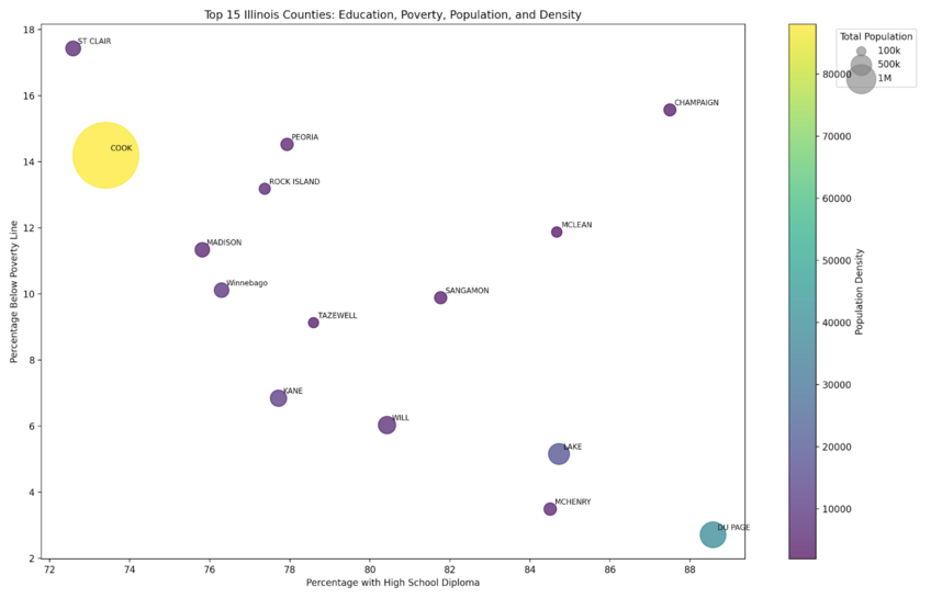
The R and Python graphs follow the same formatting. Each bubble represents one of the top 15 counties in Illinois. The size of the bubble corresponds to the total population density of the county, the colour indicates the population density (with lighter colours representing higher density). Each bubble is labeled with the county abbreviation.
8. Scatter Plot
A scatter plot is a type of data visualization technique that displays values for two variables for a set of data points. It shows how one variable is affected by another, which can reveal relationships between them. Each point on the plot represents an individual data point, with its position along the x-axis representing one variable and its position on the y-axis indicating another variable.
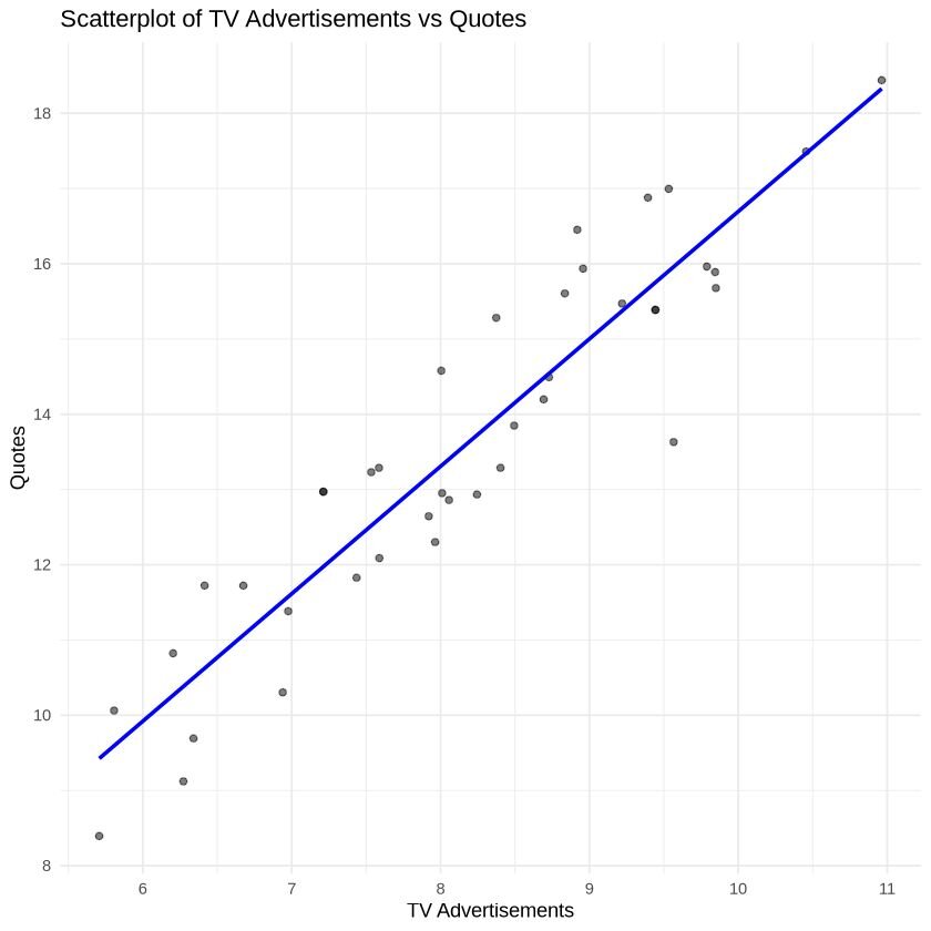
For this visualization, we are using a dataset called ‘insurance’, which can be accessed here. This dataset includes data on monthly quotes and television advertising expenditure from a US-based insurance company, collected from January 2002 to April 2002. This dataset contains 40 entries and 3 columns. The visualization will examine the relationship between TV advertisements and quotes given. A trendline will be added to help visualize the relationship.
R Example
Python Example
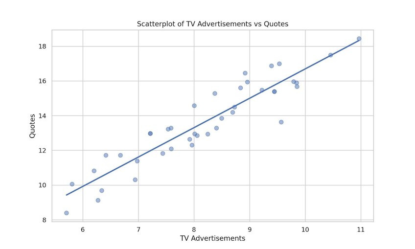
A positive relationship was observed between increases in TV advertisement and quotes given, as displayed by the increasing trendline.
9. Hexagonal binning
Hexagonal binning is a technique used for large, complex datasets with continuous numerical data in two dimensions. It displays the distribution and density of points, which is particularly useful when over-plotting occurs.
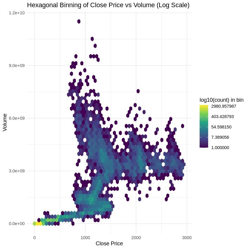
For this visualization, we will use a dataset containing daily observations made for the S&P 500 stock market from 1950 to 2018. The dataset includes 17,346 observations and 7 variables. It can be accessed here. The visualization will be plotting the volume by closing price.
R Example
Python Example
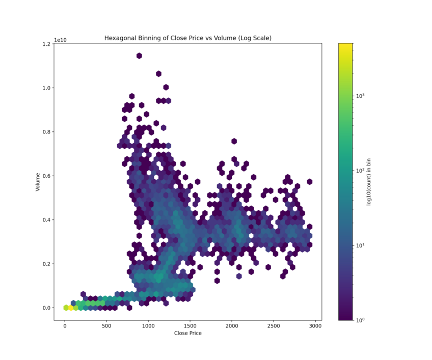
The yellow hexagon at the lower left corner indicates a clustering of points (high density of points here) that represents low closing price and trading volume. Here, the closing price was equal to $44.64 per share, and the volume of trade is ≤ 2.5 million shares. This specific point makes up ~8.0% of the total dataset.
10. Contour plot + Surface Plot
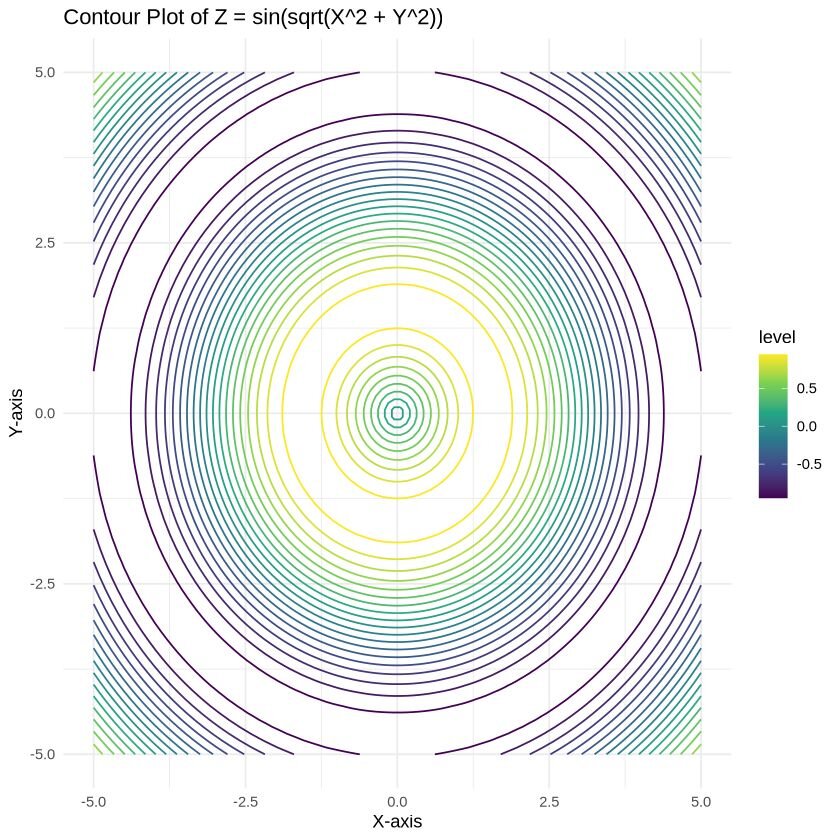
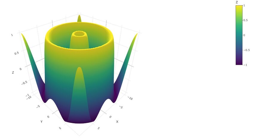
This is another technique that is used for visualizing data distributions and densities within a two dimensional field. It is oftentimes used to create topographic maps of data. For simplicity, we are going to plot the function Z = sin(sqrt(X^2 + Y^2)).
R Examples
Python Example
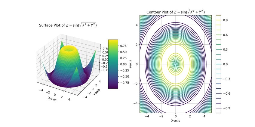
You can manipulate the surface plot directly within Julius itself to examine different angles, allowing for an in-depth exploration of the plotted points.
Part-to-Whole & Hierarchical Charts
Part-to-Whole visualizations show how individual portions contribute to the whole. Hierarchical graphs represent data in a tree-like structure, displaying relationships between different levels of data.
You can find the code associated with these charts by visiting our community forum.
11. Stacked Bar Graphs
Stacked bar graphs show the composition of different categories within a dataset. Each bar represents the total amount, with segments within the bar representing the categories and their proportion to the total.
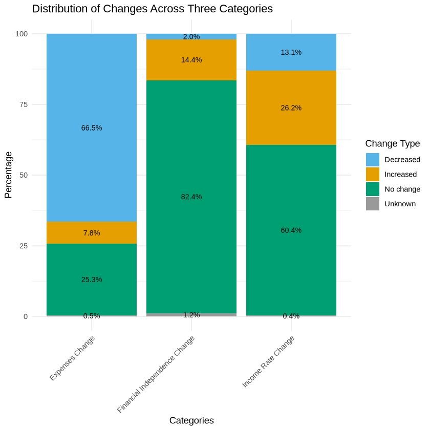
For this example, we will use data from a 2020 Financial Independence (FI) Survey conducted on Reddit. This dataset examined people’s finances and the changes experienced during the pandemic. The full dataset can be accessed here, which contains 1998 rows and 65 variables. We will be using a cleaned version of the full dataset, that contains the same number of rows but only 3 variables. This dataset can be accessed here.
The visualization focuses on the columns pan_inc_chg (pandemic income change), pan_exp_chg (pandemic expense change), and pan_fi_chg (pandemic financial independence change), as they contain multiple categories relevant to the analysis.
R Example
Python Example
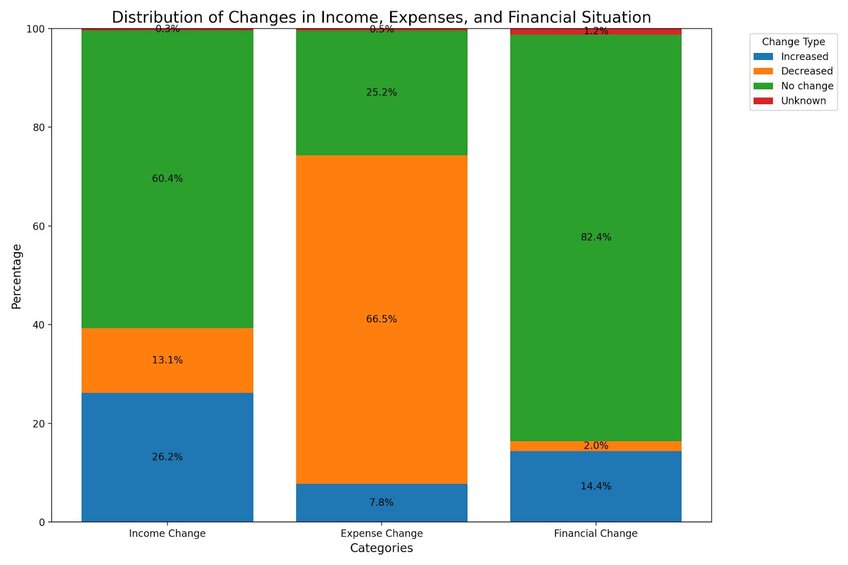
The results show that the pandemic had varying effects on income, leading to reductions in expenses for many individuals. The combination of stable or increased income, along with decreased expenses, may have contributed to a slight improvement in the financial independence for some people.
12. Dendrogram
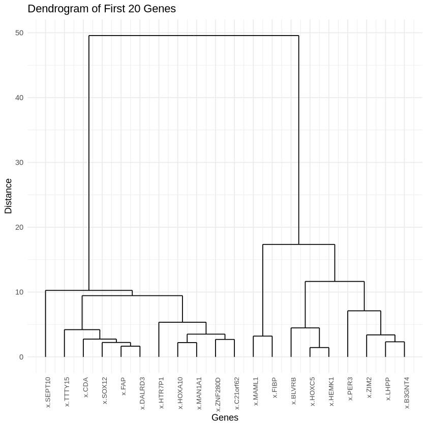
Dendrograms are tree-like diagrams that show the arrangement of clusters formed by a hierarchical structure. They are commonly used in fields such as biology, bioinformatics, and machine learning to visualize the relationships between data points.
For this visualization, we will use a dataset called ‘cerebellum_gene_expression2’, which can be accessed here. We are only going to plot the first 20 genes for this visualization.
The original dataset can be accessed through this file. This example dataset, provided by the ‘tissueGeneExpression’ package from the genomicsclass GitHub repository, includes 500 genes randomly selected from a larger dataset containing 22,215 entries.
R Example
Python Example
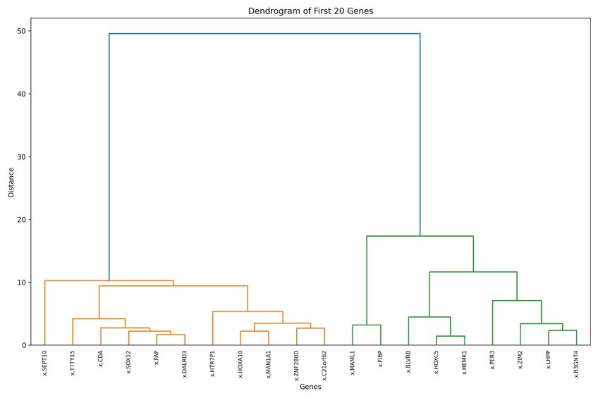
Genes grouped together at lower heights in this dendrogram have more similar expression patterns across samples. Additionally, the higher the branching point between two pairs of genes or clusters, the more dissimilar they are. For example, x.MAML1 and x.FIBP are clustered closely together, suggesting similar expression patterns.
13. Pie Chart
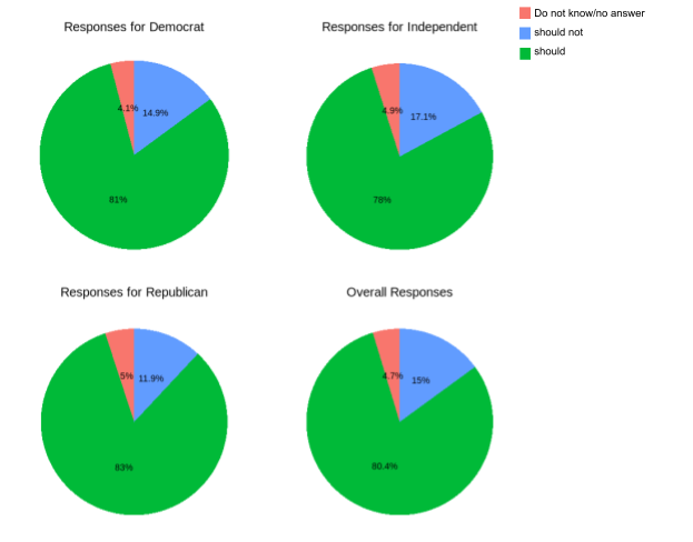
A pie chart is a circular statistical graph divided into slices to show the relative proportions of different categories within a dataset. Each slice represents a category, and the size of the slice corresponds to the proportion of that category in relation to the whole.
For this visualization, we will use a dataset from a 2010 poll on whether airports should use full-body scanners. The poll collected a total of 1137 responses and included two factors. The dataset can be accessed here.
R Example
Python Example
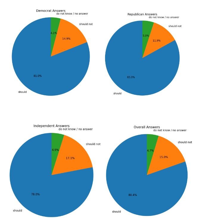
Both visualizations show group responses regarding body scanner use in airports for security purposes, with an overall trend suggesting that people approve of their use.
14. Donut Chart
Donut charts are similar to pie charts, but they have a hole in the center of the circle, giving them their name. This inner circle’s removal allows for the additional information to be shown in the chart. The length of each arc corresponds to the proportion of the category it represents.
For this visualization, we will use a dataset detailing the chemical composition (Aluminum, Iron, Magnesium, Calcium, and Sodium) found at four different archaeological sites in Great Britain (26 entries). We will compare the different chemical composition of pottery amongst the four sites. The dataset can be accessed here.
R Example
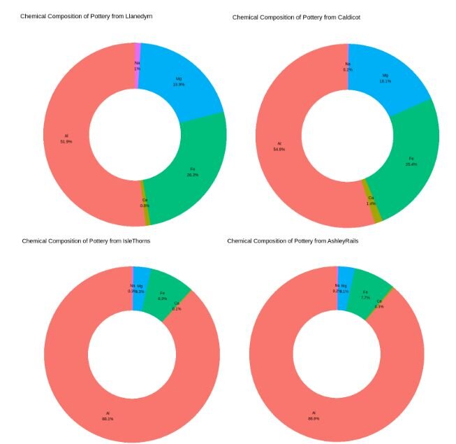
Across all four different sites, we can observe variations in the chemical composition of the pottery. Aluminum, the primary chemical compound, constitutes the highest percentage in composition of each pottery sample, but its percentages vary amongst sites.
15. Population Pyramid
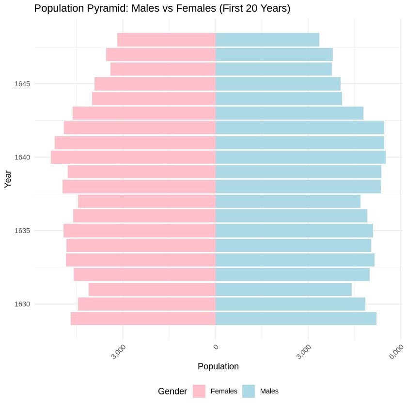
Also known as age-sex pyramids, population pyramids are visualizations that display the gender distribution of a population. They are typically presented as a bar chart, with age cohorts displayed horizontally to the left or right. One side represents males, while the other side shows females.
For this visualization, we will use a dataset containing male and female birth rates in London from 1962 to 1710 (82 rows; 7 variables). For simplicity, we will only plot male and female data for the first 20 years. The dataset can be accessed here.
R Example
Python Example
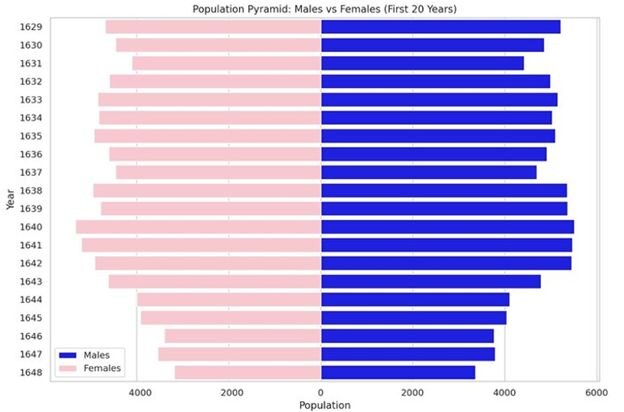
The population distribution between males and females appears steady amongst the years, showing a slight decrease in births for both sexes from 1641 to 1648.
Data Over Time (Temporal) Charts
Temporal charts are used to display data over time, revealing trends, patterns, and changes. They are essential for time series analysis and can be presented in multiple different forms depending on the type of data and the message intended to be conveyed.
You can find the code associated with these charts by visiting our community forum.
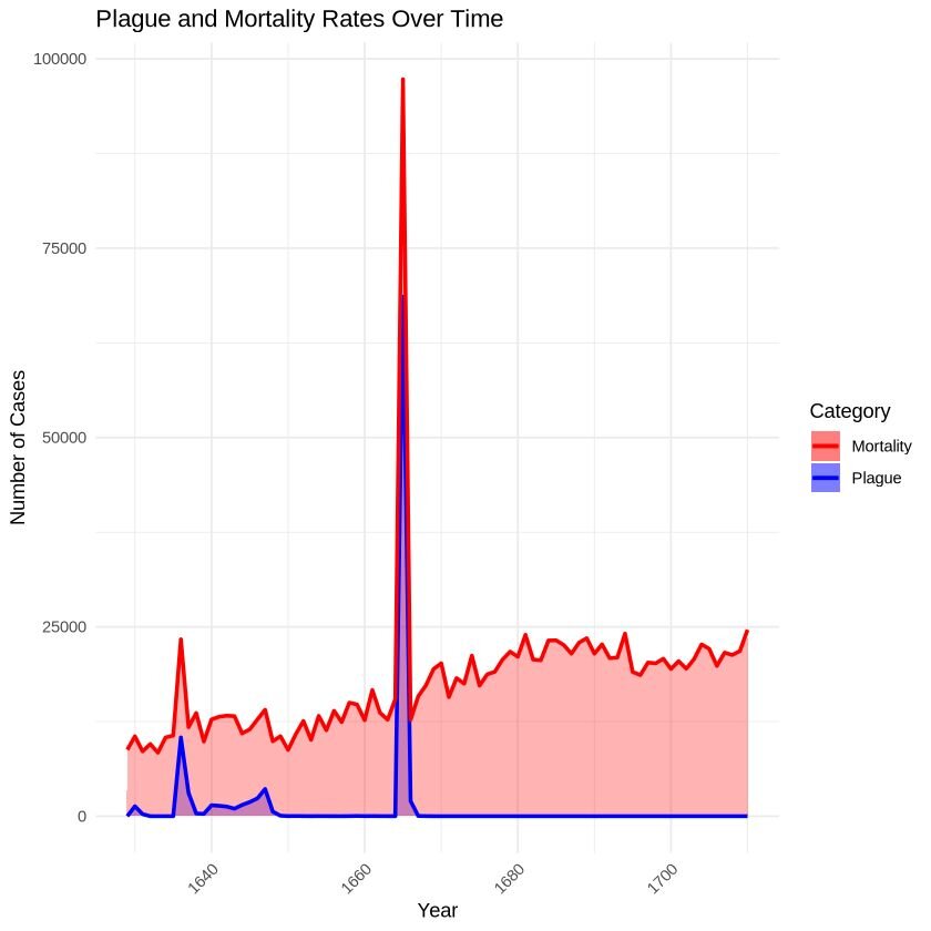
16. Area Chart
Area charts are a type of data visualizations used to represent quantitative data and show how values change over a period of time. They plot a continuous variable and are great at showing the magnitude of change over time or visualizing cumulative effects.
We will be using the London dataset (82 rows; 7 variables) to visualize the mortality rate and plague deaths over time. The dataset can be accessed here.
R Example
Python Example
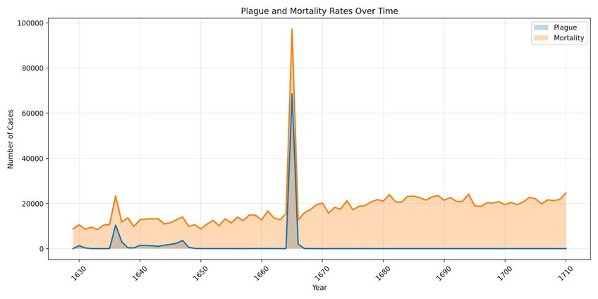
These charts visualize the impact of the plague on mortality rates. We can see a peak between 1660 and 1670, during which the majority of deaths were due to plague.
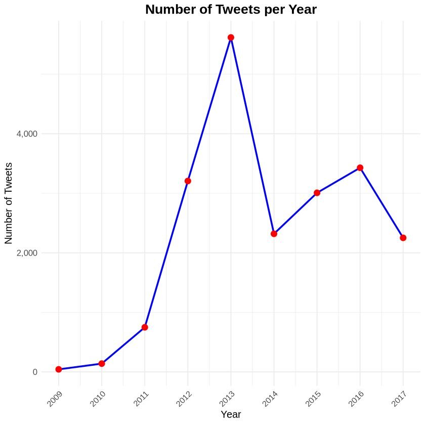
17. Line chart
Line charts are among the most commonly used types of charts worldwide. They are great at showing overall trends or progress over time. The x-axis typically represents the continuous variables (usually time), while the y-axis displays the dependent variable, showing how its value changes.
For this visualization, we will use a dataset called ‘trump_tweet’, which tracks the number of tweets by Mr. Trump from 2009 to 2017. The full dataset can be accessed here (20,761 rows; 8 variables), while the condensed dataset used for this visualization is available here (9 rows; one variable).
R Example
Python Example
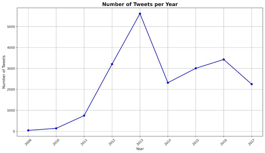
This line chart displays the number of tweets made by Mr. Trump over an eight year period. The lowest number of tweets was recorded in 2009 (~43 tweets/year), while his highest was in 2013 (~5,616 tweets/year).
18. Candlestick Chart
A candlestick chart is a financial visualization used to analyze price movements of an asset, derivative, or currency. It is commonly used in technical analysis to predict market trends. The chart displays the high, low, opening, and closing prices of a product within a specific time frame.
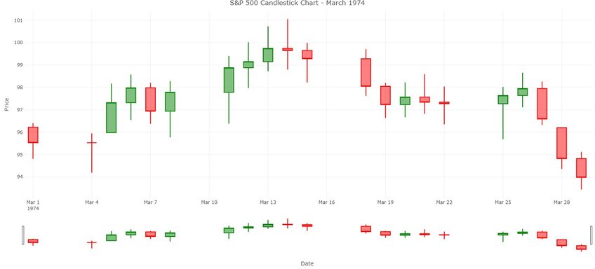
For this chart, we will use the S&P 500 stock market dataset. This dataset includes daily observations from 1950 to 2018, with a total of 17,346 entries and 7 variables. The original dataset can be accessed here, while the one we are using for the visualization is here. For this chart, we are only focusing on a short timeframe, specifically March 1974 high, low, opening, closing prices and volume.
R Example
Python Example
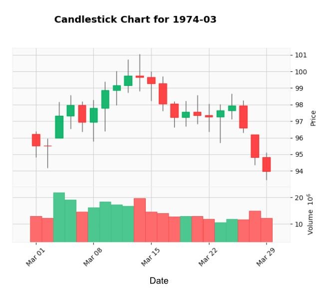
The green candlesticks indicate the days when the closing price was higher than the opening price, suggesting buyer pressure. Red candlesticks indicate days where the closing price was lower than the opening price, suggesting selling pressure. Candlesticks with small bodies, where the opening and closing prices are close together, suggest market indecision.
Overall, this chart shows that the market started positively (as indicated by many green candlesticks), experienced a brief mid-month dip (indicated by the red candlesticks), and then recovered slightly, as shown by some green candlesticks.
19. Stream graph
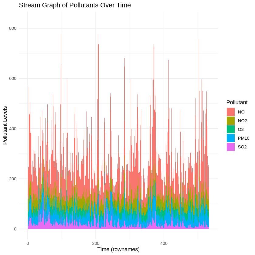
A stream graph displays changes in the magnitude of categorical data over time. It is a variation of the stacked area bar graph, where the baseline is not anchored to a singular point but rather moves up or down, allowing the to display a natural flow.
For this visualization, we will use a dataset that measures air pollutants in Leeds (UK) from 1994 to 1998 (Heffernan and Tawn, 2004). The winter dataset includes measurements between November to February of the various air pollutants (532 rows with 5 variables). The dataset can be accessed here.
R Example
Python Example

The images shows how the composition of the pollutants change over time, with peaks and dips of pollutants illustrated throughout the season.
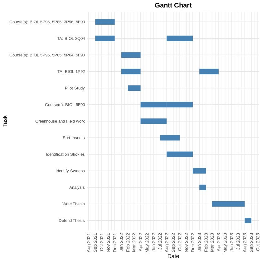
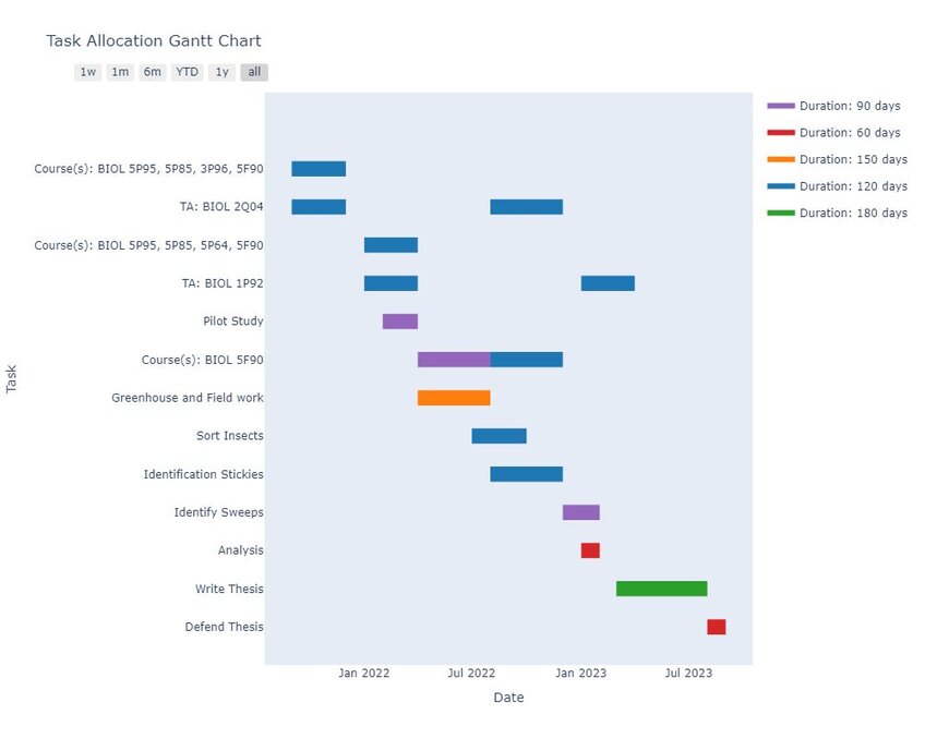
20. Gantt chart
A Gantt chart is a visual tool used in project management to plan and track the progress of tasks. It displays individual tasks or activities along a timeline, highlighting their scheduled start and end dates. Gantt charts are a great way for visualizing sequences of tasks, duration, and the dependencies between tasks.
For this visualization, we will use a dataset showing task allocation between start and end dates of my Master’s program. The dataset can be accessed here (contains 17 rows, with 4 columns).
R Example
Python Example
Distribution Charts
Distribution charts are meant to show the spread of data across various categories or values. They help readers understand the frequency, range, and the overall shape of the data’s distribution. In addition, it can help readers understand the patterns, central tendency, and variations within their dataset.
You can find the code associated with these charts by visiting our community forum.
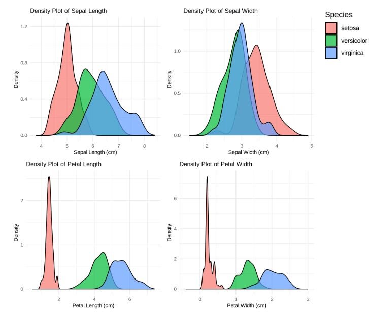
21. Density plot
A density plot measures the probability distribution of a continuous variable. By providing a smooth curve that represents the distribution of data points over a range, it helps readers to identify patterns, trends, and the overall shape of the distribution. Density plots are useful for visualizing the distribution, identifying modes, and comparing distributions between multiple groups.
For this visualization, we will use the “iris” dataset (151 rows, 5 columns). This is a common dataset that contains information on petal width, petal length, sepal width and sepal length of three different iris species (Setosa, Versicolour, and Virginica). It is often used as an introductory model for clustering algorithms in machine learning. For this visualization, we will be using it to compare how flower features differ between species. The dataset can be accessed by simply asking Julius to retrieve it in Python or R, or it can be accessed here.
R Example
Python Example
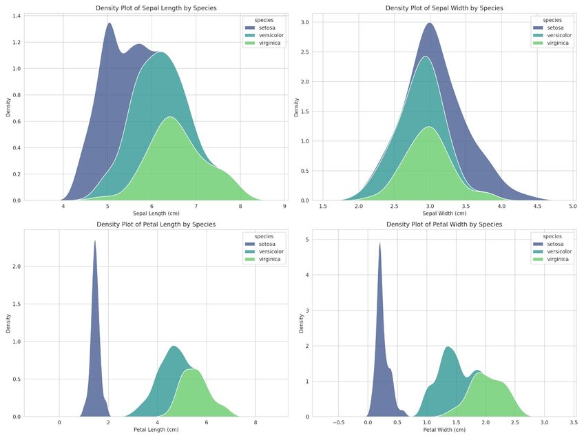
The density plot reveals the following observations: For Setosa, the distribution of petal width and length is generally on the lower end compared to the other species of iris’s, suggesting that Setosa would be easily distinguished by its smaller petal dimensions.
Versicolor shows some overlap with Virginica regarding sepal length and width, but exhibits less variation and tends to concentrate around 5.5cm (sepal length) and 3.0cm (sepal width).Vericolor can be identified by its intermediate petal size – larger than Setosa but smaller than Virginica. Virginica, on the other hand, displays the largest petal length and width, though it does show some high variability due to the spread of points along the x-axis.
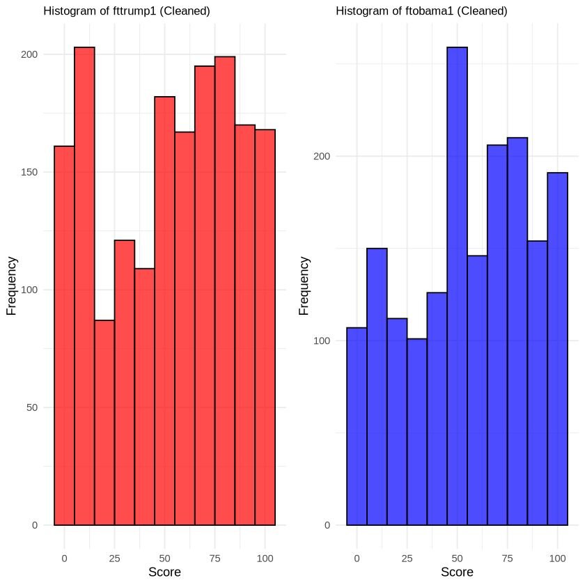
22. Histogram
A histogram is used to display the distribution of a dataset by dividing it into intervals, or bins, and counting the data points that fall into each bin. The height of each bar represents the frequency of data points falling into that specific interval. Histograms are commonly used to display frequency distribution of a continuous variable.
For this visualization, we will use a dataset comparing thermometer readings between Mr. Trump and Mr. Obama (3,081 rows, 3 columns). We will visualize the frequencies of scores between Mr. Trump and Mr. Obama. The dataset can be found here.
R Example
Python Example
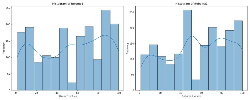
The dataset shows a non-normal distribution, as evident by the multiple peaks observed in the trendline.
23. Jitter Plot
A jitter plot is similar to scatter plot but introduces intentional random dispersions of points – referred to as ‘jittering’ – along one axis to prevent overlapping. This technique reveals the density and distribution of data points that would otherwise overlap. This is useful when your data points may have the same values or relatively close values across categories.
For this visualization, we will use a dataset comparing dried plant weight yields (30 observations) under three different conditions (control, treatment 1, and treatment 2). The dataset can be accessed here.
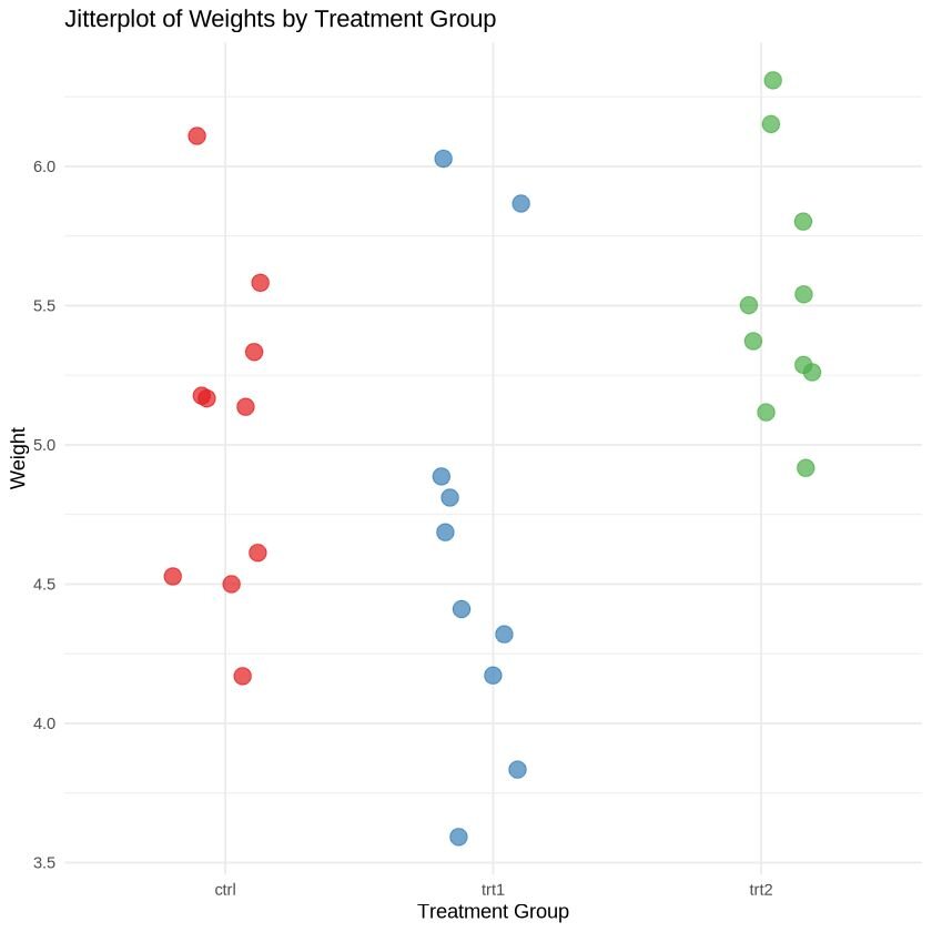
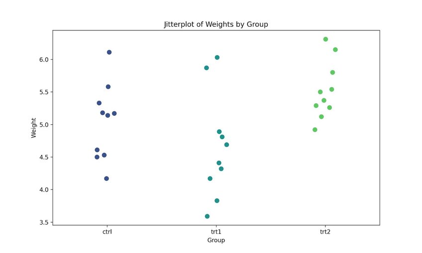
Both images demonstrate how a jitter plot effectively prevents overlapping between points with identical or nearly identical values.
24. Beeswarm Chart
A beeswarm chart visualizes data points along a single axis, with dots representing each individual datapoint. This method does slightly rearrange the points to avoid overlapping.
We will use the same plant growth dataset from the jitter plot visualization to illustrate how the data points appear in comparison to the jitter plot. The dataset can be accessed here.
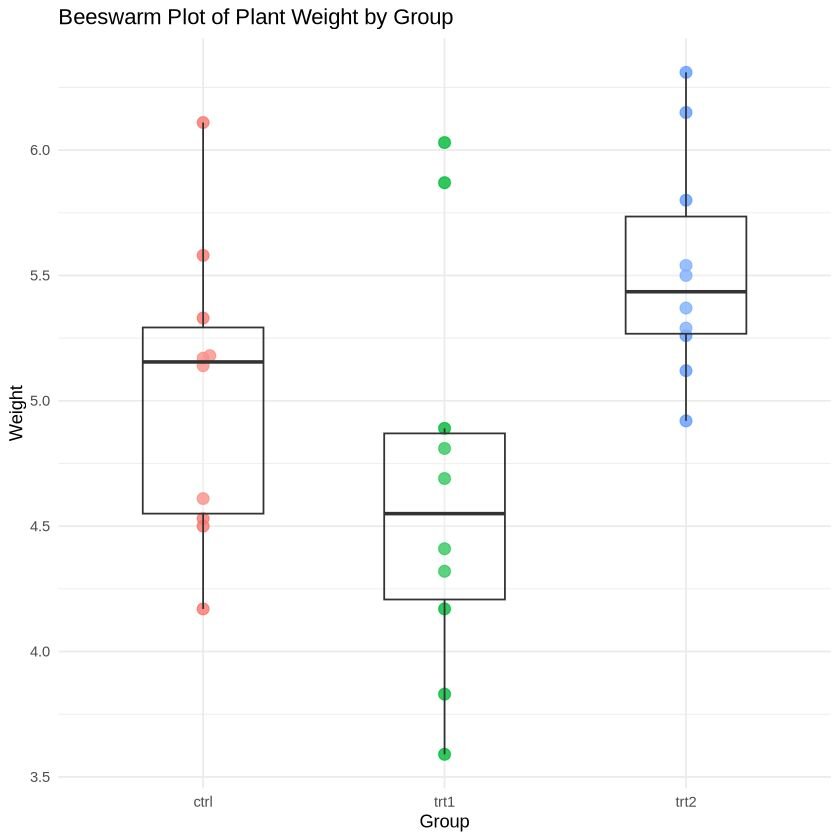
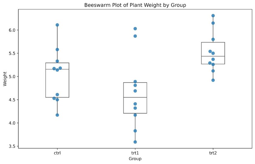
The beeswarm plot is more appealing with a larger sample size, but this example provides a general idea of its format. Unlike the jitter plot, data points in a beeswarm plot are positioned in a vertical line, with slight dispersion when multiple points overlap. Although some beeswarm plots do not include boxplot and box-and-whiskers plot, adding these can help visualize interquartile ranges.
From a general observation, treatment 2 appears to have a slightly higher overall weight compared to the control and treatment 1. However, it is important to note that outliers in treatment 1 and the control can skew this range.
25. Boxplot (Box-and-whisker plot)
A boxplot, or box-and-whiskers plot, is a standardized method for displaying the distribution of a dataset. It highlights five key aspects: the minimum value, the first quartile (Q1), median, third quartile (Q3), and the maximum value. This allows the reader to examine the spread of the data, central tendency, and identify potential outliers, making it a great tool for exploratory data analysis.
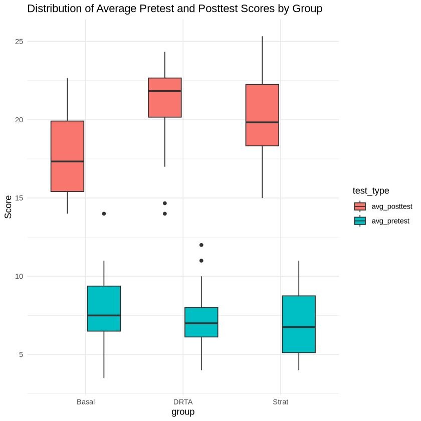
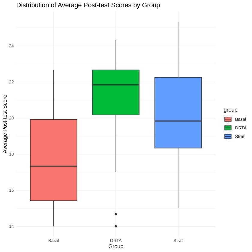
For this visualization, we will use a dataset from Baumann & Jones, as reported by Moore & McCabe (1993). The dataset examines whether three different teaching methods – traditional (Basal), innovative 1 (DRTA), and innovative 2 (Strat) – affected reading comprehension in students. The data frame has 66 rows with 6 columns: group, pretest.1, pretest.2, post.test.1, post.test.2, post.test.3. The dataset can be accessed here.
The visualization was created by averaging the scores between the two pre-tests and three post-tests by teaching methods, and then plotting them.
R Example
Python Example
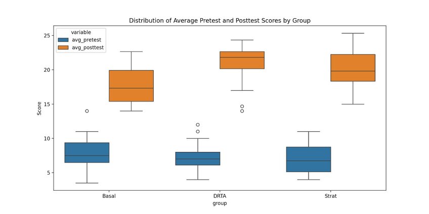
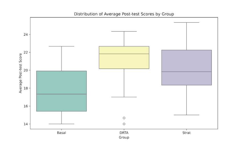
From quick observation, there appears to be differences in test performance associated with teaching methods. The Basal method seems to show the lowest median test score in comparison to the DRTA and Strat. However, these initial observations should be confirmed through further statistical testing.
Geospatial & Other
Geospatial visualizations are designed to represent data with geographic information, such as coordinates, GPS, longitude, and latitude. Their purpose is to communicate spatial patterns and relationships. Also included in this section are flow charts and network diagrams, which show how ideas or concepts are related to one another.
You can find the code associated with these charts by visiting our community forum.
26. Geographic Heat Map
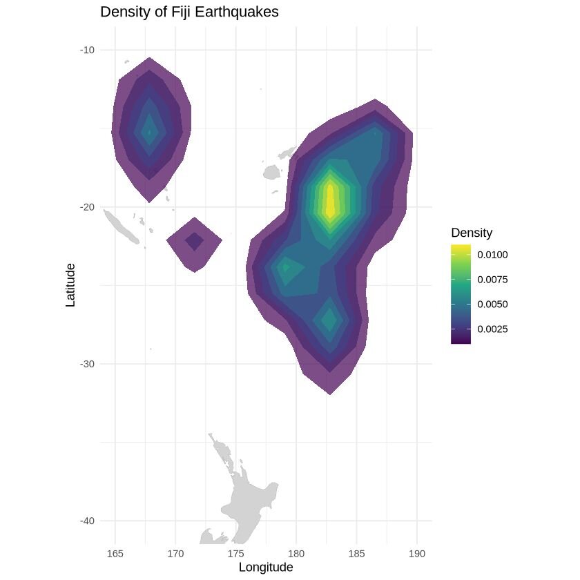
A geographic heat map shows where points are most concentrated within a specific geographic location by using colours to represent density. This type of map is useful for highlighting patterns, trends, and hotspots in spatial data.
For this visualization, we will use a dataset that includes the locations of 1000 seismic events near Fiji since 1964. This dataset, part of the Harvard PRIM-H project dataset, was obtained by Dr. John Woodhouse from the department of Geophysics. This dataset can be accessed here.
27. Choropleth map
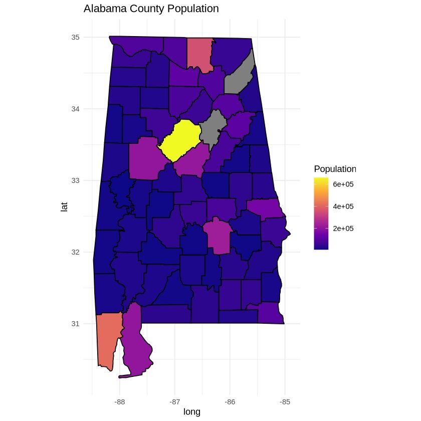
A choropleth map is a thematic map where areas are shaded (or patterned) based on the values of a variable, such as population density, income level, or election results. Colours are used to represent different densities or magnitudes, which provides a comparative visual between spatial data distributions.
For this visualization, we will use data from the 2017 American Census Society. It has 3221 entries, with 37 columns detailing various demographic information. This dataset can be accessed here.
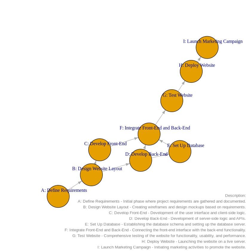
28. Network diagram
A network diagram is a visualization tool used to show connections between multiple different elements, illustrating how different entities (nodes) are connected to one another.
For this visualization, we will use a document that outlines the sequence of tasks in a project. It defines the nodes (tasks), dependencies, and gives a short description of the dependencies. This document can be accessed here and the google sheet can be accessed here.
R Example
Python Example
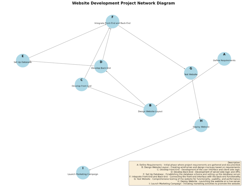
Network diagrams are great ways to organize your thoughts and visualize how events are connected to one another.
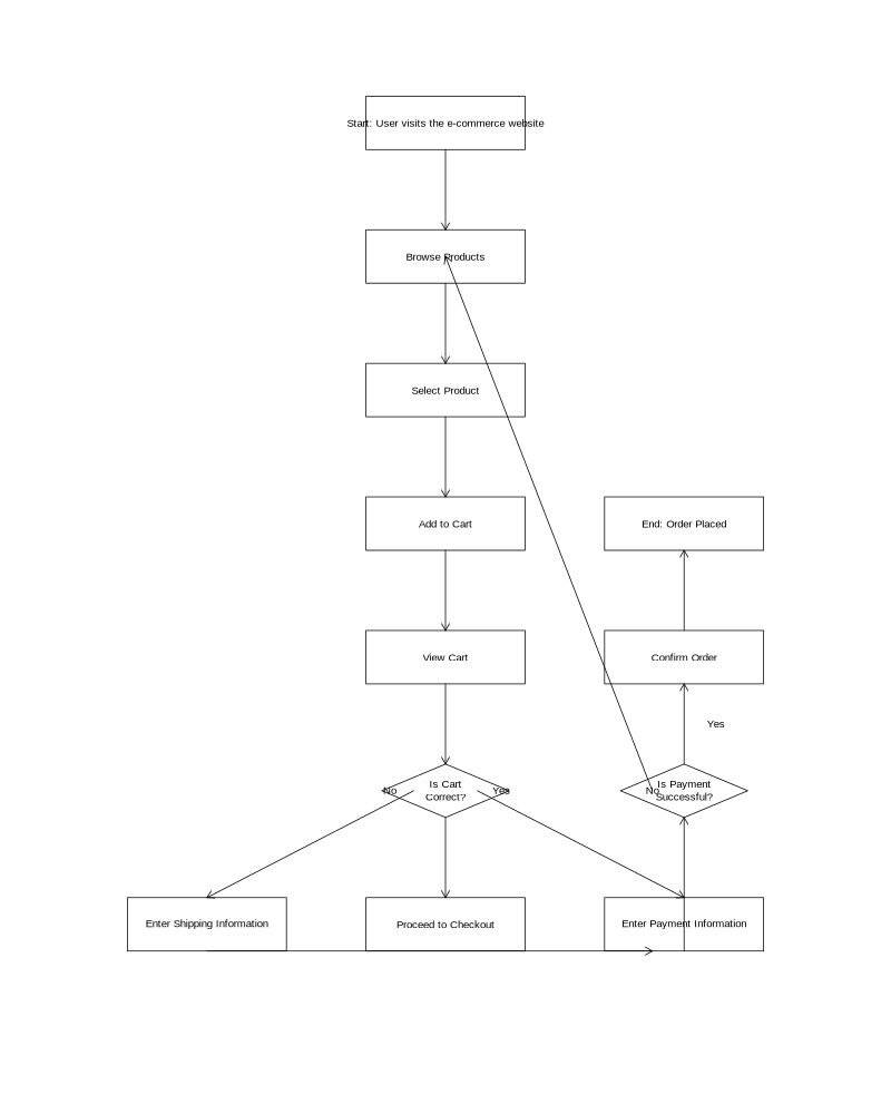
29. Flowchart
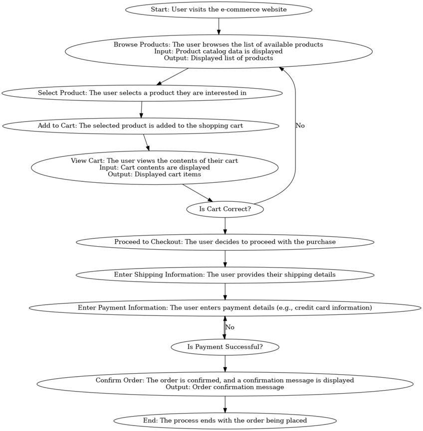
A flowchart is a visual representation of a process, workflow, or system. It uses symbols and arrows to signify a sequence of steps, decisions, or actions. Flowcharts are similar to network diagrams, as they clearly illustrate how different activities or steps are connected, making it easy to understand the flow of activities involved in the process.
For this example, we will create a flowchart outlining the process of online purchases. The Google document can be accessed here, which contains all the information you need to create the flowchart. You can simply copy and paste the text into the chat box.
R Example
Python Example
Conclusion
This article has served as a visual guide to 29 diverse chart and graph types, each designed to address specific data presentation needs. From simple bar charts to complex network diagrams, we've explored a range of visualization options to help you choose the right tool for your data story. Understanding these different graph types empowers you to communicate your insights more effectively, regardless of your audience or data complexity.
Throughout this journey, we've used Julius to generate our examples, showcasing how it seamlessly supports both R and Python users. Julius's ability to create these visualizations through simple, natural language commands demonstrates how data visualization tools are evolving to become more accessible. As you continue to explore and apply these chart types in your own work, consider how platforms like Julius can streamline your process, allowing you to focus on the story your data tells rather than the technicalities of graph creation.
