Graph Maker
Free graph maker. Upload your data and create a beautiful, customizable graph or chart in seconds.
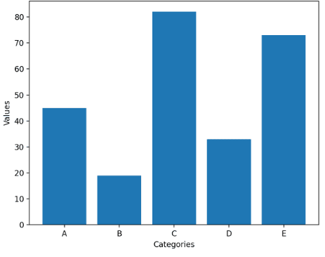
Bar Chart Maker
Upload your data and generate a bar chart
zfickenworth
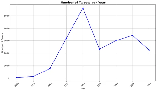
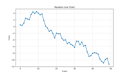
Create Line Chart from Dataset
Line charts are among the most commonly used types of charts worldwide. They are effective at showing overall trends or progress over time. Create your own with this workflow!
Alysha.G
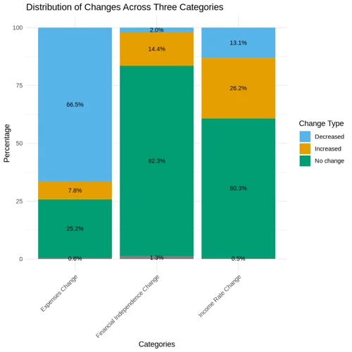
Create a Stacked Bar Graph
Stacked bar graphs show the composition of different categories within a dataset. Each bar represents the total amount, with segments within the bar representing the categories and their relative contributions to the total. Create your own with this workflow!
Alysha.G
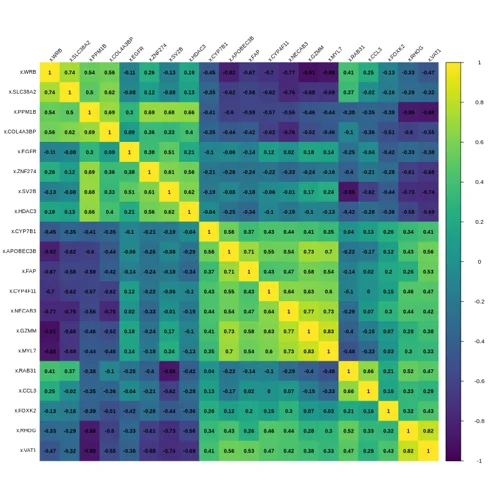
Create Correlation Matrices & Heatmap
Correlation graphs are used to visualize relationships between variables, showing how one variable changes in relation to another. Create your own correlation matrix and heatmap!
Alysha.G
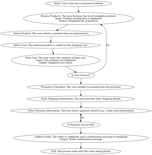
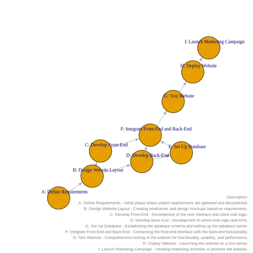
Create Flowchart
A flowchart is a visual representation of a process, workflow, or system. It uses symbols and arrows to signify a sequence of steps, decisions, or actions. Create your own with this workflow!
Alysha.G
Line Chart Maker
Upload your data and generate a line chart
zfickenworth
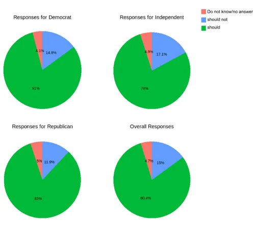
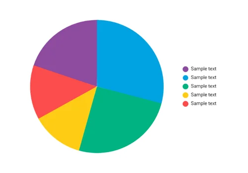
Create Pie Chart
A pie chart is a circular statistical graph divided into slices to illustrate the relative proportions of different categories within a dataset. Create your own with this workflow!
Alysha.G
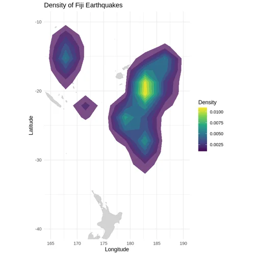
Create a Heatmap
A geographic heat map illustrates where points are most concentrated within a specific geographic location by using colours to represent density. This type of map is useful for highlighting patterns, trends, and hotspots in spatial data. Create your own with this workflow!
Alysha.G
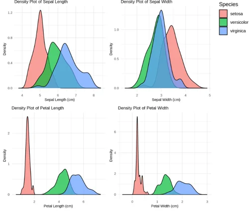
Create Density Plots
A density plot measures the probability distribution of a continuous variable. By providing a smooth curve that represents the distribution of data points over a range, it helps readers to identify patterns, trends, and the overall shape of the distribution.
Alysha.G
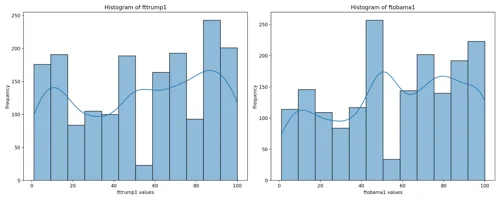
Create a Histogram
A histogram is used to display the distribution of a dataset by dividing it into intervals, or bins, and counting the data points that fall into each interval. Create your own with this workflow!
Alysha.G
Pie Chart Template
Simple, clean templated workflow for creating a pie chart.
zfickenworth
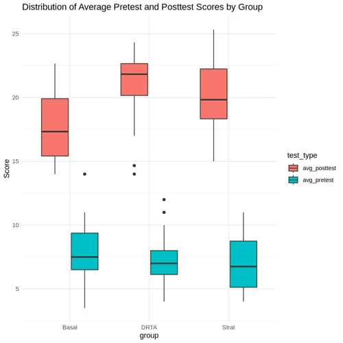
Create a Boxplot
A boxplot, or box-and-whiskers plot, is a standardized method for displaying the distribution of a dataset. It highlights five key aspects: the minimum value, the first quartile (Q1), median, third quartile (Q3), and the maximum value. Create your own with this workflow!
Alysha.G
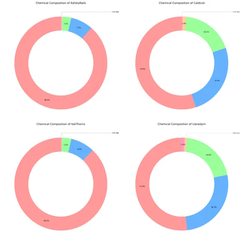
Create Donut Charts
Donut charts are similar to pie charts, but they have a hole in the center of the circle, giving them their name. This inner circle’s removal allows for the additional information to be displayed in the chart. Create your own with this workflow!
Alysha.G
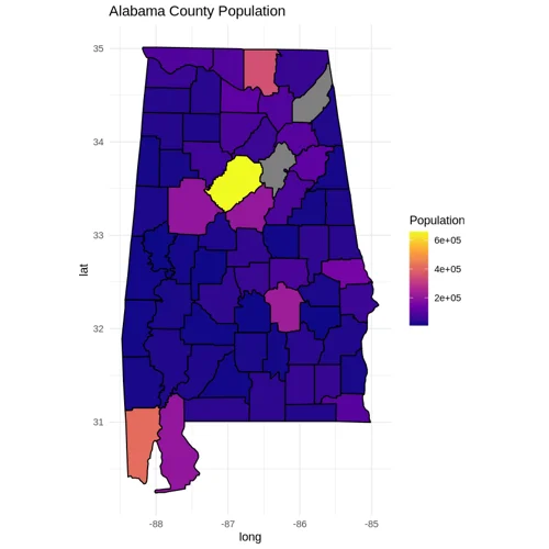
Create Choropleth Map
A choropleth map is a thematic map where areas are shaded or patterned based on the values of a variable, such as population density, income level, or election results. Colours are used to represent different densities or magnitudes, which provides a clear comparative visual between spatial data distributions. Create your own with this workflow!
Alysha.G
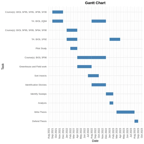
Create a Gantt Chart
A Gantt chart is a visual tool used in project management to plan and track the progress of tasks. It displays individual tasks or activities along a timeline, highlighting their scheduled start and end dates. Create your own using this workflow!
Alysha.G
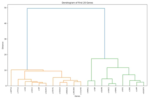
Create Dendrogram
Dendrograms are tree-like diagrams that illustrate the arrangement of clusters formed by a specific hierarchical structure. Create your own with this workflow!
Alysha.G
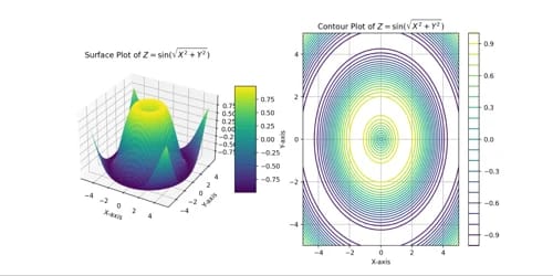
Generate Contour and Surface Plots
A contour plot is another technique that is used for visualizing data distributions and densities within a two dimensional field. A surface plot is a diagram of three-dimensional data. Create your own with this workflow!
Alysha.G
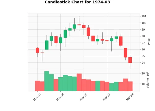
Create a Candlestick Chart
A candlestick chart is a financial visualization used to analyze price movements of an asset, derivative, or currency. It is commonly used in technical analysis to predict market trends. Create your own with this workflow!
Alysha.G
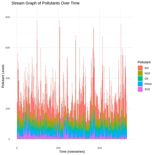
Create a Stream Graph
A stream graph displays changes in the magnitude of categorical data over time. Create your own with this workflow!
Alysha.G
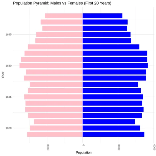
Create Population Pyramid
Also known as age-sex pyramids, population pyramids are visualizations that display the gender distribution of a population. Create your own with this workflow!
Alysha.G
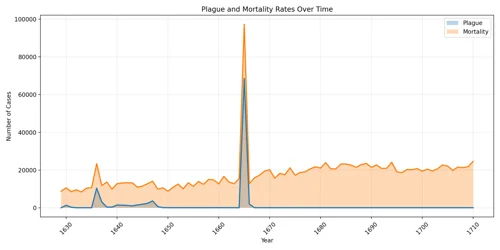
Create an Area Chart
Area charts are a type of data visualizations used to represent quantitative data and illustrate how values change over a period of time. Create your own with this workflow!
Alysha.G
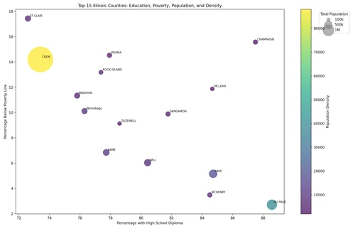
Create a Bubble Chart
A bubble chart is a data visualization technique that displays multiple dimensions of data in a two-dimensional plot. Create your own with this workflow!
Alysha.G
Create Network Diagram
A network diagram is a visualization tool used to show connections between multiple different elements, illustrating how different entities (nodes) are connected to one another. Create your own with this workflow!
Alysha.G
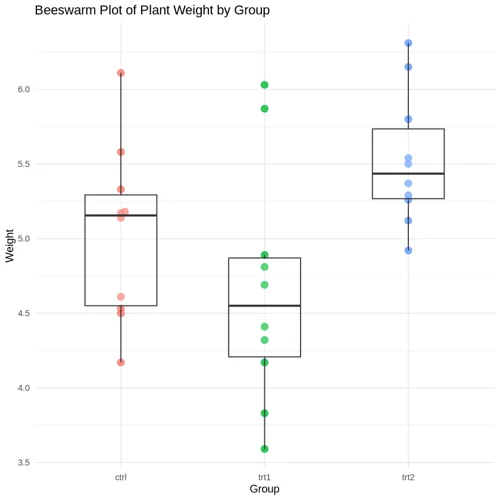
Create Beeswarm Plot with Boxplot Overlay
A beeswarm chart visualizes data points along a single axis, with dots representing each individual datapoint. Create your own using this workflow!
Alysha.G
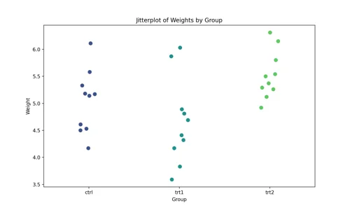
Create a Jitter Plot
A jitter plot is similar to scatter plot but introduces intentional random dispersions of points – referred to as ‘jittering’ – along one axis to prevent overlapping. This technique helps to reveal the density and distribution of data points that would otherwise overlap. Create your own using this workflow!
Alysha.G

Assist User with Online Banking, Network Security, and AWS Password Reset
Amazon
Facebook account
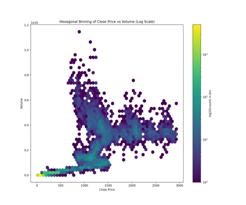
Hexagonal Binning
Hexagonal binning is a technique used for large, dense datasets with continuous numerical data in two dimensions. It helps display the distribution and density of points, particularly useful when overplotting occurs, making it difficult to identify trends. Create your own with this workflow!
Alysha.G
ResearchHub Personal $RSC Balance Sheet Analysis
Process Accounting data related to ResearchHub's $RSC token balance sheet
DreamBrook Labs