

A product presentation is built to move an audience toward a decision, like buying a product, funding it, or getting a team on board with using it. I've built and reviewed enough of these to break down the slides, structure, and delivery habits that make one work.
What is a product presentation?
A product presentation is a structured pitch that explains what a product does, who it's for, and why it's worth buying, funding, or adopting. Sales teams, marketers, founders, and product managers use it to walk an audience toward a decision.
The product presentations I've reviewed tend to share the same structure. They open with a hook or a problem, introduce the product as the solution, show how it works, and close with a clear next step.
💡 Note: A product presentation isn't the same as a product demo. A demo shows the product in action. A product presentation is the bigger package, the story, the slides, and the demo combined into one pitch.
Slides to include in a product presentation (with examples)
A product presentation works best with a clear sequence of slides. To make each one concrete, here's how they'd play out for a made-up product, an app that sends automatic invoice reminders to freelancers' clients.
Here's the slide-by-slide breakdown:
1. Opening hook
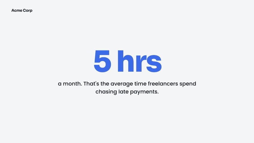
Start with a stat, a question, or a short story that gets people paying attention before you say anything about the product. For the invoice reminder app, that might be "freelancers spend an average of 5 hours a month chasing late payments."
2. The problem
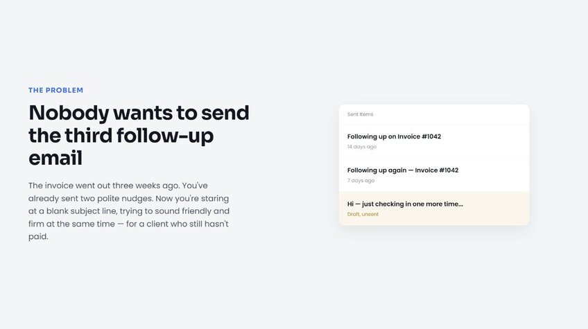
Show what's broken or frustrating for your audience right now. This gives the product a reason to exist before you introduce it. Here, the problem slide would walk through what it's like to send a third follow-up email to a client who still hasn't paid.
3. The solution
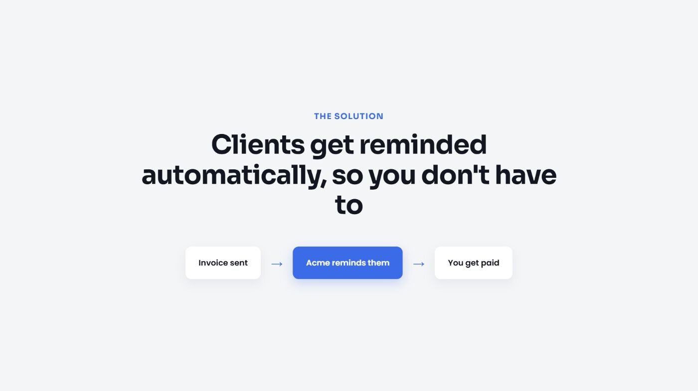
Introduce the product as the answer to the problem you just laid out. Keep this slide focused on the outcome. For the invoice app, that's "clients get reminded automatically, so you don't have to."
4. Product demo or walkthrough
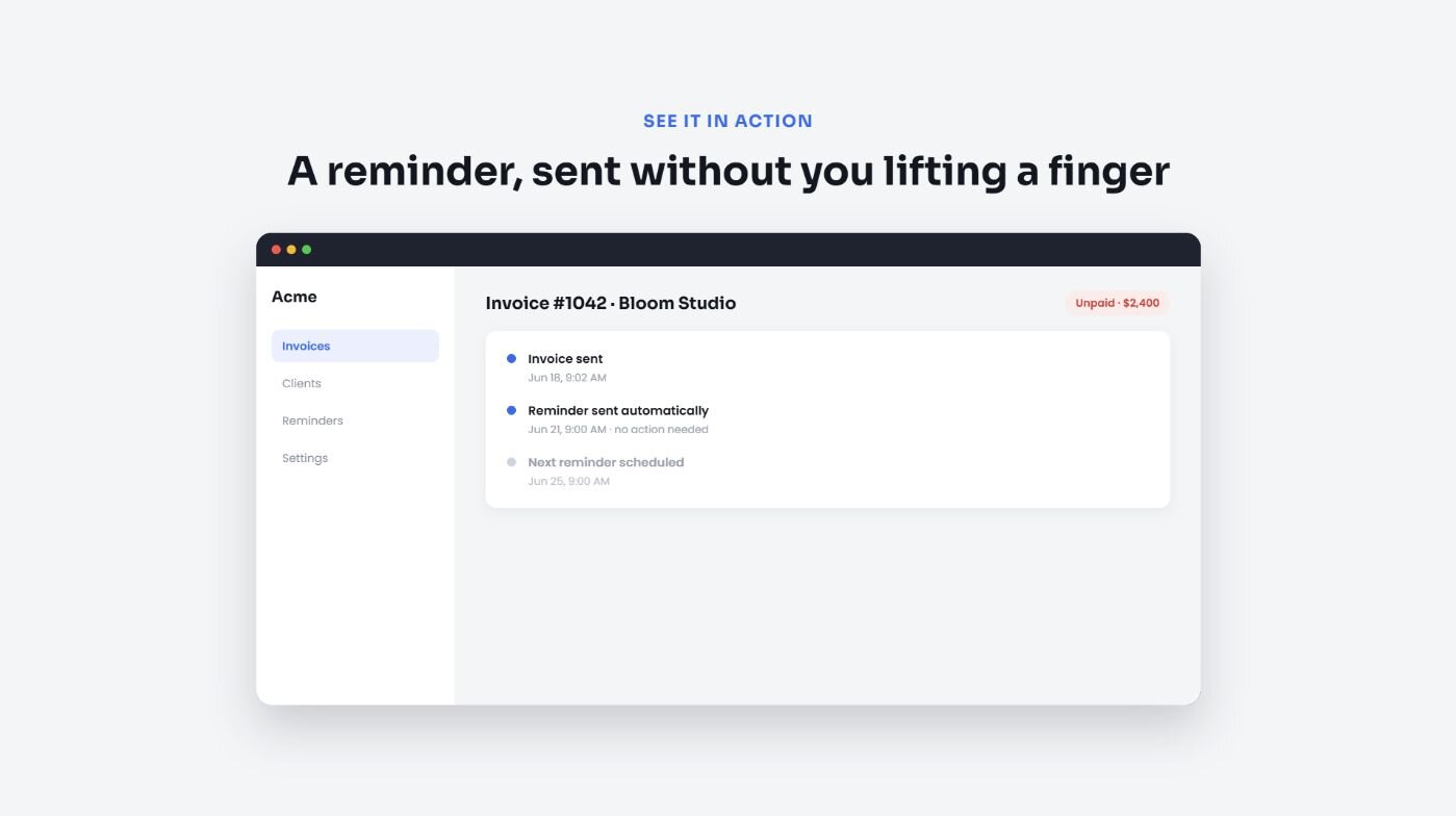
Show the product in action with screenshots, a short video, or a live demo. This is where the audience sees it's real. You might show a screen recording of an invoice going out, then a reminder firing off three days later without anyone touching it.
5. Key features and benefits
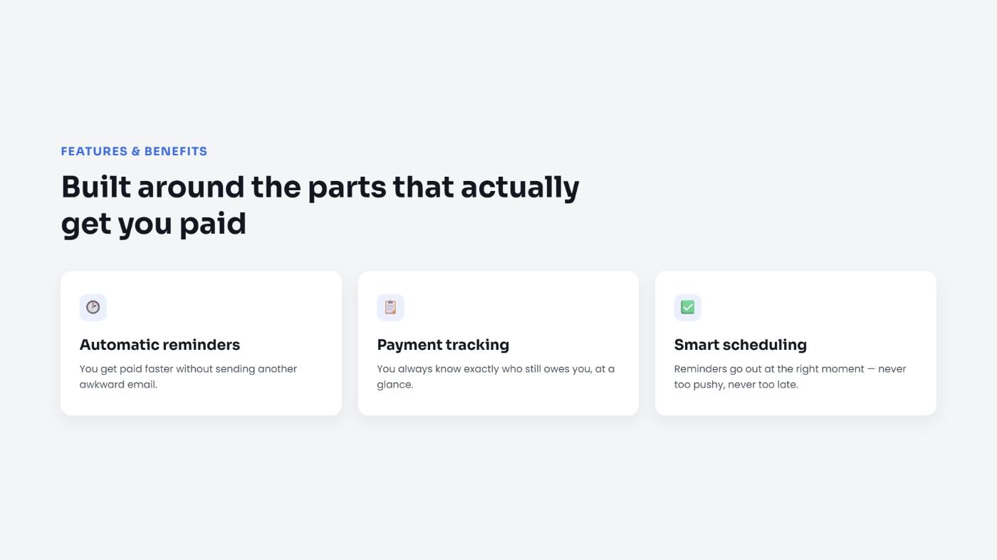
Cover the features that matter most to this audience, and tie each one to what it changes for them. For a freelancer audience, that could be "automatic reminders" tied to "you get paid faster without an awkward email," or "payment tracking" tied to "you always know who still owes you."
6. Social proof
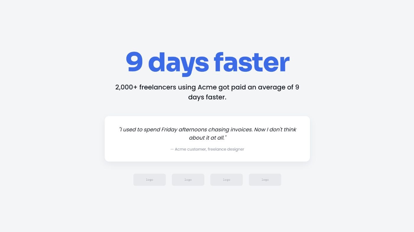
Add customer logos, testimonials, or a data point like "2,000 freelancers using the app got paid an average of 9 days faster" to back up what you've claimed.
7. Objections
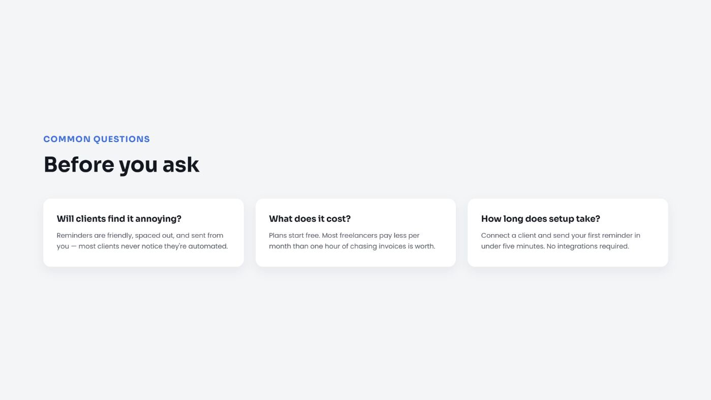
Address the questions your audience is likely to have before they have to ask. For the invoice app, that's usually about cost, whether clients will find the reminders annoying, or how long setup takes.
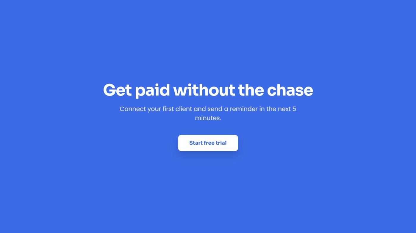
8. Call to action
End with a specific next step, like starting a free trial, booking a demo, or connecting a bank account. For the invoice app, that might be "connect your first client and send a reminder in the next 5 minutes."
💡 Tip: If you're presenting a roadmap item or something still in development, you can also add a product roadmap slide to show what's coming and build trust in the direction.
Product presentation best practices
Once your slide order is set, how you design each one matters just as much as what's on it. Here are the habits worth building into every deck:
One idea per slide: Cramming multiple points onto a slide forces your audience to choose between listening to you and reading the screen. Give each idea its own slide, even if that means more slides overall.
Visuals over bullet points: A chart, product screenshot, or icon usually explains something faster than a list of text. Save the bullet points for the moments where you actually need a list.
Charts that are easy to read at a glance: If you're showing performance data or growth numbers, keep the chart simple, one clear trend per chart instead of five metrics crammed into one graph.
Consistent branding: Use the same colors, fonts, and layout across every slide. It signals that the deck was made with care.
White space: A slide with room to breathe reads as more confident than one packed edge to edge. Don't be afraid to leave space blank.
Short, punchy text: If a sentence takes more than one breath to say out loud, it's probably too long for a slide. I'd keep your text to a phrase or a single short sentence per line.
💡 Tip: Check out our data visualization best practices guide to learn more.
Deliver your presentation confidently with these tips
Even a well-built deck can fall flat if the delivery doesn't hold up. These habits help you keep the room's attention once you're presenting:
Practice out loud, more than once: Reading your slides in your head skips over awkward phrasing you'll only catch when you say it out loud. I’d run through a new presentation at least three times before showing it to anyone else.
Record yourself: Play back a practice run and you'll notice filler words, pacing issues, or slides that need more explanation than you planned for.
Pace yourself around your slides, not the clock: Rushing through a slide to hit a time limit usually means the audience missed the point. Slow down on the slides that matter most and move quickly through the ones that don't.
Pause after a key point: A few seconds of silence after an important stat or statement gives your audience time to actually process it, instead of rushing straight into the next slide. I used to rush straight through this moment, and it made even strong stats fall flat.
Prepare for questions: Think through what your audience is likely to ask and have an answer ready. If something catches you off guard, it's fine to say you'll follow up instead of guessing.
Common product presentation mistakes to avoid
Even a solid deck can lose an audience if a few small things go wrong along the way. Here are the mistakes worth watching for:
Not testing your tech beforehand: A demo that freezes, a video that won't play, or a laptop that won't connect to the projector can derail a presentation before you've said a word. I always test everything on the actual setup I'll use, not just my own laptop at my desk.
Using jargon your audience doesn't know: Internal shorthand or technical terms make sense to your team but can lose a customer or investor fast. Say it the way you'd explain it to a friend outside the industry.
Treating it as a one-way monologue: Presentations that leave no room for questions or reactions until the very end can lose people halfway through. Build in a natural pause or two where you check if the room is following along.
Skipping a dry run with a real audience: Practicing alone catches some issues, but a colleague or friend will ask the questions your actual audience would ask. I've caught some of my worst slides this way, ones I thought were totally clear until someone else read them cold.
Assuming the next step is obvious: Ending on "any questions?" without a specific ask leaves people unsure what to do next. Always close with the exact action you want them to take.
Turn your product data into a deck-ready story
Every product presentation needs numbers to back up its market, performance, or feature slides, and gathering that data often takes longer than building the slides around it. Julius can help with both sides of that problem, analyzing your data and turning the results into slides ready for your presentation.
Here's what Julius brings to your next product presentation:
Find data without uploading anything: Ask Julius to pull public datasets from the web or tap structured financials for 17,000+ companies through its Financial Datasets integration. You can start with a question and skip the file search entirely.
Go from analysis to slides: The Julius AI presentation maker takes your finished analysis and builds it into a deck, carrying your charts and findings straight onto the slide.
Connect your own sources: Link databases like PostgreSQL, Snowflake, and BigQuery, or upload CSV and Excel files, so the numbers behind your slides update with your actual data instead of a snapshot.
Get more accurate the more you use it: A built-in Learning Sub Agent studies your database as you go, picking up table relationships and column meanings that help keep your results on target.
Skip the separate charting tool: Request bar charts, line graphs, or pie charts directly in Julius, so the visuals behind your feature comparisons or performance slides are presentation-ready without a detour through another app.
Want the data and the deck handled in one place? Try Julius for free today.
Frequently asked questions
When should you give a product presentation?
You should give a product presentation when you're launching a new product, pitching to a potential customer, or updating stakeholders on progress. It works best once you have enough detail to show real functionality instead of just a concept. Timing it around a key decision point, like a purchase or renewal, gives the presentation more weight.
How long should a product presentation be?
A product presentation should run between 15 and 30 minutes, depending on the audience and how many questions you expect. Internal updates can stay shorter and more focused, while sales presentations to new customers may need more time to cover features and answer questions. Leaving room for discussion afterward matters more than hitting an exact length.
Should you include pricing in a product presentation?
Yes, you should include pricing in a product presentation when you're presenting to a buyer who needs it to make a decision. Leaving pricing out can create confusion or push the conversation to a follow-up meeting that wasn't necessary. For internal or investor audiences, pricing may not be relevant unless it ties directly to the discussion.
What's the difference between a product presentation and a sales deck?
A product presentation focuses on how a product works and what it does, while a sales deck focuses on convincing a buyer to purchase it. Product presentations often include demos, feature walkthroughs, and roadmaps. Sales decks lean more on pricing, case studies, and a clear call to action.
How do you present a product that's still in development?
You present a product that's still in development by focusing on the problem it solves and showing a prototype, mockup, or demo of what's built so far. Being upfront about what's finished versus what's planned helps set the right expectations. Sharing a timeline for what's coming next can keep the audience engaged despite the product not being complete.