

May19th, 2026
Data analytics tools range from self-service platforms anyone can use to technical environments built for data teams. I tested dozens across use cases, budgets, and skill levels to find the 16 best for 2026.
16 Best data analytics tools: Quick comparison
| 💻 Tool | 🎯 Best for | 🔥 Starting price (billed annually) | ⚡ Strengths |
|---|---|---|---|
| Tableau | Interactive dashboards and visual storytelling | $75/user/month for the Creator license | Drag-and-drop interface, deep visualization options, and large connector library |
| Power BI | Reporting within the Microsoft 365 ecosystem | $14/user/month | Native Microsoft integrations, DAX modeling, and affordable pricing |
| Looker Studio | Free Google-connected reporting | Free; Pro plan $9/user/project/month, billed monthly | Google ecosystem integrations, shareable dashboards, and a no-cost entry point |
| Julius | AI-powered analysis without code | $16/month | Natural language querying, web data search, live financial data for 17,000 companies, and scheduled reports |
| Qlik Sense | Associative data exploration | $300/month, includes 10 users | Associative engine, self-service analytics, and governed data access |
| Sisense | Embedded analytics for custom applications | $399/month, billed monthly | Embedded analytics, API-first architecture, and white-label options |
| Domo | Cloud BI and executive dashboards | Usage-based pricing | Real-time data connections, pre-built connectors, and mobile-friendly dashboards |
| SAS Viya | Enterprise data science and governance | Custom pricing | Distributed processing, open-source integration, and audit trails |
| Snowflake | Cloud data warehousing with analytics | Usage-based pricing | Multi-cloud storage, data sharing, and scalable compute |
| KNIME | No-code data science workflows | $19/month, billed monthly | Visual workflow builder, open-source core, and Python and R integration |
| Python | Custom analytics with full code control | Free (open-source) | Flexible libraries, open-source ecosystem, and broad community support |
| R | Statistical analysis and research | Free (open-source) | Statistical depth, academic adoption, and strong visualization packages |
| Jupyter Notebooks | Interactive code-based analysis | Free (open-source) | Multi-language support, shareable notebooks, and live code execution |
| Microsoft Excel | Spreadsheet-based data analysis | $99.99/year for a personal Microsoft 365 plan | Familiar interface, pivot tables, and wide business adoption |
| Google Analytics | Web and marketing performance tracking | Free | Traffic analysis, conversion tracking, and Google Ads integration |
| Apache Spark | Large-scale distributed data processing | Free (open-source) | Distributed computing, fast in-memory processing, and multi-language support |
How I researched and tested these data analytics tools
I tested each tool using sample business datasets across tasks like building performance reports, analyzing trends, and pulling insights from sales and marketing data. For the tools that don't offer direct access, I went through documentation, demos, and verified user reviews.
Here's what I considered:
Query and analysis depth: How far you can push each tool with business questions, and how much technical knowledge is required.
Time to first insight: How quickly you can go from connecting your data to getting a result you can use.
Integration with existing tools: How well each platform connects to the sources and software a typical business team already uses.
Audience fit: Whether the tool is built for business users, data teams, or both, and how that shows up in practice.
In my testing, the tools that cut the most time between a question and an answer were the ones that required minimal technical help to operate.
1. Tableau: Best for interactive dashboards and visual storytelling
What it does: Tableau is a data visualization and business intelligence platform that lets you connect to data sources, build interactive dashboards, and share findings across your organization.
Best for: Business analysts and data teams that need polished, interactive dashboards for stakeholder reporting and visual data exploration.
I connected a sample sales dataset via Tableau's file upload to test how quickly I could build a multi-view dashboard without SQL knowledge. Filters, trend lines, and a regional breakdown came together without writing any code, and layout, color schemes, and axis formatting are all adjustable in detail. However, the volume of options makes the interface harder to navigate for first-time users.
💡Tip: Check out our in-depth Tableau review if you’d like to learn more.
Key features
Drag-and-drop dashboard builder: Build charts, filters, and multi-view dashboards by dragging fields onto a canvas without writing queries or code.
Live and extract data connections: Connect directly to databases, cloud warehouses, and files for live querying, or extract data for faster offline analysis.
Viz in Tooltip: Embed a secondary visualization inside a tooltip so users can see additional context by hovering over a data point in a dashboard.
Pros and cons
| ✅ Pros | ❌ Cons |
|---|---|
| Wide range of chart types and visual customization options without requiring code | Dashboard sharing and publishing require a Creator license, which adds to the cost |
| Connects to a large number of data sources, including cloud warehouses and flat files | Building and maintaining complex dashboards can require dedicated analyst time |
| Strong community and documentation library for troubleshooting and learning |
What users say
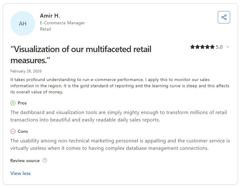
Pro: “The dashboard and visualization tools are simply mighty enough to transform millions of retail transactions into beautiful and easily readable daily sales reports.” - Amir H., Capterra
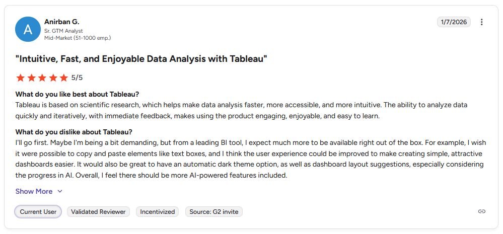
Con: “I wish it were possible to copy and paste elements like text boxes, and I think the user experience could be improved to make creating simple, attractive dashboards easier. … Overall, I feel there should be more AI-powered features included.” - Anirban G., G2
Pricing
Tableau starts at $75 per user per month for a Creator license.
Bottom line
Tableau's visualization depth makes it a strong option for teams that need to communicate complex data findings through polished, interactive reports. If your data lives primarily in Microsoft products and you want built-in reporting without a separate BI tool, Power BI might be a better fit.
2. Power BI: Best for reporting within the Microsoft 365 ecosystem
What it does: Power BI is a business intelligence platform that lets you connect to data sources, build interactive reports, and share dashboards across your organization.
Best for: Teams already using Microsoft 365 or Azure that need affordable, scalable reporting without a dedicated BI team.
I imported a sample Excel file into Power BI to see how fast I could turn it into a shareable report without technical help. A revenue report with slicers, bar charts, and a monthly trend line took under 30 minutes, and the Excel integration required no extra configuration. Writing DAX formulas for custom calculations took considerably more time and may frustrate users without a technical background.
Key features
Native Microsoft integrations: Connect directly to Excel, Azure, SharePoint, and other Microsoft products without additional configuration or third-party connectors.
Power Query: Pull in data from multiple sources, clean and reshape it, and load it into your report without writing SQL.
Scheduled report refresh: Set reports to update automatically on a schedule so stakeholders always view current data without manual exports.
Pros and cons
| ✅ Pros | ❌ Cons |
|---|---|
| Tight integration with Microsoft 365 makes it a natural fit for teams already in that ecosystem | DAX formula language has a steep learning curve for users without a technical background |
| Large library of community-built visuals extends the default chart and report options | Report layout and design options can feel limited compared to more visualization-focused tools |
| Power Query handles data cleaning and transformation without requiring SQL knowledge |
What users say
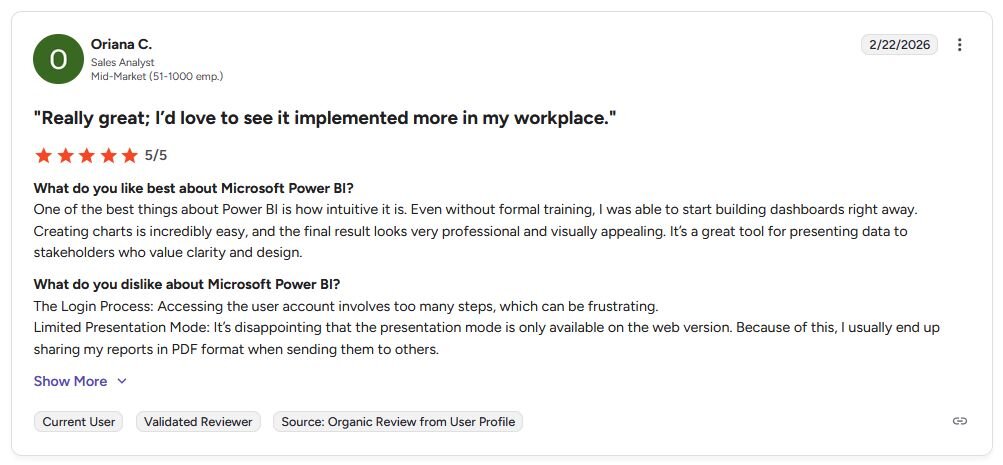
Pro: “One of the best things about Power BI is how intuitive it is. Even without formal training, I was able to start building dashboards right away.” - Oriana C., G2
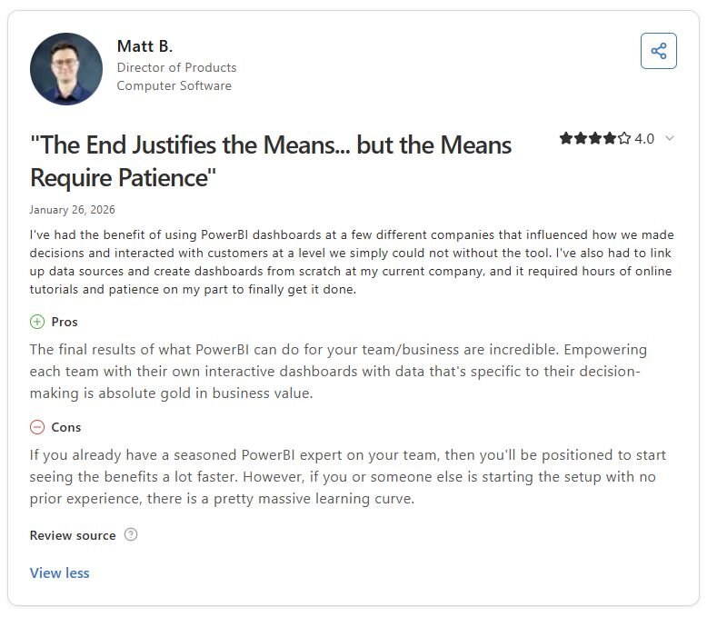
Con: “If you already have a seasoned [Power BI] expert on your team, then you’ll be positioned to start seeing the benefits a lot faster. However, if you or someone else is starting the setup with no prior experience, there is a pretty massive learning curve.” - Matt B., Capterra
Pricing
Power BI starts at $14 per user per month.
Bottom line
Power BI's scheduled refresh and native Microsoft connections make it a practical choice for finance and operations teams that need reports to update automatically without manual intervention. If you need more advanced visual customization and your data doesn't live primarily in Microsoft tools, Tableau might be a better fit.
3. Looker Studio: Best for free Google-connected reporting
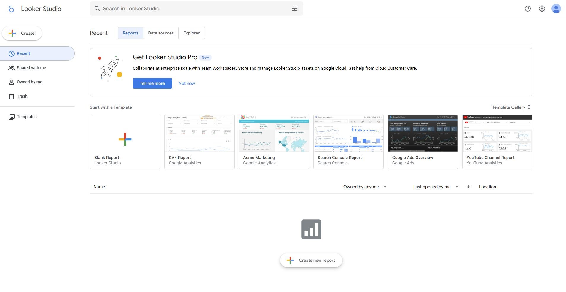
What it does: Looker Studio is a free reporting and dashboard tool that connects to Google products and other data sources to help you build shareable, interactive reports.
Best for: Marketing and business teams that run their reporting primarily through Google products and need a free, shareable dashboard tool.
I connected a Google Analytics account and a Google Sheets dataset in Looker Studio to test how fast I could build a marketing report from scratch. I had a working report with date range controls, traffic breakdowns, and conversion metrics in under an hour, but non-Google sources often required additional setup through partner or open-source connectors.
Key features
Google ecosystem connectors: Connect natively to Google Analytics, Google Ads, Google Sheets, and BigQuery without additional setup or third-party tools.
Shareable, interactive reports: Publish reports as live links that viewers can filter and explore without needing a Looker Studio account.
Blended data sources: Combine data from multiple sources into a single chart or table to compare metrics across platforms in one view.
Pros and cons
| ✅ Pros | ❌ Cons |
|---|---|
| Free to use with no seat limits for viewing and sharing reports | Non-Google data connectors often require third-party integrations at additional cost |
| Native Google integrations make setup fast for teams already in the Google ecosystem | Report design options are more limited than dedicated BI platforms for complex layouts |
| Interactive reports can be shared via a link without requiring viewers to log in |
What users say
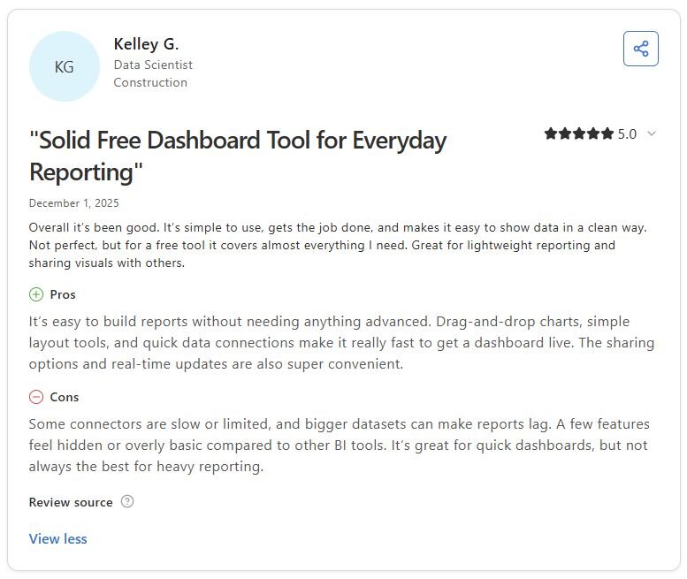
Pro: “It’s easy to build reports without needing anything advanced. Drag-and-drop charts, simple layout tools, and quick data connections make it really fast to get a dashboard live.” - Kelley G., Capterra
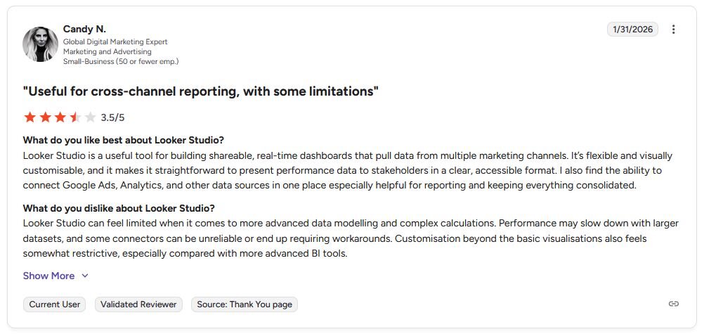
Con: “Looker Studio can feel limited when it comes to more advanced data modeling and complex calculations. Performance may slow down with larger datasets, and some connectors can be unreliable or end up requiring workarounds.” - Candy N., G2
Pricing
Looker Studio is available for free. There is also a Pro plan starting at $9 per user per project per month, billed monthly.
Bottom line
Looker Studio's free entry point makes it a practical starting point for marketing teams that need shareable dashboards without a BI budget. If you'd rather ask a question to get an answer than build a report, Julius might be a better fit.
4. Julius: Best for AI-powered analysis without code
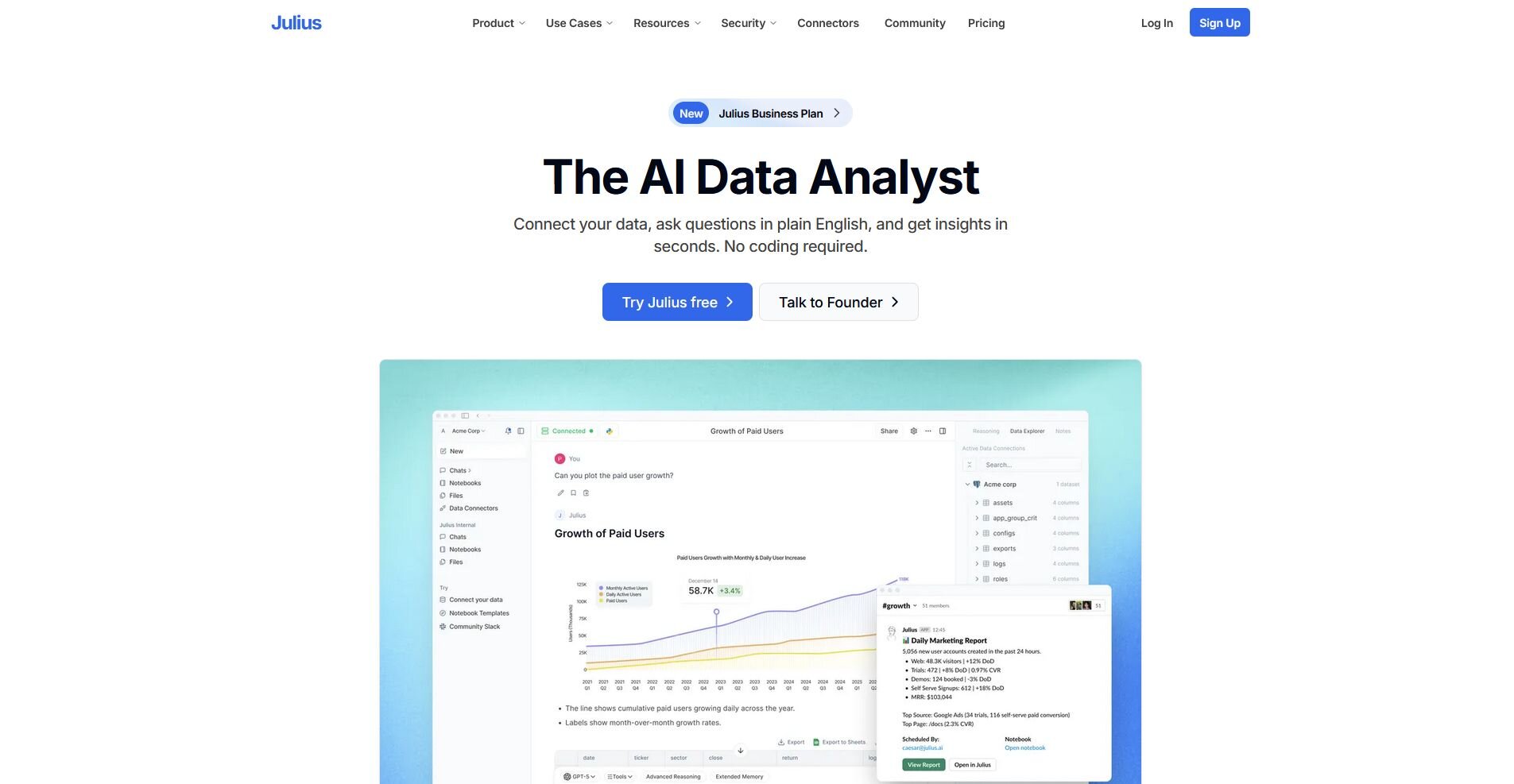
What it does: Julius is an AI-powered data analysis tool that lets you query, visualize, and report on your data through natural language, without writing SQL or Python.
Best for: Business users who need fast insights from connected data, public datasets, or uploaded files without coding or building dashboards.
We built Julius so business users could get answers from their data without waiting on an analyst or learning a new technical skill. You can connect your own data sources, upload files, or type a question and have Julius search for and compile public or financial data to answer it, covering everything from company revenue trends to market benchmarks across 17,000 companies. Results can vary depending on how questions are phrased, so getting consistent outputs may take some experimentation with wording.
Key features
Natural language querying: Type a question about your data and get a chart, summary, or table back without writing SQL or building a dashboard.
Web and financial data search: Search for public datasets or pull structured financial data for 17,000 companies directly inside Julius without uploading a file.
Scheduled reports via email and Slack: Set analysis to run on a recurring schedule and deliver results to your inbox or Slack channel automatically.
Pros and cons
| ✅ Pros | ❌ Cons |
|---|---|
| Queries on connected data sources get faster and more precise over time as Julius learns your database structure | Output quality can vary depending on how questions are phrased |
| Built-in web and financial data search means you can start with a question rather than a file | Not suited for teams that need embedded analytics or predictive model deployment |
| Scheduled reports deliver recurring analysis to email or Slack without manual exports |
What users say
Pro: “If you spend more than 2 hours a week working with data, Julius AI will save you time. Start with the free plan. You’ll know within a week if it fits your workflow. For most non-technical users, it’s a no-brainer.” - Fahim Joharder, Fahim AI (independent Julius review)

Con: “Not gonna lie, the first time I uploaded a messy CSV with empty values, the results were off. AI can help identify outliers and handle empty values. But you still need to clean your raw data first.” -Fahim Joharder, Fahim AI (independent Julius review)
Pricing
Julius starts at $16 per month.
Bottom line
Julius's built-in financial data access and web search mean you can start an analysis from a question rather than a file. If you need to embed analytics directly into a product or customer-facing application, Sisense might be a better fit.
5. Qlik Sense: Best for associative data exploration
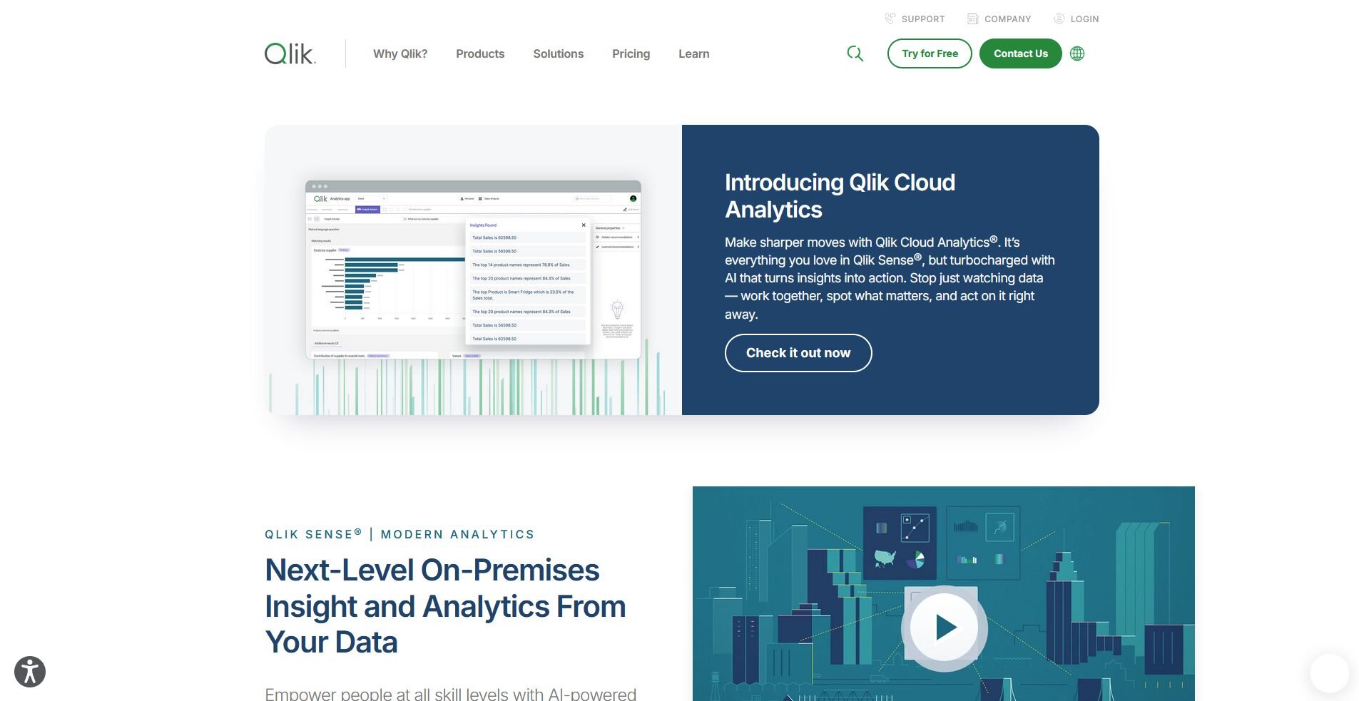
What it does: Qlik Sense is a self-service analytics platform that lets you explore relationships across your data without following predefined queries or drill paths.
Best for: Analytics teams that need to explore complex datasets and uncover relationships across data points without writing SQL or following a fixed report structure.
I loaded a sample sales dataset into Qlik Sense to test how well its associative engine handles open-ended data exploration. Clicking any data point automatically filters every connected chart and metric on the page, but field relationships must be defined manually before the engine works as intended.
Key features
Associative engine: Select any data point and watch every connected chart and metric update automatically, so you can trace relationships across your entire dataset without writing queries.
Self-service analytics: Build and modify charts, filters, and dashboards without relying on a data team to create or update reports.
Governed data access: Set data access rules and permissions at the platform level so different teams see only the data relevant to their role.
Pros and cons
| ✅ Pros | ❌ Cons |
|---|---|
| Associative engine makes it possible to explore unexpected relationships across large datasets without predefined drill paths | Initial data model setup can be complex and may require analyst support to configure correctly |
| Self-service layer lets business users build and modify their own reports without waiting on a data team | Interface has a steeper learning curve than drag-and-drop dashboard tools |
| Governed access controls let administrators manage what each team can see without restricting their ability to explore |
What users say
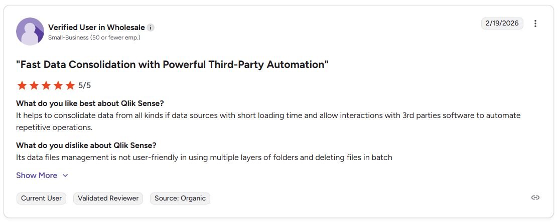
Pro: “It helps to consolidate data from all kinds if [sic] data sources with short loading time and allow interactions with 3rd parties [sic] software to automate repetitive operations.” - Verified User in Wholesale, G2
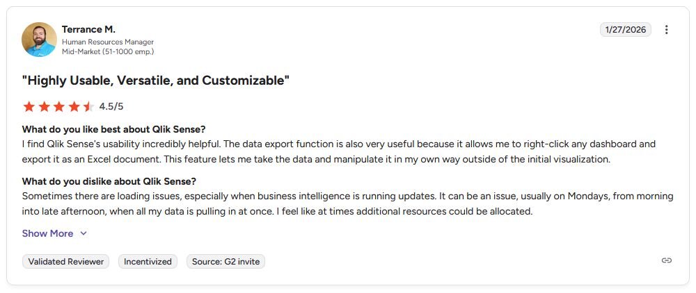
Con: “Sometimes there are loading issues, especially when business intelligence is running updates. It can be an issue, usually on Mondays, from morning into late afternoon, when all my data is pulling in at once. I feel like at times additional resources could be allocated.” - Terrance M., G2.
Pricing
Qlik Sense starts at $300 per month, which includes 10 users.
Bottom line
Qlik Sense's associative engine makes it a strong option for analytics teams that need to explore how variables connect across large, complex datasets without writing code. If your reporting runs primarily through Google products and you need a free starting point for shareable dashboards, Looker Studio could be worth a look.
6. Sisense: Best for embedded analytics for custom applications
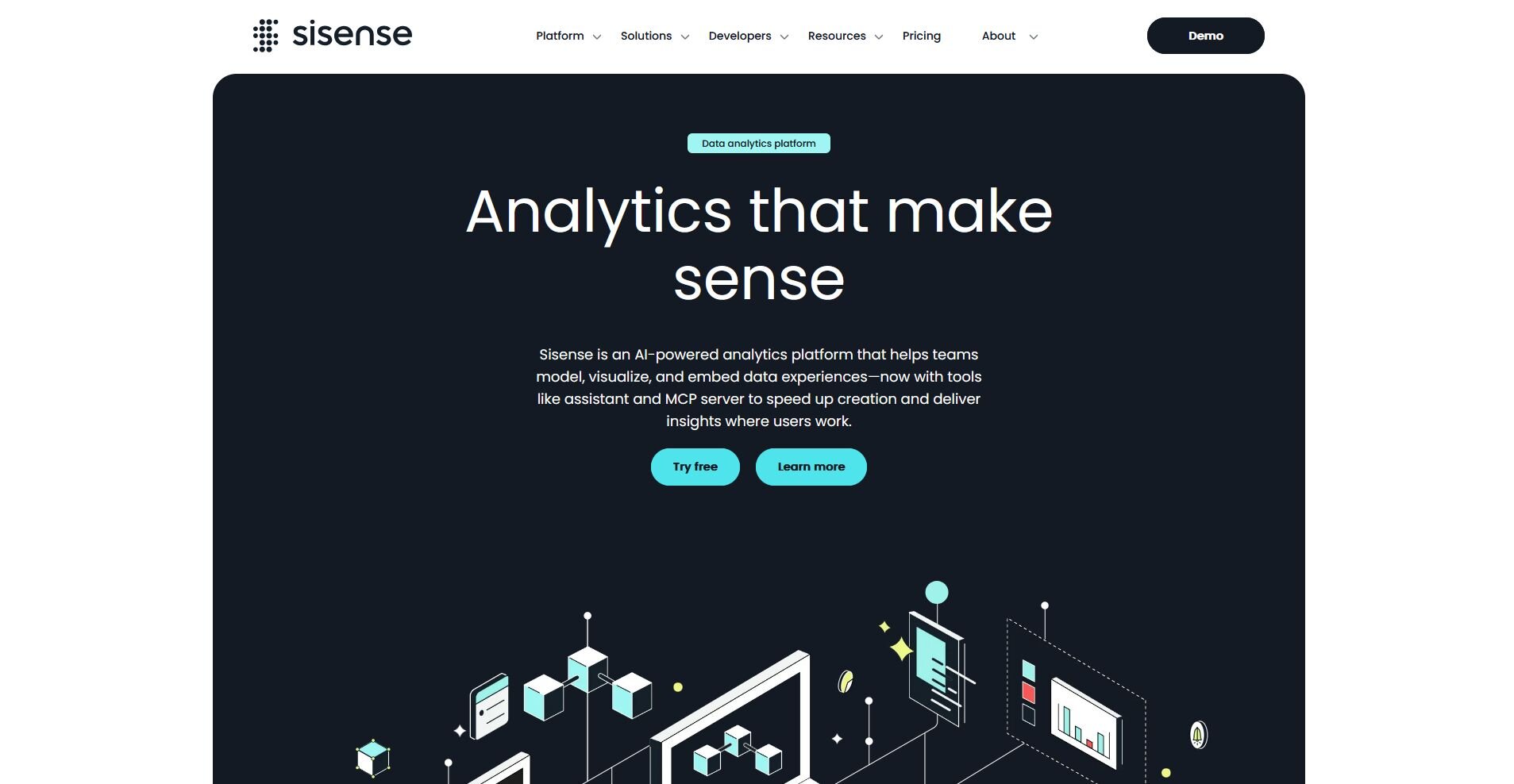
What it does: Sisense is an analytics platform built for embedding interactive dashboards and data visualizations directly into applications, portals, and customer-facing products.
Best for: Development and product teams that need to build analytics into their own applications or customer-facing platforms.
I built a sample embedded dashboard in Sisense to test how quickly a development team could add a performance report to a client portal. Dashboard appearance and behavior are configurable at a detailed level, and white-label options let the output match the portal's existing design. The initial setup typically requires developer involvement, which can be a barrier for smaller teams.
Key features
Embedded analytics: Embed interactive dashboards and charts directly into external applications or portals using Sisense's API and SDK.
White-label customization: Remove Sisense branding and apply custom styling so embedded analytics match the look and feel of your product.
API-first architecture: Build, manage, and automate analytics workflows programmatically, giving development teams full control over how data is surfaced and displayed.
Pros and cons
| ✅ Pros | ❌ Cons |
|---|---|
| Embedded analytics capabilities make it a strong fit for product teams building data features into customer-facing applications | Requires developer involvement to set up and configure, which limits self-service use for non-technical teams |
| White-label options let teams remove Sisense branding and match the look of their own product | Less suited for ad hoc business reporting compared to dedicated BI platforms |
| API-first design gives development teams programmatic control over how analytics are built and managed |
What users say
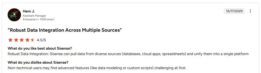
Pro: “Robust Data Integration: Sisense can pull data from diverse sources (databases, cloud apps, spreadsheets) and unify them into a single platform.” - Hem J., G2
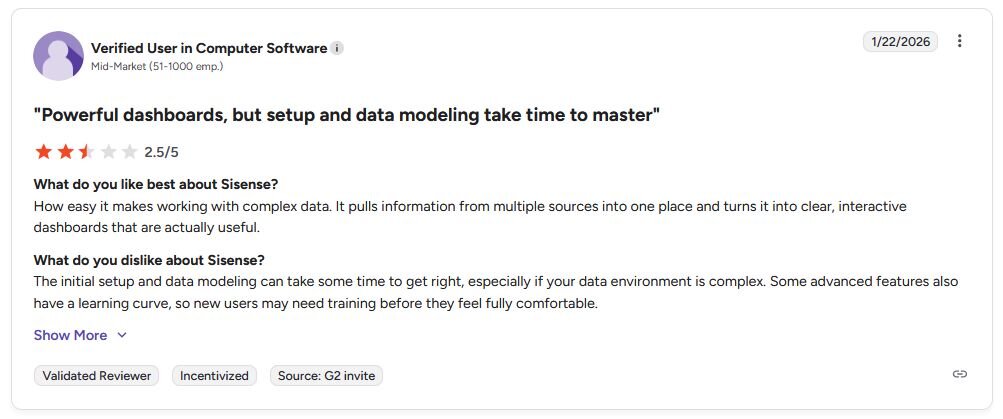
Con: “The initial setup and data modeling can take some time to get right, especially if your data environment is complex. Some advanced features also have a learning curve, so new users may need training before they feel fully comfortable.” - Verified User, G2
Pricing
Sisense starts at $399 per month, billed monthly.
Bottom line
Sisense is built for teams that need to deliver analytics as part of a product experience, not just internal reporting. If you need a self-service analytics platform your whole business team can use without developer support, Qlik Sense might be a better fit.
Special mentions
The tools below cover a wide range of use cases, from open-source coding environments to cloud data warehouses.
Here are 10 more data analytics tools worth a look:
Domo: Domo is a cloud BI platform built around real-time data connections and executive-facing dashboards. I found it strong for teams that need live visibility across multiple data sources in one place, but smaller teams may find the feature set broader than what they need day to day.
SAS Viya: SAS Viya is an enterprise analytics platform with strong capabilities in statistical modeling, data management, and governed data science workflows. I found it well-suited for large organizations with compliance requirements, but the learning curve is steep and it may be overkill for teams that just need dashboards and reports.
Snowflake: Snowflake is a cloud data warehouse that can run SQL queries and support analytics workloads across large datasets. Its multi-cloud flexibility is useful, and it pairs well with dedicated BI tools like Tableau or Power BI. On its own, it doesn't offer the dashboards or self-service features most business users need to get answers without technical help.
KNIME: KNIME is an open-source data science platform that lets you build analysis workflows visually without writing code. It covers a wide range of tasks from data cleaning to machine learning, but the interface takes time to learn and can feel cluttered on more complex workflows.
Python: Python is a general-purpose programming language with a rich ecosystem of data analysis libraries, including pandas, NumPy, and Matplotlib. It gives you precise control over how data is cleaned, transformed, and visualized, but you'll need to write and debug code to get there. This can make it a difficult starting point for business users who just need answers from their data.
R: R is a programming language built specifically for statistical analysis and data visualization, and it remains a go-to in academic and research settings. You can run complex regression models, time series analysis, and detailed charts, but it requires writing R code.
Jupyter Notebooks: Jupyter Notebooks is an open-source environment for writing and running code interactively, with support for Python, R, and other languages. It works well for exploratory analysis and sharing findings with annotated code, but you'll need some coding knowledge to get meaningful results from it.
Microsoft Excel: Excel is a spreadsheet tool with pivot tables, formulas, and basic charting built in. It can handle a surprising range of analysis tasks for smaller datasets, but it starts to show its limits quickly when data volumes grow or multiple team members need to work from the same source.
Google Analytics: Google Analytics is a web analytics platform that tracks traffic, user behavior, and conversion data for websites and apps. It's a strong option for marketing teams monitoring campaign performance, but its scope is limited to web data. That means it may not help much with sales, finance, or operational analysis.
Apache Spark: Apache Spark is an open-source distributed computing framework built for processing large volumes of data across clusters. Setting it up requires configuring distributed infrastructure, and maintaining it day to day typically needs dedicated engineering support. This may put it outside the scope of many business user workflows.
Which data analytics tool should you choose?
The right data analytics tool depends on what your team needs to do with their data and how much technical experience they have. Teams at software and SaaS companies can also compare our picks for the best data analytics tools for the tech industry.
Choose Tableau if you:
Need polished, interactive dashboards that non-technical stakeholders can explore on their own
Work across multiple data sources and need a wide range of connector options
Want a visualization tool with a large community and extensive learning resources
Choose Power BI if you:
Already use Microsoft 365 or Azure and want analytics that fits naturally into that ecosystem
Need an affordable option that can scale from individual users to large teams
Want to build reports and dashboards without heavy reliance on a data team
Choose Looker Studio if you:
Run your marketing or business reporting primarily through Google products
Need a free, shareable dashboard tool your whole team can access without a license
Want to combine data from Google Ads, Google Analytics, and Google Sheets in one view
Choose Julius if you:
Want to ask questions about your data in plain English without writing SQL or Python
Need to pull financial data, search public datasets, or analyze your own files without setting up a data pipeline
Want scheduled reports delivered to your inbox or Slack without manual exports
Choose Qlik Sense if you:
Need to explore relationships across large, complex datasets without predefined queries
Want a self-service analytics platform with strong governance controls for larger teams
Have analysts who can configure and manage the platform for broader team use
Choose Sisense if you:
Need to embed analytics directly into a product, portal, or customer-facing application
Want a white-label analytics solution you can customize for your own users
Have a development team that can work with an API-first architecture
Skip this category entirely if you:
Need a platform that processes live data streams as they happen, rather than analyzing data that's already been collected and stored
Are looking for a customer data platform or marketing automation tool, since the tools above focus on analysis and reporting rather than data activation or campaign management
Work primarily with unstructured data like images, video, or audio, since the tools above are built for structured, tabular data
Final verdict
Data analytics tools range from free self-service dashboards to technical environments that require dedicated data teams to run. Tableau and Power BI work well for teams that need polished, scalable reporting, and Looker Studio is a strong starting point for anyone already working within the Google ecosystem.
If your priority is getting answers from your data without writing code or waiting on an analyst, Julius is worth trying first.
Here’s how Julius helps:
Data search: Type your question, and Julius can search for relevant public data or pull live financial market data for over 17,000 companies through its Financial Datasets integration, so you can start your analysis before you have a dataset ready.
Direct connections: Link databases like PostgreSQL, Snowflake, and BigQuery, or integrate with Google Ads and other business tools. You can also upload CSV or Excel files. Your analysis can reflect live data, so you’re less likely to rely on outdated spreadsheets.
Repeatable Notebooks: Save an analysis as a notebook and run it again with fresh data whenever you need. You can also schedule notebooks to send updated results to email or Slack.
Smarter over time: Julius includes a Learning Sub Agent, an AI that adapts to your database structure over time. It learns table relationships and column meanings as you work with your data, which can help improve result accuracy.
Built-in visualization: Get histograms, box plots, and bar charts on the spot instead of jumping into another tool to build them.
One-click sharing: Turn an analysis into a PDF report you can share without extra formatting.
For business users who want to explore and report on their data without writing code or filing requests with an analyst, Julius is worth trying. You can connect your own data sources, upload files, or start with a question and let Julius search for the data you need.
Frequently asked questions
What is a data analytics tool?
A data analytics tool is software that helps you query, visualize, and report on data without having to process it manually. Most tools connect to your existing data sources and let you build charts, dashboards, and reports from a central interface. They range from spreadsheet-based tools like Excel to AI-powered platforms like Julius that let you ask questions about your data in natural language.
What is the difference between a BI tool and a data analytics tool?
A BI tool is a type of data analytics tool focused specifically on reporting and dashboards for business decision-making. Data analytics tools cover a broader range of tasks, including statistical analysis, data cleaning, and predictive modeling, depending on the platform. BI tools help business teams monitor performance, track KPIs, and share findings with stakeholders through visual reports. If cleanup is the main job, our list of the best data cleaning software covers dedicated tools.
Can I use a data analytics tool without coding?
Yes, many data analytics tools require no coding knowledge, including Tableau, Power BI, Looker Studio, and Julius. These platforms let you connect your data and build reports through drag-and-drop interfaces or natural language queries.