

Analytics and reporting tools help business teams track performance, spot trends, and share insights without depending on a data team for every question. After testing dozens of platforms, these are the 11 best options for 2026.
11 best analytics and reporting tools: Quick comparison
Teams evaluating Retool alternatives typically need lower costs at scale or control. The tools below address both.
Here's what makes each tool different:
| 💻 Tool | 🎯 Best for | 💰 Starting price (billed annually) | ⚡ Key strengths |
|---|---|---|---|
| Julius | Database analysis without writing SQL | $33/month | Natural language queries, scheduled reporting, and learning your data structure over time |
| Tableau | Executive data visualizations | $15/user/month; a Creator license is also required at $75/user/month | Drag-and-drop interface, extensive chart library, and embedded analytics |
| Microsoft Power BI | Microsoft ecosystem analytics | $14/user/month | Seamless Office integrations, AI visuals and forecasting, and strong data modeling |
| Looker Studio | Google data dashboards | Free; Pro plan starts at $9/user/project/month | Free tier, data connectors for multiple sources, and collaborative editing |
| Qlik Sense | Enterprise self-service analytics | $300/month for 10 users | Associative data engine, AI-powered insights, and mobile analytics |
| Zoho Analytics | Affordable BI for small teams | $48/month (Cloud) | Data source integrations, drag-and-drop builder, and predictive analysis |
| Whatagraph | Marketing performance reporting | $229/month | Platform integrations, automated report delivery, and a 30-minute data refresh |
| Domo | Real-time business dashboards | Usage-based pricing | Chart options, automated reporting, and real-time data updates |
| HubSpot | CRM reporting for sales teams | $9/seat/month | Native CRM integration, customizable dashboards, and revenue reporting |
| ThoughtSpot | Search-driven data analysis | $25/user/month | Search-based analytics, live data connections, and embedded dashboards |
| Sisense | Embedded analytics for products | $399/month, billed monthly | White-label customization, in-chip analytics for fast queries, and a developer toolkit |
How I researched and tested these analytics and reporting tools
I tested each platform by connecting sample datasets, building dashboards, and running queries to see how quickly I could move from raw data to insights. For enterprise tools, I reviewed product documentation, watched live demonstrations, and analyzed verified user feedback from G2 and Capterra.
Here's what I considered:
Data refresh speed: How quickly each tool pulls data from multiple sources and refreshes reports without manual intervention
Query flexibility: Whether business users can ask questions in everyday language or need technical knowledge to extract insights
Visualization quality: How well charts and dashboards communicate trends without requiring additional explanation
Collaboration features: Whether teams can share reports, schedule delivery, and maintain version control without friction
Pricing transparency: What features you get at each tier, and whether user limits create scaling costs
This hands-on approach revealed which platforms deliver insights fast enough to influence decisions versus those that add extra reporting work to your workflow.
1. Julius: Best for database analysis without writing SQL
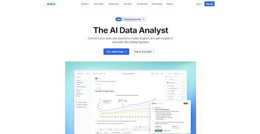
What it does: Julius is a data analysis tool that lets you upload files or connect to databases, ask questions in everyday language, and generate charts, tables, and summaries from your data.
Best for: Teams that want to analyze database data and build reports without writing SQL.
We designed Julius for business teams that want to analyze data and build reports without writing SQL. You can connect a file or a database, ask questions about your data, and generate charts, tables, or summaries as you explore. As you keep working with the same data, Julius learns how your tables relate, so follow-up analysis requires less setup.
Key features
Natural language queries: Ask questions about your data in everyday language and generate charts, tables, or summaries without writing SQL.
Learns your data structure: As you keep working with the same dataset, Julius remembers how your tables connect and what your columns represent. This reduces the setup needed when you run new analyses on the same data.
Interactive visualizations: You can create charts during analysis and adjust them through follow-up questions. This lets you refine a report step by step instead of rebuilding dashboards.
Repeatable Notebooks: You can save analysis steps inside Notebooks and run them again when new data arrives, so you don’t have to rebuild the report each time.
Report delivery options: You can send charts and tables to Slack, email, or shared workspaces so stakeholders can review the results without logging in.
Pros and cons
✅ Pros
❌ Cons
Lets you analyze structured data without writing SQL first
Results can vary if the uploaded data has inconsistent formatting
Generates charts and tables during analysis so you can iterate on reports quickly
Some complex datasets still require cleanup before analysis
Follow-up analysis takes less setup once Julius understands how your data is organized
What users say
Pro: “If you spend more than 2 hours a week working with data, Julius AI will save you time. Start with the free plan. You’ll know within a week if it fits your workflow. For most non-technical users, it’s a no-brainer.” - Fahim J., independent review

Con: “The first time I uploaded a messy CSV with empty values, the results were off. AI can help identify outliers and handle empty values. But you still need to clean your raw data first.” -Fahim J., independent review
Pricing
💰 Price, billed annually
💰 Price, billed monthly
Free
$0
$0
Pro
$33/month
$45/month
Business
$375/month
$450/month
Growth
$625/month
$750/month
Bottom line
Julius keeps the full analysis workflow in one workspace so you can move from questions to reports without switching tools. If you want traditional dashboard building and deep visualization customization, Tableau might be a better fit.
2. Tableau: Best for executive data visualizations
What it does: Tableau is a business intelligence and data visualization platform that lets you connect data sources, build dashboards, and present business metrics through interactive charts.
Best for: Teams that need polished dashboards and presentation-ready visuals for executive reporting.
I tested Tableau by building dashboards and adjusting charts to see how much control it gives you over the final presentation. It worked well when I needed reports that explained the numbers clearly and looked polished for an executive audience, but it also took more time to learn than simpler dashboard tools.
Key features
Drag-and-drop dashboard builder: You can build charts and dashboards by dragging fields into a visual workspace and arranging them on a canvas.
Wide chart library: Tableau supports many chart types, maps, tables, and filters for teams that need more than basic bar and line charts.
Interactive dashboards: You can add filters, drill-down actions, and hover details so people can explore reports during meetings.
Embedded analytics: You can place Tableau dashboards inside websites, portals, and internal tools.
Data connections: Tableau connects to spreadsheets, databases, cloud warehouses, and business apps for multi-source reporting.
Pros and cons
✅ Pros
❌ Cons
Builds polished dashboards for executive reporting
Takes more time to learn than simpler dashboard tools
Handles large reporting datasets well
Some dashboard layout work still takes manual adjustment
Gives teams more chart variety than most basic dashboard tools
What users say
Pro: “The dashboard and visualization tools are simply mighty enough to transform millions of retail transactions into beautiful and easily readable daily sales reports.” - Amir H., Capterra
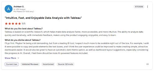
Con: "I wish it were possible to copy and paste elements like text boxes, and I think the user experience could be improved to make creating simple, attractive dashboards easier. … Overall, I feel there should be more AI-powered features included.” - Anirban G., G2
Tip: If you’d like to learn more, we also have an in-depth Tableau review.
Pricing
Tableau starts at $15 per user per month, and a Creator license is also required at$75 per user per month.
Bottom line
Tableau gives you fine control over dashboard layout and presentation. If you want search-based analysis with less dashboard building, ThoughtSpot might be a better fit.
3. Microsoft Power BI: Best for Microsoft ecosystem analytics
What it does: Microsoft Power BI is a business intelligence platform that lets you connect data sources, build dashboards, and share reports across Microsoft tools.
Best for: Teams that already use Microsoft 365 and want dashboards, reports, and data models inside the same ecosystem.
I set up Power BI with sample data and built dashboards to see how well it fits into a Microsoft-based workflow. The connections to Excel, Azure, and Teams came together cleanly, though building custom calculations got technical quickly once I moved beyond the basics.
Key features
Microsoft integrations: Power BI connects with Excel, Teams, Azure, and other Microsoft tools for shared reporting workflows.
Data modeling: You can build relationships between tables, create measures, and shape data before adding it to a dashboard.
Interactive dashboards: You can add filters, drill-down views, and clickable visuals so people can explore reports in more detail.
Pros and cons
✅ Pros
❌ Cons
Fits naturally into Microsoft-based reporting workflows
Setup can take time without prior Power BI experience
Produces polished dashboards for team reporting
Building custom calculations can slow you down if you’re new to Power BI’s formula language (DAX)
Gives you strong control over data models and visuals
What users say
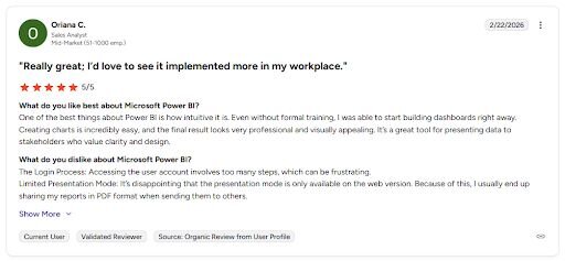
Pro: “One of the best things about Power BI is how intuitive it is. Even without formal training, I was able to start building dashboards right away.” - Oriana C., G2
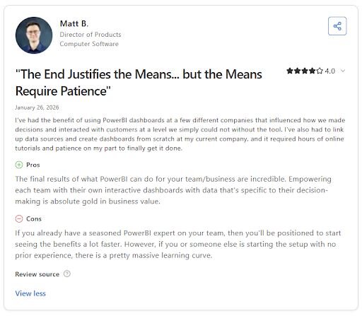
Con: “If you already have a seasoned PowerBI [sic] expert on your team, then you’ll be positioned to start seeing the benefits a lot faster. However, if you or someone else is starting the setup with no prior experience, there is a pretty massive learning curve.” - Matt B., Capterra
Pricing
Microsoft Power BI starts at $14 per user per month.
Bottom line
Power BI works well when reporting needs to stay close to the rest of your Microsoft stack. If you want faster dashboard setup with more focus on presentation, Tableau might be a better fit.
4. Looker Studio: Best for Google data dashboards

What it does: Looker Studio is a dashboard and reporting tool that lets you connect data sources, build reports, and share visuals across Google products.
Best for: Teams that want custom dashboards built around Google data sources and lightweight reporting workflows.
I tested Looker Studio by connecting data sources and building dashboards to see how quickly I could get a report live. It worked well for simple reporting, shared dashboards, and teams that already use Google tools, though it started to show its limits once the reporting setup got more complex.
Key features
Google data connectors: Looker Studio connects with tools like Google Analytics, Google Ads, and Search Console for dashboard reporting.
Drag-and-drop report builder: You can build dashboards with charts, scorecards, tables, filters, and date controls in a visual editor.
Sharing and collaboration: You can share reports with teammates, control access, and keep dashboards updated in one place.
Pros and cons
✅ Pros
❌ Cons
Gets dashboards live quickly for lightweight reporting
Some connectors can be unreliable
Works well for Google-based reporting workflows
Advanced data modeling is limited
Makes dashboard sharing easy
What users say
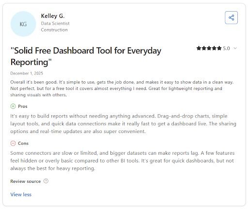
Pro: “It’s easy to build reports without needing anything advanced. Drag-and-drop charts, simple layout tools, and quick data connections make it really fast to get a dashboard live.” - Kelley G., Capterra
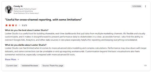
Con: “Looker Studio can feel limited when it comes to more advanced data modeling and complex calculations. Performance may slow down with larger datasets, and some connectors can be unreliable or end up requiring workarounds.” - Candy N., G2
Pricing
Looker Studio is free, then the Pro plan starts at $9 per user per project per month.
Bottom line
Looker Studio makes sharing simple when your reporting already depends on Google tools. If you want deeper modeling and more advanced dashboard control, Microsoft Power BI might be a better fit.
5. Qlik Sense: Best for enterprise self-service analytics
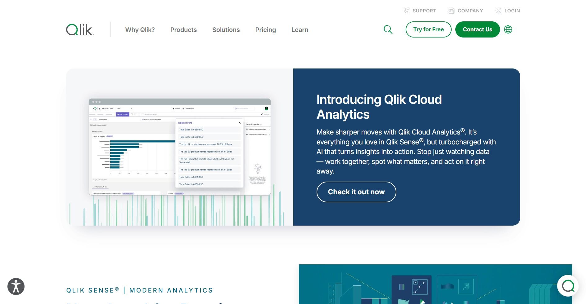
What it does: Qlik Sense is a business intelligence platform that lets you connect data sources, build dashboards, and explore data through interactive analytics.
Best for: Enterprise teams that want self-service analytics with governed data access and flexible dashboard exploration.
I built dashboards in Qlik Sense to see how it handled reporting in practice. It handled larger datasets well and gave me a lot of control over how I filtered and explored the data, but the workflow felt less intuitive than simpler business intelligence (BI) tools.
Key features
Associative data model: Qlik Sense lets you explore relationships across data without locking users into one fixed query path.
Interactive dashboards: You can add filters, drill-down views, and clickable charts so people can explore reports in more detail.
AI-assisted insights: Qlik Sense includes guided analysis and suggestion features inside the reporting workflow.
Pros and cons
✅ Pros
❌ Cons
Handles large datasets well
Not as intuitive as simpler BI tools
Gives users flexible ways to explore data
Loading issues can happen during updates
Supports dashboard exports for offline work
What users say
Pro: “Qlik Sense … stand[s] out … while handling large datasets, such as its associative model.” - Anubhav K., G2
- Anubhav K., G2
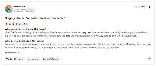
Con: Loading issues can come up during updates when the dashboard is pulling a lot of data at once. - Terrance M., G2
Pricing
Qlik Sense starts at $300 per month for 10 users.
Bottom line
Qlik Sense gives teams more freedom to explore connected data without locking every view into a fixed dashboard path. If you want an easier setup for Google-based reporting, Looker Studio might be a better fit.
6. Zoho Analytics: Best for affordable BI for small teams
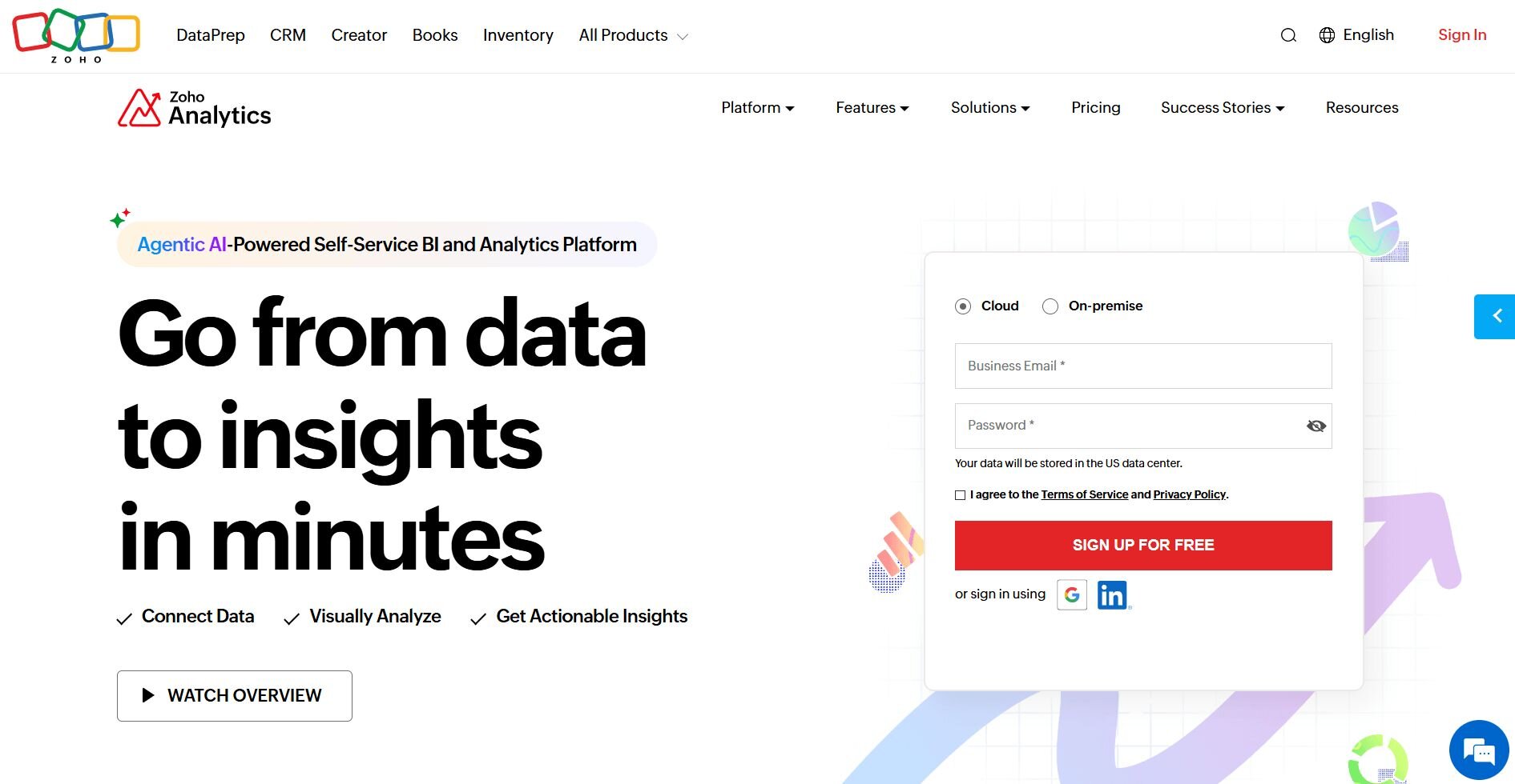
What it does: Zoho Analytics is a business intelligence platform that lets you connect data sources, build dashboards, and analyze business metrics through reports and visualizations.
Best for: Teams that already use Zoho apps and want reporting that pulls data directly from the Zoho ecosystem.
I connected Zoho Analytics to multiple Zoho apps and some external sources to see how well it pulled data into one place. Reports came together without much setup, but I hit limits on analytical depth once the work moved beyond basic dashboards.
Key features
Zoho integrations: Zoho Analytics connects with Zoho CRM, Zoho Books, and other Zoho apps so you can analyze data across the suite.
Drag-and-drop report builder: You can create dashboards with charts, tables, pivot views, and filters through a visual editor.
Data blending: You can combine data from multiple sources into a single dataset before building reports.
Pros and cons
✅ Pros
❌ Cons
Works well when reporting across Zoho apps
Reporting may not meet expectations compared with deeper analytics tools
Easy to connect data from other Zoho tools
Some teams may prefer other analytics platforms for deeper data analysis
Lets teams build dashboards without heavy setup
What users say
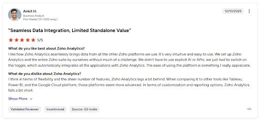
Pro: “I like how Zoho Analytics seamlessly brings data from all the other Zoho platforms we use. It's very intuitive and easy to use. … We just had to switch on the toggle, which automatically integrates all the applications with Zoho Analytics.” - Ankit H., G2
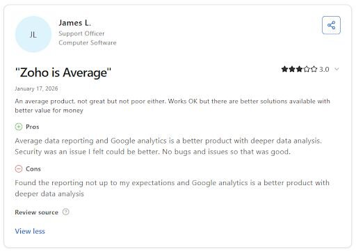
Con: “Found the reporting not up to my expectations and Google Analytics is a better product with deeper data analysis.” - James L., Capterra
Pricing
Zoho Analytics starts at $48 per month for a Cloud subscription.
Bottom line
Zoho Analytics works well when reporting needs to stay inside the Zoho ecosystem. If you want conversational analysis across connected datasets, Julius might be a better fit.
7. Whatagraph: Best for marketing performance reporting
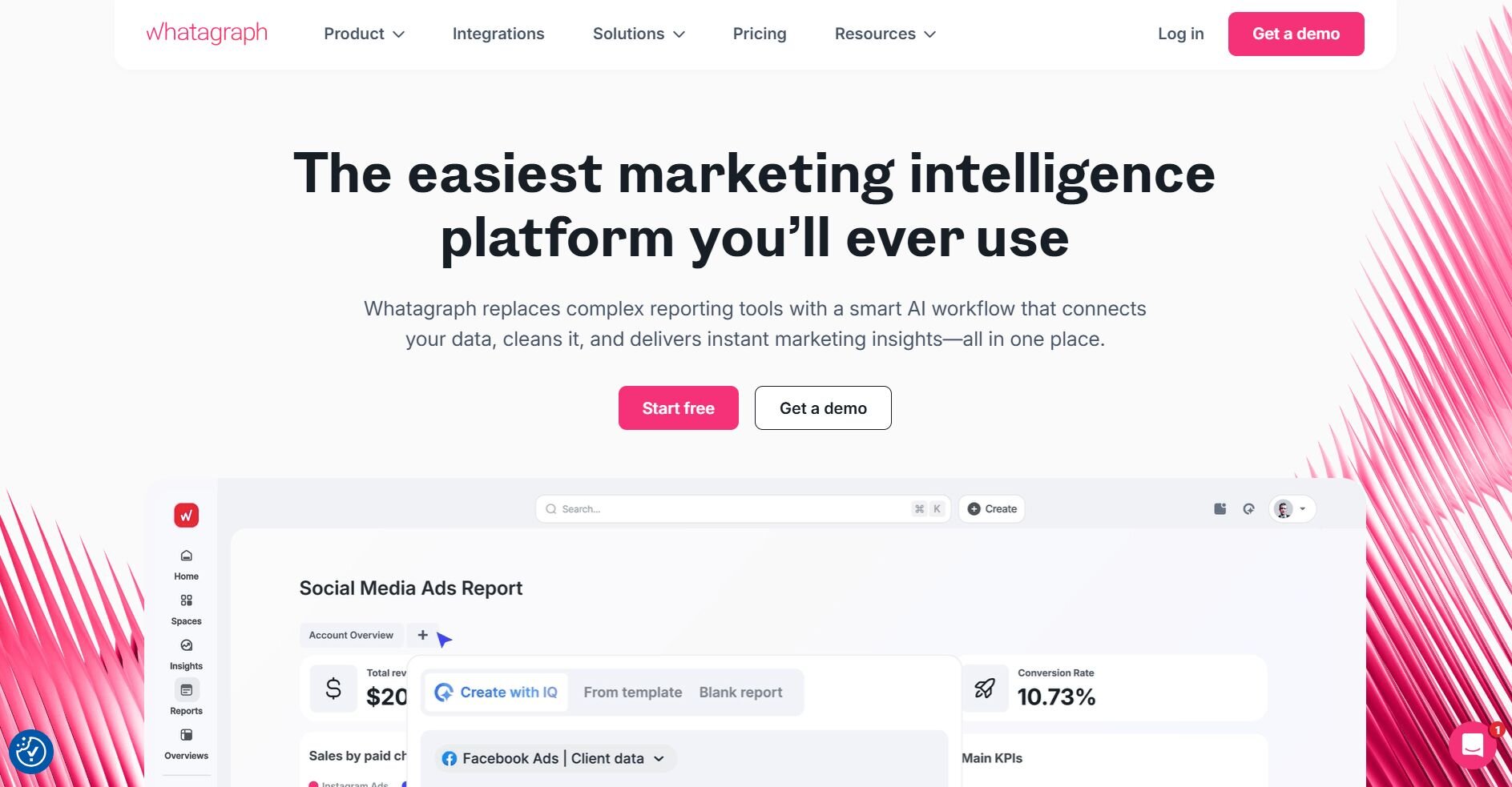
What it does: Whatagraph is a marketing reporting platform that pulls data from multiple ad and analytics sources, consolidates it into visual reports, and lets you schedule automated delivery to clients or stakeholders.
Best for: Marketing agencies and performance teams that need to build and deliver client-ready reports across multiple channels without manual data pulls.
I tested Whatagraph by connecting it to Google Ads, Meta, and LinkedIn. The report templates were already set up for client sharing, so I didn't have to adjust anything before sending. Reports refresh every 30 minutes, but Whatagraph only pulls from its supported platforms. If you need data from a platform outside that list, you’ll need a manual workaround.
Key features
Multi-source data connectors: You can pull data from platforms like Google Ads, Meta, LinkedIn, and TikTok into a single report without switching between tools.
Automated report delivery: You can schedule reports to send to clients or internal stakeholders by email on a recurring basis.
Report templates: Whatagraph includes pre-built templates for common marketing use cases that you can customize with your own branding and layout preferences.
Pros and cons
✅ Pros
❌ Cons
Pulls from multiple ad platforms without manual data entry
Widgets can glitch when two people edit a report at the same time
Pre-built templates speed up client report setup
No support for X Ads (Twitter), which limits full-funnel campaign reporting
Automated delivery removes recurring manual work
What users say
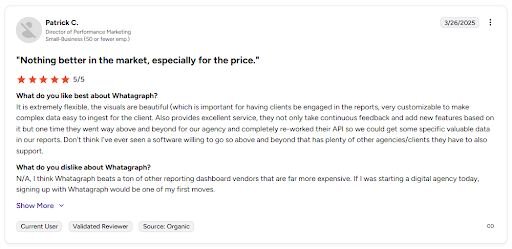
Pro: “It is extremely flexible, the visuals are beautiful … very customizable to make complex data easy to ingest for the client. Also provides excellent service, they not only take continuous feedback and add new features based on it but one time they went way above and beyond for our agency and completely re-worked their API so we could get some specific valuable data in our reports.” - Patrick C., G2
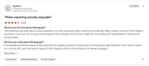
Con: “If two people are editing a report at the same time, the widgets can glitch or break which is frustrating on tight deadlines. There's also no option for a custom URL, and it still doesn't support X Ads (Twitter), which is a bit limiting for full-funnel campaigns.” - Bruhith I., G2
Pricing
Whatagraph starts at $229 per month.
Bottom line
Whatagraph refreshes report data every 30 minutes, so client dashboards stay current between scheduled report sends. If you need deeper dashboard customization and broader data source coverage, Domo might be a better fit.
8. Domo: Best for real-time business dashboards
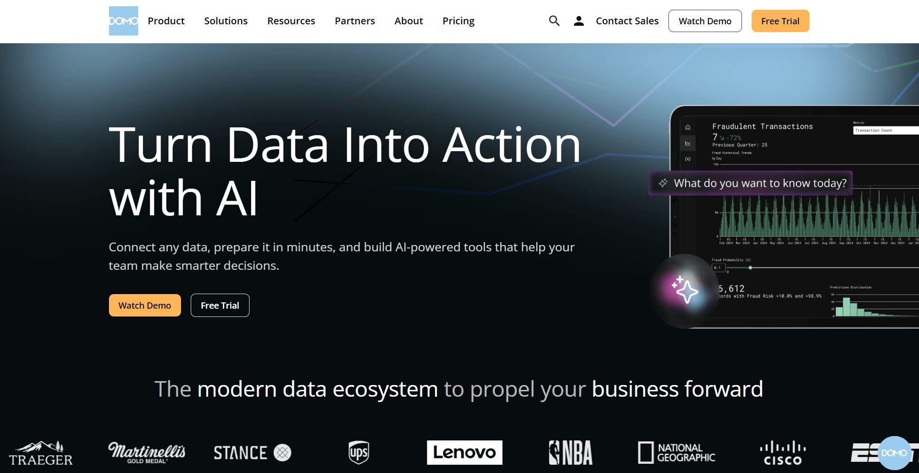
What it does: Domo is a cloud-based business intelligence platform that connects data from multiple sources, displays it in real-time dashboards, and lets teams build custom visualizations and apps.
Best for: Business teams that need live dashboards pulling from multiple data sources in one place.
I noticed during testing that Domo gives you more room to customize beyond standard chart types. You can pull data from different sources into one view and build custom visualizations when the defaults don't cover what you need. Cleaning and sorting data before analysis can take more effort than expected, so you may spend extra time preparing data before building reports.
Key features
Real-time data updates: Dashboards display live data from connected sources so your numbers stay current without manual refreshes.
Custom visualization builder: You can build charts and visuals beyond the default options using pro code tools inside the platform.
App Studio: You can create custom apps and home pages inside Domo to tailor the experience for different teams or use cases.
Pros and cons
✅ Pros
❌ Cons
Pulls from multiple data sources into one dashboard
Cleaning and sorting data inside the platform is cumbersome
Lets you build fully custom visualizations when defaults fall short
App Studio governance options are limited for managing page-level user access
Flexible enough for both standard reporting and custom app builds
What users say
Pro: “I use Domo for my job as a BI analyst, and it helps us pull data from all our different sources and display it in a clean way all in one place. … If Domo doesn't natively have a visualization I'm looking for, I can build a custom one. I enjoy that Domo gives us the ability to create our own apps inside of it.” - Andrew P., G2
Con: “I dislike how difficult it is to clean and sort data.” - Jalen S., G2
Pricing
Domo uses usage-based pricing. If you’d like to learn more, we also have a Domo pricing guide.
Bottom line
Domo gives teams the tools to build fully custom dashboards and internal apps when standard BI layouts don't cover the use case. If you need marketing-specific reporting with automated client delivery, Whatagraph might be a better fit.
9. HubSpot: Best for CRM reporting for sales teams
What it does: HubSpot is a customer platform that combines CRM, marketing automation, and reporting tools so sales and marketing teams can track contacts, campaigns, and revenue in one place.
Best for: Sales and marketing teams that want reporting tied directly to their CRM data without managing separate tools.
I tested HubSpot by pulling contact and deal data into its reporting dashboards, and the direct connection between marketing activity and pipeline results stood out right away. Basic dashboards came together quickly, though navigating the settings got harder as workflows grew more complex.
Key features
Native CRM integration: You can build reports directly from your contact, deal, and company data without exporting or connecting to a separate tool.
Customizable dashboards: You can create dashboards for different teams or goals by selecting from a range of pre-built and custom report types.
Revenue reporting: HubSpot tracks deal progress and closed revenue so sales teams can measure pipeline performance alongside marketing activity.
Pros and cons
✅ Pros
❌ Cons
Reporting connects directly to CRM contacts and deals
Platform complexity grows quickly as marketing workflows expand
Easy for new team members to learn and use
Some reporting features are locked behind higher-tier plans
Combines email, contacts, and marketing data in one place
What users say
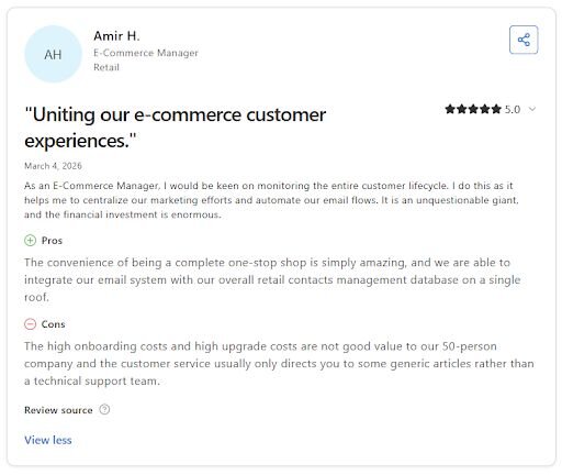
Pro: “The convenience of being a complete one-stop shop is simply amazing, and we are able to integrate our email system with our overall retail contacts management database on a single roof.” - Amir H., Capterra
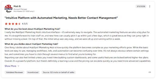
Con: “While the basic tools are easy to use, managing workflows, lists, and automation can become confusing over time. It's not always obvious where certain settings live, and sometimes you have to click through several menus to find what you're looking for. … Some useful features are locked behind higher-tier plans. … The pricing can escalate quickly as you need more advanced capabilities.” - Matt B., G2
Pricing
HubSpot starts at $9 per seat per month.
Bottom line
HubSpot keeps sales and marketing reporting in the same system as your CRM, so pipeline data and campaign data don't live in separate tools. If you need reporting across broader data sources beyond CRM activity, Domo might be a better fit.
10. ThoughtSpot: Best for search-driven data analysis
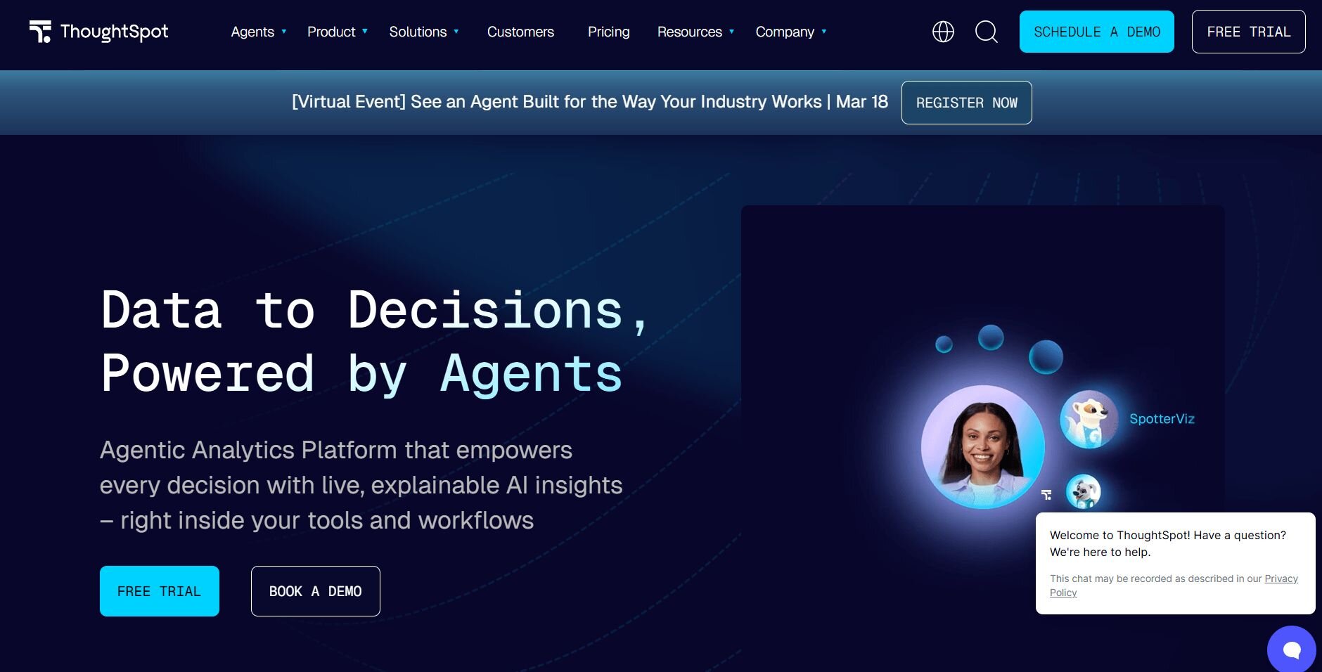
What it does: ThoughtSpot is a business intelligence platform that lets you search your connected data by typing a question and getting a chart or table back.
Best for: Business teams that want self-service analytics without building dashboards from scratch
I connected a sales dataset to ThoughtSpot and ran a series of natural language searches to test how accurately it interpreted different question types. Charts came back quickly for straightforward queries, though more complex questions needed rephrasing before the results matched the data I wanted to see.
Key features
Search-based queries: Type a question and get a chart or table without writing SQL
SpotIQ AI analysis: Run automated analysis on your data to surface patterns you didn't think to search for
Liveboards: Build and share real-time dashboards that update as your connected data changes
Pros and cons
✅ Pros
❌ Cons
Fast time-to-insight for non-technical users
Per-user pricing gets expensive at scale
Strong AI-assisted analysis features
Complex questions often need rephrasing
Real-time data connections
What users say
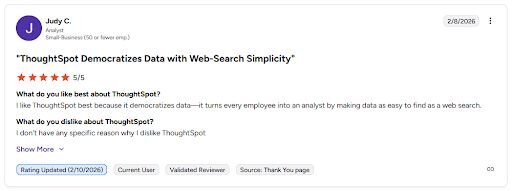
Pro: “I like ThoughtSpot best because it democratizes data—it turns every employee into an analyst by making data as easy to find as a web search.” -Judy C., G2
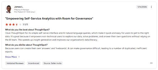
Con: “Because users can create their own ‘answers’ and ‘liveboards’, it can make governance difficult, leading to a number of duplicated, inefficient reports.” -James L., G2
Pricing
ThoughtSpot starts at $25 per user per month.
Bottom line
ThoughtSpot's search-first approach gives non-technical users a direct path to answers without waiting for a dashboard to be built. If your team needs deeper analysis on connected databases rather than search-driven exploration, Julius may be a better fit.
11. Sisense: Best for embedded analytics for products
What it does: Sisense is an analytics platform that lets you model, visualize, and embed data experiences into your product or internal tools.
Best for: Product and engineering teams that need to build analytics directly into their applications
I tested Sisense by working through its embedding workflow hands-on. The JavaScript SDK made it easy to embed a branded dashboard inside a product interface, so users only see the charts rather than the Sisense workspace. Non-technical users will likely still need support during the data modeling stage, so that learning curve is worth factoring into your timeline. Our guide to data modeling software compares tools that handle that stage.
Key features
Embedded dashboards: Add white-label analytics into your product using the JavaScript SDK without exposing Sisense branding
Multi-source data integration: Pull from databases, cloud apps, and spreadsheets into a single unified view
AI-assisted modeling: Use built-in AI tools to speed up dashboard creation and data preparation
Pros and cons
✅ Pros
❌ Cons
Purpose-built for embedded analytics use cases
Setup and data modeling take time to get right
Pulls from multiple data sources into one view
Advanced features have a steep learning curve for non-technical users
White-label options keep your product branding intact
What users say
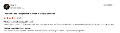
Pro: “Robust Data Integration: Sisense can pull data from diverse sources (databases, cloud apps, spreadsheets) and unify them into a single platform.” - Hem J., G2
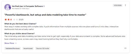
Con: “The initial setup and data modeling can take some time to get right, especially if your data environment is complex. Some advanced features also have a learning curve, so new users may need training before they feel fully comfortable.” - Verified User, G2
Pricing
Sisense starts at $399 per month, billed monthly.
Bottom line
Sisense is built for teams that need to deliver analytics inside their own product rather than through a standalone BI platform. If you need internal reporting and search-based analysis instead of embedded dashboards, ThoughtSpot might be a better fit.
Which analytics and reporting tool should you choose?
The best analytics and reporting tool depends on what you need to do with your data and how much technical setup your team can handle.
Choose Julius if you:
Need to analyze database data and build reports without writing SQL
Want natural language queries with scheduled report delivery
Work with connected data sources like Postgres, Snowflake, or BigQuery
Choose Tableau if you:
Need polished, presentation-ready dashboards for executive reporting
Want a wide chart library with deep visual customization
Have time to invest in learning a more complex platform
Choose Microsoft Power BI if you:
Already use Microsoft 365 and want reporting inside the same ecosystem
Need strong data modeling alongside dashboard building
Have a team member with prior Power BI or DAX experience
Choose Looker Studio if you:
Want free dashboards built around Google Analytics or Google Ads data
Need lightweight reporting with easy sharing across a team
Don't need advanced data modeling or complex multi-source analysis
Choose Qlik Sense if you:
Need enterprise self-service analytics with governed data access
Want flexible data exploration without locking views into fixed paths
Work with larger datasets that require more than basic BI tools
Choose Zoho Analytics if you:
Already use Zoho CRM, Zoho Books, or other Zoho apps
Want affordable BI without enterprise-level complexity
Need a straightforward dashboard building without a heavy setup
Choose Whatagraph if you:
Run a marketing agency that delivers recurring client reports
Need automated report delivery across multiple ad platforms
Want pre-built templates that are ready to share without extra formatting
Choose Domo if you:
Need live dashboards pulling from multiple data sources in one place
Want to build fully custom visualizations beyond standard chart types
Need flexibility for both standard reporting and custom internal apps
Choose HubSpot if you:
Want reporting tied directly to your CRM contacts and deal data
Need sales and marketing data in one place without managing separate tools
Have a team that needs a short learning curve to get dashboards live
Choose ThoughtSpot if you:
Want non-technical teammates to pull answers from data without SQL
Need search-based analytics without building dashboards manually
Work with live data connections that need to stay current
Choose Sisense if you:
Need to embed analytics directly into your product or application
Want white-label dashboards that match your product's branding
Have a technical team that can handle the setup and data modeling process
Final verdict
Tableau and Power BI are good choices if your team needs polished dashboards with deep visual control, and Sisense is the more practical option for embedding analytics into a product. But if your primary need is asking questions across connected databases without writing SQL or rebuilding reports from scratch each week, Julius is worth trying first.
Here’s why:
Direct connections: Link databases like PostgreSQL, Snowflake, and BigQuery, or integrate with Google Ads and other business tools. You can also upload CSV or Excel files. Your analysis can reflect live data, so you’re less likely to rely on outdated spreadsheets.
Repeatable Notebooks: Save an analysis as a notebook and run it again with fresh data whenever you need. You can also schedule notebooks to send updated results to email or Slack.
Smarter over time: Julius includes a Learning Sub Agent, an AI that adapts to your database structure over time. It learns table relationships and column meanings as you work with your data, which can help improve result accuracy.
Quick single-metric checks: Ask for an average, spread, or distribution, and Julius shows you the numbers with an easy-to-read chart.
Built-in visualization: Get histograms, box plots, and bar charts on the spot instead of jumping into another tool to build them.
One-click sharing: Turn an analysis into a PDF report you can share without extra formatting.
Julius isn't the right fit if you need embedded analytics or fine-grained dashboard control. But for business teams that want to analyze connected data and get answers without depending on engineering support, it's worth exploring.
Frequently asked questions
What is the best analytics and reporting tool for business teams?
The best analytics and reporting tools for business teams are Tableau, Microsoft Power BI, and Julius. Tableau and Power BI work well when you need polished dashboards and strong visual control. Julius fits better when you want to ask questions across connected databases without writing SQL or involving a data team.
What is the difference between reporting and analytics?
Reporting shows you what happened by presenting data in charts and tables, while analytics helps you understand why and what to do next. Analytics also goes further by identifying patterns and trends so you can act on them.
What are the key features to look for in an analytics and reporting tool?
The key features to look for in an analytics and reporting tool are data source connectivity, dashboard customization, and built-in scheduling or report sharing. Beyond the feature list, also consider how much technical knowledge your team needs to get value from the tool in daily use.