

The best cloud-based big data analytics solutions let teams query, visualize, and act on large datasets without managing any infrastructure. After testing dozens of platforms, these are the 16 worth considering in 2026.
16 Best cloud-based big data analytics solutions: Quick comparison
| 💻 Tool | 🎯 Best for | 🔥 Starting price (billed annually) | ⚡ Strengths |
|---|---|---|---|
| Domo | Business intelligence for non-technical teams | Usage-based pricing | Data integration, live dashboards, and team collaboration |
| Tableau | Visual analytics for business reporting | $75/user/month | Drag-and-drop charts, cloud connectivity, and interactive dashboards |
| Power BI | Analytics within the Microsoft ecosystem | $14/user/month | Microsoft integration, custom dashboards, and large data modeling |
| Julius | AI-powered analysis without a data team | $16/month | Natural language queries, built-in data search, and visual reporting |
| ThoughtSpot | Self-service analytics via natural language | $25/user/month | Search-based queries, AI-driven insights, and cloud warehouse connectivity |
| Snowflake | Cloud data storage and large-scale querying | Usage-based pricing | Multi-cloud support, data sharing, and scalable compute |
| Google BigQuery | Serverless SQL analytics on large datasets | Usage-based pricing | Petabyte-scale queries, built-in ML, and Google Cloud integration |
| Amazon Redshift | Big data warehousing on AWS | Hybrid (capacity + usage) | Columnar storage, massively parallel processing, and AWS integration |
| Azure Synapse Analytics | Unified analytics for Microsoft cloud users | Consumption-based pricing | SQL and Spark engines, Azure integration, and data pipeline support |
| Databricks | Large-scale data engineering and ML | DBU-based pricing | Apache Spark, Delta Lake, and multi-cloud deployment |
| Qlik Sense | Associative data exploration at scale | $300/month, includes 10 users | Associative analytics, AI-driven insights, and cloud-native deployment |
| Sisense | Embedded analytics for complex datasets | $399/month, billed monthly | Embedded BI, cloud warehouse support, and custom analytic apps |
| SAS Viya | Advanced statistical modeling in the cloud | Custom pricing | Statistical modeling, forecasting, and Kubernetes deployment |
| Spotfire | Visual analytics with real-time data streams | Custom pricing | Streaming analytics, geoanalytics, and time-series visualization |
| Yellowfin | Embedded reporting for enterprise teams | Custom pricing | Embedded dashboards, multi-tenant support, and automated reporting |
| Looker | Governed data exploration for teams on Google Cloud | Custom pricing | LookML modeling, BigQuery integration, and embedded analytics |
How I researched and tested these cloud-based big data analytics solutions
I tested the tools I could access directly by uploading sample datasets, running queries, and building reports. For tools without direct access, I went through documentation, walkthroughs, and verified user reviews to understand how they perform in practice.
Here's what I considered:
Analysis accessibility: Whether a non-technical business user can run meaningful queries and get useful outputs without writing code or SQL.
Ease of use: How quickly you can move from connecting data to seeing results, and how much setup that actually requires.
Data connectivity: How well each tool connects to cloud warehouses, databases, and common business data sources.
Pricing vs. value: What you get at each tier, and whether the features justify the cost for a typical business team.
Output quality: How clear, actionable, and shareable the charts, reports, and dashboards each tool produces are.
Some of these tools are built for data engineers and technical teams, and some are built for business users who want answers without writing code. I've tried to be clear about who each tool is really for, so you can make the right call for your team. Our broader guide to picking a cloud analytics platform covers the same ground for general business reporting.
1. Domo: Best for business intelligence for non-technical teams
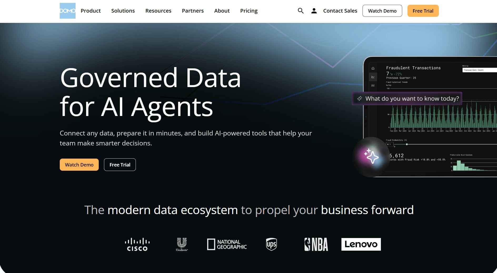
What it does: Domo is a cloud analytics platform that connects data from multiple business tools, transforms it, and displays it in shared dashboards your team can access in real time.
Best for: Business teams that need to combine data from multiple sources and share live dashboards across departments without relying on a data engineer.
I tested Domo by connecting multiple data sources and building a shared dashboard to see how far a non-technical user could get independently. The connector library covers tools like Salesforce and Google Ads, but the setup wizard doesn't walk you through mapping which fields and tables feed into your dashboards. You'll need to define those relationships manually before any data populates.
Key features
Data connectors: Connect to hundreds of business tools, databases, and cloud platforms and pull all data into a single analytics environment.
Live dashboards: Build shared dashboards that update automatically as new data comes in from connected sources.
Magic Transform: Clean, blend, and prep data from multiple sources using no-code or SQL-based transformation tools before it reaches your dashboards.
Pros and cons
| ✅ Pros | ❌ Cons |
|---|---|
| Connects to 1000+ data sources without custom engineering work | Building and maintaining data pipelines requires meaningful setup time upfront |
| Dashboards update in real time as connected sources refresh | The breadth of features can make the platform harder to navigate for new users |
| Sharing and collaboration tools give large teams shared visibility across departments |
What users say
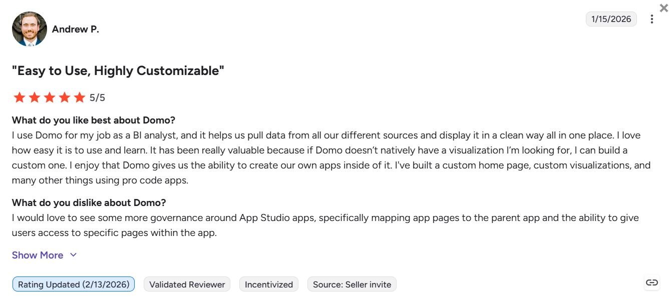
Pro: “I use Domo for my job as a BI analyst, and it helps us pull data from all our different sources and display it in a clean way, all in one place. If Domo doesn't natively have a visualization I'm looking for, I can build a custom one. I enjoy that Domo gives us the ability to create our own apps inside of it.” - Andrew P., G2
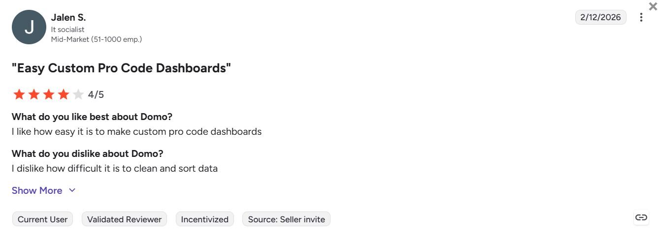
Con: “I dislike how difficult it is to clean and sort data.” - Jalen S., G2
Pricing
Domo offers usage-based pricing.
Bottom line
Domo combines data ingestion, transformation, and dashboarding in a single platform, which can reduce the number of tools a business team needs to manage separately. If you need self-service analytics on top of an existing cloud data warehouse without managing data pipelines, ThoughtSpot might be a better fit.
2. Tableau: Best for visual analytics for business reporting

What it does: Tableau is a cloud-based visual analytics platform that lets you connect to data sources, build interactive dashboards, and share reports across your organization without writing code.
Best for: Business teams that need highly customizable, interactive dashboards on top of cloud data sources and want a widely adopted BI tool with extensive community support.
I built dashboards on top of several cloud data sources in Tableau to test how far a non-technical user could get independently. Basic charts came together quickly, but building a running total across multiple sources required navigating Tableau's calculated fields syntax to get the numbers adding up correctly. Business users may need training before that part of the platform becomes usable independently.
Key features
Drag-and-drop dashboard builder: Build charts and dashboards by dragging fields onto a canvas, with over 20 visualization types available without writing any code.
Live cloud data connections: Connect directly to cloud data warehouses like Snowflake, BigQuery, and Redshift and query data without extracting it first.
Tableau Pulse: Surface automated insights in plain language, with proactive suggestions that flag trends and anomalies in your connected data.
Pros and cons
| ✅ Pros | ❌ Cons |
|---|---|
| Over 20 visualization types give business teams broad options for presenting data | Advanced analysis beyond basic dashboards requires knowledge of calculated fields and data modeling |
| Live connections to major cloud data warehouses let you query data without manual exports | Manual data refresh process can slow down reporting workflows for teams needing up-to-date outputs |
| Large user community means most questions have documented answers and shared solutions |
What users say
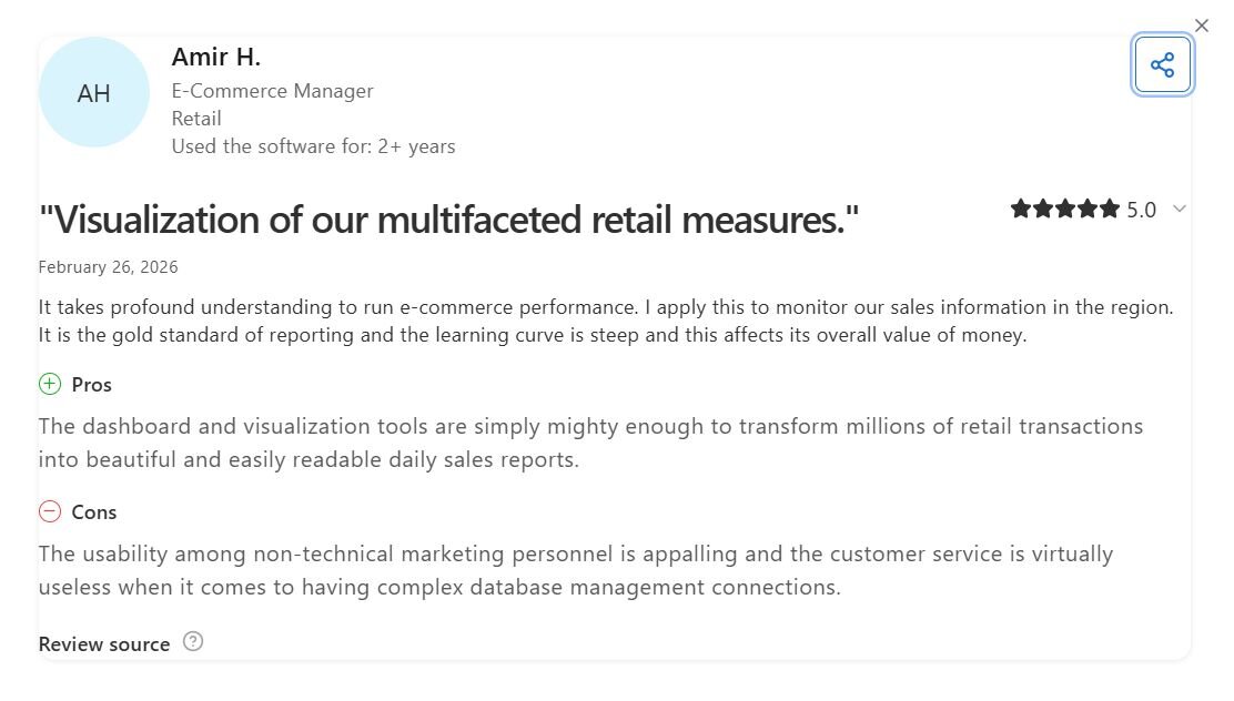
Pro: “The dashboard and visualization tools are simply mighty enough to transform millions of retail transactions into beautiful and easily readable daily sales reports.” - Amir H., Capterra
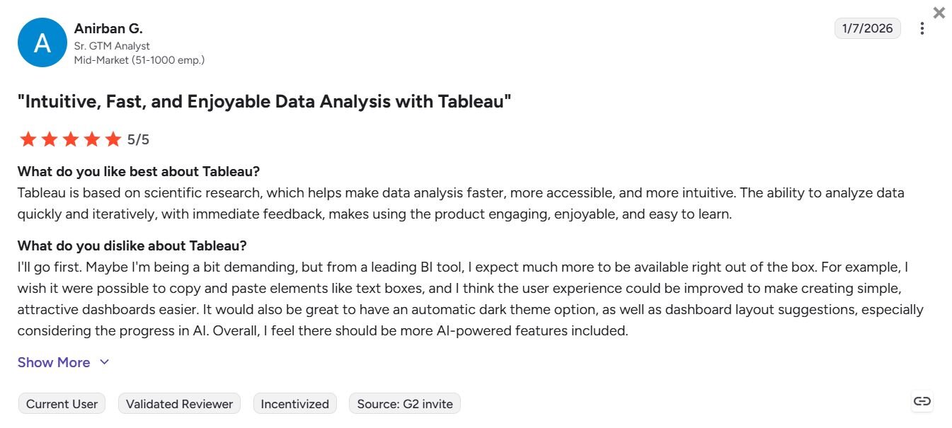
Con: “I wish it were possible to copy and paste elements like text boxes, and I think the user experience could be improved to make creating simple, attractive dashboards easier. … Overall, I feel there should be more AI-powered features included.” - Anirban G., G2
Pricing
Tableau's Creator license starts at $75 per user per month and covers publishing, dashboard building, and content management. A Viewer license at$15 per user per month is available if you need to give others their own separate login to view your work.
Bottom line
Tableau's visualization depth makes it a strong option for teams that prioritize how data looks and how stakeholders interact with it. If your team needs to get from a question to a chart without navigating a function library, Julius might be a better fit.
3. Power BI: Best for analytics within the Microsoft ecosystem
What it does: Power BI is a cloud-based business intelligence platform that lets you connect to data sources, build interactive dashboards, and share reports across your organization.
Best for: Business teams already working within the Microsoft ecosystem that need analytics connecting natively to Excel, Azure, and other Microsoft data sources.
I set up Power BI by building shared dashboards to see how the platform performs for business reporting. Connecting to Excel, Azure, and SharePoint was straightforward. More complex analysis like pulling a year-over-year growth figure across 2 data sources required working with Microsoft’s formula language (DAX), which many business users will need dedicated training to use independently.
Key features
Native Microsoft integrations: Connect directly to Excel, Azure Data Lake, SharePoint, and Teams without additional configuration or middleware.
Power Query editor: Clean, reshape, and combine data from multiple sources before it reaches your reports using a no-code transformation interface.
Natural language Q&A: Type questions about your data in plain English and get a chart or summary pulled directly from your connected datasets.
Pros and cons
| ✅ Pros | ❌ Cons |
|---|---|
| Native connections to Excel, Azure, and SharePoint remove manual data piping for Microsoft-heavy teams | Complex calculations require DAX knowledge, which may take time to learn for non-technical users |
| Many data source connectors cover most common business tools alongside Microsoft products | Dataset size is capped at 1GB on the Pro plan, which can be limiting for teams working with larger data extracts |
| Drag-and-drop report builder lets business users build basic dashboards without writing code |
What users say
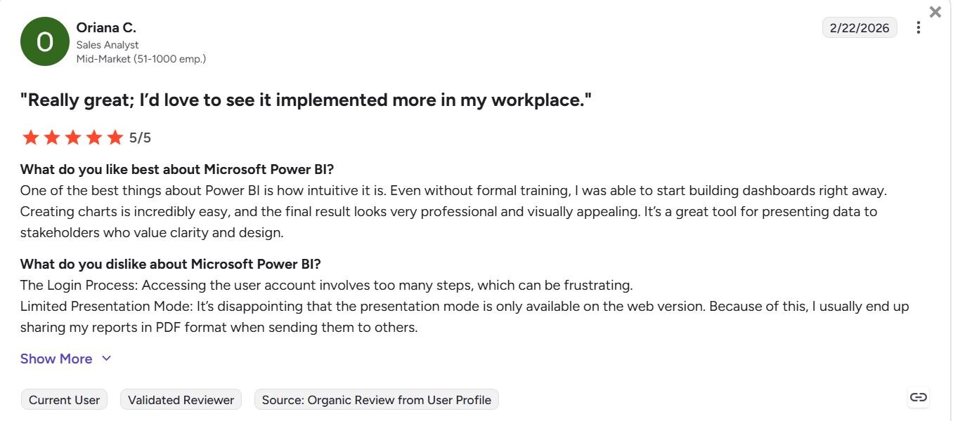
Pro: “One of the best things about Power BI is how intuitive it is. Even without formal training, I was able to start building dashboards right away.” - Oriana C., G2
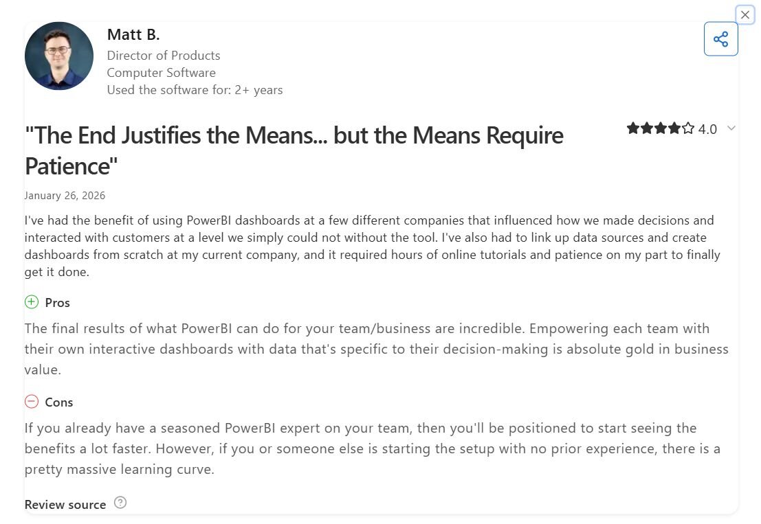
Con: “If you already have a seasoned [Power BI] expert on your team, then you’ll be positioned to start seeing the benefits a lot faster. However, if you or someone else is starting the setup with no prior experience, there is a pretty massive learning curve.” - Matt B., Capterra
Pricing
Power BI starts at $14 per user per month.
Bottom line
Power BI's native Microsoft integrations mean business teams already running Excel, Azure, or SharePoint can connect their data without additional setup. If your data lives outside the Microsoft ecosystem and you need a platform that works across multiple cloud providers, Domo might be a better fit.
4. Julius: Best for AI-powered analysis without a data team
What it does: Julius is a cloud-based AI data analysis platform that lets you query, visualize, and report on data through plain English prompts without writing code.
Best for: Business teams that need to analyze connected or public data without a data analyst, SQL knowledge, or a file upload to get started.
We built Julius so business users can start from a question, not a file. You can upload your own data, connect databases like Postgres or Snowflake, or let Julius find and compile public data from a prompt, including financial data across 17,000+ companies. Teams with complex data pipeline needs may require a dedicated data warehouse alongside it.
Key features
Built-in data search: Search for and compile relevant public datasets from a plain English prompt, so you can start analyzing without uploading a file first.
Database connectors: Connect directly to Postgres, Snowflake, BigQuery, Google Ads, Stripe, and other common business data sources for live analysis.
Financial Datasets integration: Pull institutional-grade financial data across 17,000+ companies, including financial statements, price history, and key metrics, directly inside Julius.
Pros and cons
| ✅ Pros | ❌ Cons |
|---|---|
| Notebook workflows run on a schedule and deliver outputs directly to email or Slack without manual effort | Not built for petabyte-scale data processing or complex data pipeline management |
| Non-technical users can get charts and summaries from plain English prompts without any SQL knowledge | Outputs can vary between queries since the underlying AI models are non-deterministic |
| Gets better at understanding your connected database structure with each query, making answers more precise over time |
What users say

Pro: “After asking for a revenue trend chart, it prompted me with options like 'Compare by product category?' or 'Break down by region?' These suggestions saved me time and surfaced insights I might not have thought to ask for myself. It felt more like a collaborative process than a one-way query system.” - Fritz,fritz.ai (independent Julius review)
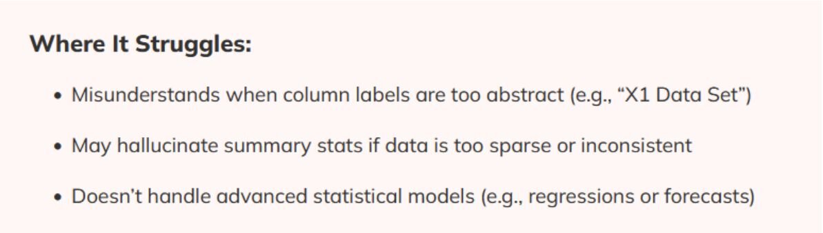
Con: “Misunderstands when column labels are too abstract … May hallucinate summary stats if data is too sparse or inconsistent … Doesn’t handle advanced statistical models.” - Fritz,fritz.ai (independent Julius review)
Pricing
| 💻 Pricing plans | 💰 Price billed annually | 💰 Price billed monthly |
|---|---|---|
| Free | $0 | $0 |
| Pro | $16/month | $20/month |
| Business | $33/month | $40/month |
| Growth | $375/month | $450/month |
Bottom line
Julius works best for business teams that need to explore and visualize data quickly without technical setup or file preparation. If your team needs a platform with deeper dashboard customization and a wider visualization library, Tableau might be a better fit.
5. ThoughtSpot: Best for self-service analytics via natural language
What it does: ThoughtSpot is a cloud analytics platform that connects directly to your data warehouse and lets you query data using natural language search without writing SQL.
Best for: Business teams with an existing cloud data warehouse that need self-service analytics without relying on a BI developer to build every report.
I connected ThoughtSpot to a cloud data warehouse and ran natural language queries to test how well business users can get answers without SQL. Asking simple questions returned clean results. More complex questions like customer churn rate across 2 tables returned incomplete data until an admin defined the relationship between those tables in the data model beforehand.
Key features
Natural language search: Type questions about your data in plain English and get charts and summaries pulled directly from your connected cloud data warehouse.
SpotIQ: Automatically analyzes your data in the background and surfaces anomalies, trends, and correlations without requiring manual queries.
Live warehouse connections: Connect directly to Snowflake, BigQuery, Redshift, and other cloud data warehouses and query live data without extracting or moving it first.
Pros and cons
| ✅ Pros | ❌ Cons |
|---|---|
| Natural language search lets business users query warehouse data without writing SQL | Accurate results for complex queries depend on thorough upfront data modeling by an admin |
| SpotIQ automatically surfaces trends and anomalies without requiring users to know what to look for | Dashboard visualizations are more limited in customization compared to dedicated BI tools |
| Connects live to major cloud warehouses like Snowflake and BigQuery without requiring data exports |
What user say
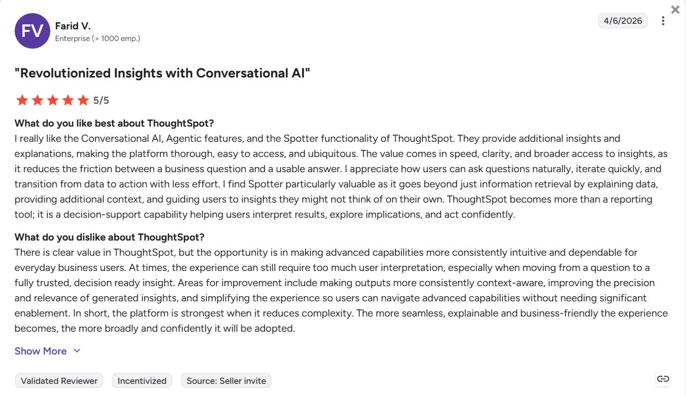
Pro: "I really like the Conversational AI, Agentic features, and the Spotter functionality of ThoughtSpot. They provide additional insights and explanations, making the platform thorough, easy to access, and ubiquitous. The value comes in speed, clarity, and broader access to insights, as it reduces the friction between a business question and a usable answer." - Farid V., G2
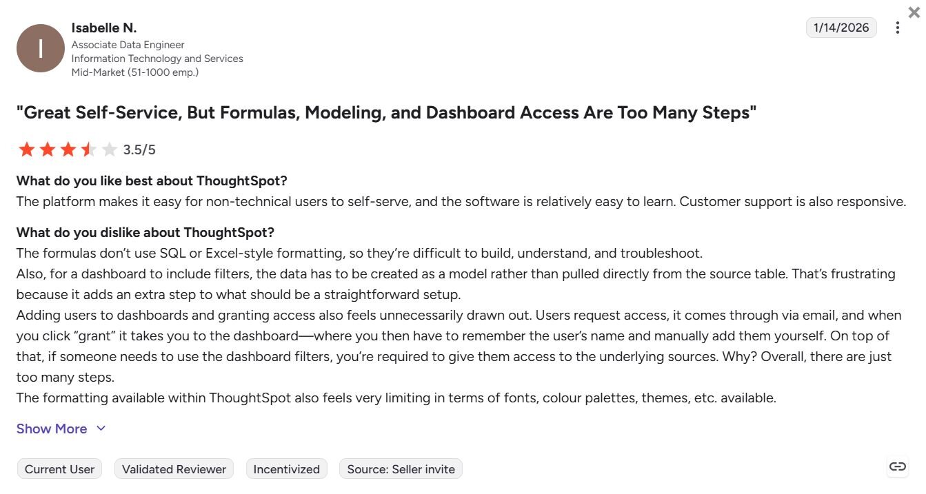
Con: "The formulas don't use SQL or Excel-style formatting, so they're difficult to build, understand, and troubleshoot. Also, for a dashboard to include filters, the data has to be created as a model rather than pulled directly from the source table. That's frustrating because it adds an extra step to what should be a straightforward setup." - Isabelle N., G2
Pricing
ThoughtSpot starts at $25 per user per month.
Bottom line
ThoughtSpot works best when your data warehouse is already set up and modeled correctly, since the natural language search relies on that foundation to return useful results. If your team doesn't have an existing warehouse and needs a platform that can find and compile data on its own, Julius might be a better fit.
6. Looker: Best for governed data exploration for teams on Google Cloud
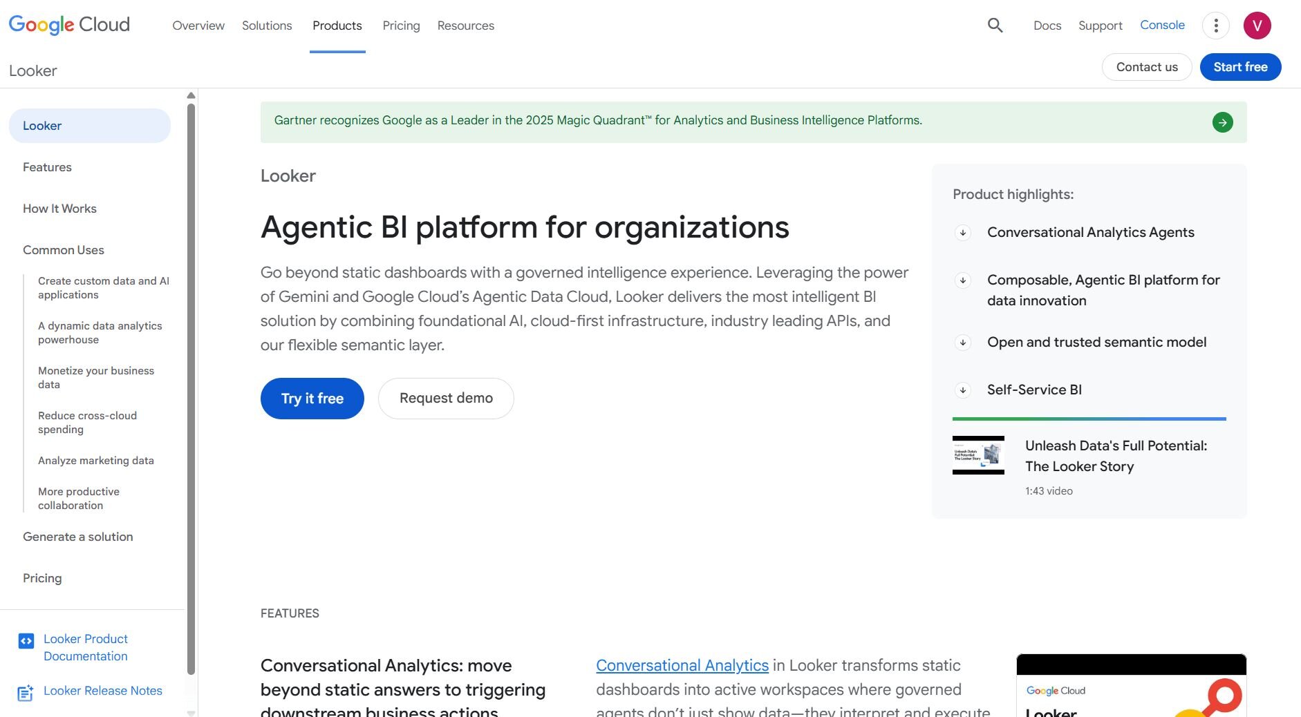
What it does: Looker is a cloud-based business intelligence platform that lets you build and share reports and dashboards from a centrally governed data model.
Best for: Data and analytics teams on Google Cloud that need a consistent, governed data layer that multiple departments can query from.
I set up a Looker exploration to test how it handles governed reporting across multiple teams pulling from the same data source. The LookML modeling layer lets your data team define metrics and relationships once, so everyone querying the data works from the same definitions. Getting there requires technical resources, and teams without a data engineer may struggle to get started.
Key features
LookML modeling layer: Define data relationships, metrics, and business logic in a central model that all reports and dashboards pull from.
BigQuery and Google Cloud integration: Connect directly to BigQuery and other Google Cloud data sources from within the platform.
Embedded analytics: Build and embed Looker dashboards directly into other applications or internal tools.
Pros and Cons
| ✅ Pros | ❌ Cons |
|---|---|
| Centralized data model keeps reporting consistent across teams | Initial LookML setup requires a data engineer |
| Native integration with BigQuery and Google Cloud infrastructure | Less flexible for ad-hoc exploration outside of defined data models |
| Supports embedded dashboards for internal tools and applications |
What users say
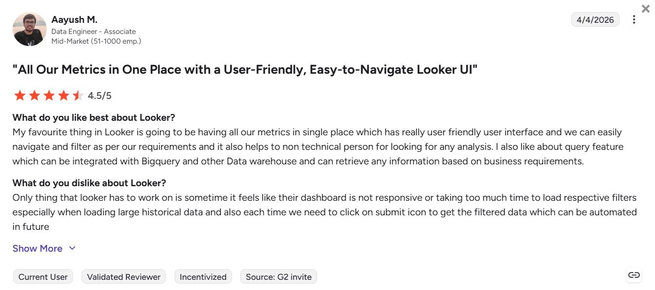
Pro: "My favourite thing in Looker is going to be having all our metrics in [a] single place…we can easily navigate and filter as per our requirements…" - Aayush M., G2
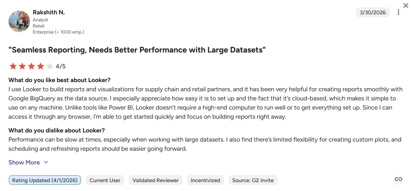
Con: "Performance can be slow at times, especially when working with large datasets. I also find there's limited flexibility for creating custom plots, and scheduling and refreshing reports should be easier going forward." - Rakshith N., G2
Pricing
Looker offers custom pricing.
Bottom line
Looker's governance layer makes it a practical option for organizations where data consistency across teams is a priority. If you want a cloud-native BI platform that works across a broader range of data sources outside of Google Cloud, Domo might be a better fit.
Special mentions
These tools didn't make the full review list, but each one has strengths worth knowing about depending on your team's setup and goals.
Here are 10 more cloud-based big data analytics solutions worth exploring:
Snowflake: Snowflake is a cloud-native data platform that separates storage and compute, so you can scale processing power without paying to store more data. The multi-cloud support across AWS, Azure, and GCP is a plus for teams that aren't locked into one provider. Business users without SQL knowledge may need a data analyst involved to get useful outputs.
Google BigQuery: Google BigQuery is a serverless data warehouse that runs SQL analytics across very large datasets without any server management. Business users without SQL knowledge will likely need a data analyst involved before they can get useful outputs from it.
Amazon Redshift: Amazon Redshift is a cloud data warehouse built to run analytics across very large datasets using a storage format optimized for fast queries. It fits naturally into AWS-heavy workflows, but teams on other cloud providers lose a lot of the native connectivity that makes it worth using.
Azure Synapse Analytics: Azure Synapse combines data warehousing and large-scale data processing in one platform. For teams already on Microsoft infrastructure, data moves between Power BI, Azure Data Lake, and Synapse with minimal configuration. Teams on other cloud providers will need to set those connections up manually.
Databricks: Databricks is a cloud platform built for large-scale data processing, analytics, and machine learning across AWS, Azure, and GCP. The workflows I reviewed required writing custom code and configuring data pipelines before any analysis could run, which puts it out of reach for most business users without an engineer involved.
Qlik Sense: Qlik Sense is a cloud analytics platform that lets you explore connections across your dataset freely without being limited to predefined query paths. The associative engine can catch unexpected correlations between unrelated metrics, but without predefined query paths to follow, figuring out how to structure your exploration takes practice.
Sisense: Sisense is a cloud analytics platform built for teams that want to embed dashboards and analytics into their own products or internal tools. It handles multi-source data well, but the initial setup involves working with Sisense's cloud operations team to configure your environment and manually map how your data sources connect before any dashboards can be built.
SAS Viya: SAS Viya is a cloud analytics platform built for statistical modeling, forecasting, and machine learning at enterprise scale. The range of analytical techniques is broad, but getting useful outputs requires familiarity with statistical concepts that business users may not have.
Spotfire: Spotfire is a cloud analytics platform covering visual analytics, real-time data streams, and time-series analysis. I found that combining live streaming data with historical datasets in a single dashboard works well for monitoring and reacting to operational data in real time. It's a better fit for specific real-time or time-series use cases than for general business reporting.
Yellowfin: Yellowfin is a cloud BI platform built for enterprise reporting and embedding analytics into products used by large teams. The automated report scheduling works well for teams that need regular outputs with minimal manual effort, but the platform is built around serving analytics to external users or customers rather than internal business teams exploring their own data.
Which cloud-based big data analytics solution should you choose?
The right cloud-based big data analytics solution depends on where your data lives, who needs to access it, and how much technical setup your team can handle.
Choose Julius if you:
Want to ask questions about your data in everyday language without writing SQL or code
Need to analyze connected data sources like Postgres, Snowflake, or BigQuery
Want to start from a business question and pull public or financial data without uploading a file first
Choose Domo if you:
Need a platform that combines data integration, storage, and dashboards in one place
Work across a large team that needs shared access to live data
Want to connect data from dozens of business tools and view everything in one dashboard
Choose Tableau if you:
Need highly customizable, interactive visualizations built on top of cloud data
Have a mix of technical and non-technical users who need to explore data visually
Want a widely recognized BI tool with a large community and extensive documentation
Choose Power BI if you:
Already work within the Microsoft ecosystem and want analytics that connect natively
Need a cost-effective BI tool that your team can get running without heavy onboarding
Want dashboards that pull directly from Excel, Azure, or other Microsoft data sources
Choose ThoughtSpot if you:
Want to search your cloud data warehouse using natural language questions
Need self-service analytics that connects directly to Snowflake, BigQuery, or Redshift
Have a cloud data warehouse already in place and want a fast way to query it without SQL
Final verdict
The best cloud-based big data analytics solutions range from large-scale data warehousing platforms that need engineering support to self-service tools built for business teams working independently. Snowflake, Databricks, and BigQuery suit data teams running complex SQL workflows and large-scale pipelines, while Tableau, Power BI, and ThoughtSpot cover visual reporting and self-service querying.
For business users who need to explore, visualize, and report on data without writing code, Julius is worth trying first.
Here’s how Julius helps:
Data search: Type your question, and Julius can search for relevant public data or pull live financial market data for over 17,000 companies through its Financial Datasets integration, so you can start your analysis before you have a dataset ready.
Direct connections: Link databases like PostgreSQL, Snowflake, and BigQuery, or integrate with Google Ads and other business tools. You can also upload CSV or Excel files. Your analysis can reflect live data, so you’re less likely to rely on outdated spreadsheets.
Repeatable Notebooks: Save an analysis as a notebook and run it again with fresh data whenever you need. You can also schedule notebooks to send updated results to email or Slack.
Smarter over time: Julius includes a Learning Sub Agent, an AI that adapts to your database structure over time. It learns table relationships and column meanings as you work with your data, which can help improve result accuracy.
Quick single-metric checks: Ask for an average, spread, or distribution, and Julius shows you the numbers with an easy-to-read chart.
Built-in visualization: Get histograms, box plots, and bar charts on the spot instead of jumping into another tool to build them.
One-click sharing: Turn an analysis into a PDF report you can share without extra formatting.
For business users who want quick answers from connected or public data without writing code, Julius is worth trying. You can bring your own data or start with a question and have Julius find and compile the data you need.
Frequently asked questions
What is a cloud-based big data analytics solution?
A cloud-based big data analytics solution is a software platform that lets you store, process, and analyze large datasets over the internet without managing physical servers or on-premise infrastructure. The provider handles storage, computing power, and maintenance, so your team can focus on getting answers from data rather than keeping systems running.
What is the difference between big data analytics and business intelligence?
Big data analytics focuses on processing and analyzing very large, complex datasets to find patterns or answer open-ended questions, while business intelligence typically covers reporting and dashboards built on structured historical data to track known metrics. The two overlap in practice, but big data analytics tends to involve more raw data processing, and BI focuses on presenting results to decision-makers.
What are the benefits of cloud-based big data analytics?
Cloud-based big data analytics platforms let you analyze large datasets without buying or maintaining physical infrastructure, which reduces upfront costs and lets you scale storage and processing as your data grows. You can access your data and reports from anywhere, and many platforms update automatically with minimal manual upgrades.