

Data collaboration tools give your team one shared home for its data and analysis so nobody has to dig through Slack or an old doc to find what they need.
I researched the tools data teams reach for daily, then hands-on tested the shared-analysis picks for shared context, reproducibility, and access control. These 15 stood out for data teams, analysts, data scientists, and ops folks who share datasets and decisions.
15 best data collaboration tools: TL;DR
- Julius: Best for data teams that want to turn a plain-English question into shared analysis without writing code first
- Hex: Best for code-first teams that co-edit SQL and Python together and publish the result as an interactive data app
- Deepnote: Best for teams that want real-time, Google-Docs-style co-editing on a shared notebook
- Tableau: Best for teams that want polished, interactive dashboards for stakeholders and leadership meetings
- Looker: Best for data teams that need governed, consistent metric definitions modeled directly on the warehouse
- Notion: Best for teams that want one shared home for metric definitions, data dictionaries, and process docs
- Confluence: Best for larger orgs already inside the Atlassian ecosystem that need structured knowledge bases at scale
- Airtable: Best for ops and PM teams that pull data together from multiple sources without writing code
- Baserow: Best for teams that want to self-host their database and own the data outright
- Google Sheets: Best for quick, shared spreadsheet math almost every team already knows how to use
- GitHub: Best for data engineers and scientists that need version-controlled review for production-ready code
- Slack: Best for flagging a number that looks off before it reaches a dashboard
- Microsoft Teams: Best for teams already standardized on Microsoft 365 that need chat tied to their existing tools
- Miro: Best for mapping data models and sketching an analysis plan before anyone writes a query
- Linear: Best for keeping data-team requests and project work organized and visible
What are data collaboration tools?
Data collaboration tools are software that let a team work on the same data together, so the analysis, the definitions, and the decisions built on them stay shared instead of scattered.
They cover:
- Shared datasets: The whole team works from one source
- Shared analysis: The query and its logic travel with the result
- Shared dashboards: One dashboard, one number, for everyone
- Shared definitions: A metric means the same thing in every department
How data collaboration tools differ from general collaboration apps
General collaboration apps move messages and files. Slack, Microsoft Teams, and Google Docs all work this way.
Data collaboration tools preserve the data context. They track the query behind a number, the environment that query ran in, and who can see which fields.
Data collaboration is a growing category of spend too. The enterprise collaboration market was worth $54.7 billion in 2024 and is growing about 12% a year, and data-specific tools are pulling in a bigger share of it.
💡 Tip: For a deeper cut on the analytics side, see our guide to the best AI analytics tools for collaborative data platforms.
How I researched and tested these data collaboration tools
I picked tools by tracking two things: the names that keep recurring across on-topic data-team lists, and the ones I've seen actual data teams run day to day.
For the shared-analysis tools, I built and shared analyses with a mock sales dataset. Then, I checked whether a teammate could open it, see the data context, and rerun it without a fresh export. For the rest, I worked through documentation and product walkthroughs to see how each one handled shared data or coordination.
Here's what I considered:
- Context preservation: How much of the reasoning behind a number, doc, or decision survived being shared, beyond just the file itself
- Access control: How granular the sharing got, down to a field, a page, or a channel
- Data stack fit: How easily the data-facing tools connected to a warehouse, database, or existing source
- Setup time: How long it took a non-technical teammate to go from an invite to doing something useful
- Free tier value: How much a team could do before hitting a plan wall
Context preservation ended up mattering most, since plenty of tools make something easy to share, but only some let the next person understand it without asking the original author to explain it.
The 15 best data collaboration tools: quick comparison
| 💻 Tool | 🎯 Best for | 🔥 Starting price (billed annually) | ⚡ Strengths |
| Julius | Natural-language analysis for non-technical teammates | $16/month | No-code queries, chart generation, and database connections |
| Hex | Collaborative SQL and Python notebooks for technical teams | $36/editor/month, billed monthly | SQL and Python together, multiplayer editing, and shareable data apps |
| Deepnote | Real-time co-editing on a shared notebook | $39/editor/month | Real-time co-editing, dual-language support, and warehouse integrations |
| Tableau | Executive-ready dashboards and visual reporting | $75/month for a Creator license | Custom visualizations, broad data connections, and enterprise governance |
| Looker | Enterprise-wide governed metrics on the warehouse | Custom pricing | Centralized metrics, deep BigQuery integration, and embedded analytics |
| Notion | A shared wiki for metric definitions and process docs | $10/member/month | Docs, wikis, and databases in one workspace |
| Confluence | Atlassian-native documentation at scale | $680/year for up to 10 users | Jira integration, structured hierarchies, and enterprise scale |
| Airtable | No-code databases for ops and PM teams | $20/seat/month | Spreadsheet simplicity, database structure, and built-in automations |
| Baserow | Self-hosted, open-source database ownership | $10/user/month | Self-hosting, open-source access, and full data control |
| Google Sheets | Familiar spreadsheet collaboration for quick math | Free | Google Workspace integration, real-time editing, and a near-zero learning curve |
| GitHub | Version control for data pipeline code | $4/user/month, billed monthly | Pull requests, code review, and pipeline integrations |
| Slack | Fast, informal data discussion in chat | $7.25/user/month | Threaded chat, broad integrations, and fast alerts |
| Microsoft Teams | Chat and meetings inside Microsoft 365 | $4/user/month | Microsoft 365 integration, built-in video calls, and enterprise rollout support |
| Miro | Visual whiteboarding for data models and planning | $8/member/month | Visual brainstorming, data-modeling templates, and remote whiteboarding |
| Linear | Tracking data-team tickets and requests | $10/user/month | Clean issue tracking, GitHub and Slack integration, and keyboard-driven workflows |
*Pricing correct as of September 2026. Confirm with vendor.
Shared analysis and notebooks
1. Julius: Best for natural-language analysis for non-technical teammates

- What it does: Julius is an AI-powered data analysis tool that lets a team ask data questions in plain English and get back charts, code, and a written explanation.
- Best for: Marketers, ops teams, and other non-technical teammates who want to query connected data without writing SQL or Python.
We built Julius so your team spends less time on repeat requests from other departments.
You can ask a question in plain English and get back a chart, the code behind it, and an explanation anyone can follow. Julius works with a database you connect, a file you upload, or public and financial datasets it pulls in on its own when nothing's ready to go.
Julius currently doesn't offer a direct API for plugging its analysis into another internal system.
Key features
- Natural language analysis: Ask a question in plain English and get back charts, code, and an explanation of the result.
- Data connectors: Connect data sources like Postgres, Snowflake, and BigQuery directly, without exporting a fresh file each time.
- AI Report Generator: Turn a connected or uploaded dataset into a structured report with charts and a written summary.
Pros and cons
| ✅ Pros | ❌ Cons |
| Non-technical teammates can query data without writing SQL or Python | Doesn't embed into existing systems through a direct API today |
| Connects directly to data sources like Postgres, Snowflake, and BigQuery | Free plan doesn't include database connectors, only Google Drive, OneDrive, and SharePoint |
| Turns a connected dataset into a full report with one request |
What users say
Pro: “If you spend more than 2 hours a week working with data, Julius AI will save you time. Start with the free plan. You’ll know within a week if it fits your workflow. For most non-technical users, it’s a no-brainer.” (Fahim Joharder, Fahim AI independent Julius review)

Con: “Not gonna lie, the first time I uploaded a messy CSV with empty values, the results were off. AI can help identify outliers and handle empty values. But you still need to clean your raw data first.” (Fahim Joharder, Fahim AI independent Julius review)
Pricing
Julius starts at $16 per month.
Bottom line
Julius turns a plain-English question into an analysis you can rerun without touching a query. If your team needs polished, stakeholder-ready dashboards more than natural-language analysis, Tableau might be a better fit.
2. Hex: Best for collaborative SQL and Python notebooks for technical teams
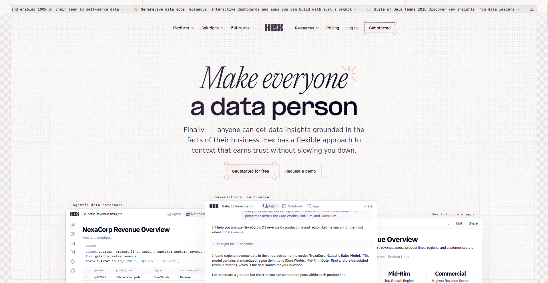
- What it does: Hex is a notebook-based platform that lets technical teams write SQL and Python together and publish the result as a shareable app.
- Best for: Data analysts and data scientists who want to co-edit code in real time and hand off the finished analysis as an app.
To see whether two people could work in the same Hex notebook without stepping on each other, I opened it with a teammate account and wrote a SQL query.
Hex kept the query and its output synced for both of us, and publishing the finished notebook as a shareable data app took one click.
The multiplayer editing lagged occasionally when we both typed in the same cell, so one of us had to pause and let the other finish.
Key features
- SQL and Python in one notebook: Write and run both languages in the same workflow without switching tools.
- Multiplayer editing: See a teammate's cursor and edits land in the same notebook in real time.
- Shareable data apps: Publish a finished notebook as an interactive app for people outside the notebook.
Pros and cons
| ✅ Pros | ❌ Cons |
| Runs SQL and Python together in the same workflow. | Editing the same cell at the same time causes a brief lag. |
| Shows a teammate's edits landing in the same notebook in real time. | Pricing is billed per editor, which adds up for larger teams. |
| Publishes a notebook as a shareable app with one click. |
What users say
Pro: "What I like best about Hex is how it combines powerful data analysis with an intuitive and collaborative interface. It makes it easy to explore data, build interactive analyses, and share insights with others, all in one place. I especially appreciate the flexibility of working with SQL and Python while still being able to create clear, polished outputs for non-technical stakeholders." (Verified User in Retail, G2)
Con: "The load times can be frustrating at times, but everything else about it is great. I just wish there were more explainer modules that gave qualitative review for dense tables." (Joey M., G2)
Pricing
Hex starts at $36 per editor per month, billed monthly.
Bottom line
Hex treats a notebook as a live, shareable app the moment you publish it. If your team wants notebooks built specifically around real-time co-editing, Deepnote might be worth a look.
3. Deepnote: Best for real-time co-editing on a shared notebook
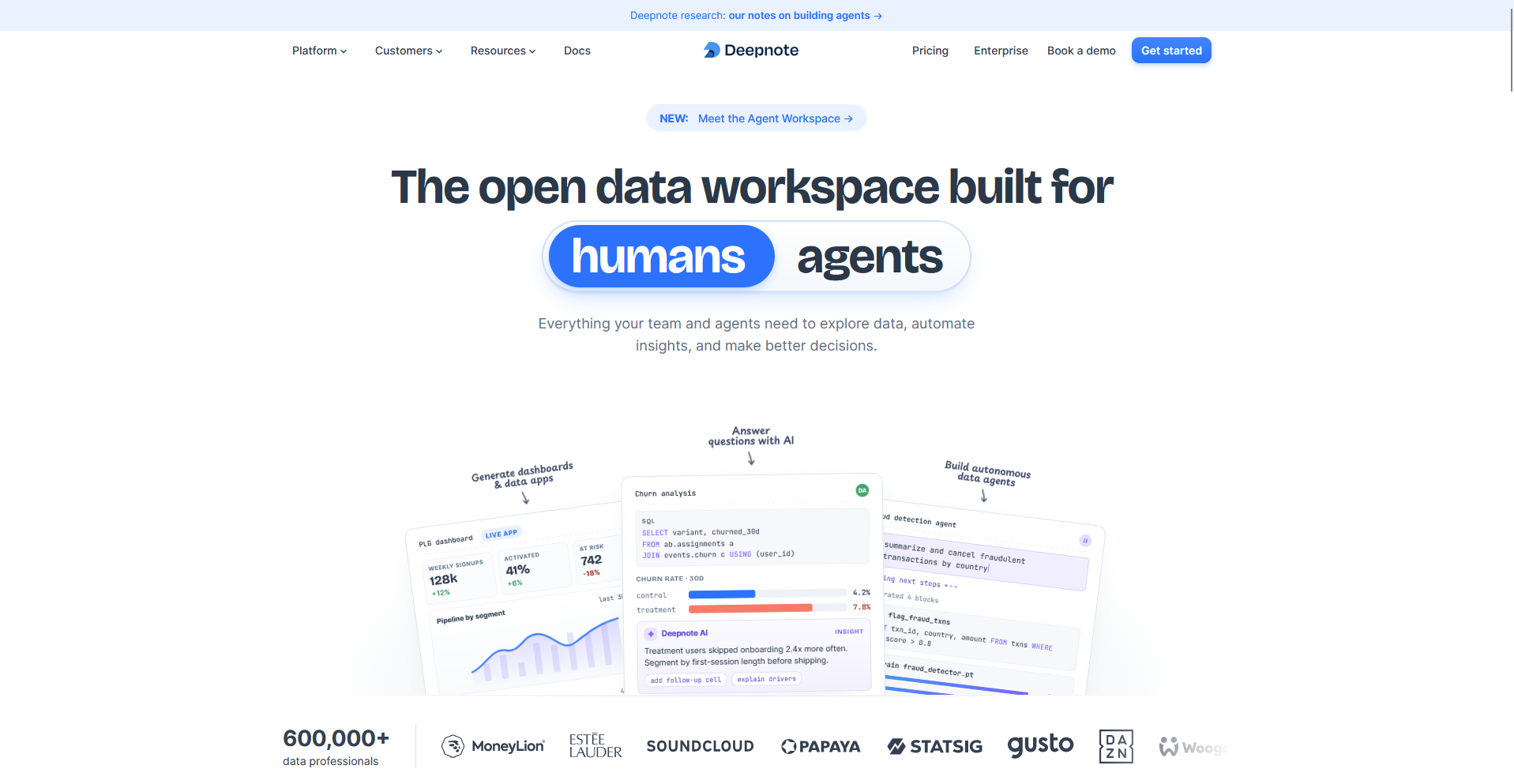
- What it does: Deepnote is a notebook-based platform that lets teams co-edit SQL and Python in real time and connect directly to a data warehouse.
- Best for: Data teams that want a shared notebook to feel as responsive as a live document, with a teammate's edits visible as they type.
Deepnote is built around real-time co-editing, so I tested it by opening the same notebook with a teammate account to see how closely it tracked a live Google Doc.
Both of our cursors moved and typed at the same time without any lag, and comments landed on the exact cell they were meant for.
Connecting a sample Snowflake warehouse took a few extra steps, since it asked for connection credentials before it would run a single query.
Key features
- Real-time co-editing: See a teammate's cursor and changes land in the same notebook as they type.
- Dual-language support: Write SQL and Python in the same notebook and pass results between them.
- Warehouse integrations: Connect directly to a data warehouse like Snowflake and query it from inside a notebook.
Pros and cons
| ✅ Pros | ❌ Cons |
| Tracks a teammate's edits in real time with no noticeable lag. | Connecting a warehouse takes more setup steps than uploading a file. |
| Runs SQL and Python in the same notebook and passes results between them. | Pricing is billed per editor, same as Hex, which adds up for larger teams. |
| Comments land on the exact cell they're meant for. |
What users say
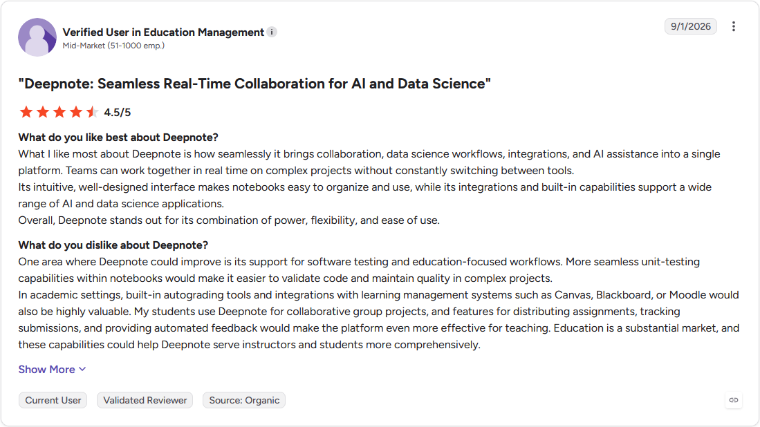
Pro: "What I like most about Deepnote is how seamlessly it brings collaboration, data science workflows, integrations, and AI assistance into a single platform. Teams can work together in real time on complex projects without constantly switching between tools." (Verified User in Education Management, G2)
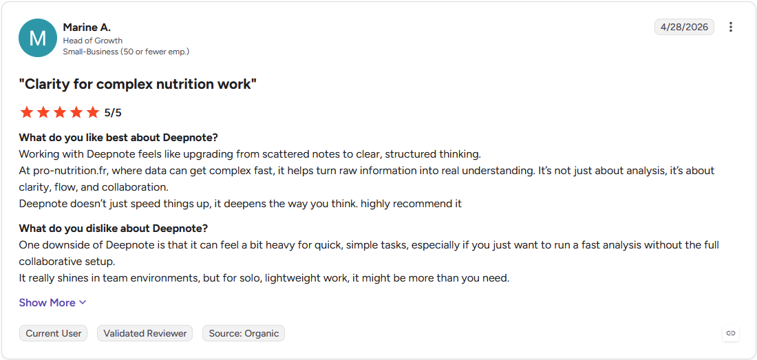
Con: "One downside of Deepnote is that it can feel a bit heavy for quick, simple tasks, especially if you just want to run a fast analysis without the full collaborative setup. It really shines in team environments, but for solo, lightweight work, it might be more than you need." (Marine A., G2)
Pricing
Deepnote starts at $39 per editor per month.
Bottom line
Deepnote's cursor tracking makes a shared notebook feel like a live document instead of a file someone else might be editing. If your team wants that same notebook published as a standalone app when it's done, Hex might be worth a look.
BI and dashboards
4. Tableau: Best for executive-ready dashboards and visual reporting
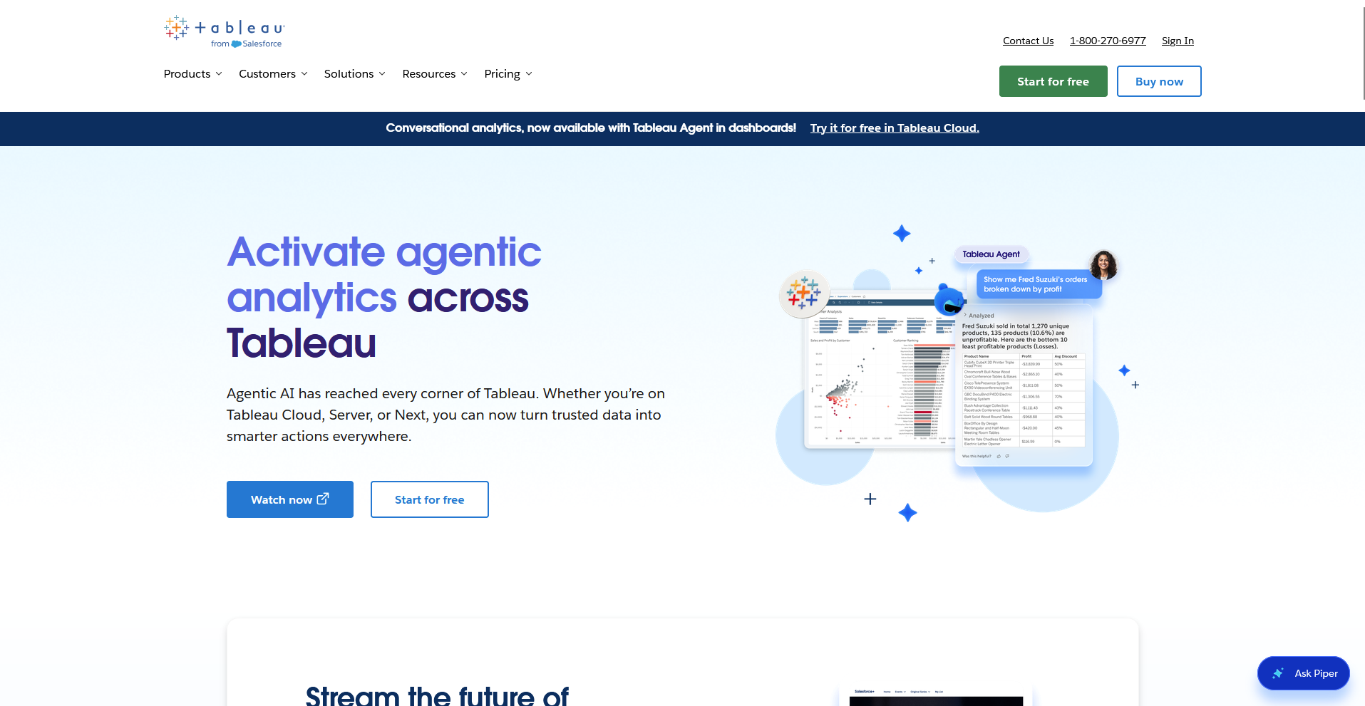
- What it does: Tableau is a business intelligence tool that turns connected data into interactive, shareable dashboards.
- Best for: Data teams building polished dashboards meant for executives and other stakeholders outside the team.
I connected a sample sales dataset to Tableau to see how it handled a data team's actual reporting workflow, then built a dashboard meant for a leadership meeting.
Tableau let me layer filters, drill into a single region, and adjust colors down to one data point, and the finished dashboard looked ready to present without the need for extra polish.
Getting there took longer than I expected, since Tableau's calculated fields and formatting options carry a steep learning curve for someone new to the tool.
Key features
- Custom visualizations: Build charts down to individual data points, with control over color, layout, and filters.
- Broad data connections: Connect to warehouses, databases, spreadsheets, and cloud apps from one platform.
- Governance controls: Manage who can view, edit, or publish a dashboard with role-based permissions.
Pros and cons
| ✅ Pros | ❌ Cons |
| Builds highly customized visualizations down to a single data point. | Calculated fields and formatting carry a real learning curve for new users. |
| Connects to a wide range of databases, warehouses, and cloud apps. | Licensing gets complex once a team mixes Creator, Explorer, and Viewer seats. |
| Supports detailed governance and permissioning for large teams. |
What users say
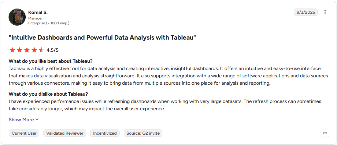
Pro: "Tableau is a highly effective tool for data analysis and creating interactive, insightful dashboards. It offers an intuitive and easy-to-use interface that makes data visualization and analysis straightforward." (Komal S., G2)
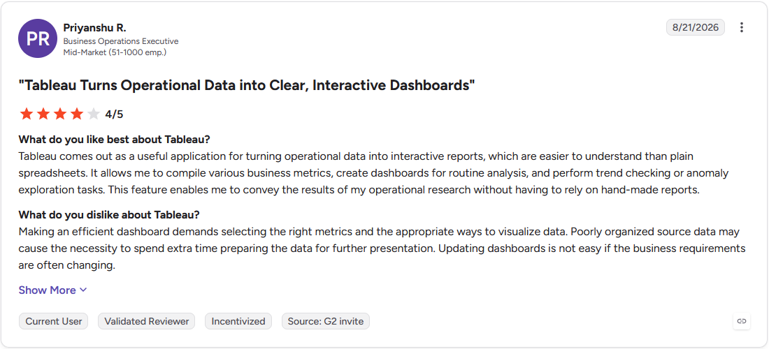
Con: "Making an efficient dashboard demands selecting the right metrics and the appropriate ways to visualize data. Poorly organized source data may cause the necessity to spend extra time preparing the data for further presentation. Updating dashboards is not easy if the business requirements are often changing." (Priyanshu R., G2)
Pricing
Tableau starts at $75 per month for a Creator license.
Bottom line
Tableau's calculated fields let you build a custom metric without touching the underlying database. If your team wants to co-edit SQL and Python side by side, Hex might be worth a look.
5. Looker: Best for enterprise-wide governed metrics on the warehouse
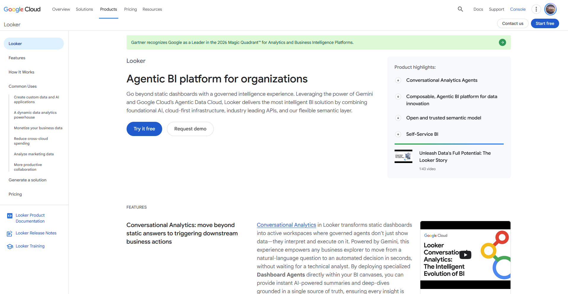
- What it does: Looker is a business intelligence platform that centralizes metric definitions in a semantic layer built on top of a data warehouse.
- Best for: Larger data teams that need one governed metric definition to stay consistent across every dashboard in the company.
Looker centers on a semantic layer called LookML that defines every metric once. I reviewed that layer through Google's documentation and product demos, since Looker requires a sales conversation before it grants hands-on access.
The setup guides show a BigQuery warehouse connecting in a handful of steps, and every dashboard afterward pulls from the same defined metric.
Getting from a raw table to that governed metric takes someone who can write LookML, so a team without that skill waits on someone else for every new definition.
Key features
- Semantic layer (LookML): Define a metric once so every dashboard built on it uses the same number.
- BigQuery integration: Connect directly to a BigQuery warehouse and query it without exporting data elsewhere.
- Embedded analytics: Embed a Looker dashboard inside another internal tool or customer-facing product.
Pros and cons
| ✅ Pros | ❌ Cons |
| Centralizes every metric definition in one semantic layer so dashboards stay consistent. | Requires someone who can write LookML before a team sees any benefit. |
| Connects directly to a BigQuery warehouse without a separate export step. | Requires a sales conversation before granting access, with no self-serve trial. |
| Supports embedding a dashboard inside another internal or customer-facing product. |
What users say
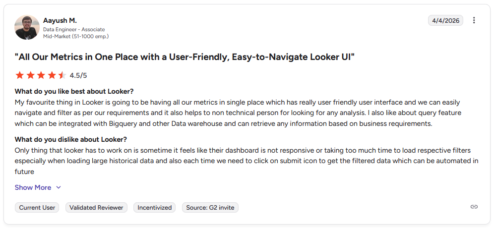
Pro: "My favourite thing in Looker is going to be having all our metrics in single place which has really user friendly user interface and we can easily navigate and filter as per our requirements and it also helps to non technical person for looking for any analysis. I also like about query feature which can be integrated with Bigquery and other Data warehouse and can retrieve any information based on business requirements." - Aayush M., G2
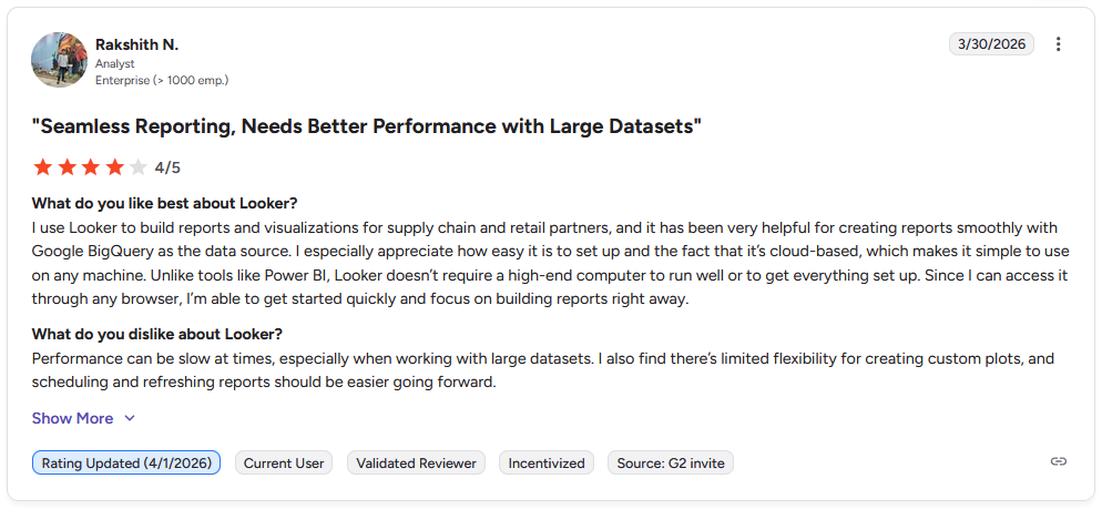
Con: "Performance can be slow at times, especially when working with large datasets. I also find there's limited flexibility for creating custom plots, and scheduling and refreshing reports should be easier going forward." - Rakshith N., G2
Pricing
Looker offers custom pricing.
Bottom line
LookML defines a metric once, and every dashboard built after that inherits the same number. If your team wants an answer without learning LookML first, Julius might be worth a look.
Documentation and knowledge
6. Notion: Best for a shared wiki for metric definitions and process docs
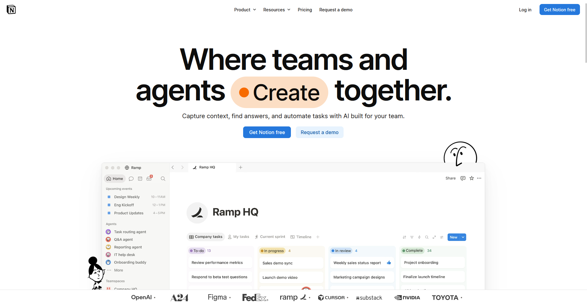
- What it does: Notion is a workspace tool that combines docs, wikis, and databases in one shared space.
- Best for: Teams that want a single place to keep metric definitions, data dictionaries, and process docs next to the work itself.
Notion is built around flexible pages and databases, so I looked at how teams pair a metric definition with the dashboard that relies on it.
Its database views link a glossary entry directly to the process doc explaining how that number gets calculated, based on Notion's own workspace templates.
Notion can't run a live query against a warehouse, so a typed-in number stays static until someone updates it by hand.
Key features
- Shared databases: Build a database of metric definitions, glossary terms, or process docs that stays in the same workspace as everything else.
- Flexible page structure: Nest pages inside each other to organize documentation however a team's structure actually works.
- Templates: Start from a library of pre-built templates for wikis, glossaries, and project trackers.
Pros and cons
| ✅ Pros | ❌ Cons |
| Combines docs, wikis, and databases in one workspace. | Can't run a live query against a warehouse, so numbers stay static until updated by hand. |
| Links a metric definition directly to the process doc that explains it. | Large workspaces with many nested pages can get hard to navigate without a clear structure. |
| Flexible enough to match how a specific team organizes its documentation. |
What users say
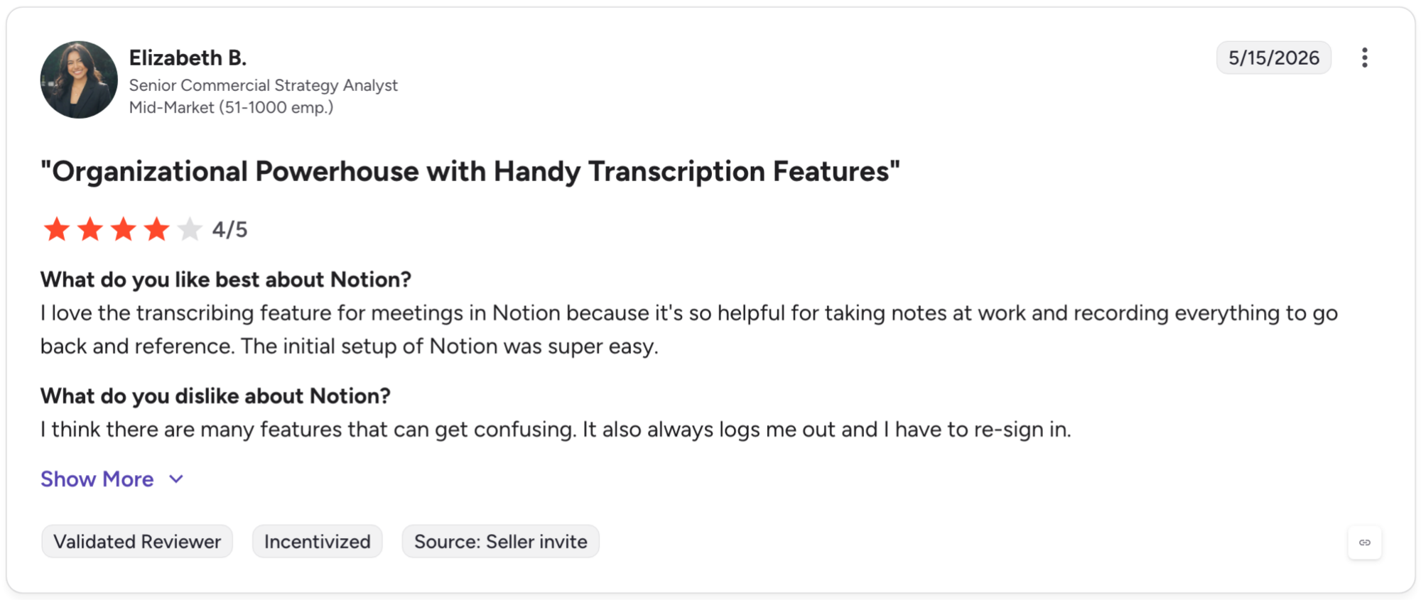
Pro: "I love the transcribing feature for meetings in Notion because it's so helpful for taking notes at work and recording everything to go back and reference. The initial setup of Notion was super easy." (Elizabeth B., G2)
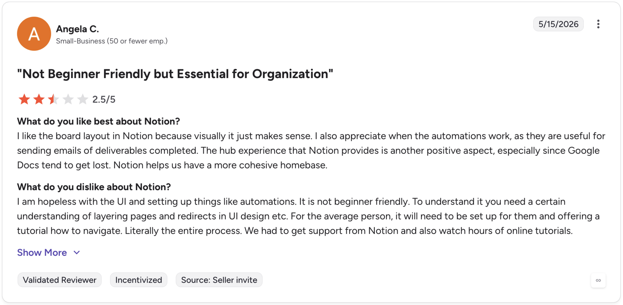
Con: "I am hopeless with the UI and setting up things like automations. It is not beginner friendly. To understand it you need a certain understanding of layering pages and redirects in UI design etc. For the average person, it will need to be set up for them and offering a tutorial on how to navigate." -(Angela C., G2)
Pricing
Notion starts at $10 per member per month.
Bottom line
Notion keeps a metric definition and the process doc explaining it in the same shared space. If your team wants that same documentation habit built around a page hierarchy and tighter Jira integration, Confluence might be worth a look.
7. Confluence: Best for Atlassian-native documentation at scale
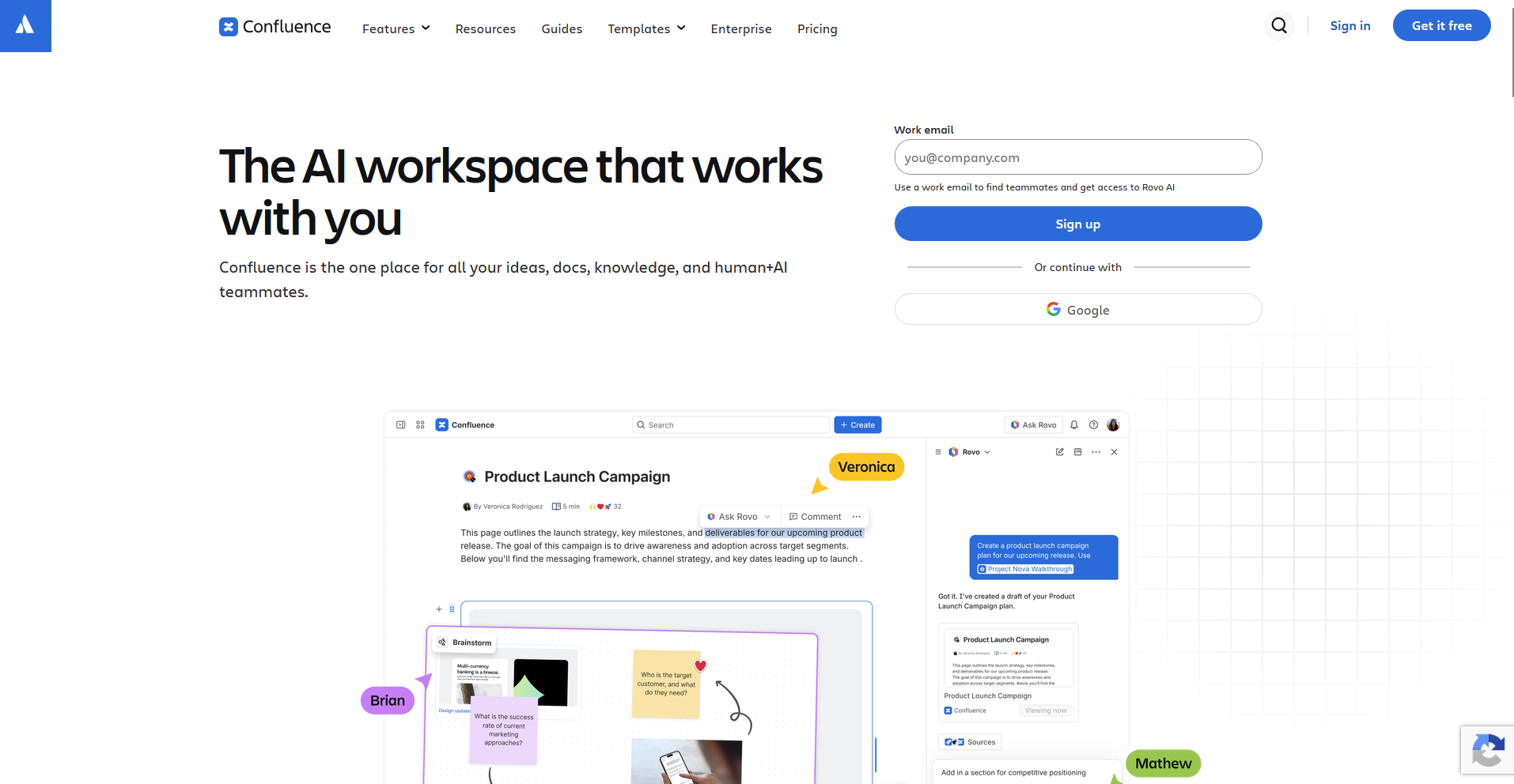
- What it does: Confluence is a documentation tool built around page hierarchies that turns nested pages into a searchable knowledge base.
- Best for: Larger orgs already inside the Atlassian ecosystem that need structured knowledge bases and tight Jira integration.
I dug into Confluence's nested page structure to see whether it could still find a specific page once a knowledge base grew past a few dozen pages.
I found its search could surface a page buried several folders deep without me typing the exact title. Confluence's editor trails Notion's for building lightweight databases, so tracking anything more structured than a page usually routes through a separate Jira ticket.
Key features
- Page hierarchies: Organize documentation into nested spaces and pages that mirror a team's actual structure.
- Jira integration: Link a documentation page directly to the Jira ticket it explains or depends on.
- Search: Surface a specific page across a large knowledge base without knowing its exact location.
Pros and cons
| ✅ Pros | ❌ Cons |
| Search surfaces buried pages across a large knowledge base. | Editor trails Notion's for building lightweight databases. |
| Links documentation directly to Jira tickets and projects. | Structured data usually needs a separate tool like Jira, since it doesn't live natively in a page. |
| Scales well for large organizations with many contributors. |
What users say
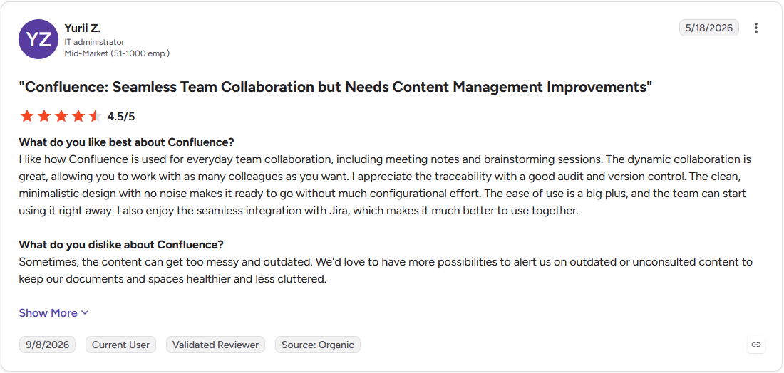
Pro: "The dynamic collaboration is great, allowing you to work with as many colleagues as you want. I also enjoy the seamless integration with Jira, which makes it much better to use together." (Yurii Z., G2)
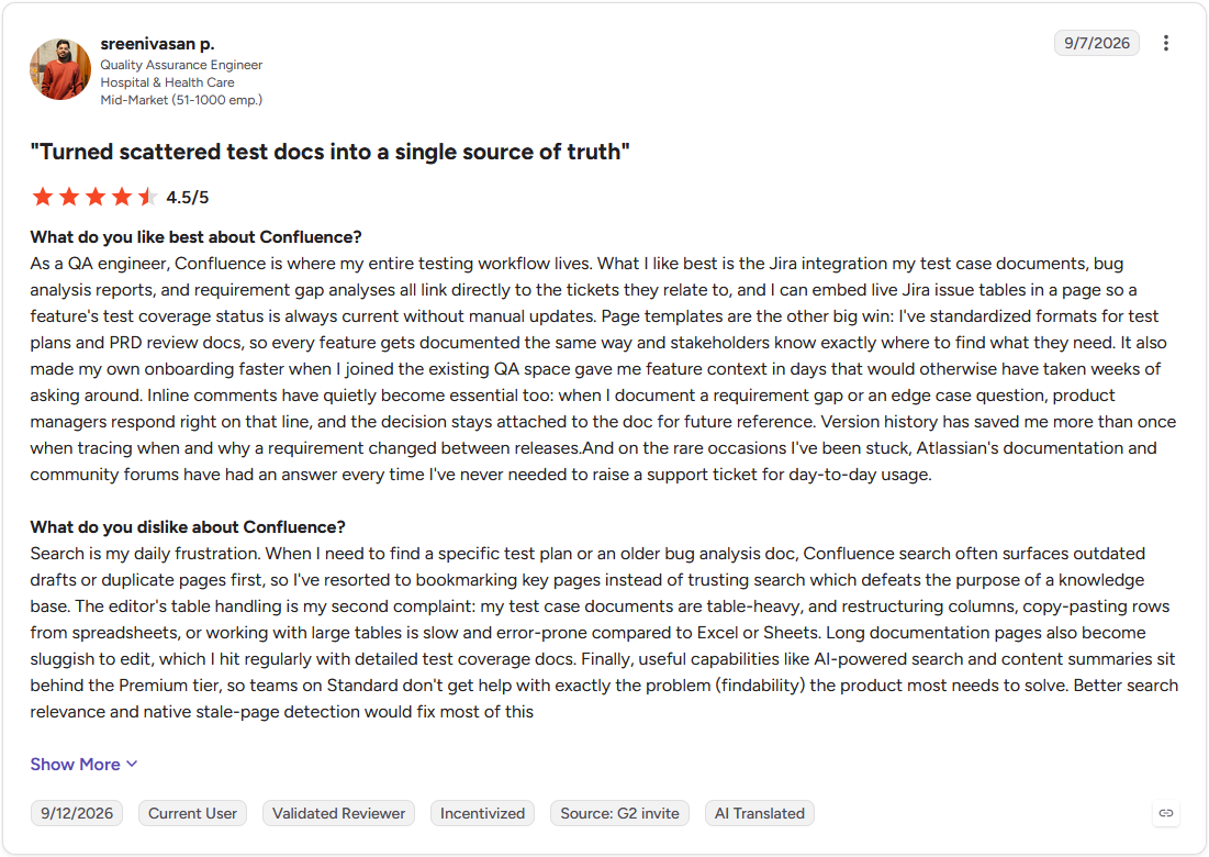
Con: "Search is my daily frustration. When I need to find a specific test plan or an older bug analysis doc, Confluence search often surfaces outdated drafts or duplicate pages first, so I've resorted to bookmarking key pages instead of trusting search which defeats the purpose of a knowledge base." (Sreenivasan P., G2)
Pricing
Confluence starts at $6.40 per user per month for the Standard plan.
Bottom line
Confluence ties documentation directly to the Jira tickets it explains, keeping context in one ecosystem. If your team wants that same shared-documentation habit without the Atlassian lock-in, Notion might be the right choice for you.
Shared data workspaces
8. Airtable: Best for no-code databases for ops and PM teams
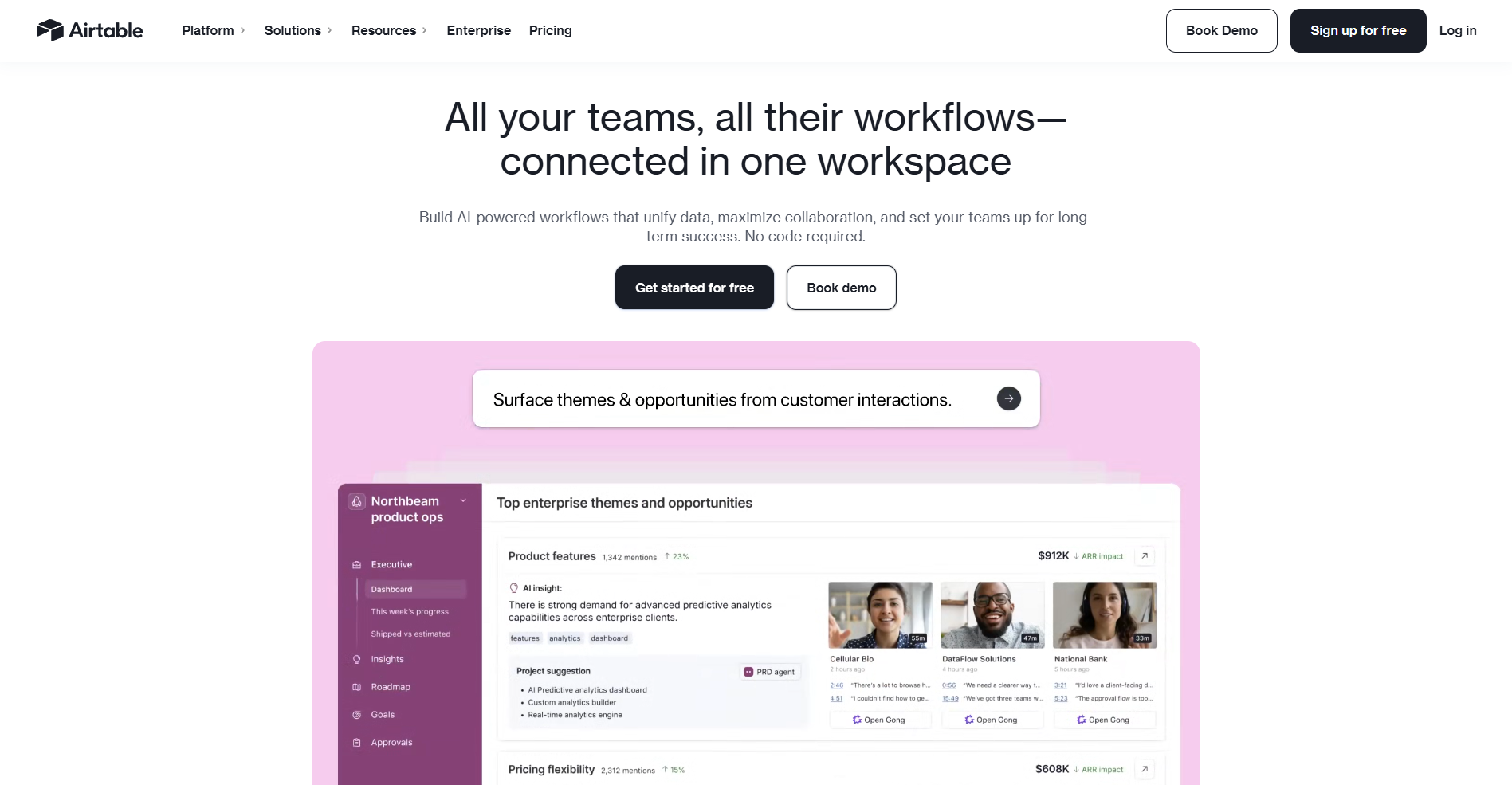
- What it does: Airtable is a no-code database tool built around spreadsheet-style rows.
- Best for: Ops and PM teams that want to pull data together from multiple sources without writing code.
I tested Airtable to see whether it could pull data from more than one table into a single shared view without anyone writing a formula.
A linked record pulled in data from another table without me touching a formula, so I could see a related order sitting right next to the customer it belonged to. But it only showed one field by default, so seeing the full details meant clicking into it separately.
Key features
- Linked records: Pull data from a related table into a shared view without writing a formula.
- Custom views: Build a grid, calendar, or kanban view of the same underlying data for different teams.
- Automations: Trigger an action, like a notification or a status update, when a record changes.
Pros and cons
| ✅ Pros | ❌ Cons |
| Pulls related data across multiple tables without a formula. | A linked record shows only its primary field by default. |
| Offers grid, calendar, and kanban views of the same data. | Free and entry-level plans cap records per base, so a growing dataset can hit a ceiling. |
| Needs no coding experience to build a working database. |
What users say
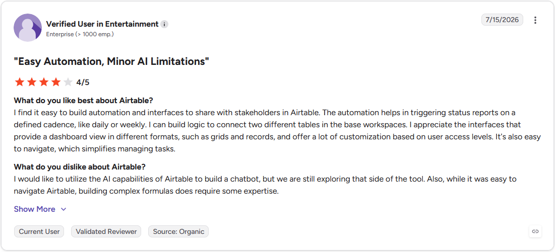
Pro: "I find it easy to build automation and interfaces to share with stakeholders in Airtable. The automation helps in triggering status reports on a defined cadence, like daily or weekly." (Verified User in Entertainment, G2)
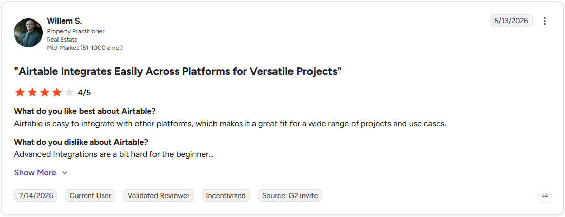
Con: "Advanced Integrations are a bit hard for the beginner…" (Willem S., G2)
Pricing
Airtable starts at $20 per seat per month.
Bottom line
Airtable turns a spreadsheet habit into a real relational database without anyone writing a query. If your team wants that same database ownership self-hosted on its own servers, Baserow might be worth a look.
9. Baserow: Best for self-hosted, open-source database ownership
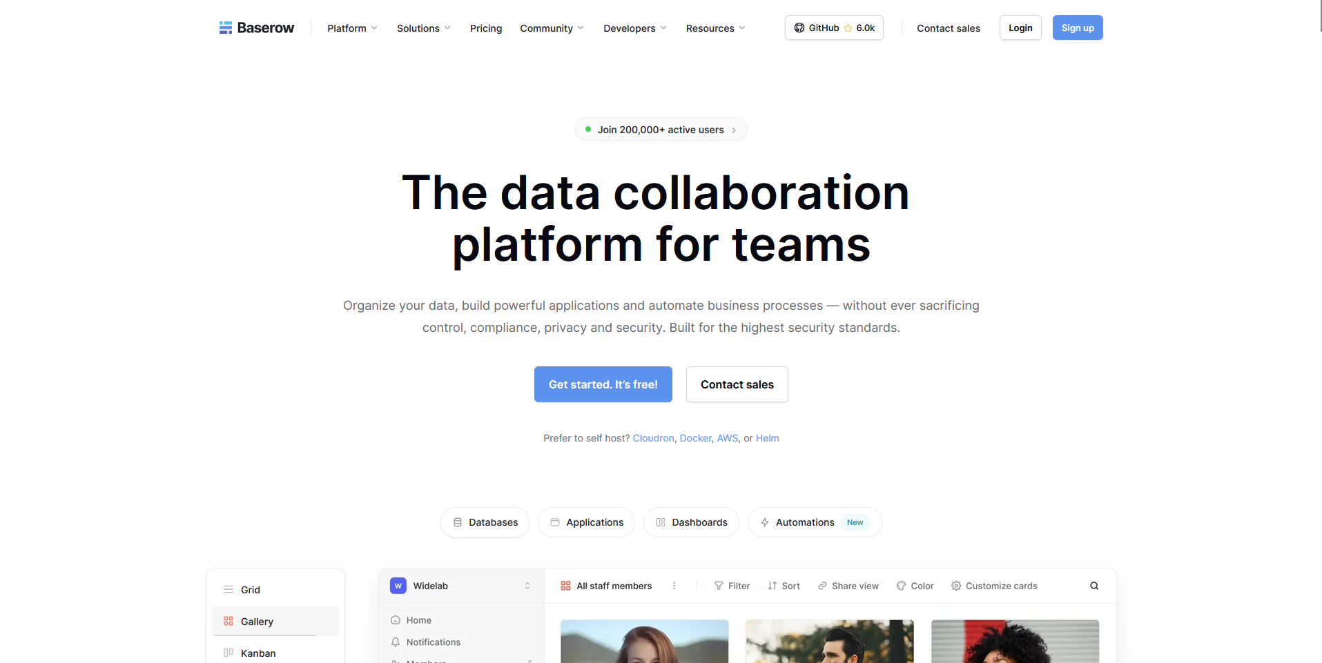
- What it does: Baserow is an open-source database tool a team can self-host on its own servers.
- Best for: Teams that want to own their database outright and avoid vendor lock-in.
Baserow is built to be self-hosted, so I looked at how its setup guide handles getting a working instance running.
I found its grid view worked like a familiar spreadsheet, so building a database didn't require learning new query syntax.
Baserow's automations still feel like a step behind Airtable's, and I found myself reaching for a webhook and an outside tool the moment I wanted anything past a simple trigger.
Key features
- Self-hosting: Run Baserow on a team's own servers for full control over the underlying data.
- Spreadsheet-style interface: Build a database using a grid view that works like a familiar spreadsheet.
- Open-source access: Inspect or modify the underlying code rather than depend on a closed vendor platform.
Pros and cons
| ✅ Pros | ❌ Cons |
| Full self-hosting option for teams that want to own their data outright. | Automation builder trails Airtable's for complex workflows. |
| Grid interface needs no new query syntax to get started. | Self-hosting requires technical setup and ongoing maintenance a cloud-only tool doesn't. |
| Open-source access avoids vendor lock-in. |
What users say
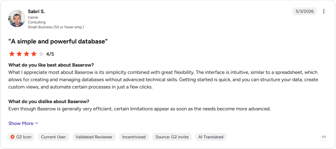
Pro: "What I appreciate most about Baserow is its simplicity combined with great flexibility. The interface is intuitive, similar to a spreadsheet, which allows for creating and managing databases without advanced technical skills." (Sabri S., G2)
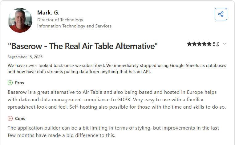
Con: "The application builder can be a bit limiting in terms of styling, but improvements in the last few months have made a big difference to this." (Mark G., Capterra)
Pricing
Baserow starts at $10 per user per month.
Bottom line
Baserow gives a team full ownership of its database, down to the servers it runs on. If your team wants that same spreadsheet-style database without managing the hosting, Google Sheets could be worth considering.
10. Google Sheets: Best for familiar spreadsheet collaboration for quick math
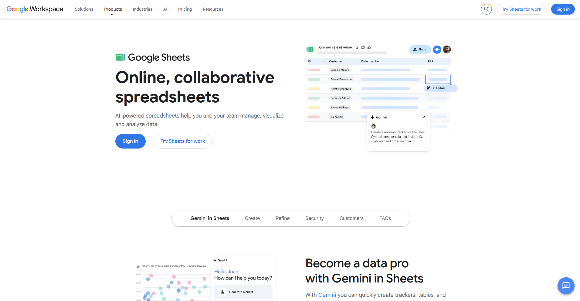
- What it does: Google Sheets is a spreadsheet tool most teams already know, shared with a link for real-time editing.
- Best for: Teams that want quick, shared spreadsheet math without learning a new tool.
I've used Google Sheets for years, and a broken formula has sent me to version history more than once to roll it back. Comments stay pinned to the exact cell someone's asking about, so a question doesn’t drift into a separate thread. One thing I don’t like is that once a sheet holds hundreds of thousands of formulas, it starts to lag.
Key features
- Real-time co-editing: Multiple teammates can edit the same spreadsheet at the same time.
- Cell-level comments: Attach a comment to the exact cell it's about.
- Version history: Roll back to an earlier version of the sheet if a formula breaks.
Pros and cons
| ✅ Pros | ❌ Cons |
| Nearly every team already knows how to use it. | Slows down noticeably once a file holds hundreds of thousands of formulas. |
| Comments stay attached to the exact cell they're about. | Lacks the relational structure a proper database like Airtable or Baserow offers. |
| Version history recovers a broken formula quickly. |
What users say
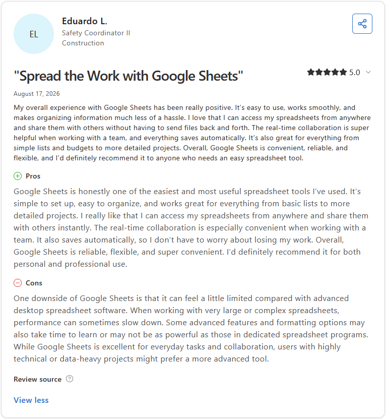
Pro: "Google Sheets is honestly one of the easiest and most useful spreadsheet tools I've used. ... The real-time collaboration is especially convenient when working with a team. It also saves automatically, so I don't have to worry about losing my work." (Eduardo L., Capterra)
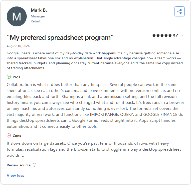
Con: "It slows down on large datasets. Once you're past tens of thousands of rows with heavy formulas, recalculation lags and the browser starts to struggle in a way a desktop spreadsheet wouldn't." (Mark B., Capterra)
Pricing
Google Sheets is free with a personal Google account.
Bottom line
Google Sheets keeps spreadsheet math somewhere nearly every teammate already knows how to use. If your team wants that same data pulled together with more structure, Airtable might be worth a look.
Code collaboration
11. GitHub: Best for version control for data pipeline code
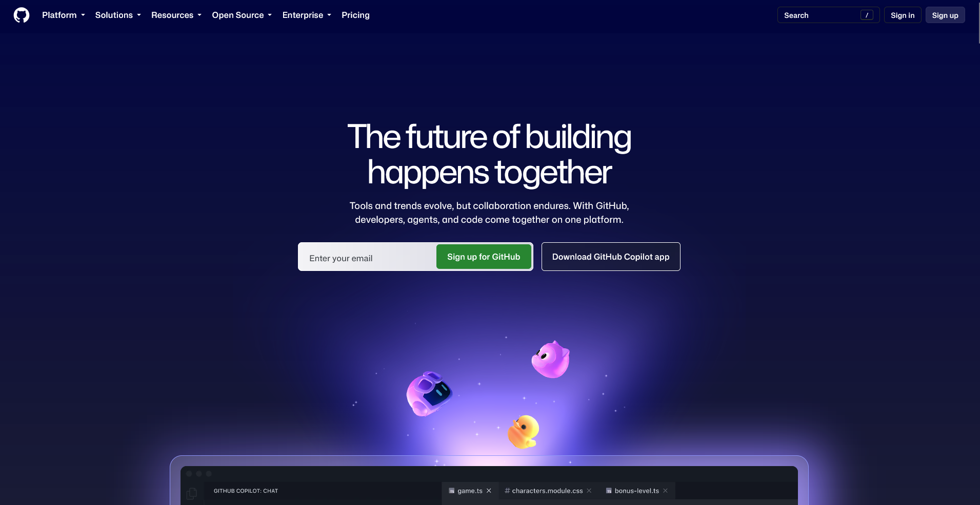
- What it does: GitHub is a code-hosting tool built around pull requests.
- Best for: Data engineers and scientists who need version-controlled review for production-ready code.
GitHub is built around pull requests, so I looked at how that review process handles a data pipeline script headed for production.
I opened a pull request against a sample script, and a teammate left line-level comments right on the function that needed a fix. GitHub assumes everyone touching the repo can read code, so a non-technical teammate needs help translating what a pull request's changes actually mean.
Key features
- Pull requests: Review code changes line by line before they merge into a shared codebase.
- Version history: Track every change to a file and roll back to an earlier version if needed.
- CI/CD integrations: Connect automated tests and deployments to run whenever code changes.
Pros and cons
| ✅ Pros | ❌ Cons |
| Line-level review catches issues before code reaches production. | Assumes familiarity with code, so a non-technical teammate needs help interpreting a change. |
| Tracks every change to a codebase with full version history. | Free and Team plans cap some collaboration features reserved for paid tiers. |
| Integrates with most CI and data pipeline tools. |
What users say
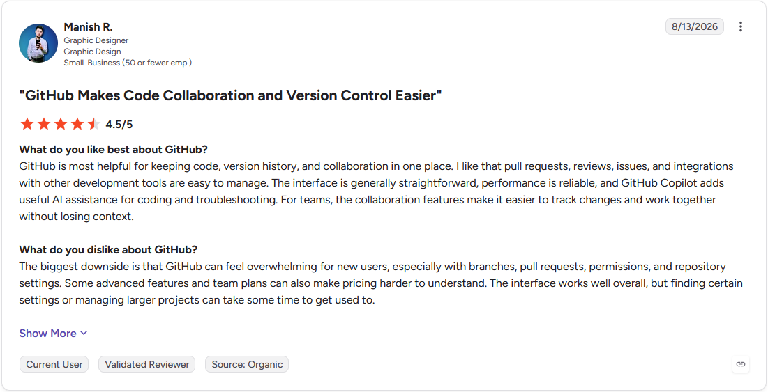
Pro: "GitHub is most helpful for keeping code, version history, and collaboration in one place. I like that pull requests, reviews, issues, and integrations with other development tools are easy to manage." (Manish R., G2)
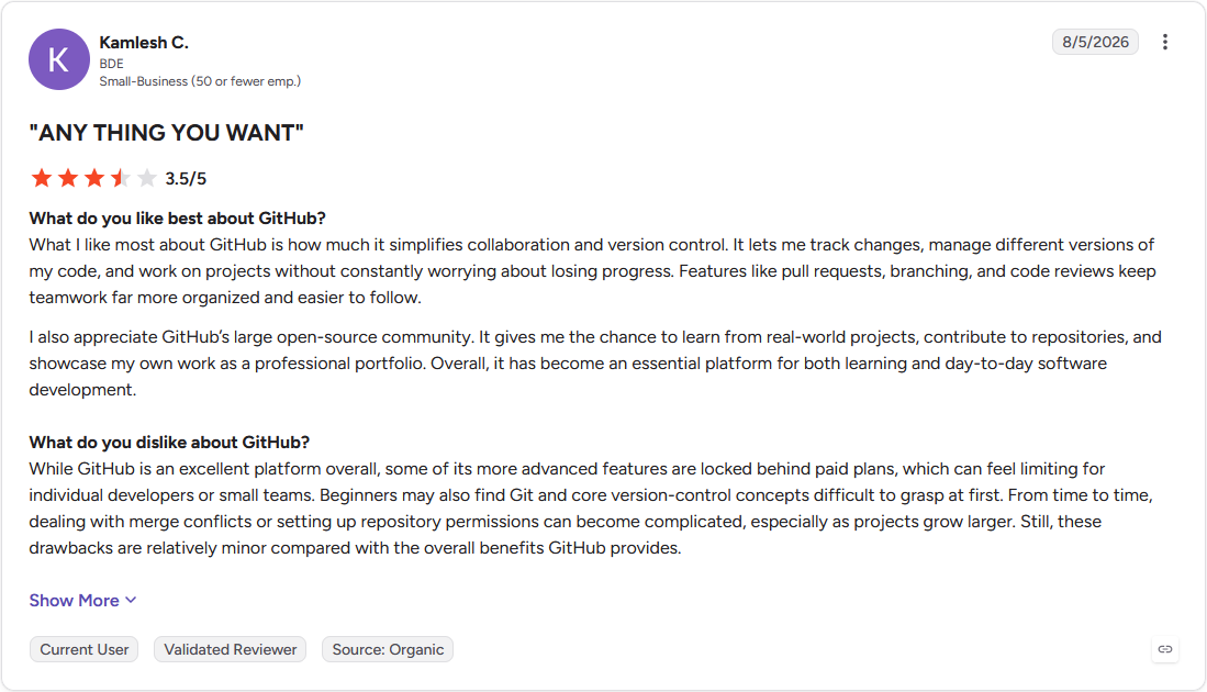
Con: "Beginners may also find Git and core version-control concepts difficult to grasp at first. From time to time, dealing with merge conflicts or setting up repository permissions can become complicated, especially as projects grow larger." (Kamlesh C., G2)
Pricing
GitHub starts at $4 per user per month.
Bottom line
GitHub tracks every change to a codebase so a data team can trace exactly who changed what. If your team wants that same clear ownership trail applied to project requests, you may want to try Linear.
Communication and coordination
12. Slack: Best for fast, informal data discussion in chat
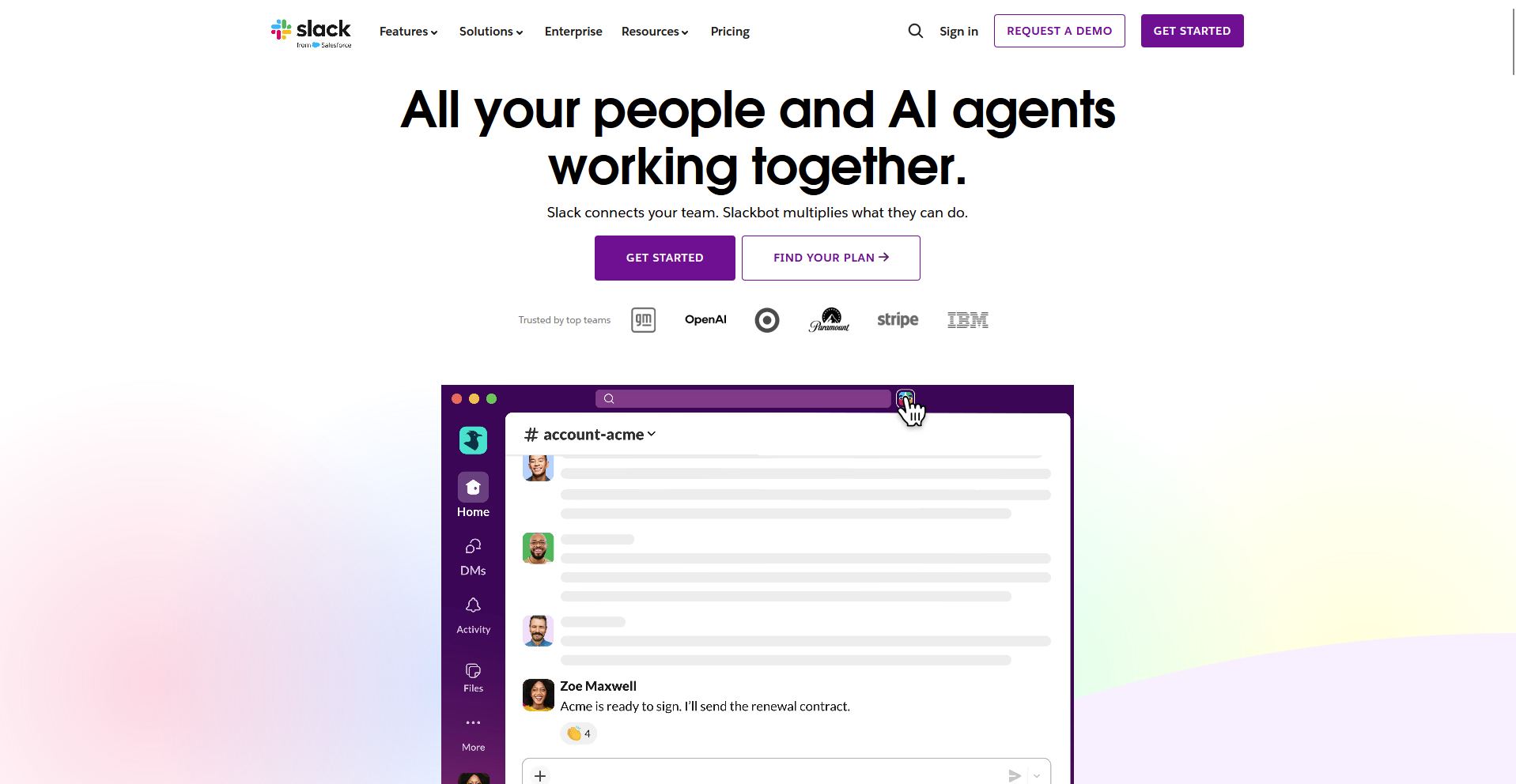
- What it does: Slack is a team chat tool built around channels and threads.
- Best for: Teams that want a fast way to flag a number that looks off before it reaches a dashboard.
I rely on Slack daily for a lot of things, but flagging a number that looks off before it reaches a dashboard is where it earns its keep for data work.
Tagging the person who owns that data helps me get it in front of them fast, and threads keep the back-and-forth out of the main channel. It's convenient too, since almost everyone already has it open.
A chart dropped into Slack turns into a flat image the moment it's posted, so nobody can click back into the data behind it.
Key features
- Channels and threads: Organize conversations by topic and keep side discussions out of the main channel.
- App integrations: Connect Slack to most data and business tools for automated alerts.
- Huddles: Start a quick voice conversation without scheduling a formal meeting.
Pros and cons
| ✅ Pros | ❌ Cons |
| Fast, informal way to flag a number that looks off. | A chart posted in Slack becomes a flat image nobody can rerun. |
| Threads keep side conversations organized. | Free plan limits message history. |
| Integrates with most data and business tools already in use. |
What users say
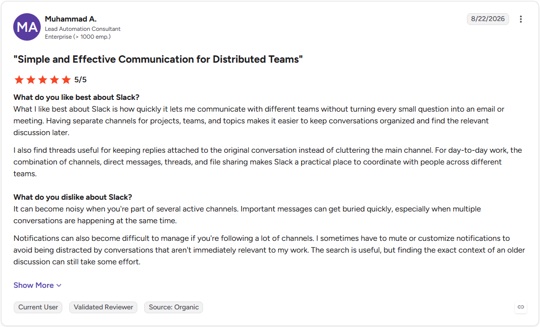
Pro: "What I like best about Slack is how quickly it lets me communicate with different teams without turning every small question into an email or meeting. Having separate channels for projects, teams, and topics makes it easier to keep conversations organized and find the relevant discussion later." (Muhammad A., G2)
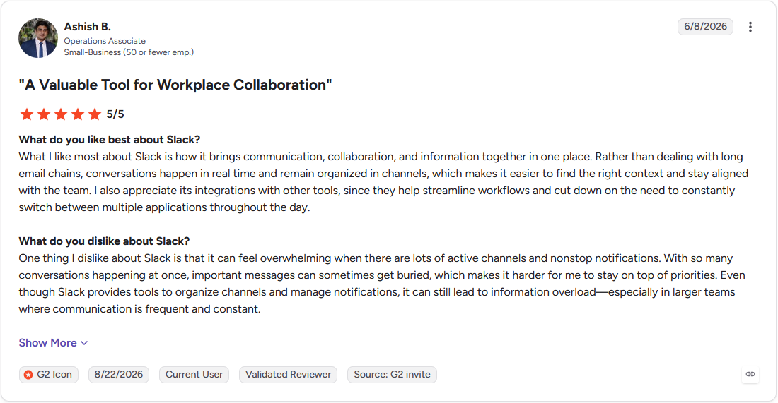
Con: "One thing I dislike about Slack is that it can feel overwhelming when there are lots of active channels and nonstop notifications. ... it can still lead to information overload—especially in larger teams where communication is frequent and constant." (Ashish B., G2)
Pricing
Slack starts at $7.25 per user per month.
Bottom line
Slack turns a quick question about a number into a conversation within minutes. If your team is already standardized on Microsoft 365 and wants that same fast chat tied to existing tools, Microsoft Teams might be worth a look.
13. Microsoft Teams: Best for chat and meetings inside Microsoft 365
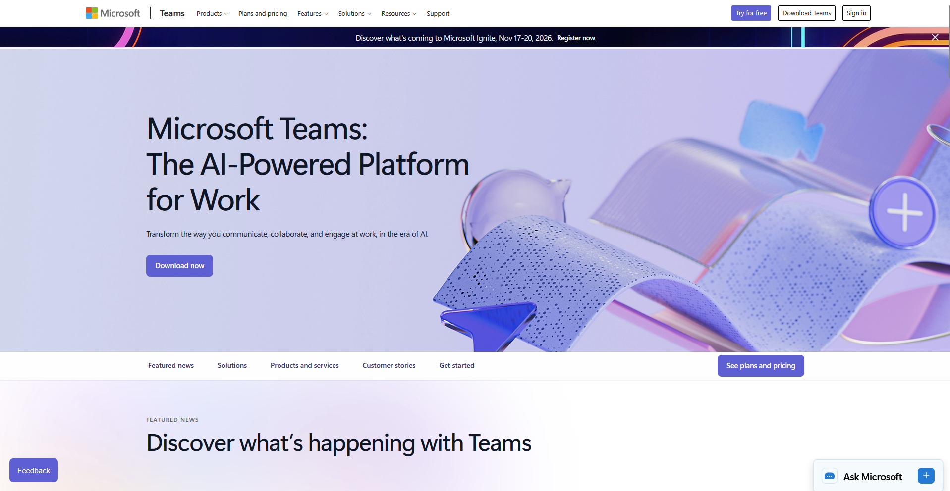
- What it does: Microsoft Teams is a chat and video tool built into Microsoft 365.
- Best for: Teams already standardized on Microsoft 365 that need chat tied to their existing files and tools.
I've used Microsoft Teams too, mostly on teams that already lived inside Microsoft 365 (though nowhere near as often as Slack).
What stood out was how close it kept a data conversation to the actual files. I can link a shared Excel file into a channel and edit it right there, without hunting it down in SharePoint first.
Search was the letdown, since an old message buried in a channel with heavy file-sharing was hard to track down, and finding a past conversation usually meant scrolling.
Key features
- Microsoft 365 integration: Link and edit a shared Excel file directly inside a channel.
- Video calls: Start a meeting from the same window as the chat conversation.
- Channels: Organize conversations by team or topic, similar to Slack's channel structure.
Pros and cons
| ✅ Pros | ❌ Cons |
| Links directly to Excel, SharePoint, and other Microsoft 365 files. | Search struggles to surface old messages in a busy channel. |
| Combines chat and video calls in one window. | Feels redundant for a team not already using Microsoft 365. |
| Familiar to any team already standardized on Microsoft 365. |
What users say
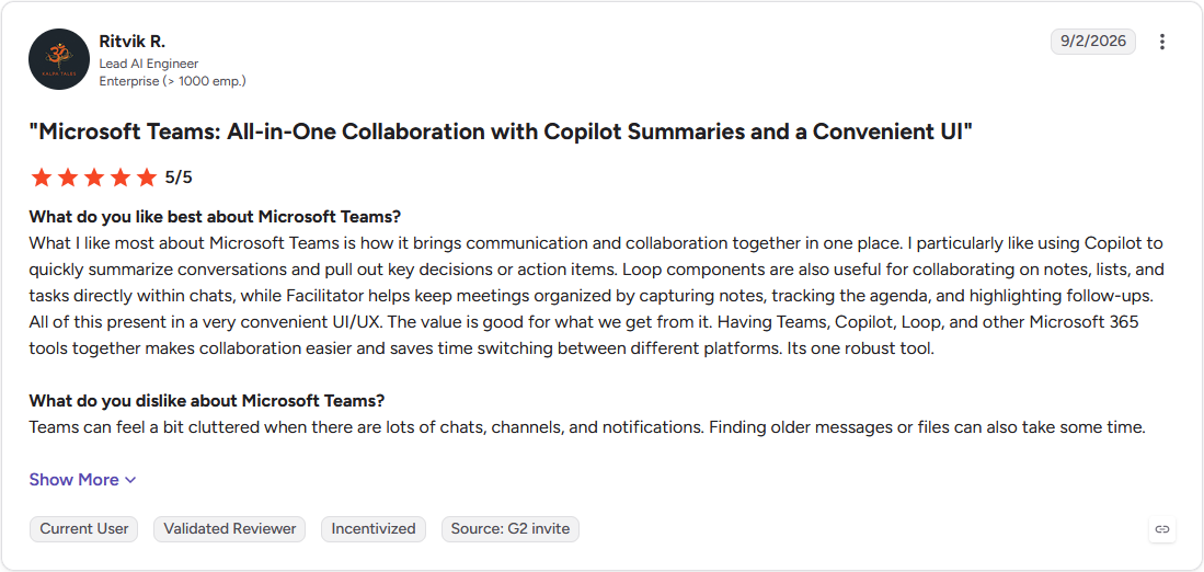
Pro: "What I like most about Microsoft Teams is how it brings communication and collaboration together in one place. I particularly like using Copilot to quickly summarize conversations and pull out key decisions or action items." (Ritvik R., G2)
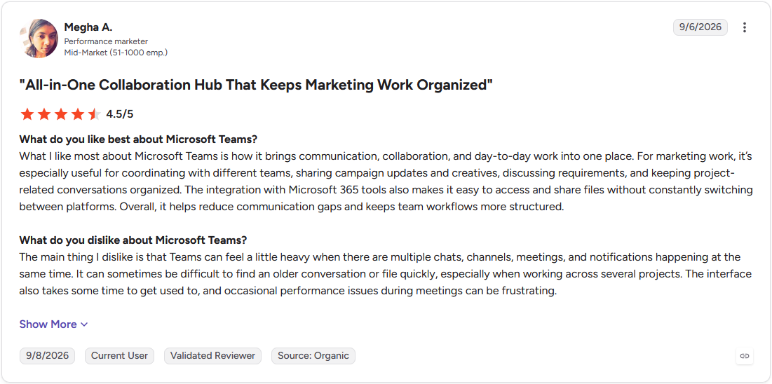
Con: "Teams can feel a little heavy when there are multiple chats, channels, meetings, and notifications happening at the same time. It can sometimes be difficult to find an older conversation or file quickly, especially when working across several projects." (Megha A., G2)
Pricing
Microsoft Teams starts at $4 per user per month.
Bottom line
Microsoft Teams keeps a data conversation tied to the same Excel files a team already stores in SharePoint. If your team wants that same fast chat without the Microsoft 365 requirement, Slack might be the better choice.
14. Miro: Best for visual whiteboarding for data models and planning
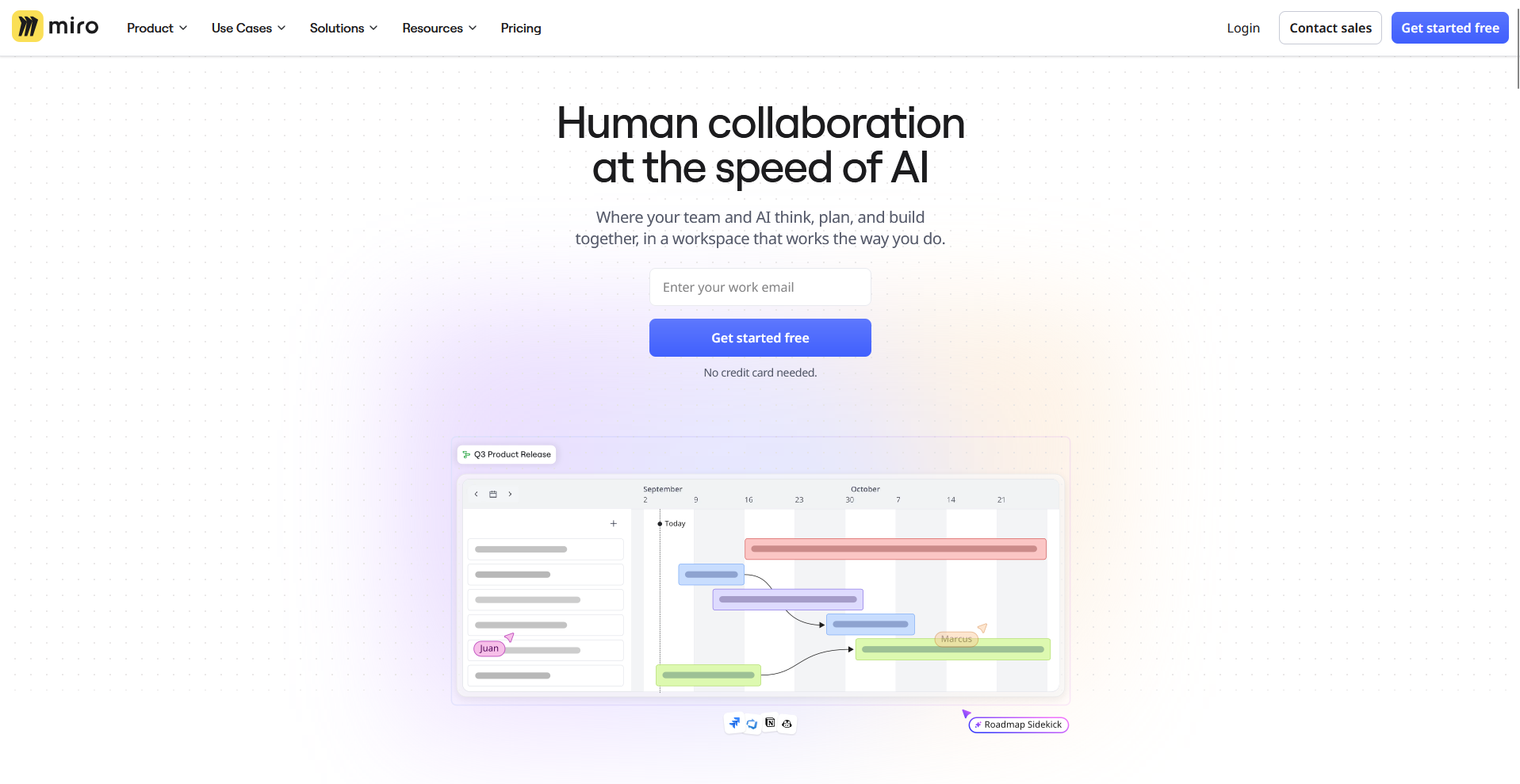
- What it does: Miro is a visual whiteboard tool built around an infinite canvas.
- Best for: Teams that want to map a data model or sketch an analysis plan before anyone writes a query.
Miro replaces the fixed slide format many planning tools default to with an infinite canvas, so I tested how that space handled mapping a data model with more than one person. I dragged boxes and arrows onto a shared board with a teammate while we sketched out table relationships, and neither of us ran out of room.
Boards get sluggish once a canvas fills with more than a few hundred objects, so a sprawling data model needs occasional cleanup.
Key features
- Infinite canvas: Map a data model or analysis plan without running out of space.
- Real-time boards: See a teammate's cursor and edits land on the same board.
- Templates: Start from pre-built templates for data modeling and planning.
Pros and cons
| ✅ Pros | ❌ Cons |
| Infinite canvas fits a sprawling data model without running out of room. | Boards get sluggish past a few hundred objects. |
| Real-time boards let two people map relationships together. | Not built for the actual analysis, just the planning that comes before it. |
| Templates give a starting point for common planning tasks. |
What users say
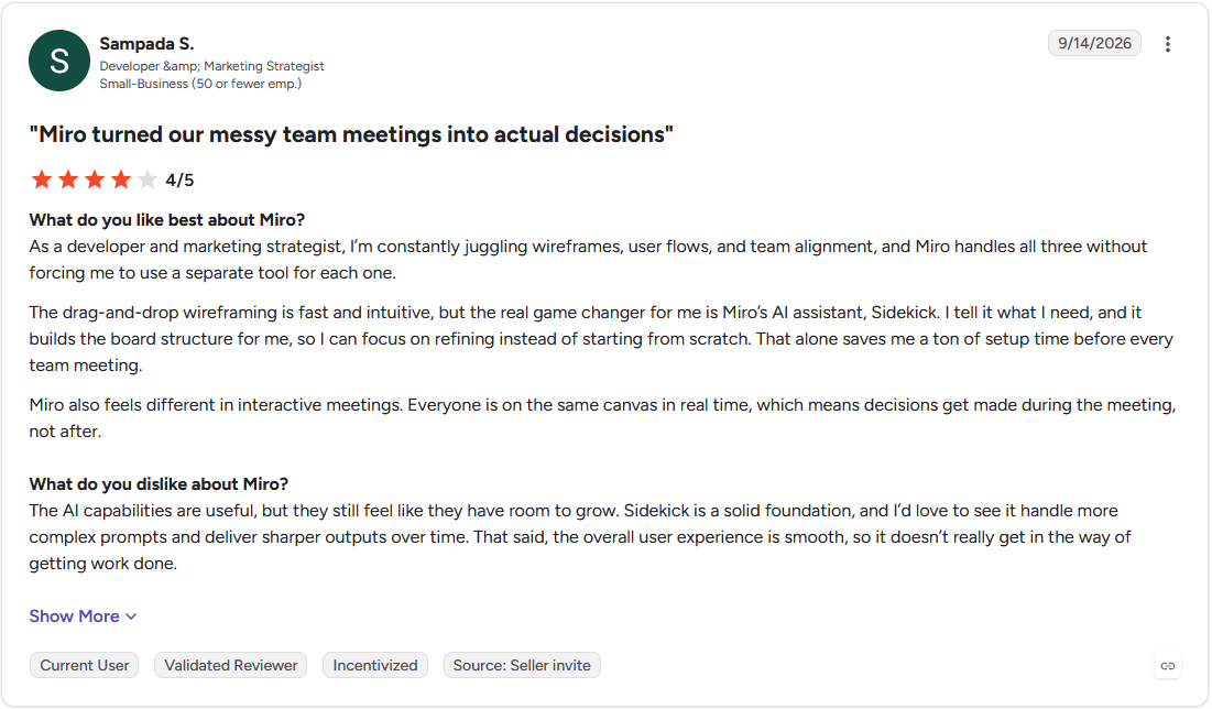
Pro: "Miro also feels different in interactive meetings. Everyone is on the same canvas in real time, which means decisions get made during the meeting." (Sampada S., G2)
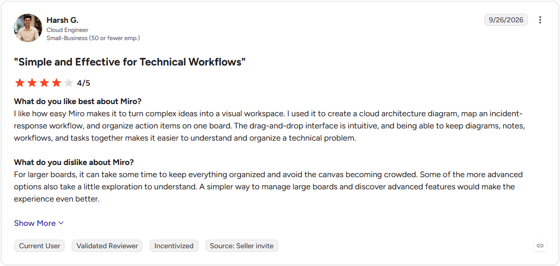
Con: "For larger boards, it can take some time to keep everything organized and avoid the canvas becoming crowded. Some of the more advanced options also take a little exploration to understand." (Harsh G., G2)
Pricing
Miro starts at $8 per member per month.
Bottom line
Miro turns a data model into something two people can sketch out together before writing a single query. If your team wants that same planning habit tracked as an actual ticket afterward, Linear might be worth a look.
15. Linear: Best for tracking data-team tickets and requests
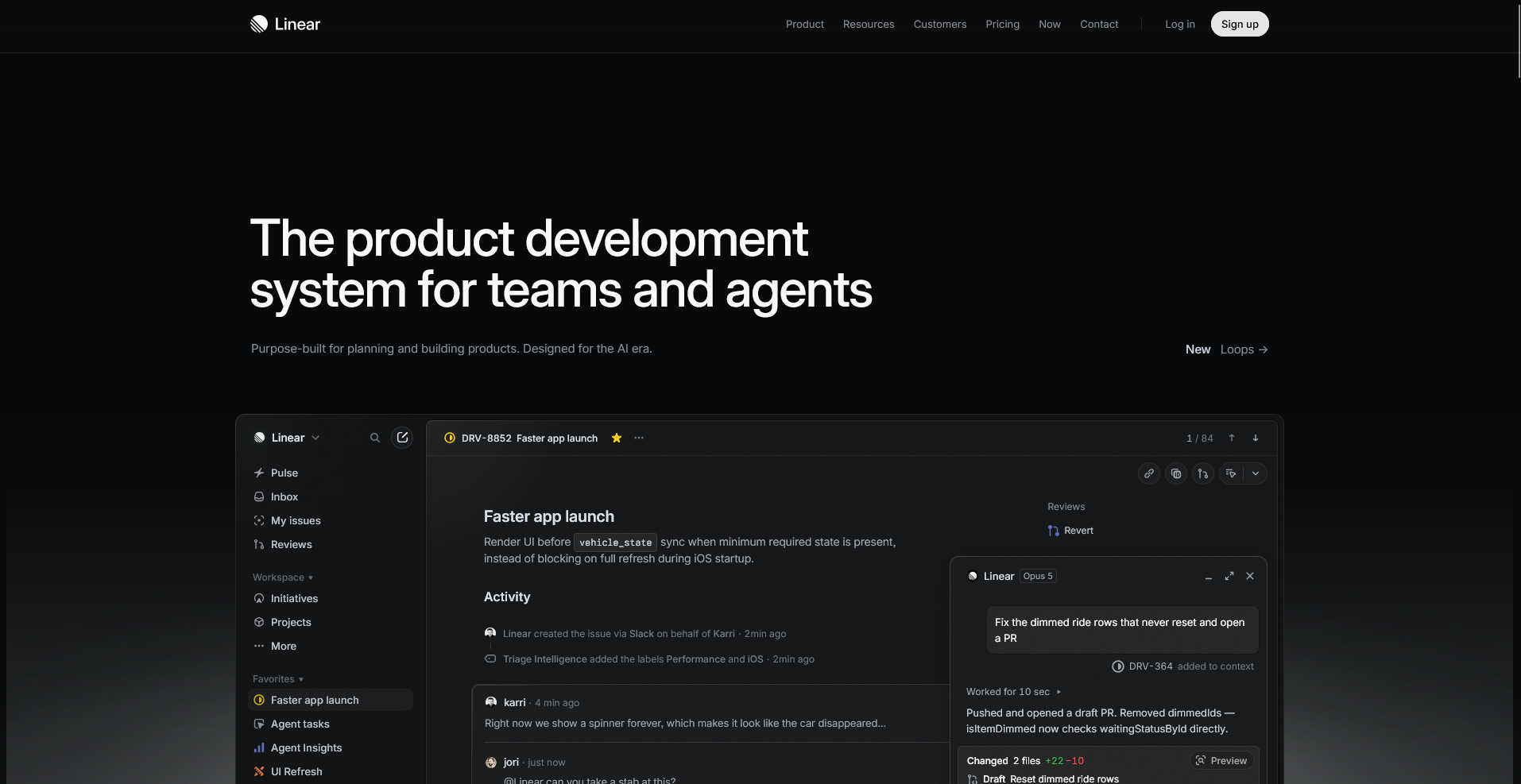
- What it does: Linear is a project-tracking tool built around issues and cycles.
- Best for: Teams that want data requests tracked as tickets with a clear status and owner.
Linear turns a data request into a ticket with a status and an owner, so I tested how that ticket moves once work actually starts on it.
I opened a pull request linked to a sample ticket, and it jumped from backlog to in progress on its own without me touching the status. The interface suits engineering workflows well, but a stakeholder outside the data team who isn't used to issue trackers can find it unfamiliar.
Key features
- Issues and cycles: Track a data request as a ticket with a clear status, owner, and timeline.
- GitHub integration: Link a ticket directly to the pull request that resolves it.
- Keyboard-driven workflow: Move through tickets quickly using keyboard shortcuts instead of clicking through menus.
Pros and cons
| ✅ Pros | ❌ Cons |
| Tracks a request from backlog to done with a clear owner. | Interface can feel unfamiliar to a stakeholder outside the data team. |
| Links directly to the GitHub pull request that resolves it. | Built for engineering-style tracking, not general project management. |
| Keyboard-driven workflow moves quickly for technical teams. |
What users say
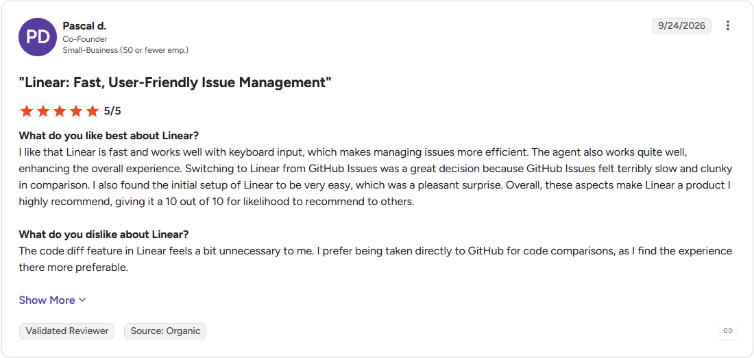
Pro: "I like that Linear is fast and works well with keyboard input, which makes managing issues more efficient." (Pascal D., G2)
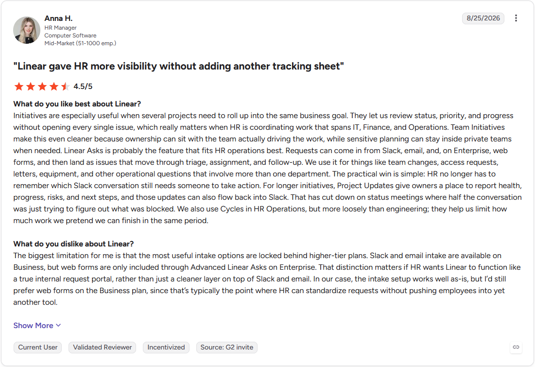
Con: "The biggest limitation for me is that the most useful intake options are locked behind higher-tier plans. Slack and email intake are available on Business, but web forms are only included through Advanced Linear Asks on Enterprise." (Anna H., G2)
Pricing
Linear starts at $10 per user per month.
Bottom line
Linear ties a data request directly to the GitHub pull request that resolves it. If your team wants that same clear ownership trail applied to the code itself, consider GitHub.
Governance and access: who can see which data
Governance means knowing who can see a piece of data and being able to prove that later if someone asks. This becomes serious once you're sharing customer data, personal details, or financial numbers, since a security team will ask exactly this before anyone adopts a new tool.
Docs and chat tools handle this poorly. Someone forwards a link, and three more teams now have your revenue numbers with no record of how they got it. Warehouses and shared-analysis platforms handle it better, since the permission travels with the data itself instead of with whatever file someone happens to share.
Check for these 5 things before you adopt any data collaboration tool:
- Role-based access: Permissions should tie to a person's role, following the role-based access control model, so someone sees only what their job needs.
- Row and field-level controls: The tool should be able to hide specific columns or rows inside a table, beyond just locking the whole thing.
- Audit trails: There should be a log of who accessed or changed data, and when.
- SSO and provisioning: One central identity system should grant and revoke access.
- Sharing scope: There should be a clear line between workspace sharing and a public link, so nothing leaks by accident.
Check for these governance features before you standardize on a tool if your team handles regulated data. Adding access control after a team already shares data freely is painful, and it's usually the reason a tool gets replaced.
💡 Tip: Pair your stack with dedicated data governance tools when governance needs to be a serious, ongoing focus.
Free and free-tier data collaboration tools
You can build a real starter stack for $0, as long as you know where each free tier runs out:
- Julius: A free plan with daily credits, enough to test shared analysis on your own data before paying.
- Hex: A free Community plan capped at 1 editor and 3 projects.
- Deepnote: A free plan capped at 3 editors and 5 projects.
- Notion: A free plan generous enough for a small team to build out shared docs and databases before hitting a limit.
- Google Sheets: Free with a personal Google account, capped by the usual spreadsheet limits.
- Baserow: Free and open-source if you self-host it, which trades money for maintenance.
- Slack: A free plan with a limited message history.
- GitHub: A free plan that covers most small-team basics, with some collaboration features reserved for paid tiers.
The pattern with every free plan holds steady. Each one works as a real starting point, but none of them work as a forever home. Seat caps, history limits, and compute ceilings are where teams eventually upgrade.
How to choose the right data collaboration tools for your team
The right tool depends on your role and the specific gap in your stack. A long feature list won't tell you that, the checklist below breaks it down by role instead:
- Analysts: Pair a shared-analysis workspace like Julius or Hex with a chat tool like Slack for quick questions. Send a live link to an analysis so the number stays current.
- Data scientists: Clean the data first with a dedicated data cleaning tool, then use a shared notebook tool for exploration, and move production code into a version-control tool once an analysis is ready to ship. The notebook handles the messy middle, and version control handles what other people depend on.
- PMs: Run a dashboard tool like Tableau or Looker for the ongoing view stakeholders check daily, and pair it with a shared-analysis tool for the one-off questions a fixed dashboard can't answer.
- Leadership: Stick mostly to dashboards, backed by an analysis someone else can open and rerun if a number gets questioned. A number nobody can rerun isn't worth much in a room full of decision-makers.
Skip adding another tool if you already have this job covered and the new one just overlaps. More tools rarely means better collaboration. It usually just means more places to lose the thread.
💡 Tip: If you're still choosing your reporting layer, our guide to the best BI tool can help you round out the stack.
Where Julius fits in your data collaboration stack
Picking data collaboration tools usually means choosing between something built for shared coordination and something built for shared analysis. A tool like Slack or Notion keeps a team talking, while Tableau or Looker keeps a team looking at the same dashboard.
If your team wants the analysis itself to live in one shared place, Julius is worth trying first. Its natural-language interface turns a data question into a shared analysis anyone on the team can open, check, and rerun.
Here's how Julius helps:
- Start before you've gathered a file: Ask a question, and Julius can pull public data from the web or live financial data on over 17,000 companies through its Financial Datasets integration, so a shared analysis can begin before anyone has a dataset ready.
- Work from one connected source: Connect a database like Postgres or Snowflake, or upload a shared spreadsheet, and the whole team pulls from the same data instead of passing files back and forth.
- Keep every analysis reproducible: Julius runs the underlying code before it answers a question, so a teammate can open that same analysis and rerun it. A static export can't offer that.
See what a shared analysis looks like with your own data. Try Julius for free today.
Frequently asked questions
What are the 4 types of collaboration tools?
For a data team, collaboration tools generally fall into four groups: communication tools (Slack, Microsoft Teams), coordination and project tools (Linear), knowledge and documentation tools (Notion, Confluence), and shared data or analysis tools (Julius, Hex, Google Sheets). Data teams often add that last analysis layer on top of the first three.
What are examples of data collaboration tools?
Examples of data collaboration tools include Julius, Hex, and Deepnote for shared analysis, Notion and Confluence for documentation, Airtable, Baserow, and Google Sheets for shared data, Tableau and Looker for BI, GitHub for code, and Slack and Microsoft Teams for communication. Many teams run several together.
What is the difference between data collaboration and data sharing?
Data sharing hands someone a static copy of data to use on their own, like emailing a spreadsheet. Data collaboration means working on the same live data together, with the context intact, so more than one person can analyze it, rerun it, and act on it.
Are there free data collaboration tools?
Yes, many data collaboration tools have free tiers. Julius, Google Sheets, Slack, GitHub, Notion, Deepnote, and Hex all offer free plans, and Baserow is free to self-host. Free tiers usually cap seats, history, or compute, so growing teams tend to upgrade.
What is the difference between a BI tool and a shared-analysis tool?
A BI tool distributes a finished dashboard, while a shared-analysis tool is where the analysis behind that dashboard gets built. Tableau and Looker fit the first job, showing what's happening. Julius and Hex fit the second, letting a team explore why and rerun the analysis behind it.