

A project presentation works best when the room believes your numbers. I've watched a few well-designed decks stall in the first round of questions because the presenter couldn't back up a figure on screen.
Here's how to structure a project presentation, build slides that hold attention, and get your data prep done before it becomes a scramble.
How to pick the right PowerPoint idea for your presentation
I've watched people spend an hour picking a font before they've even nailed down what the presentation is supposed to do. That's backward, and it shows in the final deck.
Before you touch a template, get clear on three things.
- Know your audience: A deck for your team looks different than one for a client or a room full of executives. The invite list tells you who's in the room, but it doesn't tell you who actually cares about what you're presenting.
- Pick one core message: If someone remembers only one slide, what should it say? I try to write that sentence down before I open PowerPoint at all. It keeps me from cramming five ideas into one deck.
- Match the idea to the purpose: A quarterly recap and a product pitch need different structures, even if they cover similar ground. The idea only works if it fits what you're trying to do.
Once those three are locked in, picking a layout or a concept gets a lot easier. At this point, you're filling in a shape you've already defined.
The concept is usually where I start, so let’s cover that first.
12 concept ideas
Every idea on this list does the same job: it gives the whole deck one idea to organize around. I usually land on mine once I know the story I'm trying to tell.
These are the concepts I reach for most:
- Storytelling arc: Setup, turning point, resolution. It's the oldest structure in the book, and it still works best for pitches. People usually stick around to see how the story ends.
- Problem and solution: Open with the problem, then walk straight into how you solve it. Sales and product decks live or die on this concept, and it's the one I reach for most.
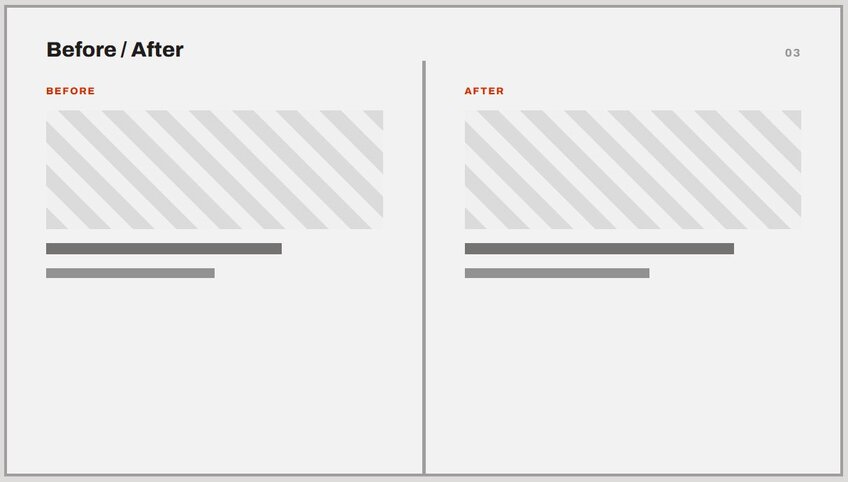
- Before and after: Pick a shift, whether that's a metric, a process, or a design, and frame the whole deck around it. Every slide gets an obvious reference point to build from.
- Journey or roadmap: Lay out your content as a path with stops along the way. Onboarding decks practically write themselves once I frame them this way.
- Comparison-driven: Build the entire deck around comparing two or more things, like tools, strategies, or time periods. Every single slide reinforces the same comparison.
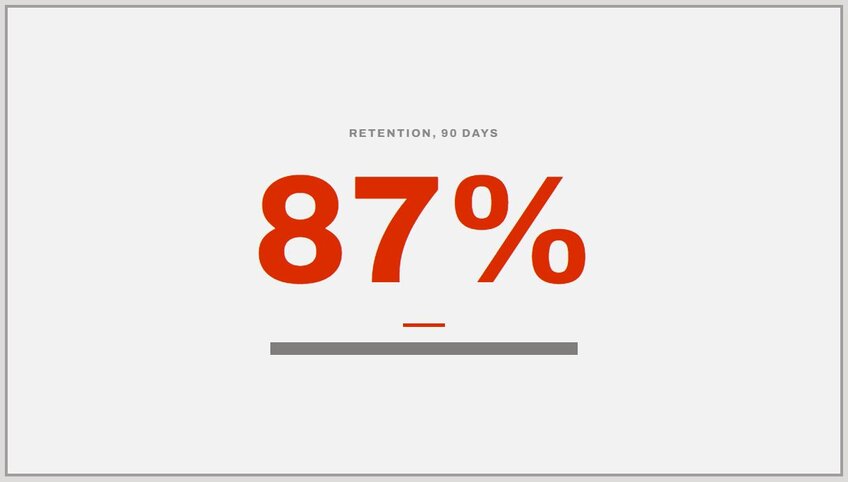
- Data-first concept: Let a handful of numbers drive the structure instead of building a narrative around them. I only pull this one out when the numbers are strong enough to carry the deck on their own.
- Case study format: Center the whole deck on one real example, then walk through what happened and what it means. A strong example carries this concept almost by itself.
- Single-metaphor concept: Pick one metaphor, like a race, a recipe, or a journey, and carry it through every slide. It turns an ordinary topic into something people remember. Don’t worry about being corny; worry more about being relatable.
- Interactive concept: Build in a moment where you ask the audience a question or run a quick poll. Even a small break like this keeps a long deck from losing people.
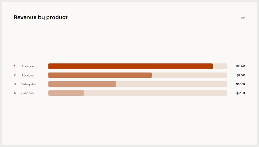
- Countdown or ranked list: Structure the deck as a ranked list, from least to most important or vice versa. This gives people a reason to keep watching to see what lands at number one.
- FAQ-style concept: Build the deck around answering the questions your audience is most likely to ask. It works especially well when you already know the objections you're facing.
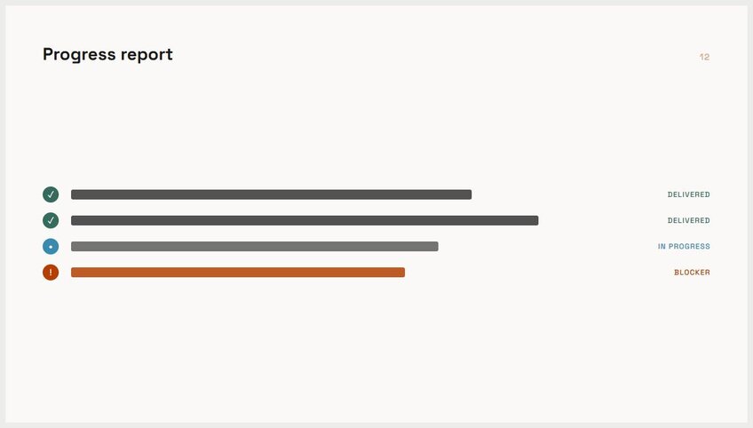
- Milestone concept: Frame the deck around a series of milestones hit (or ones still ahead). This one holds up well for progress updates where the timeline itself is the story.
12 design and layout ideas
The layout is where most decks either grab attention or start losing it. A strong layout does the work before anyone reads a single word.
Here's where I'd start:
13. Title slide with a single image:Skip the logo and bullet clutter. A strong photo behind your title does more work than a crowded cover slide, since it gives people one thing to look at instead of five things to skim.


 12 content and topic ideas for work presentations
Layouts and concepts only matter once you know what you're presenting. This section is about the topic itself, the stuff that fills the slides once the structure is in place.
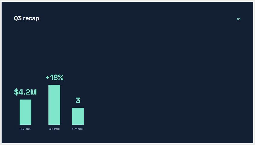
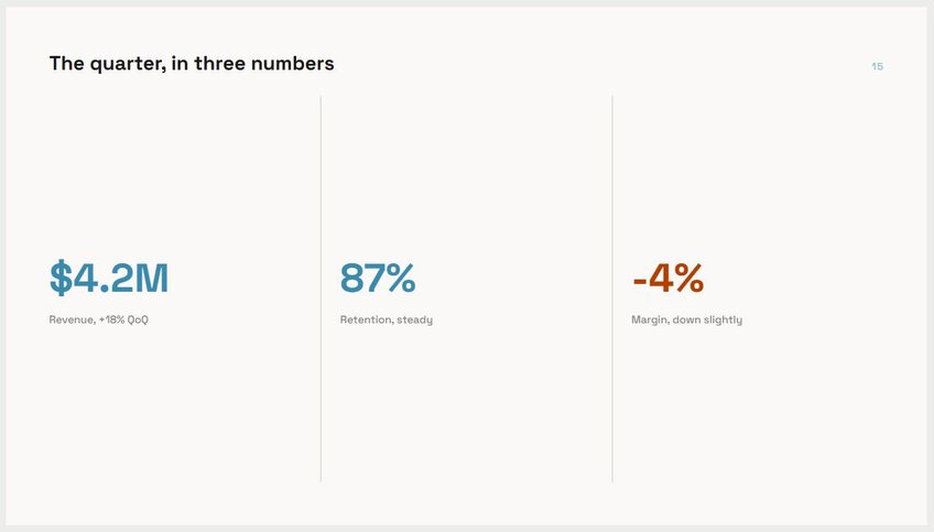
Here's what tends to come up on repeat in most workplaces: 25. Quarterly business recap: Revenue, growth, and a few key wins from the last three months. Keep it to the numbers that actually moved, and don’t include every metric your dashboard tracks.
 15 data-driven presentation ideas
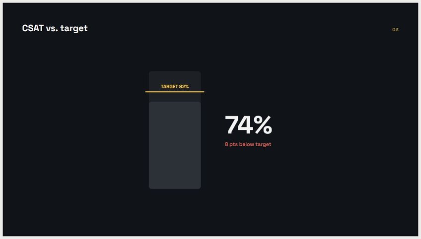
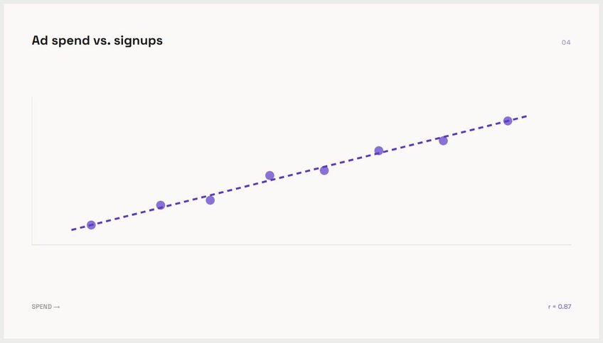
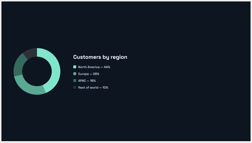
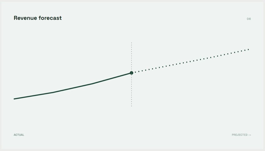
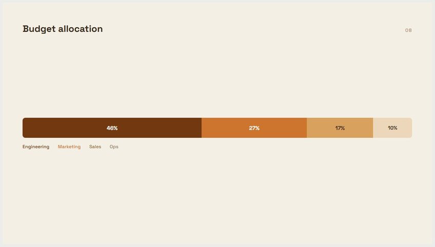
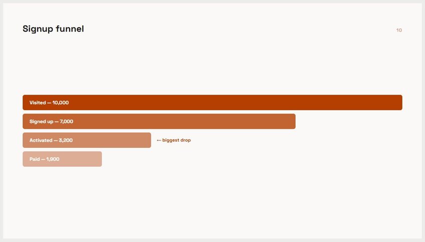
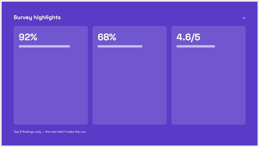
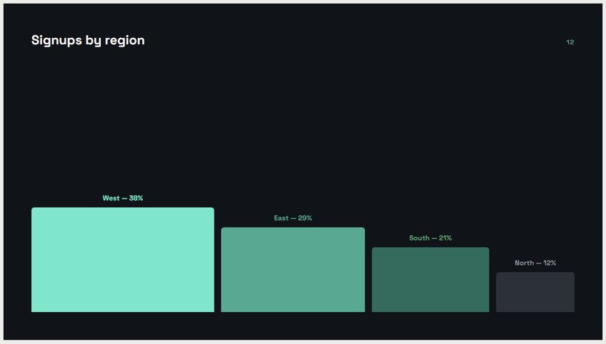
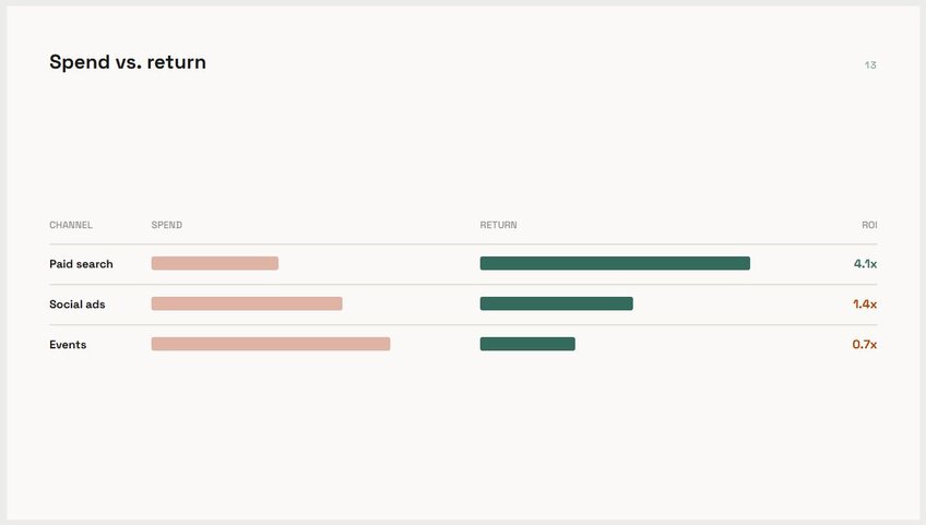
A slide built on real numbers tends to convince people faster than one built on opinion. The hard part is usually finding the right data and turning it into something a slide can show.
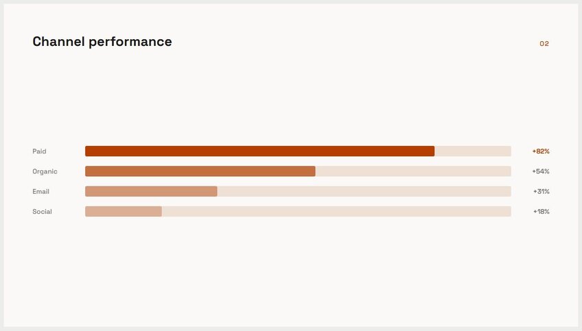
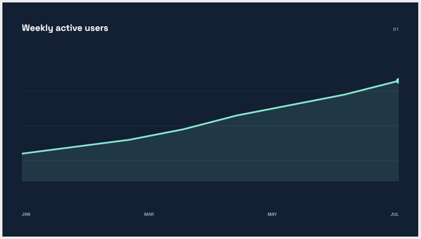
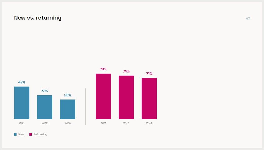
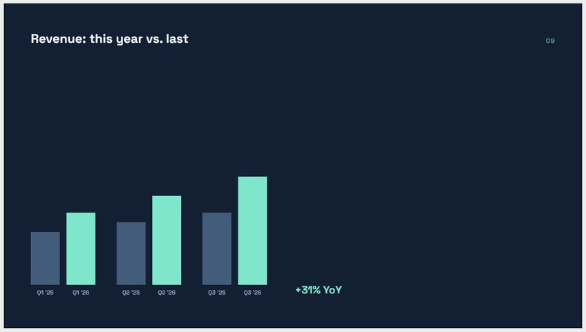
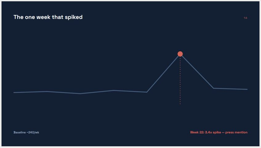
Here are the data-driven slides I use most: 37. Trend-over-time chart: Show a metric moving across weeks, months, or years. This works anytime "up" or "down" is the actual point you're making.
 From idea to deck, without the busywork
Good PowerPoint ideas built on numbers still need the numbers turned into a chart, and that's where most afternoons get lost in spreadsheets. Julius is an AI-powered data analysis platform that handles that part, then carries the finished analysis straight into a deck.
Here's how Julius helps with the ideas on this list:
- Built-in presentation maker: Skip the tool switching. Once your chart is ready, Julius can carry it straight into a finished slide, which covers most of the data-driven ideas above in one step.
- Chart types built right in: Bar charts, distributions, trend lines, whatever the slide calls for. Julius builds it on the spot, so there's no separate design tool in the mix.
- Public and financial data search: Need numbers for a ranked comparison or benchmark slide? Julius can pull them from the open web or tap into financial data for over 17,000 companies through its Financial Datasets integration, so you're not stuck hunting for a dataset before you can even start.
- Direct connections to your existing tools: PostgreSQL, Snowflake, BigQuery, Google Ads, and more all connect directly. Prefer to work from a spreadsheet instead? CSV and Excel uploads work too.
- Faster with every question: Julius picks up on your database's structure and relationships the more you use it, so building your next trend or comparison slide takes less digging than the last one did.
Ready to turn your next data-driven idea into a finished slide? Try Julius for free today.
Frequently asked questions
What makes a good PowerPoint idea?
A good PowerPoint idea pairs a clear layout with a strong concept and numbers to back up the point. The layout gives the deck structure, the concept ties every slide to one theme, and the data gives the audience a reason to trust it. Ideas that skip the data tend to rely on opinion instead of proof.
How do you make a presentation idea feel less generic?
You can make a presentation idea feel less generic by committing to a specific concept, such as a before-and-after shift, a case study, or a ranked comparison. Carry that one concept through every slide in the deck and don’t borrow a generic template. Generic decks usually mix several ideas at once instead of committing to one.
What's a good way to include data in a presentation?
A good way to include data in a presentation is to build a slide around one clear chart type, like a trend line, a ranked bar chart, or a benchmark comparison. Each chart type answers a different question, so pick the one that matches the point you're making. A single strong chart beats a slide full of numbers with no visual structure.
How many slides should a presentation have?
Most presentations work best between 10 and 20 slides, depending on the topic and audience. A quarterly recap or team update can run shorter, while a full pitch deck often needs more room to build a case. The right number depends on how many distinct points the presentation needs to make, not a fixed rule.