

The best tools for MongoDB data visualization can save your team hours of manual data wrangling and reveal insights your stakeholders can read. After testing more than a dozen options, these are the five that deliver for MongoDB workflows in 2026.
5 Best MongoDB data visualization tools: Quick comparison
| 💻 Tool | 🎯 Best for | 🔥 Starting price (billed annually) | ⚡ Strengths |
|---|---|---|---|
| MongoDB Atlas Charts | Native MongoDB dashboard building | Usage-based pricing | No-ETL setup, nested document support, embedded analytics, and auto-refresh dashboards |
| Tableau | Enterprise-scale BI on MongoDB data | $75/month for a Creator license | Drag-and-drop dashboards, MongoDB BI Connector support, and broad data source blending |
| Studio 3T | Developer-focused MongoDB data exploration | $499/user/year | Visual query builder, aggregation pipeline editor, and table view for document data |
| Knowi | MongoDB-native business intelligence | $20,000/year, includes 5 users | Native Atlas integration, nested object support, blended data sources, and embedded dashboards |
| Looker | BI on warehoused MongoDB data | Custom pricing | LookML modeling, governed metrics, and deep integration with BigQuery and Snowflake |
How I researched and tested these MongoDB data visualization tools
I tested each tool by connecting or importing MongoDB data and working through common visualization tasks like building dashboards, querying nested documents, and sharing charts with non-technical stakeholders. For tools that don't offer direct access, I reviewed documentation, walkthroughs, and verified user reviews.
Here's what I considered:
Native MongoDB support: Whether the tool connects directly to MongoDB Atlas or requires an additional ETL step, business intelligence (BI) connector, or data warehouse in between.
Document model handling: How well each tool handles nested objects and arrays, which are common in MongoDB collections and often break standard BI tools.
Ease of use: How quickly you can go from a data connection to a readable chart without significant setup or technical knowledge.
Audience fit: Whether the output is built for developers exploring data, analysts building reports, or business stakeholders reading dashboards.
Pricing transparency: How clearly each tool communicates its cost relative to what you actually get at each tier.
From testing, I found that the tools that performed best were the ones that matched their MongoDB integration depth to the audience they were actually built for.
What tools work best for MongoDB data visualization? 5 top options
1. MongoDB Atlas Charts: Best for native MongoDB dashboard building
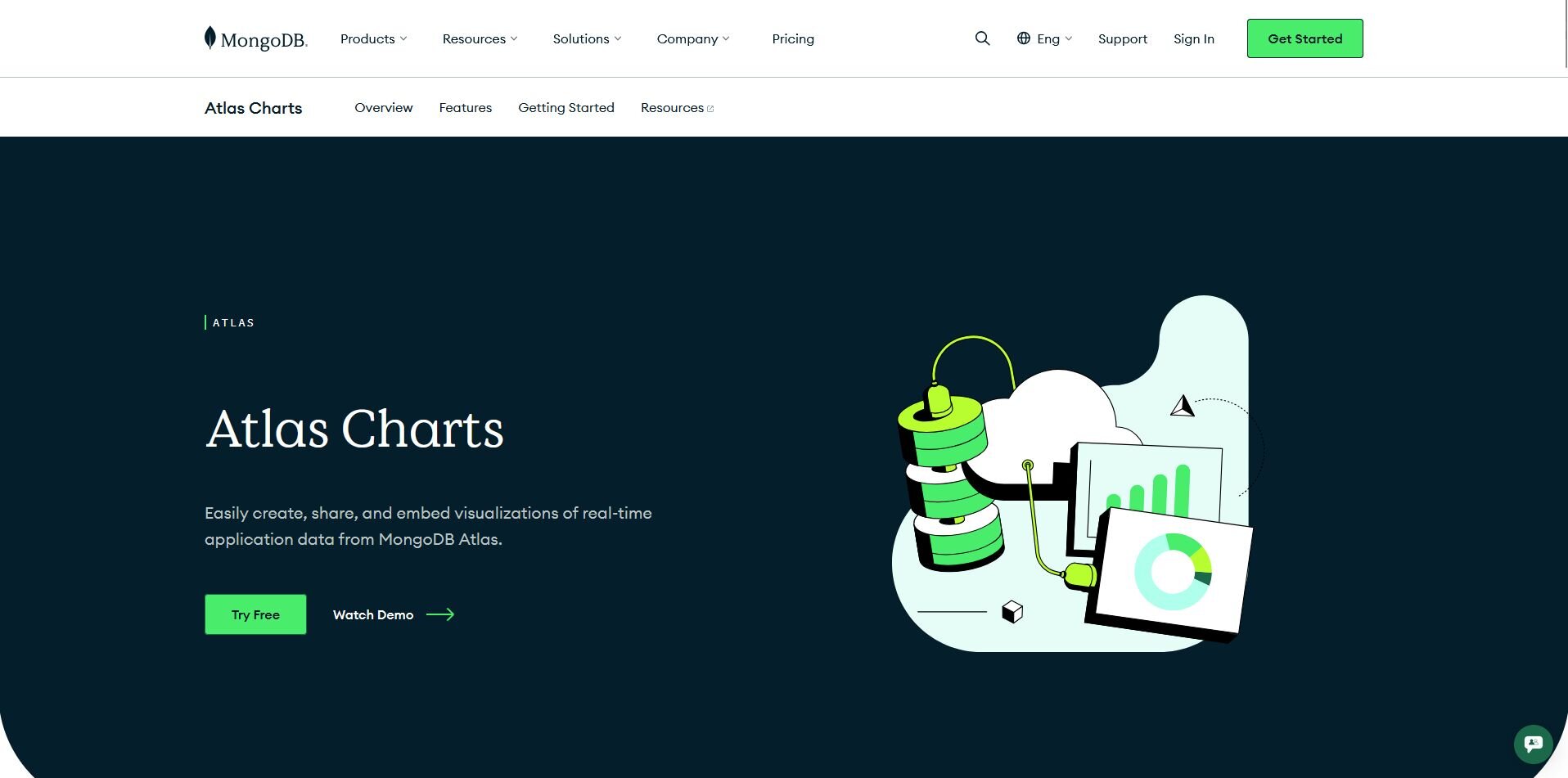
What it does: MongoDB Atlas Charts is a built-in visualization tool for MongoDB Atlas that lets you build interactive dashboards and charts directly on your collections without moving or transforming your data.
Best for: MongoDB Atlas users who need to build and share dashboards directly on live collections, including nested documents and arrays, without an ETL step.
I connected a sample Atlas project to test how quickly you can go from a raw collection to a working dashboard, and the process took minutes with no ETL or schema prep required. Natural Language Mode lets you describe a chart in plain English instead of configuring axes manually. Each chart pulls from a single collection only, so cross-collection dashboards require layering multiple charts separately.
Key features
Native document model support: Build charts directly on MongoDB collections, including nested objects and arrays, without flattening your schema or setting up an ETL process first.
Natural Language Mode: Describe the chart you want in plain English and Atlas Charts generates it from your connected Atlas data source.
Embedded analytics: Embed charts and dashboards into any application using an iframe for quick setup or the Atlas Charts SDK for greater control over styling and interactivity.
| ✅ Pros | ❌ Cons |
|---|---|
| No ETL or schema transformation needed to start visualizing Atlas data | Each chart maps to a single collection, so cross-collection dashboards require building and layering multiple charts |
| Auto-refresh keeps dashboards current without manual updates | Only works with MongoDB Atlas, so self-managed MongoDB deployments aren't supported |
| Free for all Atlas users, with premium features on paid plans |
What users say
Pro: "Automated scaling, backups, monitoring, and performance alerts make it incredibly easy to maintain clusters without dedicating a team to infrastructure. Added to that, the UI is intuitive, queries run fast and features like Atlas Search, Charts, and built-in security controls help ship features quickly." - Verified User in Renewables & Environment, G2
Con: "The dashboard can be a bit overwhelming if you don't have a working knowledge of cloud databases. There are areas such as clusters, metrics, networking configuration, backup, and security. I had to frequently refer to the documentation to understand which specific configuration was needed to change. The error messages did not give much away, so it ended up being more troubleshooting configuration than the backend." - Umesh Chandran Y., G2
Pricing
MongoDB Atlas Charts is available on usage-based pricing.
Bottom line
Atlas Charts removes the setup overhead that most visualization tools add between MongoDB and a working dashboard. If you need to blend MongoDB data with other sources or build reports for a broader BI stack, Knowi might be a better fit.
2. Tableau: Best for enterprise-scale BI on MongoDB data
What it does: Tableau is an enterprise BI platform that lets you build interactive dashboards and reports by connecting to a wide range of data sources, including MongoDB via the MongoDB SQL Interface Connector.
Best for: Enterprise teams that already use Tableau across multiple data sources and want to add MongoDB to their existing dashboard environment.
I set up a Tableau connection to MongoDB to test how it handles document-based data, and the drag-and-drop interface makes building dashboards straightforward once connected. Setup requires the MongoDB SQL Interface Connector, which adds technical overhead compared to a native tool, and the relational table format means nested arrays don't always translate cleanly without extra data prep.
Key features
MongoDB SQL Interface Connector: Connect Tableau to MongoDB Atlas by exposing your collections as relational tables through a JDBC driver, with no need for the deprecated MongoDB BI Connector.
Cross-source data blending: Combine MongoDB data with other connected sources like Snowflake, Google Sheets, or Salesforce in a single dashboard without duplicating data.
Drag-and-drop dashboard builder: Build and arrange charts, filters, and summary cards visually without writing queries or configuring chart settings manually.
| ✅ Pros | ❌ Cons |
|---|---|
| Familiar interface for teams already using Tableau across other data sources | Requires MongoDB SQL Interface Connector setup before you can connect, adding technical overhead |
| Cross-source blending lets you combine MongoDB with other datasets in one dashboard | Document structure gets flattened into relational tables, so nested arrays may need extra prep |
| Wide range of chart types and dashboard layouts for stakeholder-facing reporting |
What users say
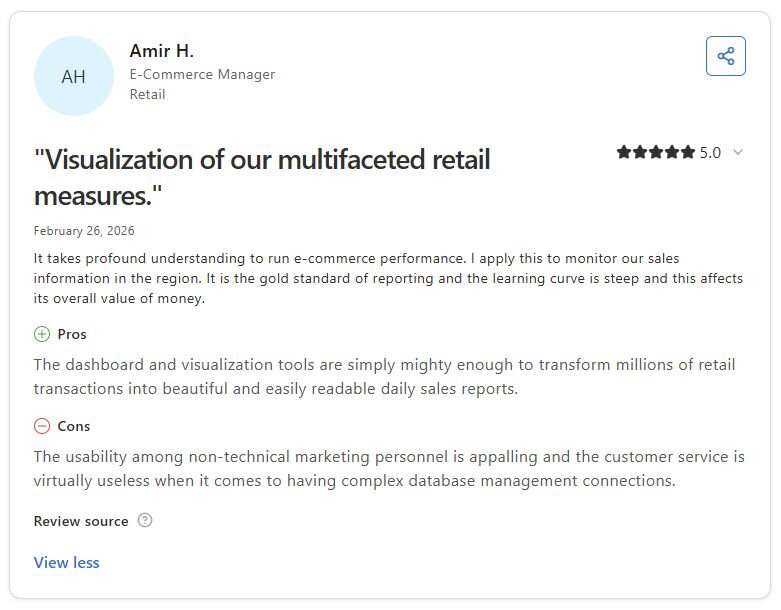
Pro: “The dashboard and visualization tools are simply mighty enough to transform millions of retail transactions into beautiful and easily readable daily sales reports.” - Amir H., Capterra
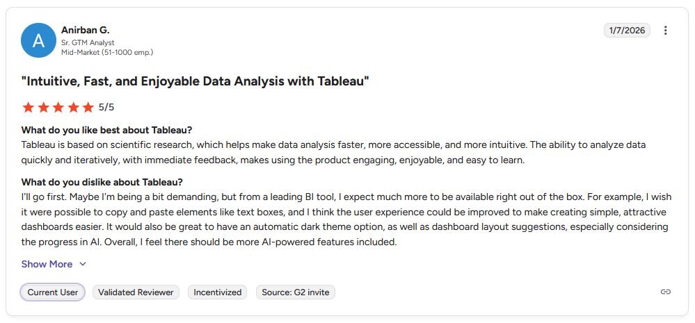
Con: “I wish it were possible to copy and paste elements like text boxes, and I think the user experience could be improved to make creating simple, attractive dashboards easier. … Overall, I feel there should be more AI-powered features included.” - Anirban G., G2
Pricing
Tableau starts at $75 per month for a Creator license.
Bottom line
Tableau earns its place for teams that need MongoDB as one input among many rather than their primary data source. If you want a developer-focused tool for exploring and querying MongoDB collections visually, Studio 3T might be a better fit.
3. Studio 3T: Best for developer-focused MongoDB data exploration
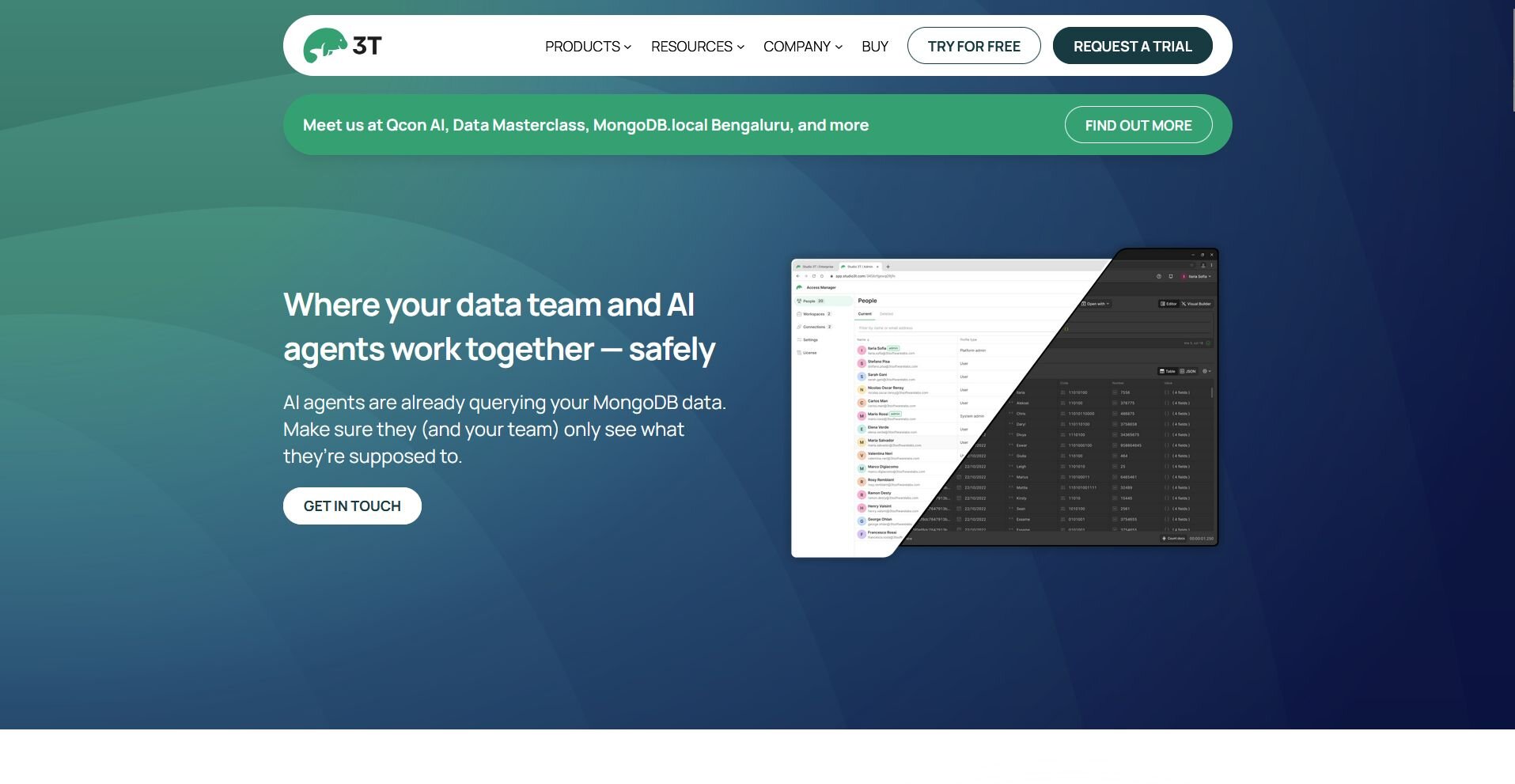
What it does: Studio 3T is a MongoDB GUI that lets developers and analysts query, explore, and manage MongoDB collections through a visual interface, including a query builder, aggregation pipeline editor, and table view for document data.
Best for: Developers and data analysts who need to explore, query, and validate MongoDB collections visually rather than build stakeholder-facing dashboards.
I built a series of aggregation pipelines in Studio 3T to test how it handles complex MongoDB queries, and the visual pipeline editor makes it easier to build and debug each stage without writing code manually. It's built for exploration and querying rather than dashboard publishing, so if your goal is shareable, auto-refreshing reports for business stakeholders, you may need a different tool.
Key features
Visual query builder: Build MongoDB queries by selecting filters and conditions through a GUI instead of writing raw query syntax manually.
Aggregation pipeline editor: Construct and debug aggregation pipelines stage by stage, with a visual output preview at each step.
Multi-format document view: Switch between JSON, tree, and table views for any collection to validate data structure and spot inconsistencies faster.
| ✅ Pros | ❌ Cons |
|---|---|
| Visual pipeline editor makes complex aggregations easier to build and debug | Not designed for stakeholder-facing dashboards or scheduled reporting |
| Table view speeds up data validation compared to reading raw JSON | Startup time can feel slow when working with larger collections |
| Import and export support for CSV, JSON, and SQL aids data sharing and testing |
What users say
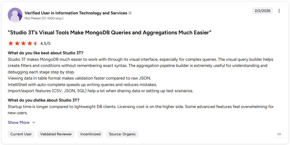
Pro: "The visual query builder helps create filters and conditions without remembering exact syntax. The aggregation pipeline builder is extremely useful for understanding and debugging each stage step by step. ... Viewing data in table format makes validation faster compared to raw JSON." - Verified User in Information Technology and Services, G2
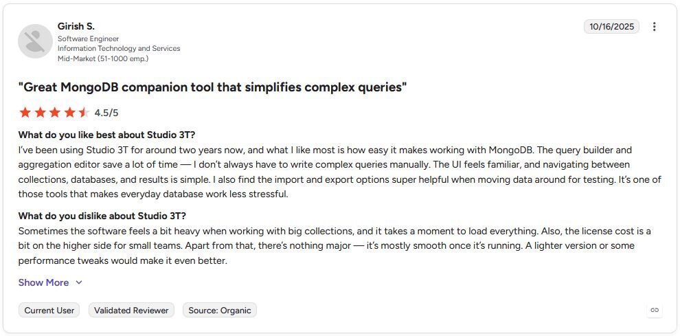
Con: "Sometimes the software feels a bit heavy when working with big collections, and it takes a moment to load everything. Also, the license cost is a bit on the higher side for small teams. Apart from that, there's nothing major - it's mostly smooth once it's running. A lighter version or some performance tweaks would make it even better." - Girish S., G2
Pricing
Studio 3T starts at $499 per user per year.
Bottom line
Studio 3T's aggregation pipeline editor is one of the more practical tools for developers who need to understand and debug complex MongoDB queries before they hit production. If you need to combine MongoDB data with other enterprise sources like Snowflake or BigQuery in a single governed dashboard, Tableau might be a better fit.
4. Knowi: Best for MongoDB-native business intelligence
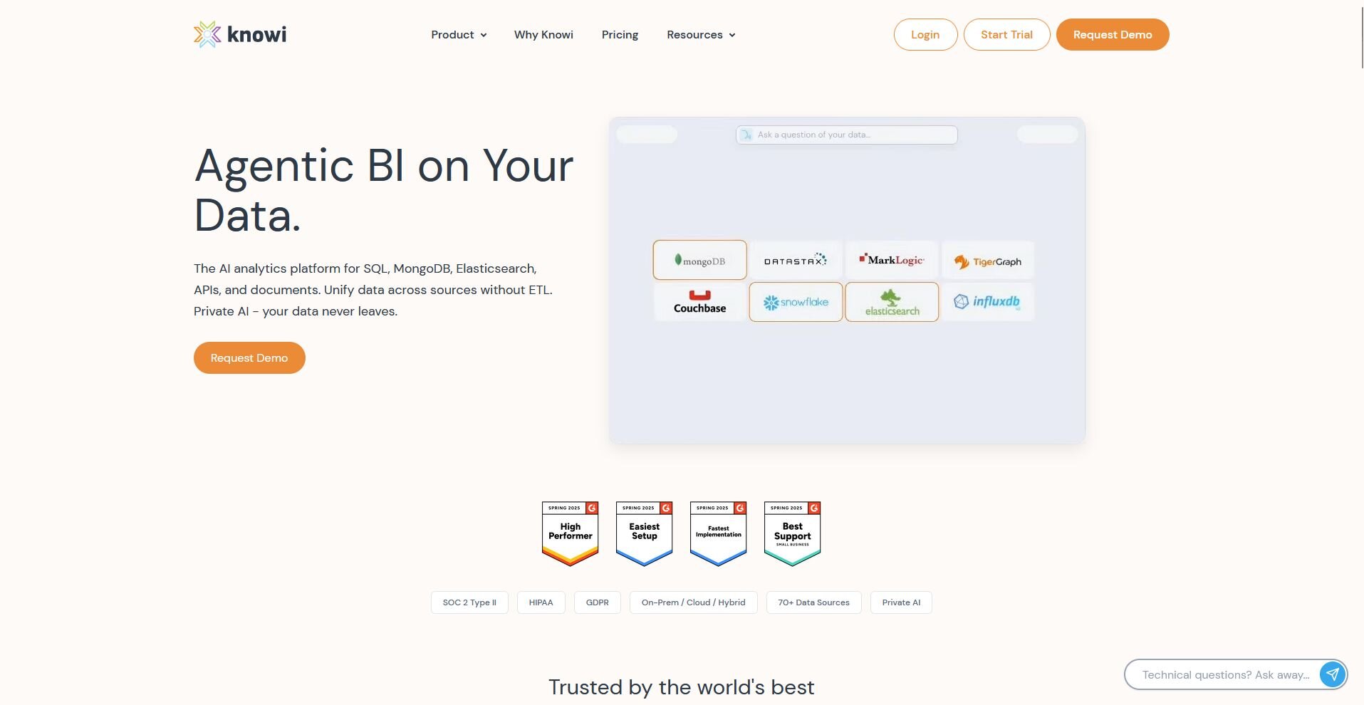
What it does: Knowi is a BI platform with a native MongoDB Atlas integration that lets you build dashboards, reports, and alerts directly on your MongoDB data, including nested objects and arrays, without a SQL layer in between.
Best for: Business and analytics teams that need a BI platform with a direct MongoDB connection and want to build dashboards for non-technical stakeholders without routing data through a warehouse first.
I explored Knowi's dashboard builder to test how it handles MongoDB's document structure, and the native Atlas integration lets you query nested objects and arrays directly without restructuring your data first. The blended data source feature lets you combine MongoDB with SQL databases and Google Analytics in a single report, but advanced query configurations can take time to get right across complex datasets.
Key features
Native MongoDB Atlas integration: Connect directly to MongoDB Atlas and query nested objects and arrays without an ETL step or schema transformation.
Blended data sources: Combine MongoDB data with other sources like SQL databases, REST APIs, and Google Analytics in a single dashboard or report.
Embedded dashboards: Embed Knowi dashboards into external applications or client-facing portals using the embedding API.
| ✅ Pros | ❌ Cons |
|---|---|
| Native Atlas connection handles nested objects and arrays without schema flattening | Advanced query configuration has a steep learning curve for new users |
| Blended data sources let you combine MongoDB with SQL and API data in one report | Setup and API documentation can be sparse for less common integration types |
| Embedded dashboard support makes it viable for client-facing reporting |
What users say

Pro: "The dashboarding features are intuitive, making my data easy to consume, saving me a ton of time. ... Once the API setup and dashboard is running, it doesn't take much maintenance, and it's easy to share." - Jose D., G2
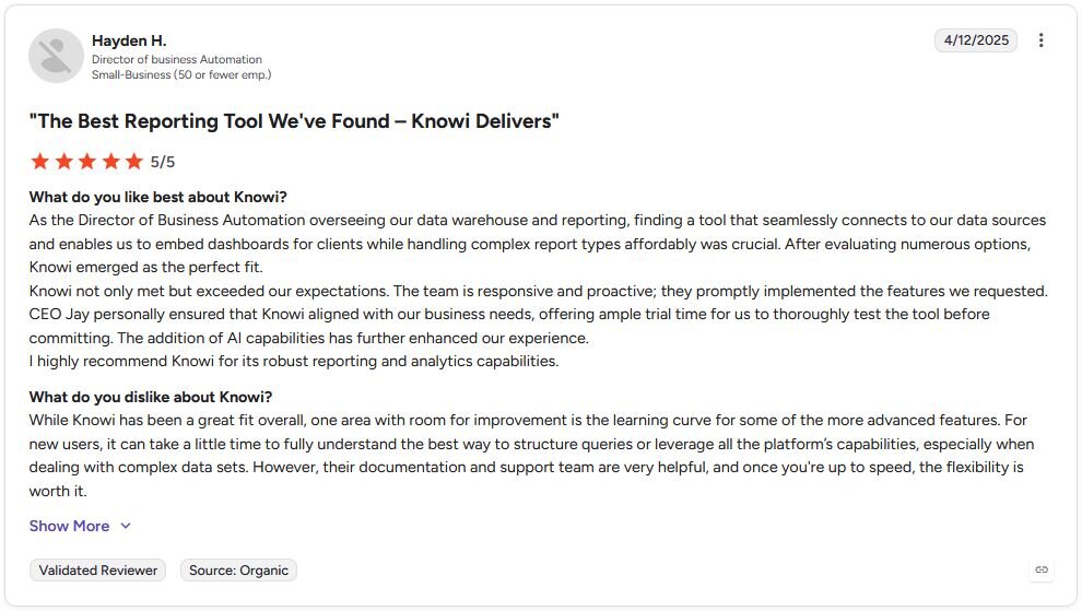
Con: "While Knowi has been a great fit overall, one area with room for improvement is the learning curve for some of the more advanced features. For new users, it can take a little time to fully understand the best way to structure queries or leverage all the platform's capabilities, especially when dealing with complex data sets." - Hayden H., G2
Pricing
Knowi starts at $20,000 per year for up to 5 users.
Bottom line
Knowi's native MongoDB support means you can query nested document structures directly without the SQL translation layer that most BI tools require. If you already warehouse your MongoDB data in BigQuery or Snowflake and need governed, scalable BI on top, Looker might be a better fit.
5. Looker: Best for BI on warehoused MongoDB data
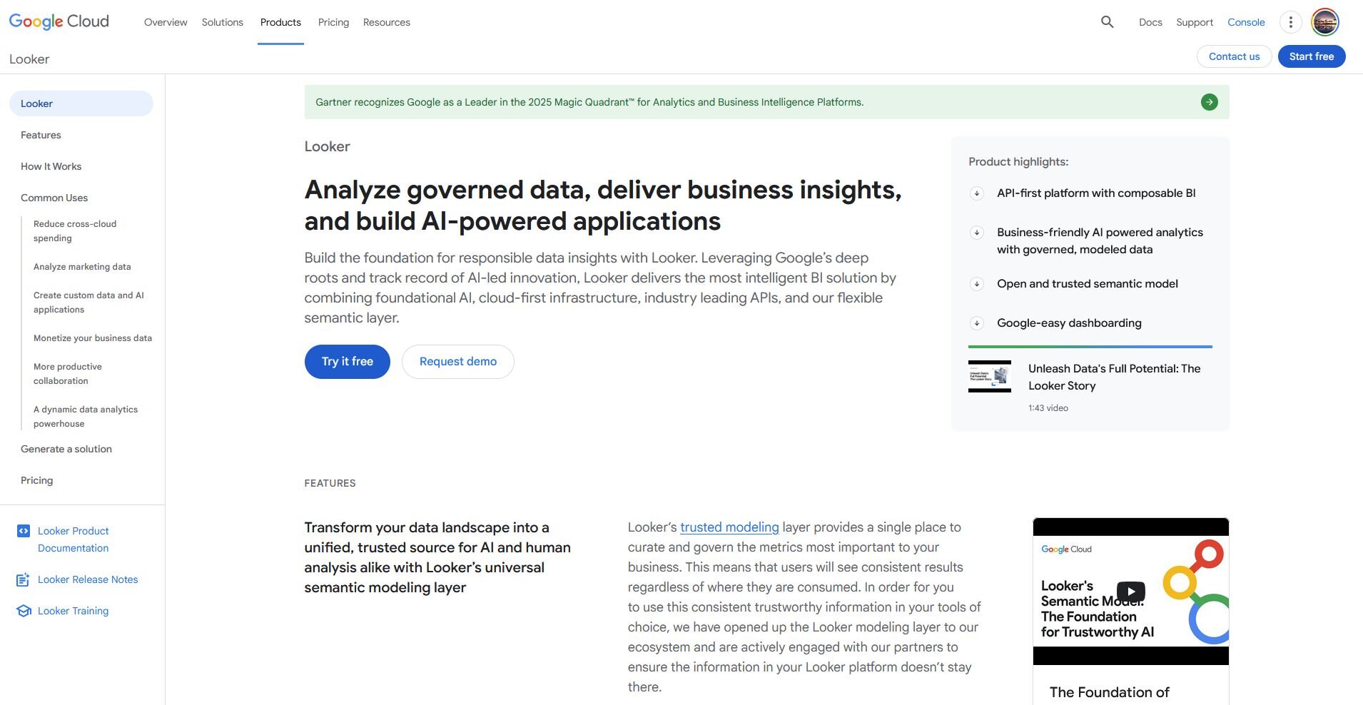
What it does: Looker is an enterprise BI platform that lets you build governed dashboards and reports on top of a SQL-compatible data warehouse, with deep integration with BigQuery, Snowflake, and other cloud data warehouses.
Best for: Data and analytics teams that already warehouse their MongoDB data in BigQuery or Snowflake and need a governed, scalable BI layer on top for organization-wide reporting.
I built a LookML model on top of a MongoDB-sourced BigQuery dataset to test how Looker handles warehoused data. The platform assumes your MongoDB data is already loaded into a SQL-compatible warehouse, which means it's not a tool you can pick up and connect to MongoDB directly.
But once your data is there, LookML lets you define metrics and business logic in one place so every team pulls consistent numbers, though getting the ETL pipeline in place first is a significant setup investment.
Key features
LookML modeling: Define metrics, relationships, and business logic in a central model so every dashboard and report across your organization pulls consistent numbers.
Warehouse-native connections: Connect directly to BigQuery, Snowflake, and other cloud data warehouses where your MongoDB data has been loaded and transformed.
Governed metrics layer: Set organization-wide definitions for key metrics so different teams can't pull conflicting numbers from the same underlying data.
| ✅ Pros | ❌ Cons |
|---|---|
| LookML modeling keeps metric definitions consistent across every team and dashboard | Requires an ETL pipeline to move MongoDB data into a warehouse before you can build anything |
| Deep BigQuery and Snowflake integration makes it a strong fit for warehouse-heavy stacks | LookML has a learning curve that typically requires a dedicated data engineer to set up and maintain |
| Governed metrics layer reduces inconsistencies across organization-wide reporting |
What users say
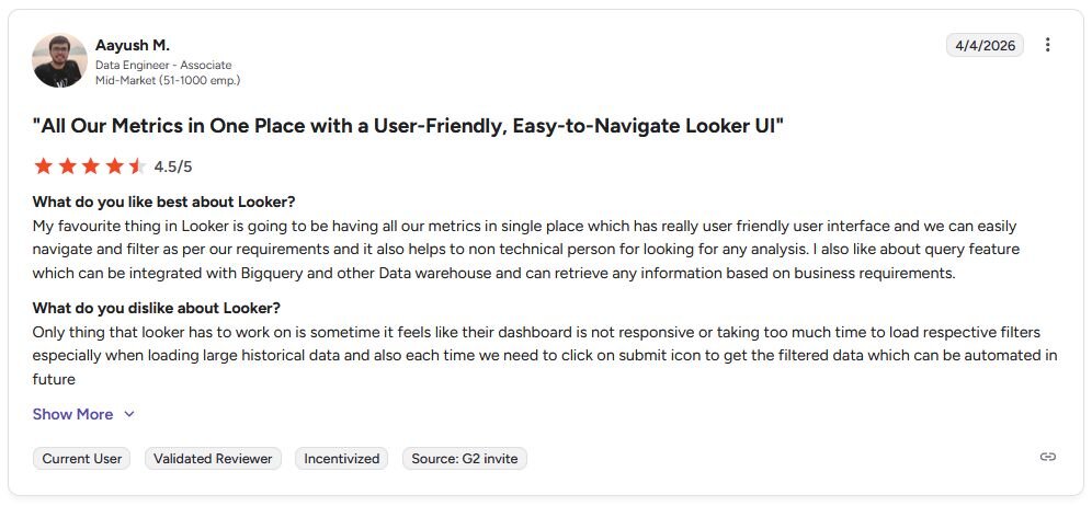
Pro: "My favourite thing in Looker is going to be having all our metrics in [a] single place, which has [a] really user-friendly user interface, and we can easily navigate and filter as per our requirements, and it also helps [a] non-technical person for looking for any analysis. [The] query feature…can be integrated with BigQuery and other data warehouses and can retrieve any information based on business requirements." - Aayush M., G2
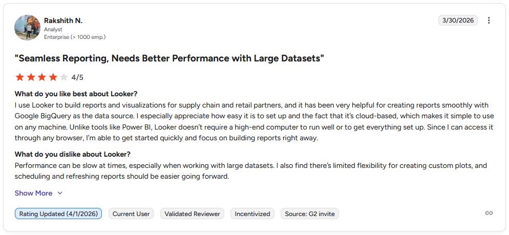
Con: "Performance can be slow at times, especially when working with large datasets. I also find there's limited flexibility for creating custom plots, and scheduling and refreshing reports should be easier going forward." - Rakshith N., G2
Pricing
Looker offers custom pricing.
Bottom line
Looker's governed metrics layer means every team across your organization pulls from the same definitions, which can reduce reporting inconsistencies at scale. If you need a BI platform that connects to MongoDB directly without a warehouse in between, MongoDB Atlas Charts might be a better fit.
Which MongoDB data visualization tool should you choose?
The right tool for MongoDB data visualization depends on how your data is structured, who needs to read the output, and how much setup your team can realistically take on.
Choose MongoDB Atlas Charts if you:
Already use MongoDB Atlas and want dashboards without moving or transforming your data
Need to visualize nested documents and arrays without flattening your schema first
Want to embed charts directly into an application or share them across your organization
Choose Tableau if you:
Need enterprise-scale dashboards that pull from MongoDB alongside other data sources
Have a team with existing Tableau experience and want to add MongoDB to your current setup
Can set up the MongoDB SQL Interface Connector (or a similar JDBC/ODBC driver) to expose your MongoDB data as relational tables
Choose Studio 3T if you:
Are a developer or data analyst who needs to explore and query MongoDB collections visually
Want a GUI that makes aggregation pipelines and complex queries easier to build and debug
Don't need stakeholder-facing dashboards and are focused on data exploration and validation
Choose Knowi if you:
Need a BI platform with a native MongoDB Atlas connection that handles nested objects out of the box
Want to blend MongoDB data with other sources and build dashboards for non-technical stakeholders
Need embedded dashboards or scheduled reports without routing data through a warehouse first
Choose Looker if you:
Already warehouse your MongoDB data in BigQuery or Snowflake and need governed, scalable BI on top
Need LookML modeling for consistent metrics across a large organization
Have a data engineering team that can manage the ETL layer between MongoDB and your warehouse
Skip this category entirely if you:
Are looking for a general-purpose database tool rather than a visualization platform
Need real-time operational dashboards directly from MongoDB without any setup or configuration
Want a single tool that covers every data need, since each option here is built for a specific use case or audience
Final verdict
The tools that work best for MongoDB data visualization depend on how close to your collections you need your dashboards to sit. MongoDB Atlas Charts and Knowi work directly with your data, Tableau and Looker require a SQL layer in between, and Studio 3T is built for developers exploring data rather than stakeholders reading dashboards.
Before you get to dashboards, you often need to explore your data, spot patterns, and figure out what's actually worth visualizing. If your team wants to ask questions about your data in plain English and build charts without writing SQL, Julius is worth trying first.
Here’s how Julius helps:
Data search: Type your question, and Julius can search for relevant public data or pull live financial market data for over 17,000 companies through its Financial Datasets integration, so you can start your analysis before you have a dataset ready.
Direct connections: Link databases like PostgreSQL, Snowflake, and BigQuery, or integrate with Google Ads and other business tools. You can also upload CSV or Excel files. Your analysis can reflect live data, so you’re less likely to rely on outdated spreadsheets.
Repeatable Notebooks: Save an analysis as a notebook and run it again with fresh data whenever you need. You can also schedule notebooks to send updated results to email or Slack.
For teams that want to explore and report on their data without writing code or filing requests with an analyst, Julius is worth considering.
Frequently asked questions
What tools work best for MongoDB data visualization?
MongoDB Atlas Charts and Knowi are strong picks for native MongoDB workflows, while Tableau and Looker tend to work better for teams with a SQL layer or data warehouse already in place. Studio 3T is better suited for developers who need to explore and query collections visually rather than build stakeholder-facing dashboards.
Can Tableau connect directly to MongoDB?
Yes, Tableau can connect to MongoDB through the MongoDB SQL Interface Connector (a .taco connector that uses a JDBC driver), which exposes your MongoDB data as relational tables for dashboard building. Note that the older MongoDB BI Connector is now deprecated. You still need an extra setup step since Tableau expects a SQL-compatible data source, so it's not a native connection out of the box.
Do I need to know SQL to visualize MongoDB data?
No, you don't need SQL if you use a tool with native MongoDB support like MongoDB Atlas Charts or Knowi, both of which work directly with your collections. Tools like Tableau and Looker require a SQL layer in between, so your choice of visualization tool determines whether SQL knowledge is necessary.