

AI reporting tools turn raw data into dashboards, charts, or full reports without hours of manual work.
I ran mock datasets through dozens of platforms and compared setup time, chart quality, and how well each handled a written summary. That testing narrowed the field down to the 16 worth your time.
Here's how each one stacks up, and which fits your workflow.
16 best AI reporting tools: TL;DR
- Tableau: Best for enterprise teams that need deep, interactive data visualization across multiple departments
- Power BI: Best for teams already working inside Microsoft 365 who want reporting built into Excel and Teams
- Domo: Best for operations teams that need real-time dashboards pulling from a wide range of connected data sources
- Julius: Best for marketers and analysts who want a written report with computed charts built from a spreadsheet or database in one step
- Whatagraph: Best for marketing agencies generating full client reports from a single text prompt
- Data Studio: Best for small teams and freelancers reporting on Google Ads, GA4, and Sheets data at no cost
- Zoho Analytics: Best for small and midsize businesses that want AI-assisted reporting without enterprise pricing
- ThoughtSpot: Best for teams that want to type a question and get a chart without building a dashboard first
- Qlik Sense: Best for analysts exploring relationships across multiple connected datasets
- Klipfolio: Best for semi-technical teams building custom KPI dashboards with their own formulas
- AgencyAnalytics: Best for marketing agencies tracking SEO and PPC performance across many clients
- DashThis: Best for small teams that want a template-based marketing dashboard without a learning curve
- ChatGPT: Best for quick, one-off summaries of data you paste directly into the chat
- Claude: Best for teams drafting long reports who want a single pass that summarizes large inputs without losing context
- Notion AI: Best for teams that already track projects in Notion and want reports drafted alongside existing docs
- Prezent: Best for enterprise teams turning data insights into branded, presentation-ready decks
How I researched and tested these AI reporting tools
I went through documentation, product walkthroughs, and user reviews for every platform on this list.
For the tools I had direct access to, I used mock sales and marketing datasets to build a dashboard from raw data, generate a written summary report, and set up a report to run on a recurring basis. Then, I checked how much manual cleanup those outputs needed before they were ready to share.
Here's what I considered:
- Dashboard clarity: How easy each tool made it to turn raw numbers into a chart or dashboard a non-analyst could read at a glance
- Report writing quality: Whether the written summary explained what the numbers meant, or just restated them
- Setup and data connections: How much manual work it took to move from a spreadsheet or database to a finished output
- Automation and scheduling: Whether a report could rerun on a recurring basis without rebuilding it from scratch
- Value at each price point: What the free or entry-level plan actually unlocked versus what required an upgrade
The clearest split I found was between tools that build a chart and stop there, and the handful that also write up what the chart actually means.
Top 16 AI reporting tools: quick comparison
| 💻 Tool | 🎯 Best for | 📊 Type | 🔥 Starting price (billed annually) | ⚡ Strengths |
| Tableau | Enterprise visualization and analytics | BI dashboard | $75/user/month for a Creator license | Deep visualizations, conversational analytics via Tableau Pulse and Tableau Agent, and strong governance |
| Power BI | Microsoft-ecosystem reporting | BI dashboard | $14/user/month | Natural language queries, Microsoft 365 integration, and AI narratives |
| Domo | Real-time operational dashboards | BI dashboard | Usage-based pricing | Real-time dashboards, a wide connector library, and mobile access |
| Julius | Analysis paired with a written report | Both | $16/month | Natural language analysis, computed reports, and scheduled runs |
| Whatagraph | Prompt-built agency reports | Report generator | $812/month | Prompt-generated reports, brand matching, and 55+ integrations |
| Data Studio | Free Google-data reporting | BI dashboard | Free | Free access, native Google integrations, and a template library |
| Zoho Analytics | Budget-friendly AI reporting | BI dashboard | $24/month (Cloud) | An AI report assistant, broad integrations, and low pricing |
| ThoughtSpot | Search-driven analytics | BI dashboard | $25/user/month | A search interface, anomaly detection, and embedded analytics |
| Qlik Sense | Associative data exploration | BI dashboard | $300/month for 10 users | An associative engine, AI-suggested correlations, and enterprise governance |
| Klipfolio | Custom KPI dashboards | BI dashboard | $120/month | Over 100 connectors, custom formulas, and flexible styling |
| AgencyAnalytics | Multi-client SEO reporting | BI dashboard | $20/client/month | Built-in SEO tools, white-label reports, and a conversational Ask AI feature |
| DashThis | Fast, template-based dashboards | BI dashboard | $44/month | 50+ templates, unlimited users, and fast setup |
| ChatGPT | Casual data summaries | Report generator | $8/month, billed monthly | Flexible prompts, fast turnaround, and no setup |
| Claude | Long-context drafting for lengthy reports | Report generator | $17/month | Long-context drafting, large-input summarization, and prompt-based revisions |
| Notion AI | Reports alongside Notion docs | Report generator | $20/member/month | Team collaboration, action-item extraction, and database context |
| Prezent | Branded presentation decks | Report generator | Custom pricing | Brand-controlled templates, audience-aware AI, and expert design services |
*Pricing correct as of September 2026. Confirm with vendor.
1. Tableau: Best for enterprise visualization and analytics
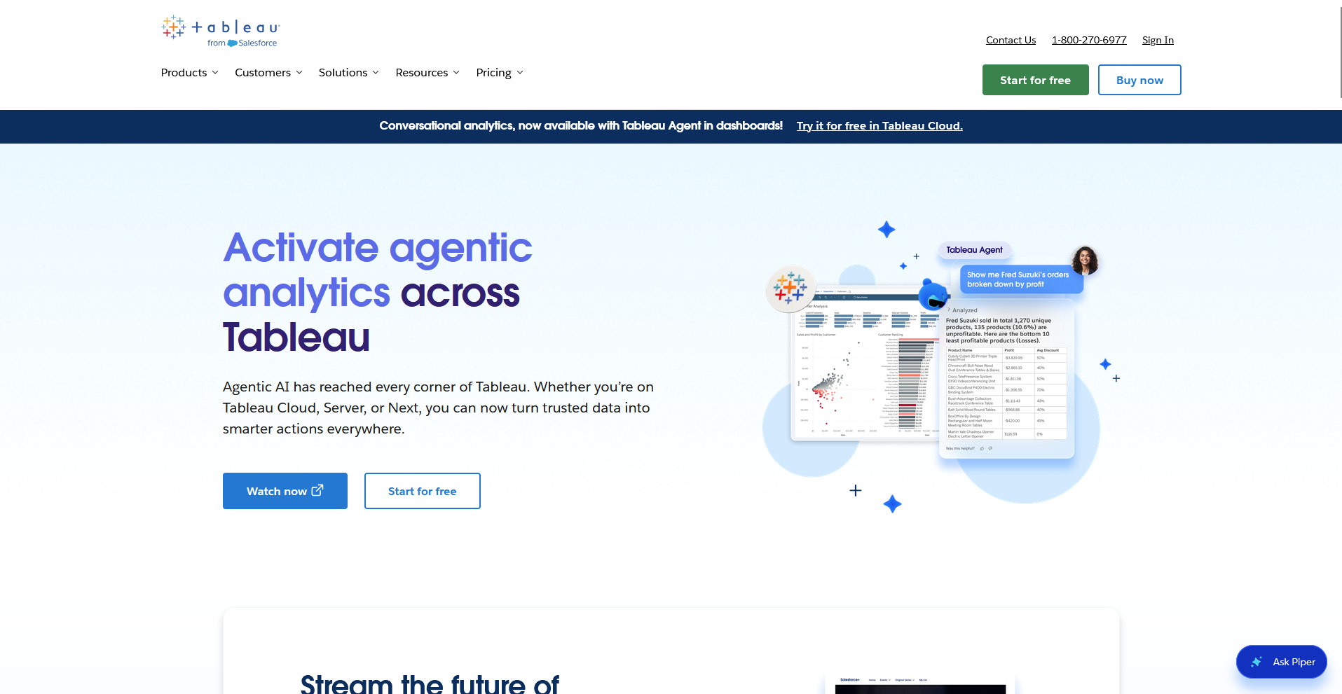
- Type: BI dashboard
- What it does: Tableau is a business intelligence platform that turns connected data into interactive dashboards and visual reports.
- Best for: Enterprise teams that need governed, interactive dashboards spanning many departments and data sources
To see how Tableau handled a reporting task, I connected a mock sales dataset and asked Tableau Agent to break down revenue by region in plain English.
It generated a chart for me in under a minute. Asking a follow-up question adjusted the same view, so I didn't have to rebuild it from scratch.
Building a calculated field to compare year-over-year growth meant writing a level-of-detail expression, and I had to check the help docs to get the syntax right.
Key features
- Tableau Agent: Generates charts and calculations from natural language questions typed into the interface.
- Data connectors: Connects to spreadsheets, cloud databases, and enterprise warehouses like Snowflake and BigQuery.
- Tableau Pulse: Sends automated metric alerts and plain-language explanations when tracked KPIs change.
Pros and cons
| ✅ Pros | ❌ Cons |
| Natural language querying through Tableau Agent speeds up building a first chart | Calculated fields and advanced filters have a real learning curve for new users |
| A wide range of data connectors covers spreadsheets and major cloud warehouses | Refreshing dashboards built on large datasets can take noticeably longer |
| Automated anomaly and trend alerts through Tableau Pulse flag changes without opening a dashboard |
What users say
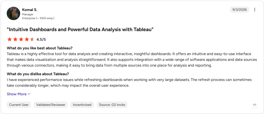
Pro: "Tableau is a highly effective tool for data analysis and creating interactive, insightful dashboards. It offers an intuitive and easy-to-use interface that makes data visualization and analysis straightforward." (Komal S., G2)
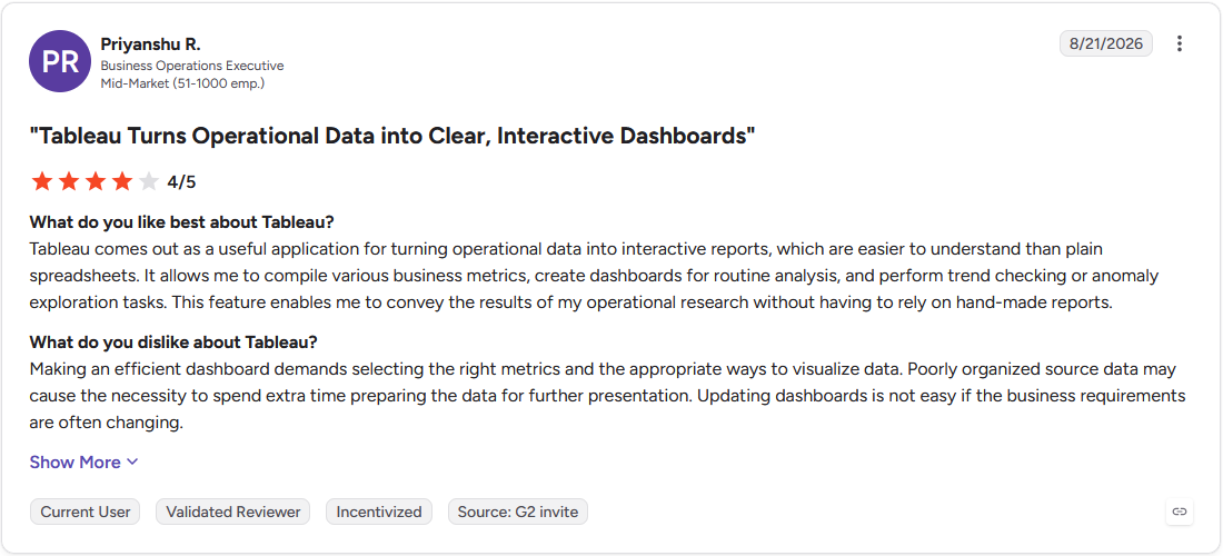
Con: "Making an efficient dashboard demands selecting the right metrics and the appropriate ways to visualize data. Poorly organized source data may cause the necessity to spend extra time preparing the data for further presentation. Updating dashboards is not easy if the business requirements are often changing." (Priyanshu R., G2)
Pricing
Tableau starts at $75 per user per month for a Creator license.
Bottom line
Tableau's MCP Server lets AI agents like Claude or ChatGPT query governed Tableau data directly, though the depth of access can depend on which Tableau product and plan you're using. If the learning curve here feels like more than you want to take on, Julius might be a better fit for building an analysis without touching calculated fields.
2. Power BI: Best for Microsoft-ecosystem reporting
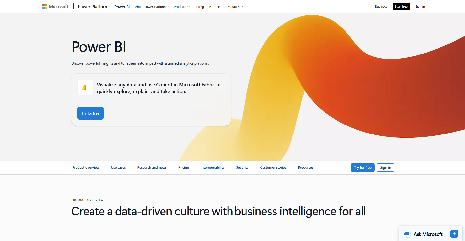
- Type: BI dashboard
- What it does: Power BI is a business analytics platform that turns connected data into reports and dashboards inside Microsoft's ecosystem.
- Best for: Teams already working in Excel, SharePoint, or Dynamics 365 who want reporting built into daily tools
Power BI leans hard on Microsoft integration, so I wanted to see how it handled data already sitting in Excel.
I dropped a mock sales spreadsheet in and asked Copilot to summarize monthly revenue trends. It wrote the DAX measure on its own and handed back a written summary next to the chart, saving me a trip to the formula bar.
A second filter for regional comparisons tripped it up, so I had to dig through Microsoft's documentation to fix the DAX syntax myself.
Key features
- Copilot integration: Generates DAX formulas, report summaries, and narrative explanations from natural language prompts.
- Key Influencers visual: Identifies which variables in a dataset most strongly affect a chosen metric.
- Microsoft 365 connectivity: Pulls data directly from Excel, SharePoint, and Dynamics 365 without manual export steps.
Pros and cons
| ✅ Pros | ❌ Cons |
| Native Excel integration makes it straightforward to pull in existing spreadsheets and datasets | DAX formulas and data modeling concepts have a steep learning curve for beginners |
| Copilot-generated DAX formulas cut down on manually writing complex measures | The interface gets harder to navigate with large datasets or many visualizations |
| Key Influencers surfaces which variables actually drive a metric without manual segmentation |
What users say
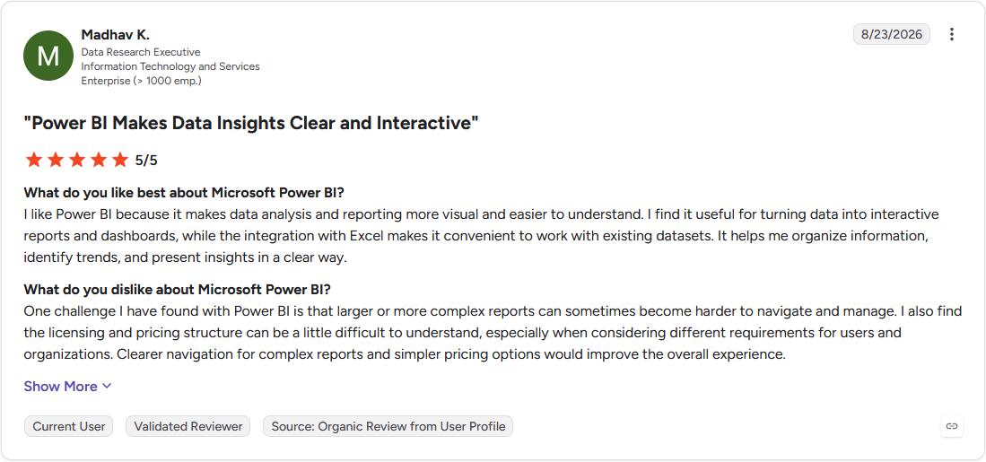
Pro: "I like Power BI because it makes data analysis and reporting more visual and easier to understand. I find it useful for turning data into interactive reports and dashboards, while the integration with Excel makes it convenient to work with existing datasets." (Madhav K., G2)
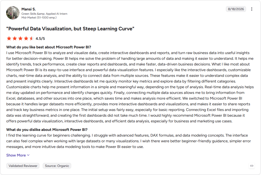
Con: "I find the learning curve for beginners challenging. I struggle with advanced features, DAX formulas, and data modeling concepts. The interface can also feel complex when working with large datasets or many visualizations." (Mansi S., G2)
Pricing
Power BI starts at $14 per user per month.
Bottom line
Power BI's integration with Microsoft Fabric connects it directly to enterprise data engineering pipelines. If your team doesn't already work in Microsoft's ecosystem, Domo could be worth a look for real-time dashboards pulling from many sources.
3. Domo: Best for real-time operational dashboards
- Type: BI dashboard
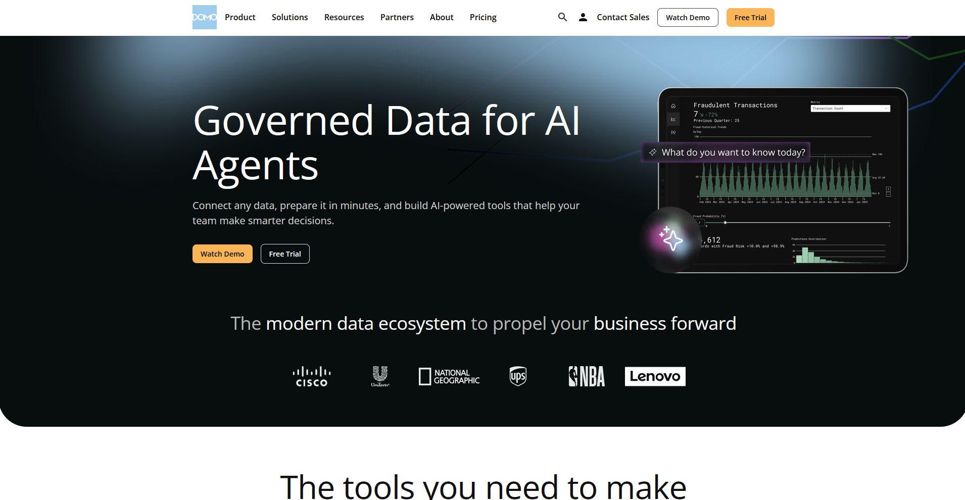
- What it does: Domo is a cloud-based business intelligence platform that pulls data from many connected sources into live dashboards.
- Best for: Operations teams that need continuously updating dashboards pulled from many connected sources
Domo pulls data from many different sources into one dashboard, so I linked two mock datasets, sales and marketing spend, to see how fast I could merge them into a single view.
I had the initial dashboard together in a few clicks, and I set a real-time alert for a sales dip that fired right on cue.
I ran into trouble building a second more detailed dashboard, since dragging and resizing several widgets became fiddly once I had more than a handful of charts running.
Key features
- Data connectors: Pulls data from marketing platforms, databases, and cloud systems through a wide range of pre-built connectors.
- Real-time alerts: Notifies users through Slack, email, or push notification when a tracked metric crosses a set threshold.
- Mobile dashboards: Displays dashboards in a mobile-optimized view for checking metrics away from a desktop.
Pros and cons
| ✅ Pros | ❌ Cons |
| Centralizing many data sources into one dashboard cuts down on switching between tools to check different metrics | Advanced reporting and custom dashboard setup have a real learning curve at first |
| Real-time alerts flag threshold changes without needing to check a dashboard manually | Configuring more detailed dashboards with several widgets takes noticeably more time than simpler ones |
| Mobile-friendly dashboards make it easy to check metrics away from a desktop |
What users say
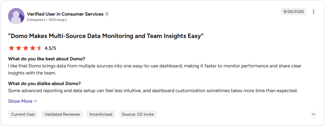
Pro: "I like that Domo brings data from multiple sources into one easy-to-use dashboard, making it faster to monitor performance and share clear insights with the team." (Verified User in Consumer Services, G2)
Con: "There is a learning curve when getting started, especially for advanced features and custom dashboards. Some reports can also take time to configure, but the platform becomes much easier to use with the experience." (Dakare D., G2)
Pricing
Domo offers usage-based pricing.
Bottom line
Domo's Agent Catalyst framework lets teams build custom AI agents that trigger business processes on their own. If a live ops dashboard isn't the priority and a written report matters more, Whatagraph could be worth a look for prompt-built client reports.
4. Julius: Best for analysis paired with a written report

- Type: Both
- What it does: Julius is an AI data analysis tool built around its AI Report Generator, which turns a spreadsheet, connected database, or a described need into a structured report.
- Best for: Marketers and analysts who want a computed report built from a spreadsheet or connected database in one step
We built Julius' AI Report Generator to compute every number in a report through real code before writing any narrative.
Give it a spreadsheet, a connected database, or a plain description of what you need, and Julius runs the analysis first, then writes the report around the results. Scheduled Runs can rerun that same analysis on a schedule, so a recurring report starts from current data each time.
The report can only analyze the data it's given, so gaps or errors in the source file carry straight through into the finished report.
Key features
- AI Report Generator: Runs code against uploaded files or connected data, then writes a structured report with charts and a narrative around the results.
- Scheduled Runs: Reruns a report's analysis on a recurring basis so regular reports start from current data.
- Data connectors: Connects to databases and cloud warehouses, or works directly from an uploaded spreadsheet, CSV, or PDF.
Pros and cons
| ✅ Pros | ❌ Cons |
| Runs real code against the data before writing anything, so every chart traces back to a computed result | Scheduled Runs are capped on lower-tier plans, so teams running frequent recurring reports may need a higher tier |
| Scheduled Runs reruns the analysis, so a recurring report starts from current data each time | Well-structured, clearly labeled data produces the most reliable results, so messy spreadsheets may need cleanup first |
| Works from an uploaded file or a plain-English description, so no clean dataset needs to be ready in advance |
What users say
Pro: “If you spend more than 2 hours a week working with data, Julius AI will save you time. Start with the free plan. You’ll know within a week if it fits your workflow. For most non-technical users, it’s a no-brainer.” (Fahim Joharder, Fahim AI independent Julius review)

Con: “Not gonna lie, the first time I uploaded a messy CSV with empty values, the results were off. AI can help identify outliers and handle empty values. But you still need to clean your raw data first.” (Fahim Joharder, Fahim AI independent Julius review)
Pricing
Julius starts at $16 per month.
Bottom line
Julius carries SOC 2 Type II compliance for teams reporting on sensitive business data. If dashboard-style visual monitoring matters more than a written narrative, Tableau is likely the better starting point for that.
5. Whatagraph: Best for prompt-built agency reports
- Type: Report generator
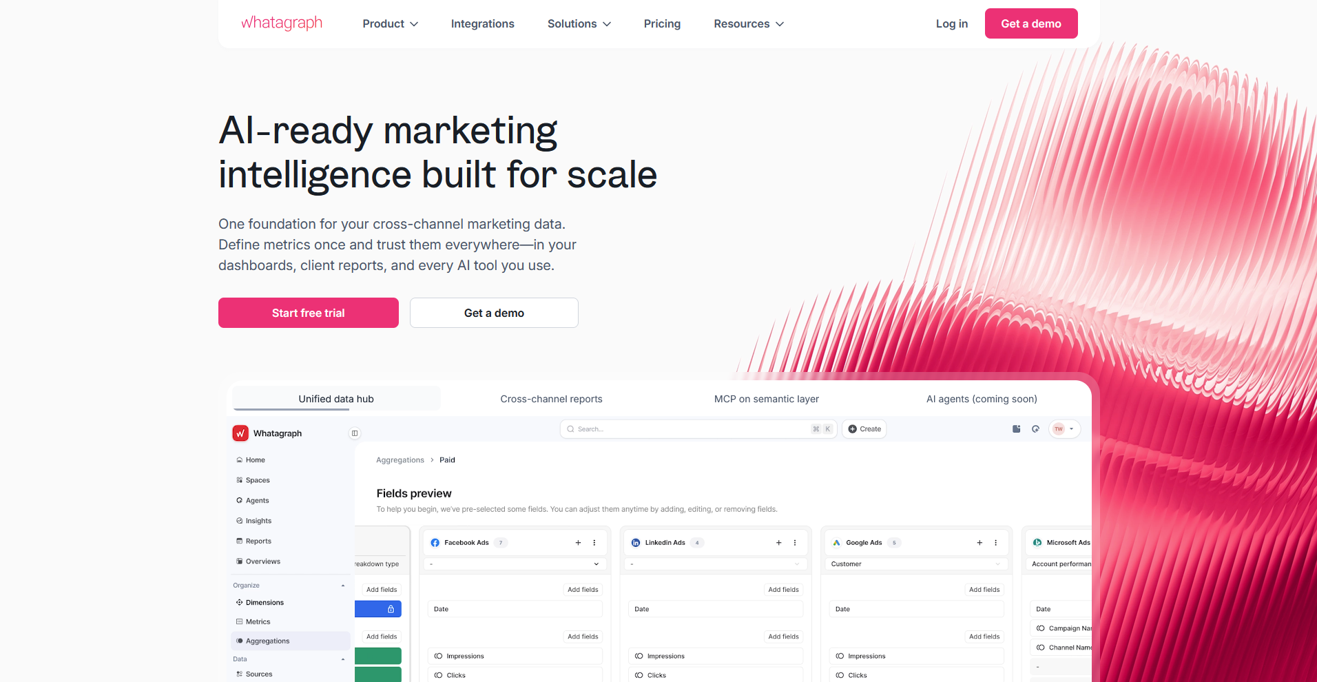
- What it does: Whatagraph is a marketing reporting platform that generates full client reports from a text prompt using its Whatagraph IQ feature.
- Best for: Marketing agencies that need full client reports built from campaign data without manually laying out each one
Whatagraph is built around generating a full report from a prompt, so I described a marketing report covering three campaigns and let Whatagraph IQ take it from there.
It pulled in the connected ad accounts and returned a formatted report with widgets and charts already laid out, which saved me from building each section by hand.
I tried uploading a screenshot of a client's brand guidelines next, and the color palette carried over automatically, though the font it picked didn't quite match what I'd uploaded.
Key features
- Whatagraph IQ: Builds a full report with widgets, layout, and styling from a text prompt using connected data sources.
- IQ Chat: Answers follow-up questions about a report's data in a conversational format.
- Managed integrations: Connects to 55+ marketing platforms without requiring manual API setup.
Pros and cons
| ✅ Pros | ❌ Cons |
| Whatagraph IQ builds a complete, styled report from a single prompt instead of a blank template | Auto-detected branding from an uploaded screenshot doesn't always match fonts exactly |
| IQ Chat answers follow-up questions about the data without rebuilding the report | Reports lean heavily on connected marketing platforms, so non-marketing data sources have less native support |
| 55+ managed integrations cut down on manual setup for common ad and analytics platforms |
What users say
Pro: "I really appreciate Whatagraph's clean and easy-to-customize interface, which has made it quite intuitive for our small analytics team. The easy report sharing feature has been a big plus for us." (Anna A., G2)
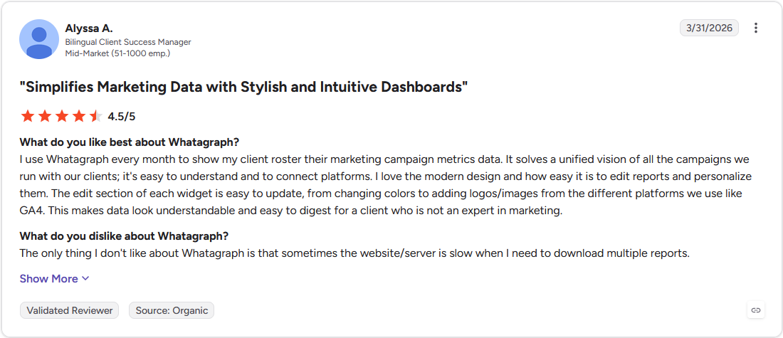
Con: "The only thing I don't like about Whatagraph is that sometimes the website/server is slow when I need to download multiple reports." (Alyssa A., G2)
Pricing
Whatagraph starts at $812 per month.
Bottom line
Whatagraph can flag when a client's campaign moves outside a set budget, alerting Slack or email. If the reporting need leans more toward a live dashboard than a styled report, Domo might make more sense for real-time operational monitoring.
6. Data Studio: Best for free Google-data reporting
- Type: BI dashboard
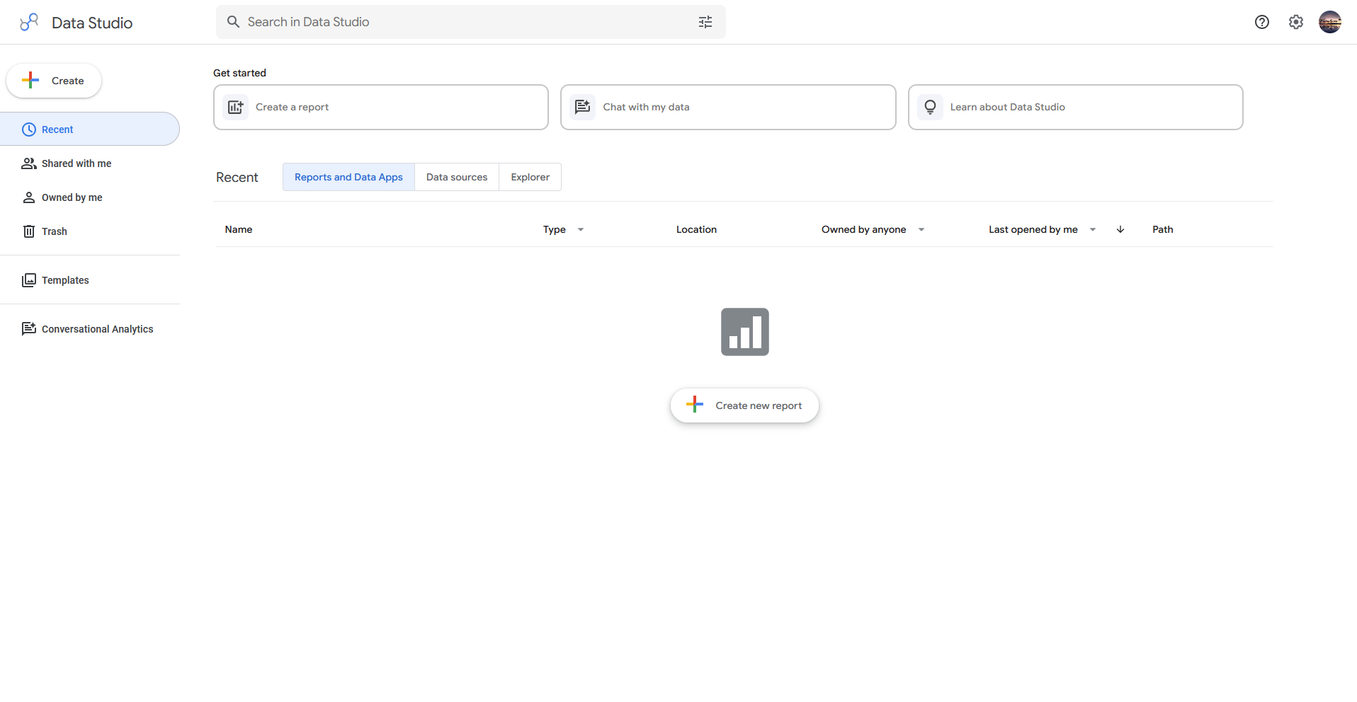
- What it does: Data Studio is a free reporting tool that turns connected Google data into dashboards and shareable reports.
- Best for: Small teams and freelancers reporting on Google Ads, GA4, and Sheets data at no cost
Data Studio is built around native Google integrations, so I connected a mock Google Ads account to see how fast a report would come together.
I had a dashboard live within minutes, and sharing it required nothing more than sending a link. Pulling in a non-Google data source meant installing a community connector from the marketplace first, since native support stays limited to Google's own products.
Key features
- Native Google integrations: Connects directly to Google Ads, Analytics, and Sheets without manual exports.
- Community connectors: Extends data access to non-Google sources through third-party marketplace connectors.
- Template gallery: Provides pre-built report templates for common categories like marketing and ecommerce.
Pros and cons
| ✅ Pros | ❌ Cons |
| Free access removes cost as a barrier for small teams and freelancers | Native support outside Google's own products depends on third-party community connectors |
| Native Google integrations cut out manual data exports entirely | Formatting and customization options are more limited than dedicated visualization tools |
| A large template library speeds up building a first report |
What users say
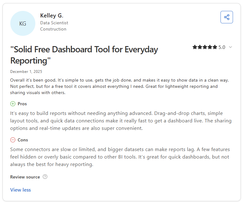
Pro: “It’s easy to build reports without needing anything advanced. Drag-and-drop charts, simple layout tools, and quick data connections make it really fast to get a dashboard live.” (Kelley G., Capterra)
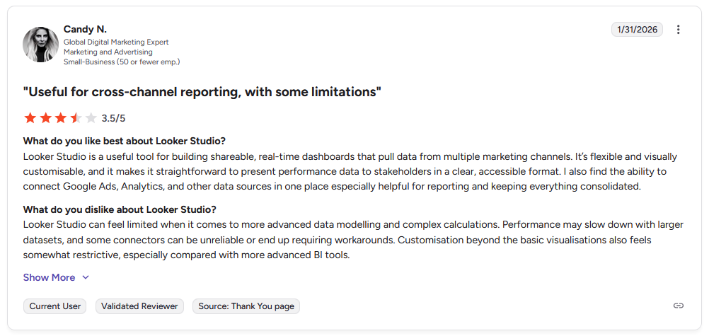
Con: “Looker Studio can feel limited when it comes to more advanced data modeling and complex calculations. Performance may slow down with larger datasets, and some connectors can be unreliable or end up requiring workarounds.” (Candy N., G2)
Pricing
Data Studio is free.
Bottom line
Data Studio's April 2026 rebrand folded in BigQuery conversational agents and Colab-built data apps as part of the same free workspace. If your reporting draws mainly from non-Google sources, Zoho Analytics might be a better fit for broad third-party integrations.
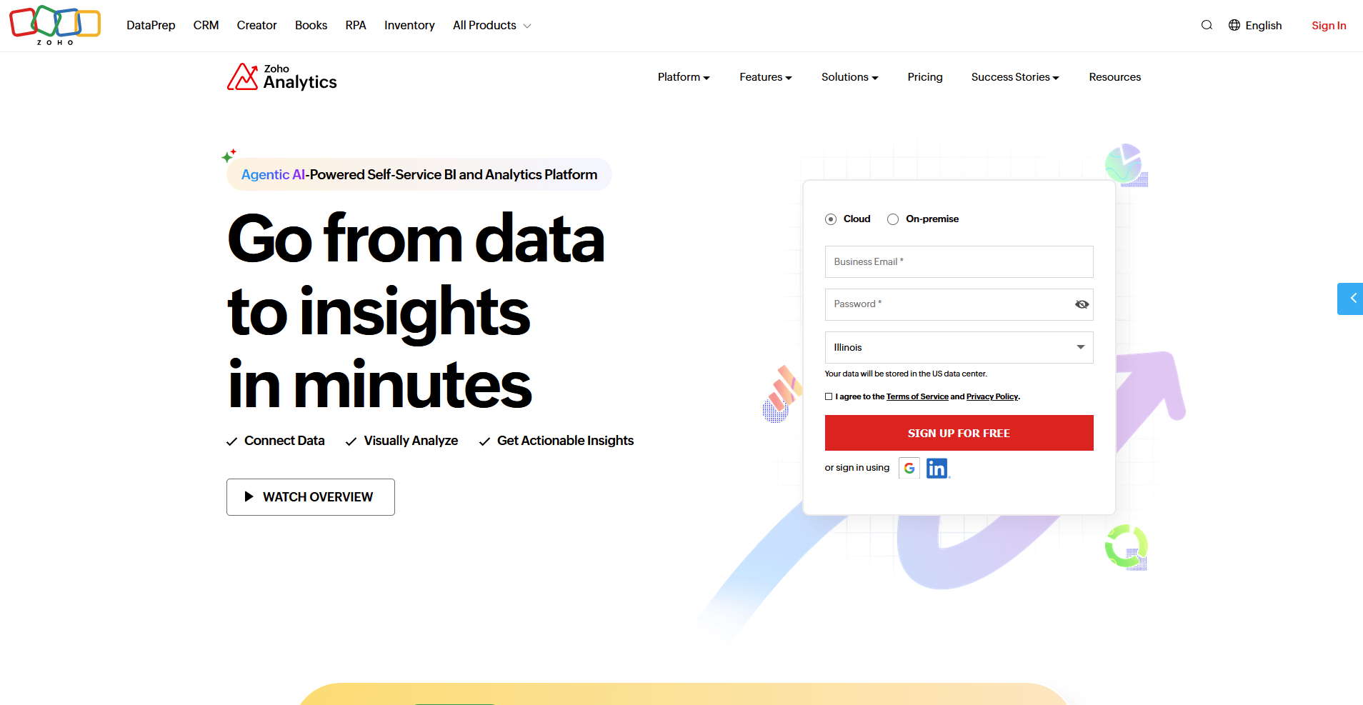
7. Zoho Analytics: Best for budget-friendly AI reporting
- Type: BI dashboard
- What it does: Zoho Analytics is a self-service BI platform that turns spreadsheets and databases into dashboards with AI-assisted analysis.
- Best for: Small and midsize businesses that want AI-assisted reporting without enterprise pricing
Zoho Analytics markets itself as budget-friendly with a light setup, so I tested a mock sales dataset to see whether that ease came at the cost of real analytical depth.
I built a dashboard and asked its AI assistant, Zia, to summarize sales trends, and it gave a plain-English answer beside the chart. I found chart formatting options were fairly basic next to dedicated visualization tools like Tableau.
Key features
- Zia AI assistant: Answers plain-language questions about connected data and summarizes trends.
- Broad integrations: Connects to a wide range of business apps, spreadsheets, and databases.
- Report scheduling: Sends dashboards and reports to email or Slack on a recurring basis.
Pros and cons
| ✅ Pros | ❌ Cons |
| Approachable pricing makes AI-assisted reporting accessible for smaller teams | Chart formatting options stay fairly basic next to dedicated visualization tools |
| Zia answers plain-language questions about the data without writing a query | Some advanced features need a higher-tier plan to unlock |
| Broad integrations cover common business apps beyond spreadsheets |
What users say
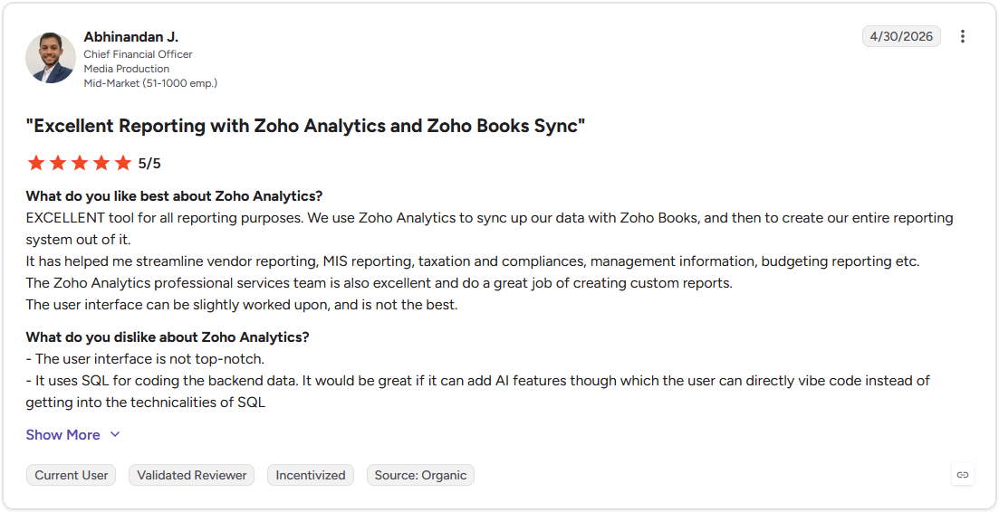
Pro: "Excellent tool for all reporting purposes. We use Zoho Analytics to sync up our data with Zoho Books, and then to create our entire reporting system out of it." (Abhinandan J., G2)
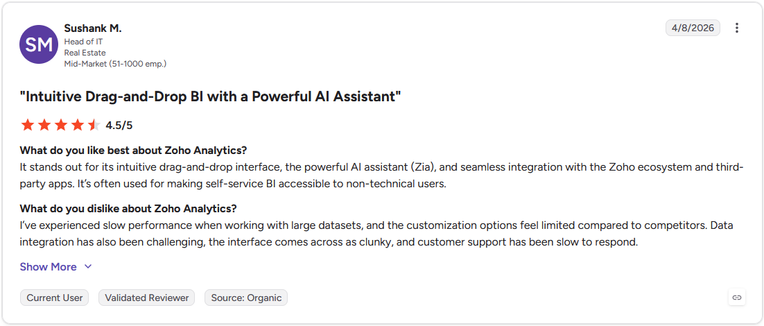
Con: "I've experienced slow performance when working with large datasets, and the customization options feel limited compared to competitors. Data integration has also been challenging, the interface comes across as clunky, and customer support has been slow to respond." (Sushank M., G2)
Pricing
Zoho Analytics starts at $24 per month for the Cloud plan.
Bottom line
Zoho Analytics ties into the broader Zoho software suite for teams already running CRM or finance tools on Zoho. If budget isn't the deciding factor, ThoughtSpot is worth a look for a more search-driven way into the same data.
8. ThoughtSpot: Best for search-driven analytics
- Type: BI dashboard
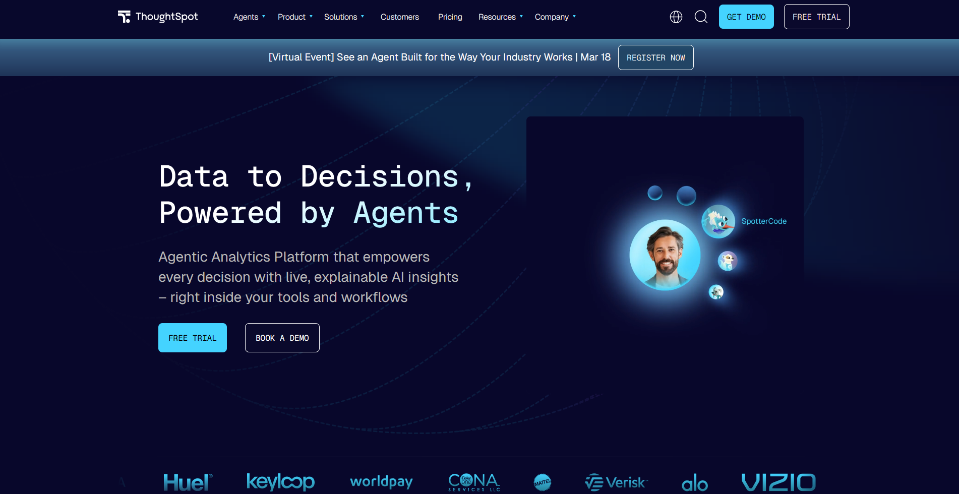
- What it does: ThoughtSpot is a search-driven analytics platform that returns charts and answers from typed questions without a built dashboard.
- Best for: Teams that want to type a question and get a chart without building a dashboard first
I wanted to see how ThoughtSpot handled a question with no dashboard built behind it yet, since it skips the usual dashboard-building step and lets you ask directly.
I typed a plain question about mock regional sales, and its AI agent, Spotter, returned a chart along with a few related trends worth checking. Getting a reliable answer on a second, more specific question depended on how cleanly the underlying data had been modeled beforehand.
Key features
- Spotter AI agent: Answers typed questions with a chart and related trends without a pre-built dashboard.
- Anomaly detection: Flags unusual patterns in connected data automatically.
- Embedded analytics: Lets other applications embed ThoughtSpot's search and visualization directly.
Pros and cons
| ✅ Pros | ❌ Cons |
| Typing a question returns a chart without building a dashboard first | Reliable answers depend on how cleanly the underlying data was modeled |
| Spotter returns related trends alongside the direct answer to a question | Embedded analytics setup can require technical help to configure |
| Anomaly detection flags unusual patterns without a manual review |
What users say
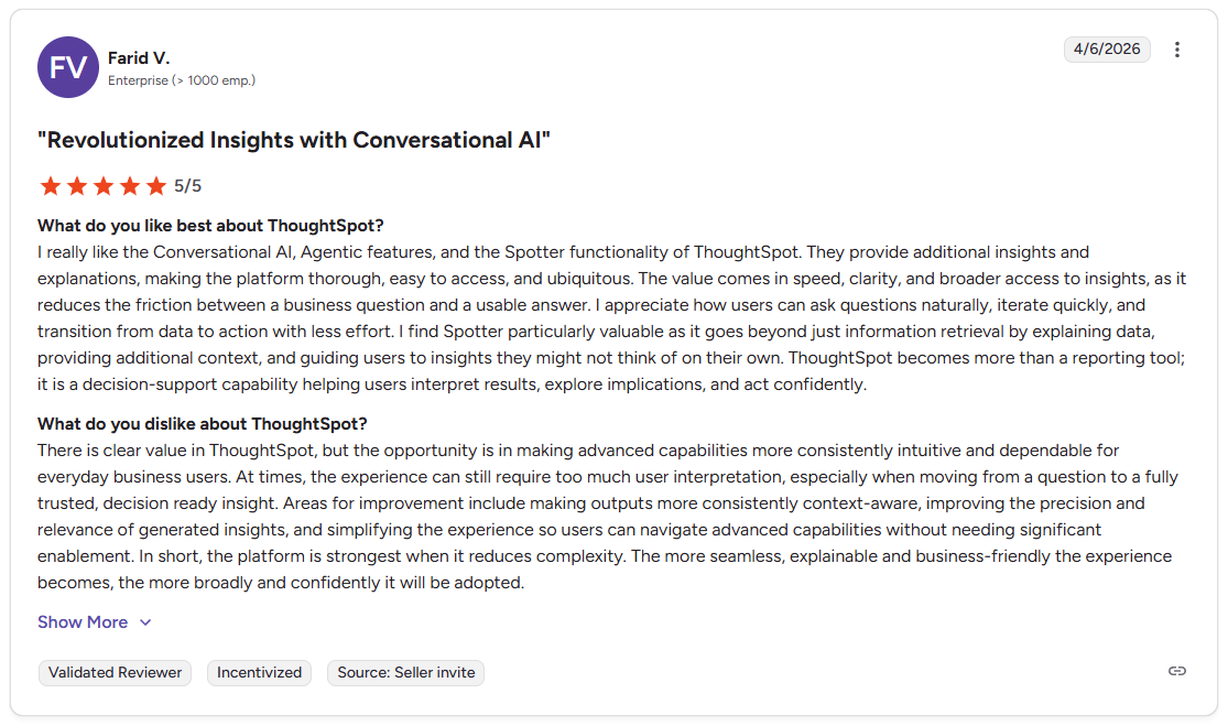
Pro: "I really like the Conversational AI, Agentic features, and the Spotter functionality of ThoughtSpot. They provide additional insights and explanations, making the platform thorough, easy to access, and ubiquitous. The value comes in speed, clarity, and broader access to insights, as it reduces the friction between a business question and a usable answer." (Farid V., G2)
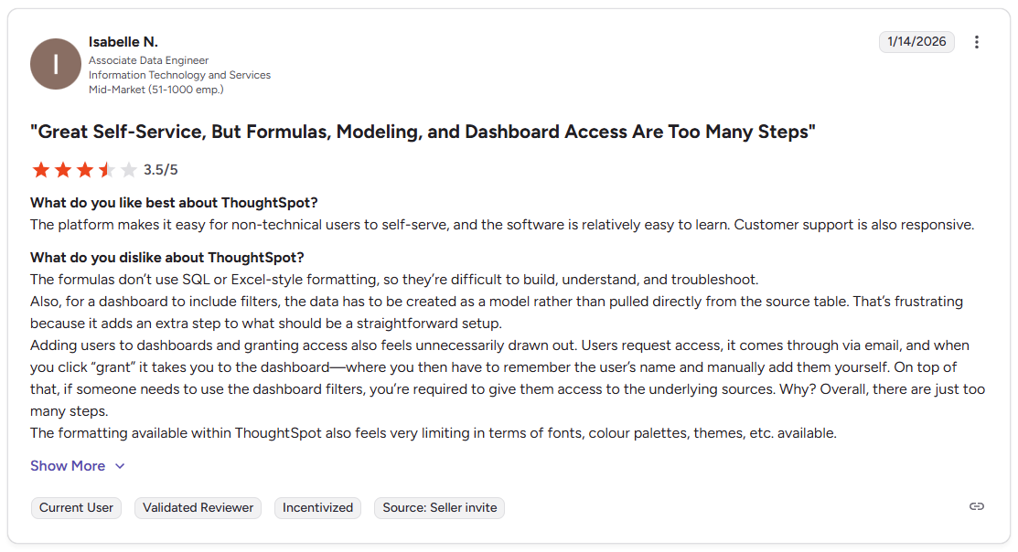
Con: "The formulas don't use SQL or Excel-style formatting, so they're difficult to build, understand, and troubleshoot. Also, for a dashboard to include filters, the data has to be created as a model rather than pulled directly from the source table. That's frustrating because it adds an extra step to what should be a straightforward setup." (Isabelle N., G2)
Pricing
ThoughtSpot starts at $25 per user per month. Spotter and other AI features require the Pro plan or higher.
Bottom line
ThoughtSpot's embedded analytics lets other software products build its search interface directly into their own applications. If clean data modeling upfront isn't realistic for your team, Data Studio could be a simpler starting point for free, low-maintenance reporting.
9. Qlik Sense: Best for associative data exploration
- Type: BI dashboard
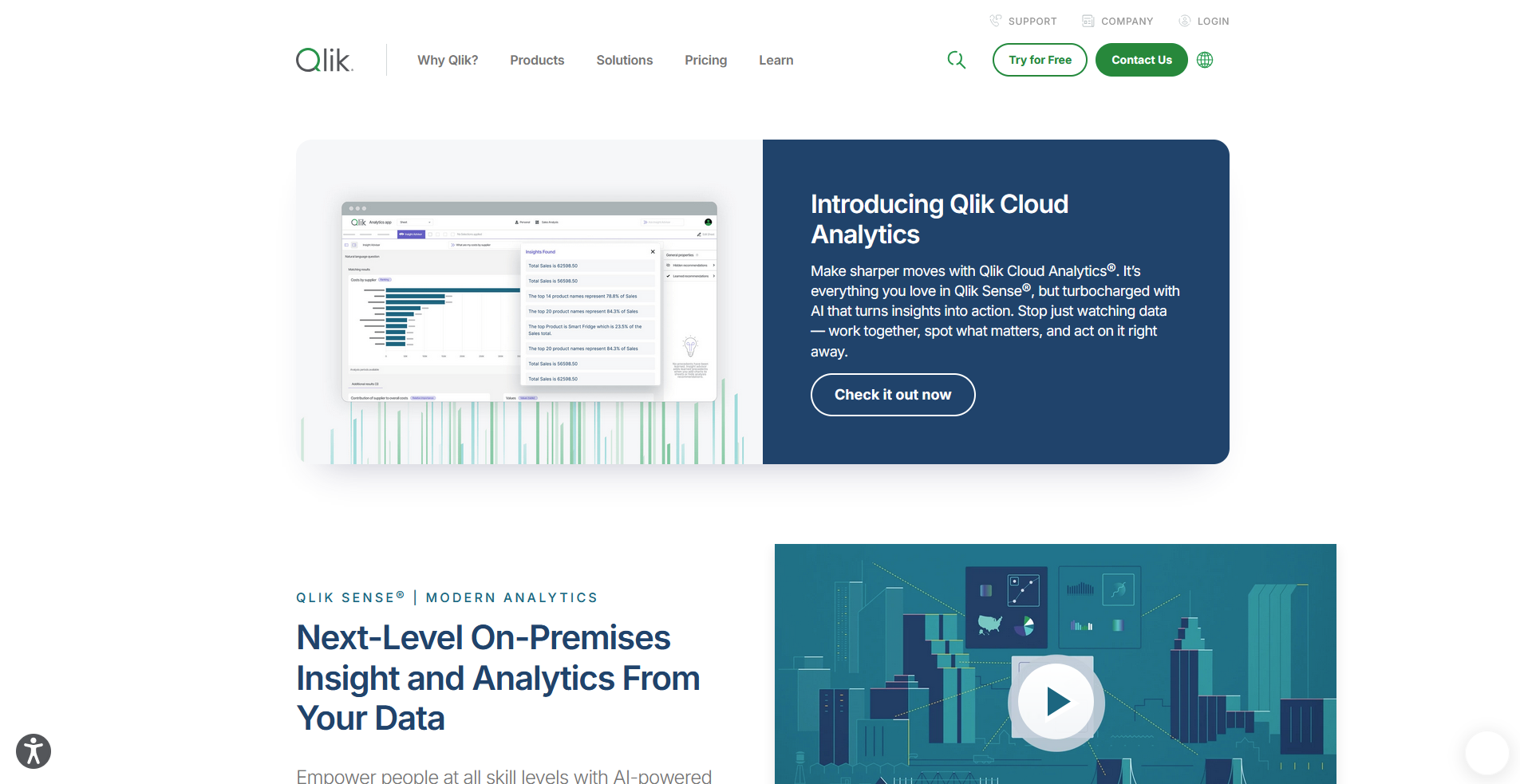
- What it does: Qlik Sense is an enterprise BI platform built around an associative data engine that links every field in a connected dataset.
- Best for: Analysts exploring relationships across multiple connected datasets
I wanted to see how Qlik Sense's associative engine handled a dataset with no predefined query path, so I clicked through a mock product catalog to explore it. Clicking one field highlighted every related value across the rest of the dataset, and I found a pattern in returns by category I wouldn't have thought to filter for directly. Getting comfortable navigating that way took longer than building a chart in a standard dashboard tool.
Key features
- Associative engine: Links every field in a dataset so selecting one value highlights related data across all connected tables.
- AI-suggested insights: Surfaces correlations and patterns the person exploring the data might not have queried directly.
- Enterprise governance: Manages data access and permissions across large teams and departments.
Pros and cons
| ✅ Pros | ❌ Cons |
| The associative engine surfaces related data without writing a query | Navigating associative exploration has a real learning curve for new users |
| AI-suggested correlations can reveal patterns a manual filter would have missed | Enterprise governance features add setup complexity smaller teams may not need |
| Clicking any field re-centers the whole view around it |
What users say
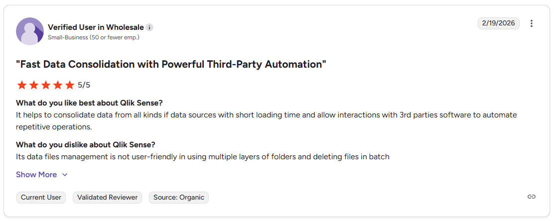
Pro: “It helps to consolidate data from all kinds of data sources with short loading time and allow interactions with 3rd party software to automate repetitive operations.” (Verified User in Wholesale, G2)
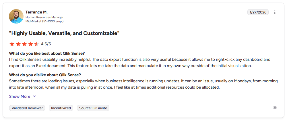
Con: “Sometimes there are loading issues, especially when business intelligence is running updates. It can be an issue, usually on Mondays, from morning into late afternoon, when all my data is pulling in at once. I feel like at times additional resources could be allocated.” (Terrance M., G2)
Pricing
Qlik Sense starts at $300 per month for 10 users.
Bottom line
Qlik Sense's AI-suggested insights can flag a correlation before an analyst thinks to look for it. If associative exploration feels like more to learn than your team needs, Data Studio offers a simpler, free starting point instead.
10. Klipfolio: Best for custom KPI dashboards
- Type: BI dashboard
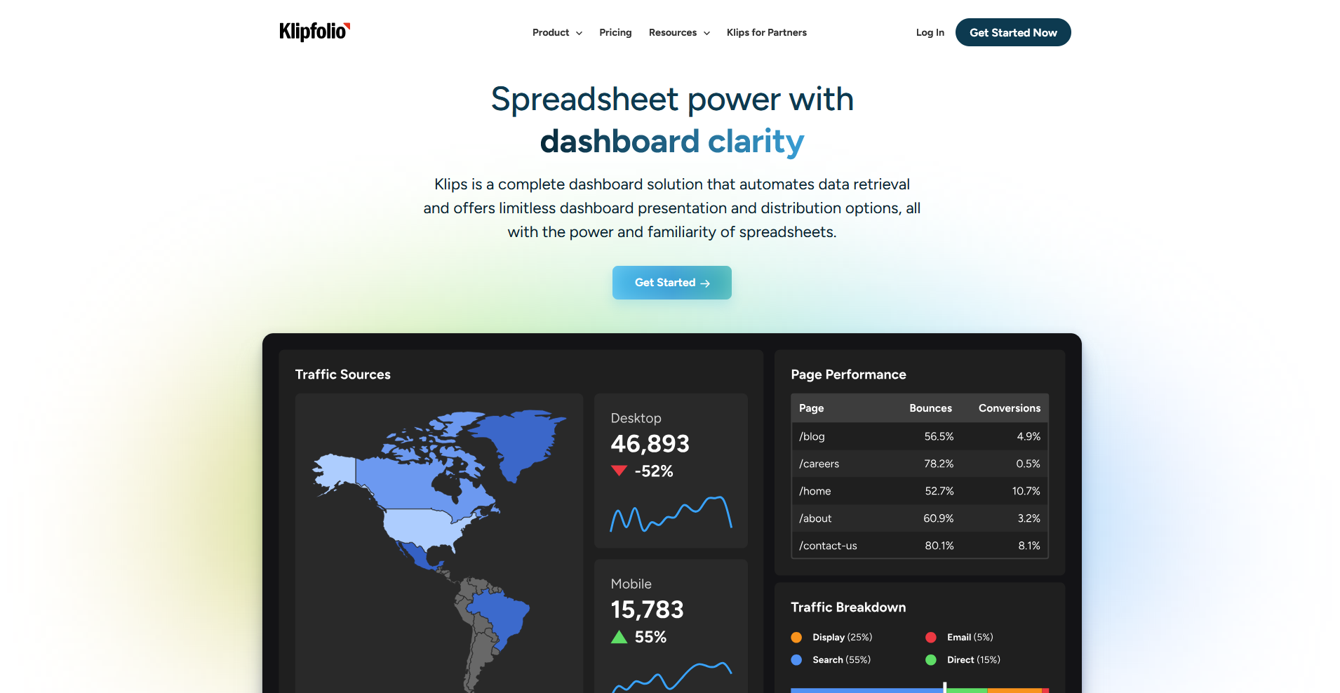
- What it does: Klipfolio is a dashboard platform that turns connected data into KPI tracking views built around custom formulas.
- Best for: Semi-technical teams building custom KPI dashboards with their own formulas
I wanted to see how far Klipfolio's formula system could go without any spreadsheet background, so I combined two mock revenue sources into a single tracked metric.
The dashboard updated as soon as I saved the formula, and I could reference that same metric across other widgets right away. Getting the formula syntax right on my first attempt took a few tries, since it works more like a scripting language than a spreadsheet function.
Key features
- Custom formulas: Builds calculated metrics from one or more connected data sources using a formula language.
- Connector library: Pulls data from over 100 marketing, sales, and finance platforms.
- Flexible styling: Adjusts dashboard layout, colors, and widget types beyond fixed templates.
Pros and cons
| ✅ Pros | ❌ Cons |
| Combining metrics from different sources into one formula cuts out manual spreadsheet work | The formula language has a real learning curve without prior spreadsheet or scripting experience |
| A dashboard updates immediately once a formula is saved, without a manual refresh step | Building a fully custom dashboard takes more setup time than a template-based tool |
| Over 100 connectors cover most common marketing and finance platforms |
What users say
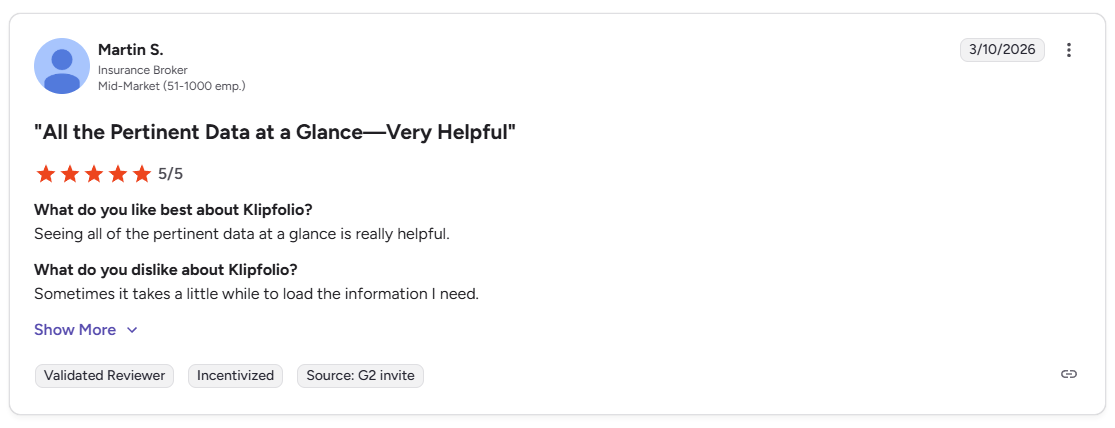
Pro: “Seeing all of the pertinent data at a glance is really helpful.” (Martin S., G2)
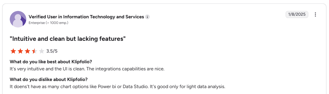
Con: “It doesn't have as many chart options like Power BI or Data Studio. It's good only for light data analysis.” (Verified User, G2)
Pricing
Klipfolio starts at $120 per month.
Bottom line
Klipfolio can combine metrics from unrelated data sources into a single custom formula most dashboard tools can't replicate. If writing formulas isn't something your team wants to take on, DashThis offers a template-based starting point instead.
11. AgencyAnalytics: Best for multi-client SEO reporting
- Type: BI dashboard
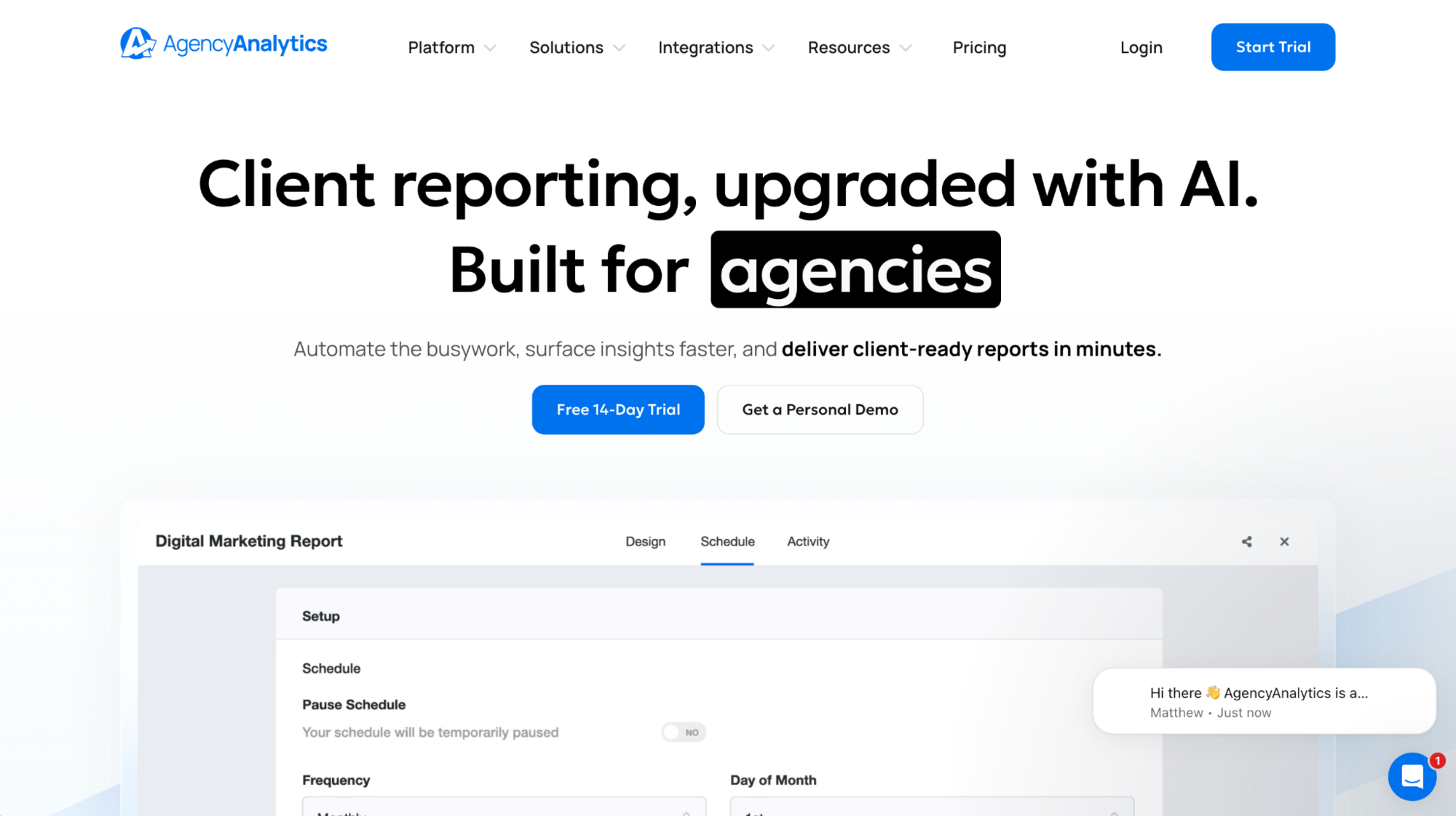
- What it does: AgencyAnalytics is a marketing reporting platform built around white-label dashboards for agencies managing multiple clients.
- Best for: Marketing agencies tracking SEO and PPC performance across many clients
To test how quickly AgencyAnalytics could get a dashboard client-ready, I uploaded my agency logo to a mock client account.
The platform suggested a matching color palette from the logo automatically, and the dashboard carried my branding without any manual color picking. Asking its Ask AI feature a campaign spend question got me an answer, though the wording needed a follow-up to land on the specific number I wanted.
Key features
- White-label branding: Applies an agency's logo and suggested color palette across every client dashboard.
- Built-in SEO tracking: Monitors keyword rankings, backlinks, and site audits without a separate SEO tool.
- Ask AI: Answers plain-language questions about a client's campaign data inside the dashboard.
Pros and cons
| ✅ Pros | ❌ Cons |
| Automatic logo-based branding removes manual color matching for every new client | Ask AI sometimes needs a follow-up question to return a specific enough number |
| Built-in SEO tracking cuts out the need for a separate keyword or backlink tool | Per-client pricing can add up quickly for agencies managing many accounts |
| White-label dashboards keep a consistent brand across every client report |
What users say
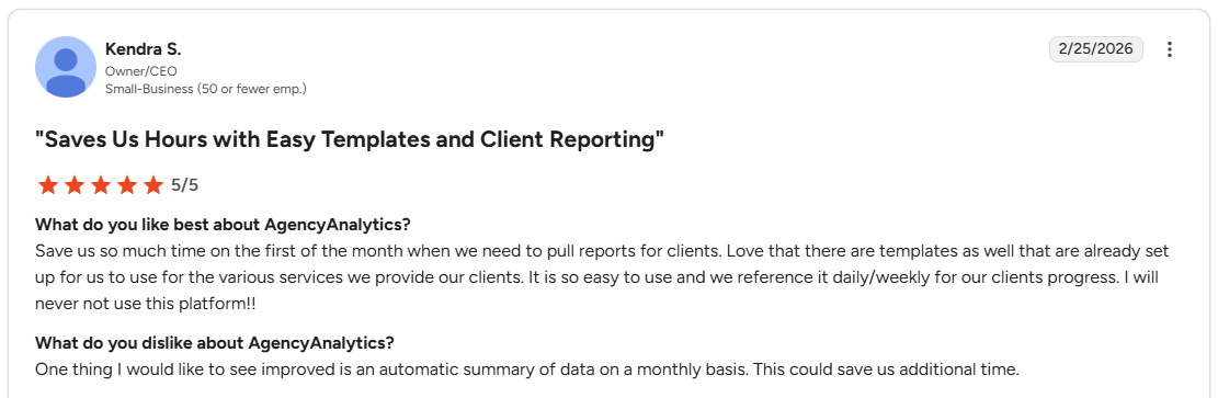
Pro: “Save us so much time on the first of the month when we need to pull reports for clients. Love that there are templates as well that are already set up for us to use for the various services we provide our clients.” (Kendra S., G2)
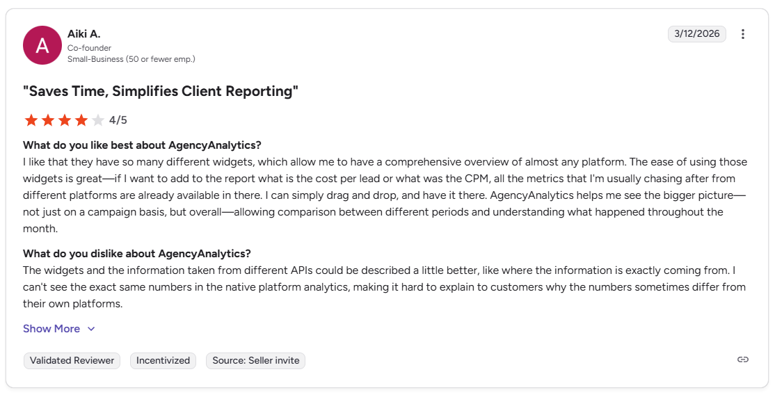
Con: “I can't see the exact same numbers in the native platform analytics, making it hard to explain to customers why the numbers sometimes differ from their own platforms.” (Aiki A., G2)
Pricing
AgencyAnalytics starts at $20 per client per month.
Bottom line
AgencyAnalytics can pull SEO and PPC data into the same dashboard as a client's other marketing metrics. If SEO tracking isn't the priority and a custom KPI view matters more, Klipfolio could be worth a look for building formulas around any metric.
12. DashThis: Best for fast, template-based dashboards
- Type: BI dashboard
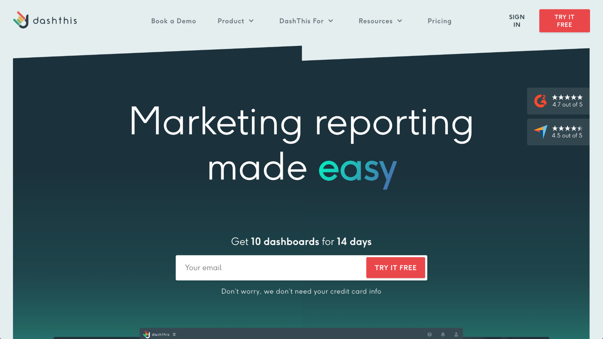
- What it does: DashThis is a template-based dashboard platform that starts a marketing report from a pre-built layout.
- Best for: Small teams that want a template-based marketing dashboard without a learning curve
DashThis leans on templates to skip a manual build, so I wanted to see how fast a dashboard could actually go live. I picked a PPC template and connected a mock ad account, and had a shareable dashboard set up within a few minutes.
Customizing a metric outside the template's preset options meant switching to a different widget type entirely, since the template structure doesn't flex much beyond what it ships with.
Key features
- Template library: Provides 50+ pre-built dashboard templates across marketing categories.
- Unlimited users: Adds team members to any plan without a per-seat charge.
- Scheduled reports: Sends dashboard snapshots to clients or stakeholders on a set schedule.
Pros and cons
| ✅ Pros | ❌ Cons |
| A pre-built template gets a shareable dashboard live within minutes | Customizing a metric outside a template's preset options means switching widget types |
| Unlimited users on every plan removes per-seat cost as a factor | The template structure limits how far a dashboard can deviate from its starting layout |
| Scheduled reports remove the need to manually export and send updates |
What users say
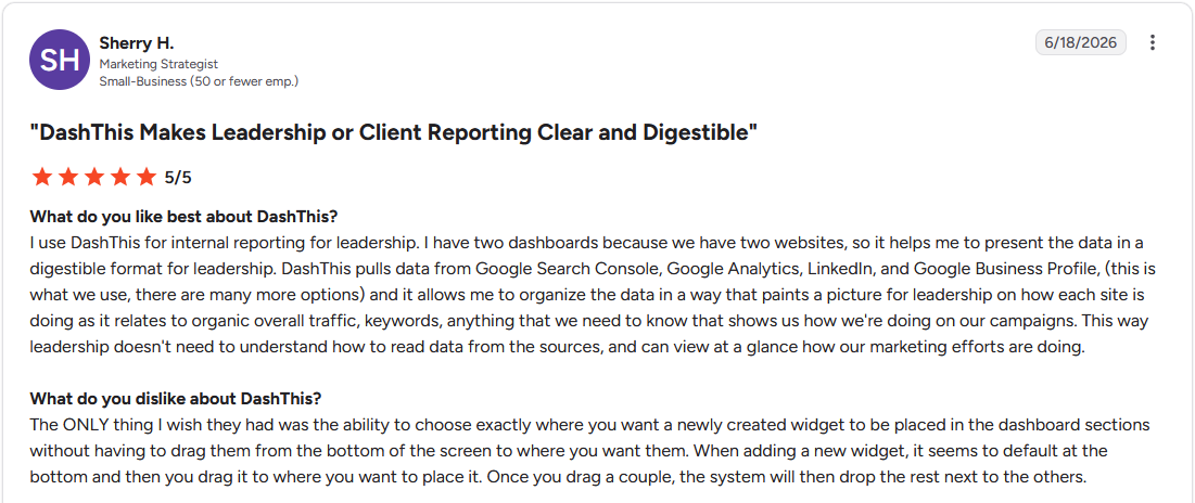
Pro: "DashThis pulls data from Google Search Console, Google Analytics, LinkedIn, and Google Business Profile. … and it allows me to organize the data in a way that paints a picture for leadership on how each site is doing." (Sherry H., G2)
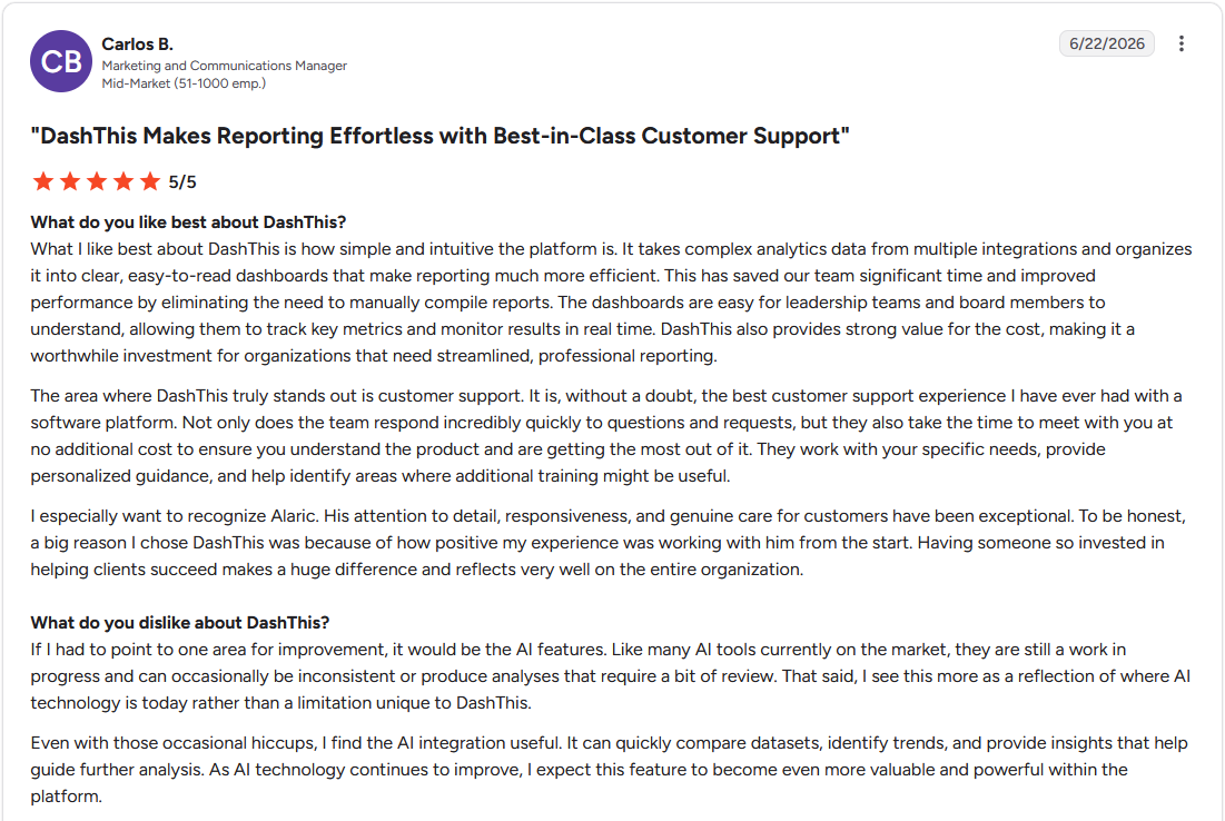
Con: "If I had to point to one area for improvement, it would be the AI features. Like many AI tools currently on the market, they are still a work in progress and can occasionally be inconsistent." (Carlos B., G2)
Pricing
DashThis starts at $44 per month.
Bottom line
DashThis includes unlimited users on every plan, even its lowest tier. If a template-based layout feels too fixed for your reporting needs, Klipfolio offers more control for building a dashboard around custom formulas instead.
13. ChatGPT: Best for casual data summaries
- Type: Report generator
- What it does: ChatGPT is a general-purpose AI assistant that turns pasted data into a written summary through conversation.
- Best for: Quick, one-off summaries of data you paste directly into the chat
I've used ChatGPT plenty of times to get a quick read on data without setting anything up, so pasting in a mock sales spreadsheet felt familiar. Asking for a summary got me a readable paragraph naming the top trends within a minute, the same as it always has.
Starting a new conversation usually meant re-pasting the specific dataset, though ChatGPT's memory feature could carry forward general context and preferences from earlier chats depending on my settings.
Key features
- Conversational prompts: Answers follow-up questions about pasted data without a fixed report structure.
- File uploads: Accepts a spreadsheet or document directly instead of requiring pasted text.
- Plugins: Combines reusable instructions with a connected app for a recurring type of analysis.
Pros and cons
| ✅ Pros | ❌ Cons |
| Pasting data directly into a chat skips any setup or connection step | Referencing earlier data again means pasting it back into a new conversation |
| Flexible prompts let a summary get reshaped with a quick follow-up question | No native dashboard or scheduled report exists outside a chat conversation |
| A written summary comes back fast, even for a first-time user |
What users say
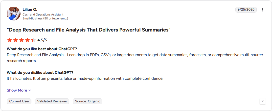
Pro: "Deep Research and File Analysis - I can drop in PDFs, CSVs, or large documents to get data summaries, forecasts, or comprehensive multi-source research reports." (Lilian O., G2)
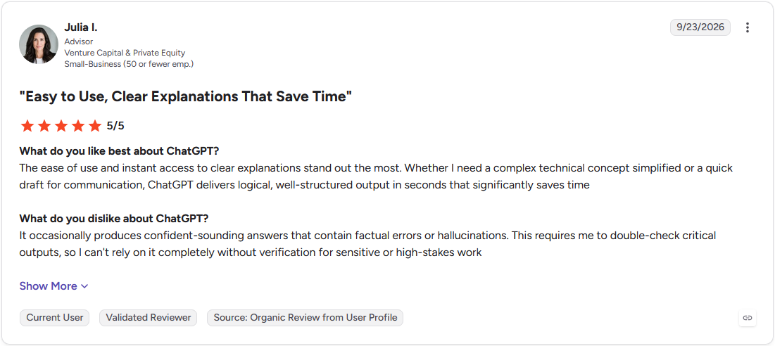
Con: "It occasionally produces confident-sounding answers that contain factual errors or hallucinations. This requires me to double-check critical outputs, so I can't rely on it completely without verification for sensitive or high-stakes work." (Julia I., G2)
Pricing
ChatGPT starts at $8 per month, billed monthly.
Bottom line
ChatGPT's Plugins can combine a reusable analysis prompt with a connected app for recurring reports. If a chart matters as much as the written summary, Data Studio offers a dashboard alongside the numbers.
14. Claude: Best for long-context drafting for lengthy reports

- Type: Report generator
- What it does: Claude is a long-context AI assistant that turns pasted or uploaded data into a written summary within a single conversation.
- Best for: Teams drafting long reports who want a single pass that summarizes large inputs without losing context
I've leaned on Claude before for exactly this kind of task, so pasting in a lengthy mock quarterly report to summarize also felt like familiar ground. Asking for an executive summary got me a version that kept the numbers consistent across every section, even toward the end of a long document.
A new conversation starts with a fresh context window, though Claude's memory feature can now search past chats and surface relevant context automatically, so some continuity carries over without manual re-uploading.
Key features
- Long-context processing: Handles large pasted or uploaded documents in a single conversation without splitting them into parts.
- File uploads: Accepts PDFs, spreadsheets, and other documents directly instead of requiring pasted text.
- Projects: Groups related conversations and files together for an ongoing piece of work.
Pros and cons
| ✅ Pros | ❌ Cons |
| Long documents can be summarized in one pass without breaking them into smaller chunks | A new conversation starts with a fresh context window, though memory can surface some relevant history automatically |
| Projects keep related files and conversations together for a recurring report | No native dashboard or chart output exists outside a written response |
| Uploaded files skip the need to paste large blocks of text manually |
What users say
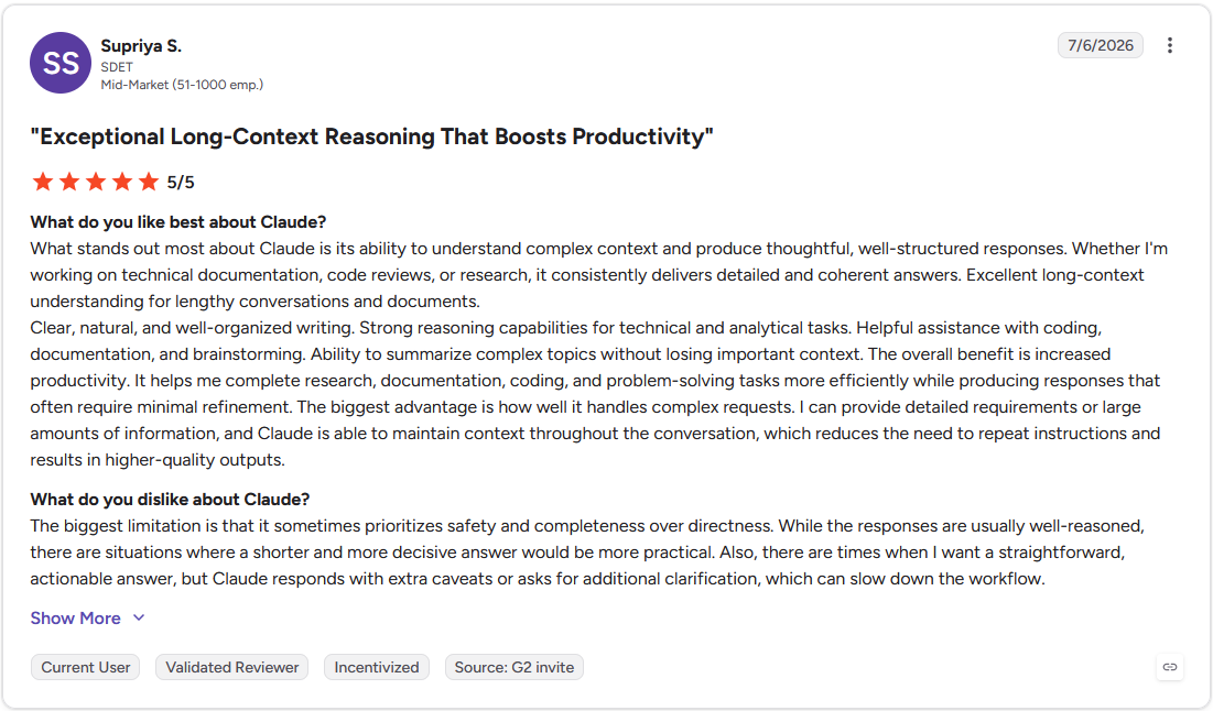
Pro: "I can provide detailed requirements or large amounts of information, and Claude is able to maintain context throughout the conversation, which reduces the need to repeat instructions and results in higher-quality outputs." (Supriya S., G2)
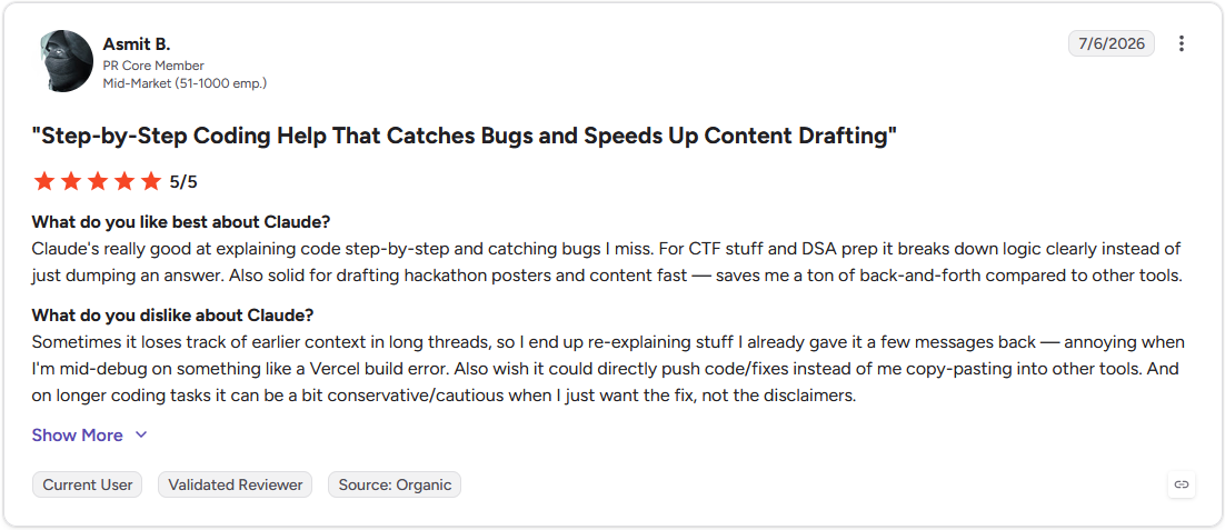
Con: "Sometimes it loses track of earlier context in long threads, so I end up re-explaining stuff I already gave it a few messages back." (Asmit B., G2)
Pricing
Claude starts at $17 per month.
Bottom line
Claude's Projects feature can hold the files and context for a recurring report across multiple sessions. If keeping a chart alongside the write-up matters, Zoho Analytics pairs an AI summary with a dashboard view in the same place.
15. Notion AI: Best for reports alongside Notion docs
- Type: Report generator
- What it does: Notion AI is a writing assistant built into Notion docs that summarizes pages and drafts report sections.
- Best for: Teams that already track projects in Notion and want reports drafted alongside existing docs
To test Notion Agent, the Business-tier AI feature that can query connected databases directly, I pulled a mock project tracker into a status report.
Asking it to summarize progress pulled data straight from the linked database, flagging blockers I hadn't manually tagged. Building a chart from that same data still meant exporting to a separate tool, since Notion Agent surfaces data points but doesn't generate visualizations itself.
Key features
- Page summarization: Condenses an existing Notion page into a shorter written summary.
- Action-item extraction: Pulls tasks and blockers out of a longer page automatically.
- Notion Agent: A more advanced AI feature that can query connected databases and specific properties, separate from the standard in-page writing assistant.
Pros and cons
| ✅ Pros | ❌ Cons |
| Summarizing an existing page into a report skips a full reread | Notion Agent can reference connected data but still can't generate a chart from it directly |
| Action-item extraction surfaces blockers without manually scanning the page | Full AI access requires the Business plan |
| Drafts stay in the same workspace as the rest of a team's project tracking |
What users say
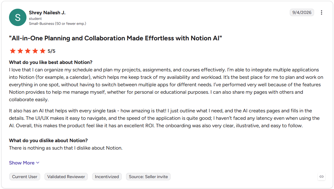
Pro: "It also has an AI that helps with every single task. I just outline what I need, and the AI creates pages and fills in the details." (Shrey Nailesh J., G2)
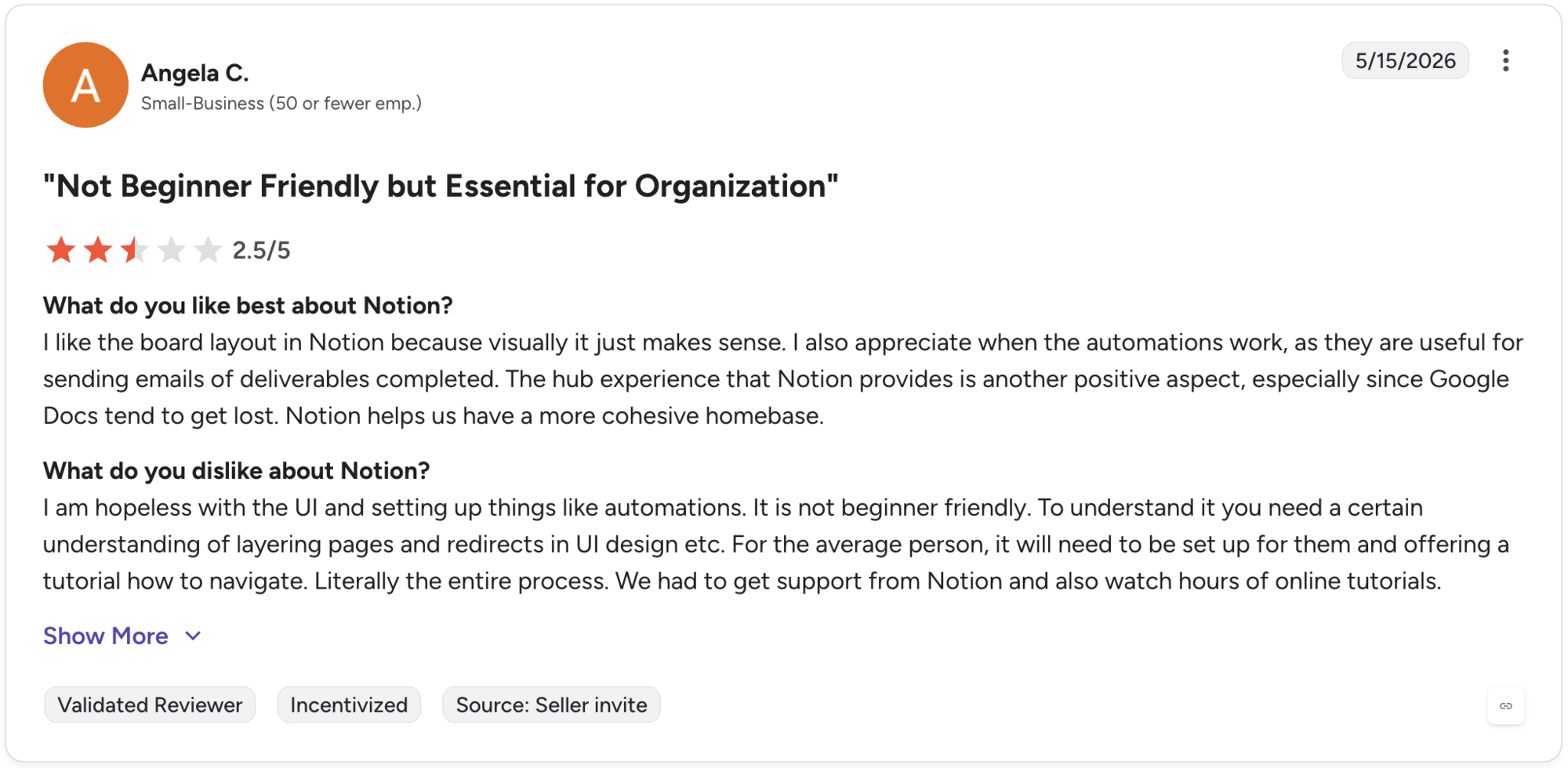
Con: "I am hopeless with the UI and setting up things like automations. It is not beginner friendly. To understand it you need a certain understanding of layering pages and redirects in UI design etc. For the average person, it will need to be set up for them and offering a tutorial on how to navigate." -(Angela C., G2)
Pricing
Notion AI starts at $20 per member per month on the Business plan.
Bottom line
Notion Agent can pull directly from a connected database when drafting a report, going beyond just the page it sits on. Teams that want a chart sitting next to that write-up may prefer Zoho Analytics, which pairs an AI summary with a dashboard view in the same place.
16. Prezent: Best for branded presentation decks
- Type: Report generator
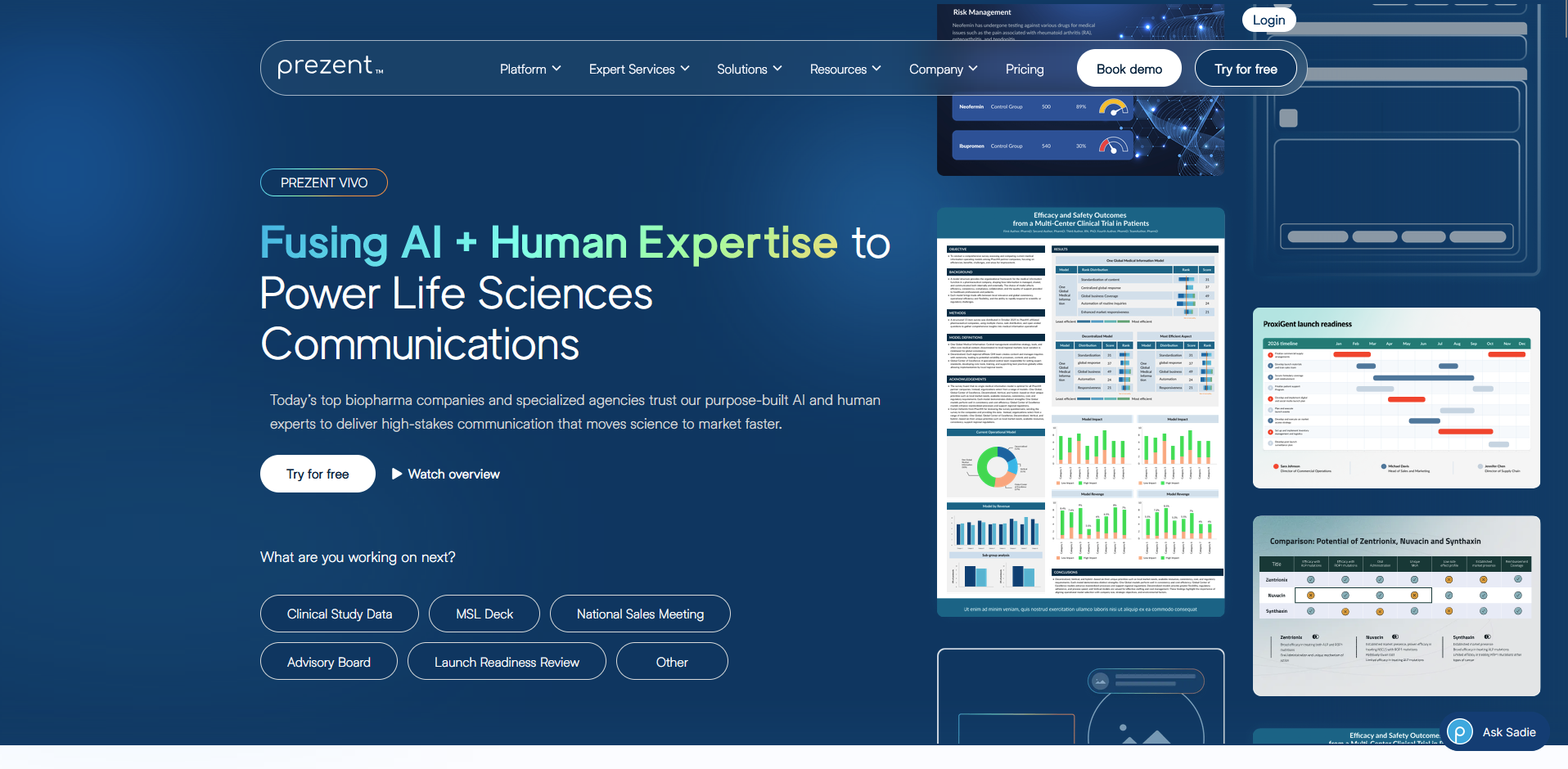
- What it does: Prezent is a presentation platform that turns a data summary into slides matching a company's brand guidelines.
- Best for: Enterprise teams turning data insights into branded, presentation-ready decks
I tested how much manual formatting Prezent could take off a deck by uploading a mock quarterly report and a screenshot of brand guidelines. It generated a full slide deck with my logo and color palette already applied, without me touching a single slide master.
Building the underlying analysis wasn't part of what it did, so the numbers and charts still had to be finished somewhere else before uploading.
Key features
- Brand-controlled templates: Applies a company's logo, colors, and slide layouts automatically from an uploaded style guide.
- Audience-aware generation: Adjusts a deck's tone and detail level based on the intended audience.
- Expert design services: Provides human design support for decks needing a more polished final pass.
Pros and cons
| ✅ Pros | ❌ Cons |
| Brand-controlled templates remove manual slide formatting for every new deck | The underlying data analysis still has to be finished before uploading |
| Audience-aware generation adjusts a deck's tone without a manual rewrite | Custom pricing means the cost isn't clear without contacting sales |
| Expert design services add a human polish pass when a deck needs one |
What users say
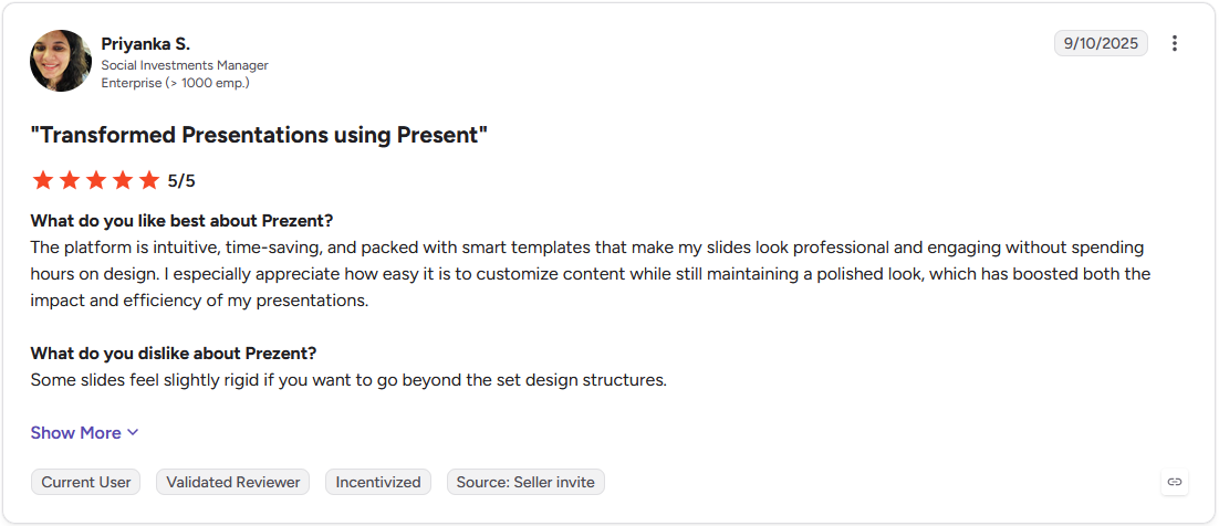
Pro: "The platform is intuitive, time-saving, and packed with smart templates that make my slides look professional and engaging without spending hours on design." (Priyanka S., G2)

Con: "Being able to edit the slides within the presentation and have formatting options within a slide would be great." (Verified User in Pharmaceuticals, G2)
Pricing
Prezent offers custom pricing.
Bottom line
Prezent's expert design services can hand off a deck to a human designer for a final polish pass. Teams that need the underlying analysis done in the same place may prefer Julius, which computes the numbers before writing anything.
Which AI reporting tool should you choose?
The right pick comes down to whether you need a live dashboard or a written report, and which tools your team already uses.
Choose Tableau if you:
- Need a dashboard connecting spreadsheets, cloud warehouses, and enterprise data sources in one place
- Want conversational analytics that still supports building custom calculated fields for complex comparisons
- Want automated alerts sent straight to Slack when a tracked metric shifts
Choose Power BI if you:
- Already have reporting data spread across Excel, SharePoint, or Dynamics 365
- Want AI-generated DAX formulas and written narratives without building every measure by hand
- Need to know which variables are driving a metric without manually segmenting the data
Choose Domo if you:
- Are pulling from many disconnected sources and want them merged into one live view
- Need threshold-based alerts pushed to Slack, email, or mobile the moment a metric moves
- Want to build custom AI agents that trigger a business process directly from a dashboard
Choose Julius if you:
- Want a report built around numbers computed through real code, with the narrative written around them
- Need reporting to rerun on a schedule so a recurring report starts from current data every time
- Are starting from a plain description of what you need, even without a cleaned dataset ready
Choose Whatagraph if you:
- Manage reporting for multiple clients and want each report styled to match their brand automatically
- Want a full report built from a single prompt, with widgets and layout already assembled
- Have reporting that draws mainly from the marketing platforms already covered by its managed integrations
Choose Data Studio if you:
- Need free reporting on Google Ads, GA4, or Sheets data with no budget for a paid tool
- Want native integrations that skip manual exports from Google's own products
- Are comfortable adding a community connector for anything outside Google's ecosystem
Choose Zoho Analytics if you:
- Want AI-assisted reporting without paying enterprise-level pricing
- Need broad third-party integrations beyond a single software ecosystem
- Are fine with more basic chart formatting in exchange for lower cost
Choose ThoughtSpot if you:
- Want to type a question and get a chart back without building a dashboard first
- Have clean, well-modeled data ready to support reliable AI-driven answers
- Need a search interface that can also embed inside another application
Choose Qlik Sense if you:
- Want to explore relationships across multiple connected datasets without a fixed query path
- Need enterprise-grade governance for a large team's data access
- Are willing to invest time learning an associative way of navigating data
Choose Klipfolio if you:
- Want to build a custom KPI dashboard using your own formulas
- Need to combine metrics from several different data sources into one tracked view
- Have some spreadsheet or scripting comfort to work through the formula language
Choose AgencyAnalytics if you:
- Manage SEO and PPC reporting across many different clients
- Want white-label branding applied automatically from an uploaded logo
- Need built-in SEO tracking without a separate keyword or backlink tool
Choose DashThis if you:
- Want a dashboard live within minutes using a pre-built template
- Need unlimited users on every plan without added per-seat cost
- Are fine working within a template's preset structure rather than a fully custom build
Choose ChatGPT if you:
- Need a quick, one-off summary of data you can paste directly into a chat
- Want a flexible prompt that can be reshaped with a follow-up question
- Are fine re-pasting a dataset each time a new conversation starts
Choose Claude if you:
- Need to summarize a long report or document in a single pass
- Want consistent, accurate figures held across a lengthy piece of writing
- Are working from files or pasted text rather than a live data connection
Choose Notion AI if you:
- Already keep projects and data in Notion and want reports drafted there
- Want an AI agent that can pull from a connected database
- Need drafts to stay in the same workspace as the rest of a team's tracking
Choose Prezent.ai if you:
- Need a branded, presentation-ready deck built from an existing data summary
- Want slides styled automatically to match uploaded brand guidelines
- Have the underlying analysis already finished and just need it presented
Skip this category entirely if:
- Your reporting need is a one-off analysis for a single meeting, and a spreadsheet pivot table already answers the question
- Your data is too sensitive to leave your own systems, and none of these tools fit your compliance requirements without a lengthy security review
- Your team already has an analyst building custom reports by hand, and switching tools would mean retraining without a clear return
Final verdict
Picking an AI reporting tool usually means choosing between a platform that builds the chart and one that also explains it. Tableau and Power BI fit teams that want an ongoing dashboard to check, while Whatagraph fits agencies handing a styled report to a client.
If your team wants a bit of both without stitching two separate tools together, Julius is worth trying first. Its AI Report Generator runs the analysis and writes the report in the same place, so the chart and the sentence describing it come from the same computed result.
Here's how Julius helps:
- Start without a file: Ask a question, and Julius can pull public data from the web or live financial data on over 17,000 companies through its Financial Datasets integration, so a report can start before you've gathered anything yourself.
- Connect your own data when it's ready: Link a database like Postgres or Snowflake, or upload a spreadsheet, and Julius works from whatever you provide.
- Reports built on calculated numbers: The AI Report Generator runs code against your data before writing a word, so every chart and figure in the finished report traces back to a calculation you can check.
See what Julius can do with your next report. Try Julius for free today.
Frequently asked questions
What is the best AI tool for reports?
Some of the best AI reporting tools include Tableau, Power BI, and Julius, depending on whether you need a live dashboard or a written report. Tableau and Power BI suit teams that want an interactive dashboard, while Julius computes the numbers first and writes the report around them. Whatagraph fits agencies reporting to multiple clients.
What is an AI reporting tool?
An AI reporting tool is software that turns raw data into a dashboard, chart, or written report using natural language, without manual queries or spreadsheet formulas. You describe what you need or connect a data source, and the tool analyzes the data and builds the output automatically. Some tools also rerun reports on a schedule.
Are AI reporting tools accurate?
Yes, AI reporting tools can be accurate, but the result depends on the quality of the connected or uploaded data. Tools that compute numbers through actual code tend to produce more reliable figures than tools that generate a written answer without running the calculation. Checking a report's underlying data before sharing it is worth doing.
What's the difference between AI reporting tools and traditional BI tools?
The main difference is setup. Older BI workflows required a dashboard and data model built before anyone could explore the data. AI features in tools like Tableau and Power BI, plus AI-native tools like Julius, let you ask a question in plain language and get a chart back right away.
Do AI reporting tools replace data analysts?
No, AI reporting tools don't replace data analysts, since someone still needs to judge whether a question was framed correctly and whether the output makes sense. What changes is the amount of manual report-building an analyst has to do by hand. Analysts can spend more time interpreting results and less time assembling charts.