

The first competitor analysis deck I ever built was gorgeous - and useless. Twelve slides of logos, a rainbow of feature checkmarks, and not one line telling the room what to actually do about any of it.
This guide is the version I wish I'd had back then: how to do the analysis that makes the slides worth presenting, and how to keep the deck honest enough that leadership actually trusts it.
What is a competitor analysis presentation?
A competitor analysis presentation compares your business against direct and indirect competitors across the dimensions that affect a decision: pricing, features, market share, positioning, and customer sentiment.
It exists to answer one question for a specific audience, whether that's "where should we invest next quarter?" or "how do we win this deal?"
A good competitor analysis presentation leads with a recommendation, backs every comparison with a defendable number, and stays honest about where competitors are stronger. I've sat through decks that skip all three, and no amount of design polish saves them once someone in the room asks, "so what do we do with this?"
Before you open a single template, get clear on the questions your deck has to answer:
- Who are the real competitors, direct and indirect?
- Where do we win and lose on price, features, and positioning?
- What's the one decision this deck should drive?
Before you begin: gather data for your presentation
Every guide online jumps straight to slide layouts, but the step that takes the longest and does the most for your final deck is gathering the data. I treat competitor research like any other data analysis project, because that's what it is.
Here's what to pull for each competitor:
- Market position: Share, size, and growth signals like funding, hiring, or new-market moves.
- Pricing: Every tier, what's gated behind each one, and how they package it.
- Features: The capabilities that differ, skipping the 40-row checklist nobody reads.
- Positioning: How they describe themselves, who they target, and the language they use.
- Sentiment: What real customers say on review sites like G2 and Capterra.
Where does this data come from? You can find it on company sites and pricing pages, review platforms, earnings reports or market databases for public companies, and plain web searches for the rest. Pricing pages and sites are best for how a competitor wants to be seen, while reviews on G2 or Capterra tend to surface what customers think.
💡 Tip: Every number that lands on a slide needs a source you can defend without flinching. Cross-check anything important against a second source before you trust it.
How to choose a framework for your analysis
A pile of facts isn't an analysis until you run it through a framework, since the framework is what gives your data a spine so the deck argues a point.
You don't need all four of the ones below, just the one that fits your goal:
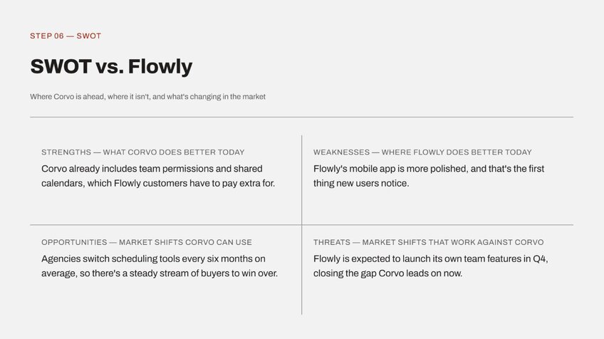
- SWOT: Fast and familiar. Map strengths, weaknesses, opportunities, and threats, either overall or per competitor. Best when you want a quick, readable snapshot.
- Porter's Five Forces: Zoom out to the whole market. Michael Porter's Five Forces framework looks at rivalry, new entrants, substitutes, and the bargaining power of buyers and suppliers. Best for a strategic or investor readout.
- PEST: Political, economic, social, and technological context. Useful when outside forces, like regulation or a new platform, are changing how the field works.
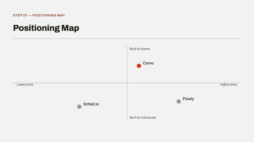
- Positioning map: Plot competitors on two axes that matter to buyers, like price versus capability. It's the most slide-ready of the bunch, and I've found it reads in about two seconds flat.
I’d choose SWOT if you need speed and a shared vocabulary. Reach for Five Forces or PEST when the decision is really about the broader market and not only how you match up against one rival.
How to build a competitor analysis presentation: step-by-step
I've built more competitor decks than I'd like to admit, and the ones that land follow the same order every time. Skip a step and the deck turns into a data dump nobody acts on, no matter how good the research behind it was.
Here's the structure I use, walked through with an example:
1. Title and objective
Before we begin, let’s say you run marketing at Corvo, a scheduling software company, and you're building a case for where to focus against your biggest rival next quarter.
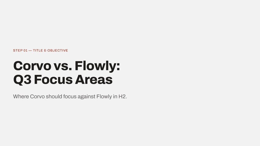
Name the deck and the one decision it supports. The title slide is the first place you tell the room what this deck is for, so it needs more than a label. One line does it: "Where Corvo should focus against [Competitor] in H2."
For this example, that objective line reads something like: Corvo vs. [Competitor], Q3 focus areas. Anyone walking in late can catch up from that slide alone.
 2. Executive summary
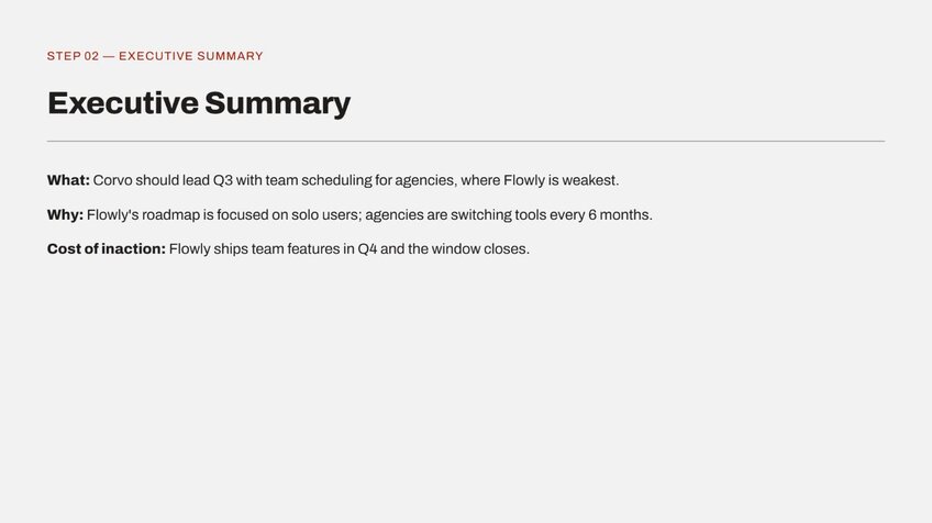
State the recommendation before you show a single chart. If someone reads only one slide, this executive summary is the one, so don't bury the "so what" on slide nine.
I'd put the whole argument in two or three lines here: what Corvo should do, why, and what it costs to get wrong. Everything after this slide exists to back up what you just said.
 3. Market overview
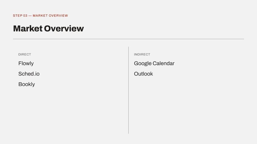
In this slide, I’d map who's in the market, direct and indirect. A positioning map or a simple grid works better here than a bullet list of company names, since the room needs to see the shape of the market, not just read it.
For Corvo, this slide would place a handful of direct scheduling competitors alongside a couple of indirect ones, like general calendar tools teams sometimes use instead.
 4. Key competitor profiles
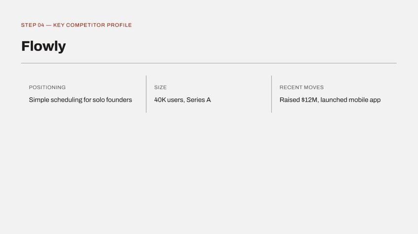
Give each major rival its own slide. Cover positioning, size, and any notable recent moves, like funding or a new feature launch. I'd keep this to your top three or four competitors, since profiling everyone dilutes the slides that matter.
One profile slide per rival keeps the deck scannable and gives you a clean place to drop each competitor's logo, pricing tier, and a line on where they're headed.
 5. Comparison slides
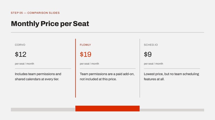
This section is the meat of your presentation. Put your data head-to-head, one dimension per slide. Pricing on one slide, features on another, market share or a KPI on a third. Cramming all of it onto one slide turns a comparison into a spreadsheet screenshot nobody reads closely.
A clean chart showing three tools on one axis, like price against a specific feature, beats a wall of checkmarks every time.
 6. SWOT
Lay out your strengths and gaps against theirs. This is the slide where honesty pays off. Being straight about where a competitor is ahead is what makes leadership trust the rest of the deck.
 7. Positioning map
Visualize where you sit against everyone else on the two axes that matter most to buyers. In my experience, this tends to be the single most quoted slide in the whole deck, since it compresses the entire competitive story into one image.
 8. Recommendation
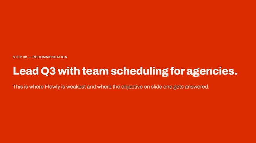
Land the "so what" the whole deck has been building toward. Tie it directly back to the objective line from your title slide, so the ending answers the exact question the deck opened with.
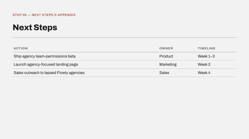
 9. Next steps and appendix
Close with owners, timelines, and the raw data behind the story. Save the details for this slide so the main flow can stay focused on the argument instead of the evidence.
Design and delivery tips that make your presentation land
A correct deck and a persuasive deck are different animals. Once the analysis is solid, the goal changes from proving you did the research to making the room actually care.
Here's what makes a deck persuasive instead of just accurate:
- One idea per slide. If you're explaining two things, that's two slides, full stop. Crowded slides often read as unfinished thinking, even when the thinking behind them was sharp.
- Visuals over tables for trends. A chart shows a gap in market share the moment someone glances at it, while a table makes people stop and do math mid-presentation, which is exactly when you lose the room. If a number needs a calculator, it needs a chart instead.
- Tell a story instead of listing facts. The market overview slide sets the scene, the comparison slides create tension, and the recommendation resolves it. I think of it less like a report and more like a case being built toward a verdict.
- Stay honest about where competitors win. Name it plainly when a rival is ahead on something real. Cherry-picked comparisons can read as spin, and a sharp audience catches that fast. A deck that admits a weakness earns more trust for everything else it claims.
- Match the deck to the room. An executive readout wants the recommendation up front, tight evidence, and detail parked in an appendix. Sales enablement works better as a battlecard with short lines reps can grab mid-call. An investor deck should lean into market size, defensibility, and the one lane nobody else has claimed yet.
Common mistakes that sink a competitor analysis deck
I've sat in the room when good analysis got buried by a handful of avoidable errors, the kind that have nothing to do with how good the research was.
Here's what to check for before any deck goes out the door:
| ❌ Mistake ✅ Fix | |
| Stale or unsourced numbers | Date every figure and link its source. Refresh before each presentation. |
| No "so what" | End with a clear recommendation that tells the room what to do next. |
| Wall-of-features slides | Show the three to five differences that actually change the decision. |
| Cherry-picked comparisons | Include competitor strengths. Honesty builds trust. |
| Too many slides, no summary | Add an executive summary and move detail to the appendix. |
| Built once, never updated | Treat it as a living document you revisit every quarter. |
💡 Tip: A competitor deck goes stale faster than almost any other document you'll build. Set a recurring reminder to refresh the underlying data before every presentation, so the deck reflects the market as it stands today.
Build a sharper competitor analysis presentation with Julius
A competitor analysis presentation is only as strong as the numbers behind it, and pulling those numbers together usually eats the most time before you've even opened a slide template.
Julius is an AI-powered data analysis platform with an AI presentation maker built in, so you can turn the numbers you pull straight into slides without a separate design step. You go from a question to a chart to a deck in one workflow.
Here's how Julius can support a competitor analysis presentation:
- Comparison-ready charts: Turn pricing, feature, or market-share data into a chart with a prompt, so your comparison slides show a clear gap instead of a table full of numbers.
- AI presentation maker: Move straight from your competitive data into slide form, so a chart becomes part of the deck without a separate export step.
- Public and financial data search: Search the web for competitor and market data, or pull structured company financials for 17,000+ public companies through the Financial Datasets integration, so a market-position slide can start from a question rather than a research folder.
- Connected data sources: Link tools like PostgreSQL, Snowflake, BigQuery, or Google Ads, so any internal numbers in your deck, like win rates against a specific competitor, stay current with your own systems.
- Smarter with every connection: Julius includes a Learning Sub Agent that picks up on your database structure as you work, so results keep getting more precise the more you use it.
Ready to build your next competitor analysis presentation on data you can defend? Try Julius for free today.
Frequently asked questions
How do you present a competitor analysis?
You present a competitor analysis in four parts: title and objective, market overview, comparisons, and recommendations. State your recommendation in the executive summary before showing any data, back it up with the market overview and comparisons, then close by landing that recommendation with next steps.
What should a competitor analysis presentation include?
A competitor analysis presentation should include an executive summary, comparison slides, and a recommendation, which are the three slides that carry the decision. You can also include a market overview, competitor profiles, a SWOT or positioning map, and an appendix holding your raw data and sources to round it out.
How do you structure a competitor analysis?
You structure a competitor analysis by picking a framework such as SWOT or Porter's Five Forces, gathering and validating the data for each competitor, then ordering the slides by decision. Lead with the recommendation for executives and keep the deep detail toward the back.
What is the best framework for a competitor analysis?
The best framework for a competitor analysis is SWOT for a fast, familiar head-to-head snapshot or Porter's Five Forces for understanding market structure and profitability. Many decks pair SWOT for the matchup with a positioning map for the visual.
How many slides should a competitor analysis presentation have?
A competitor analysis presentation usually runs about 8 to 12 slides for a live readout. That's enough for a summary, market overview, a few comparisons, and a recommendation without losing the room. Any deeper detail belongs in an appendix rather than the main deck.