

Good backgrounds for presentations stay simple, high in contrast, and out of the way. Grab the first free option you find, and you risk landing on a busy photo that swallows your text (or a template your audience has already seen this quarter).
I tested dozens of free sources for this piece. For each one, I looked at how deep the free tier actually went, whether the license required attribution, and how the site organizes its background options.
Below, I'll cover the 6 sources that made the cut, plus the best pick for each presentation type.
6 best free presentation background sources
| 🎨 Source | 🎯 Best for | 🖼️ Type | 🔥 Free tier | ⚖️ License note |
| SlidesCarnival | Genuinely free, editable templates | Templates | Fully free | Free to download and edit for any use, no registration needed |
| Slidesgo | On-trend templates by industry | Templates | 3 free downloads a month (account required) | Attribution required on the free tier |
| Unsplash | High-res photo and gradient backgrounds | Images | Fully free | Free for commercial use, no attribution |
| Canva | Custom, brand-matched backgrounds | Templates and images | Generous free tier | Some elements are Pro-only |
| SlideModel | Polished business and formal backgrounds | Templates | Limited free selection | Most designs need a subscription |
| Pexels | High-res photo and video backgrounds | Images | Fully free | Free for commercial use, no attribution |
*Free tiers and licenses are correct as of September 2026. Verify with each source.
Good backgrounds for presentations: 6 best free sources
1. SlidesCarnival: best for completely free, editable templates
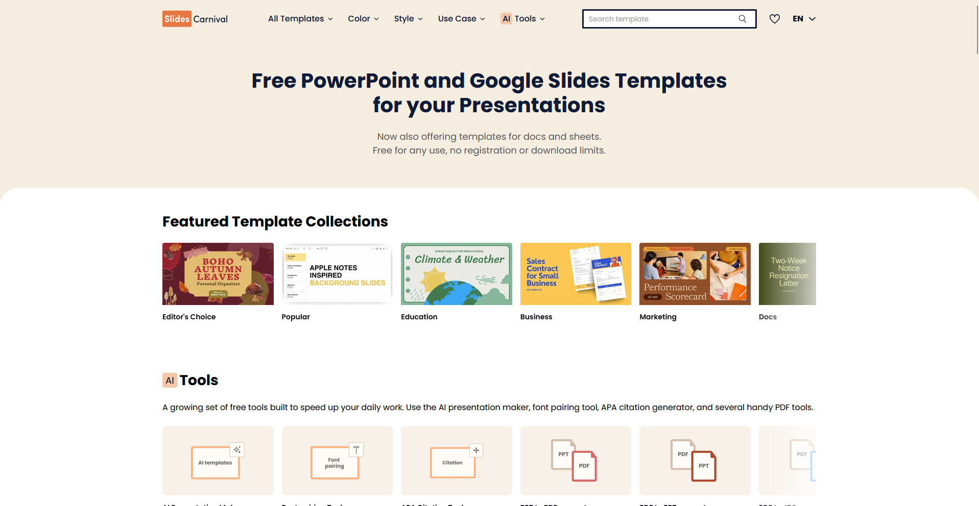
- Best for: Teachers, nonprofits, and anyone who wants a full template with background included, without hitting a paywall 3 clicks in.
- Free tier: Fully free, for PowerPoint and Google Slides.
- License: Free to download and edit for any use, no registration needed.
- Watch out for: Some designs look dated, so pick from the recent sets.
SlidesCarnival is a template library built around full slide designs, with background and layout bundled together. I clicked through 3 categories before landing on a business set, and the download button took me straight to a PowerPoint file with no signup wall. Some templates carry a dated look if you skip the recent filter, since the catalog goes back years.
2. Slidesgo: best for on-trend templates by industry
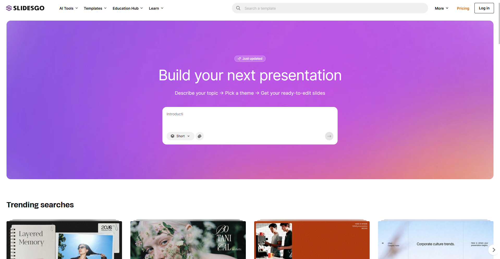
- Best for: Matching a background to a specific use, since you can filter by industry (business, education, marketing, medical, tech) and style.
- Free tier: 3 free downloads a month, but you need an account.
- License: Free-tier downloads require you to keep the credits slide in your deck. Premium removes that requirement.
- Watch out for: The best-looking templates are often premium, so filter by free first.
Slidesgo is a template site organized around industry and style filters. I filtered for business and minimalist and found 5 usable backgrounds within a minute, though the free filter cut the results by more than half. The free tier caps you at 3 downloads a month, and most of the standout designs sit behind the premium badge.
3. Unsplash: best for high-res photo and gradient backgrounds
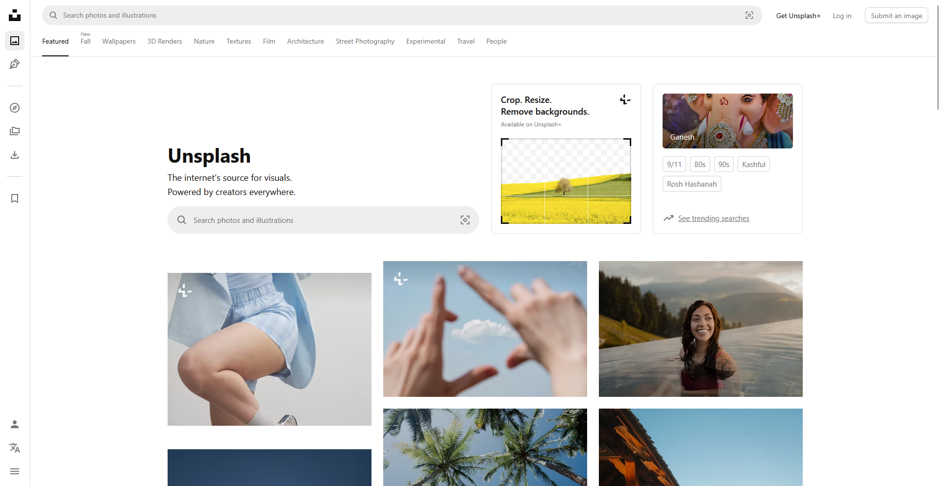
- Best for: Full-bleed title and section slides where one strong image sets the tone.
- Free tier: Fully free, thousands of photos and illustrations.
- License: Free for commercial use, no attribution required.
- Watch out for: Photos have detail everywhere, so drop an overlay behind your text or it competes with the image.
Unsplash is a photo library, so every result is a standalone image you drop into your own layout. Downloads take one click with no account required, and the search filters by color and orientation, which made finding a wide 16:9 shot fast. Every photo comes packed with detail, so a busy shot fights your text until you add a dark or light overlay.
4. Canva: best for custom, brand-matched backgrounds
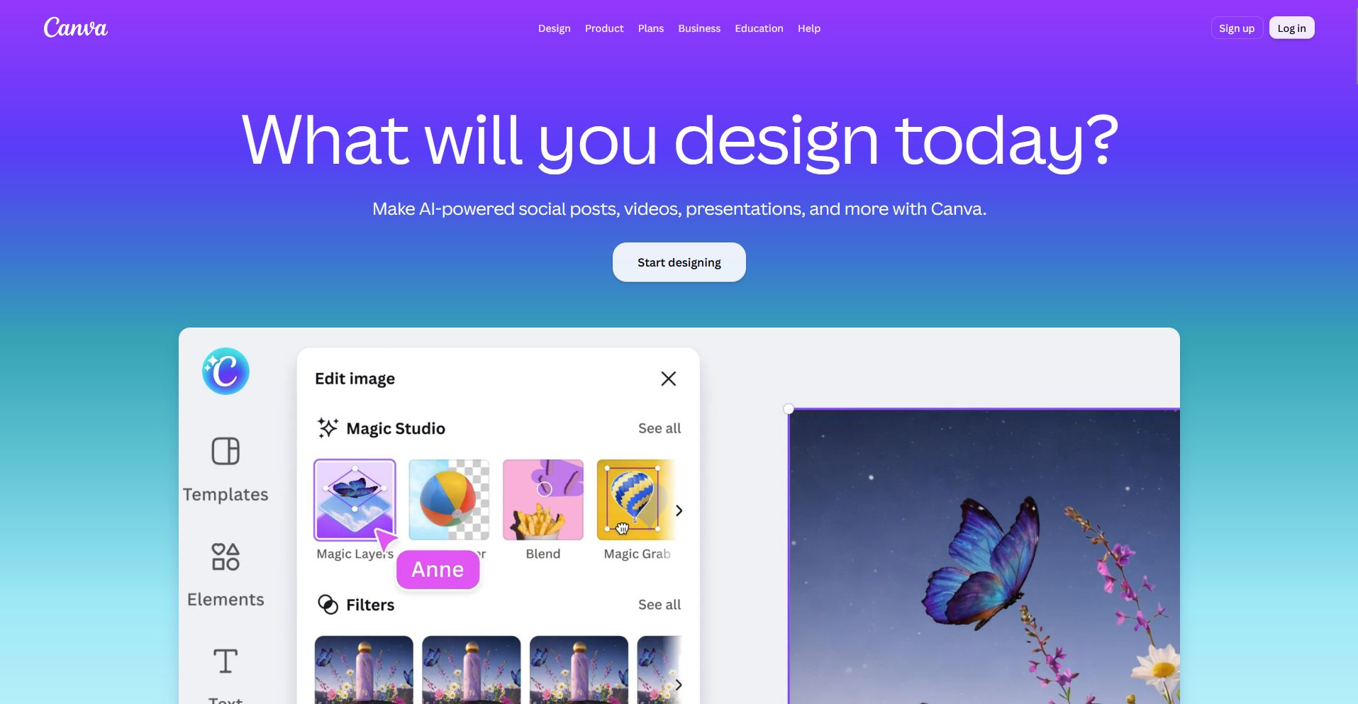
- Best for: Creative and marketing decks where you want to recolor a background to your brand.
- Free tier: Generous, with backgrounds, gradients, and templates you can edit in the browser.
- License: Free elements are free to use. Some sit behind Canva Pro.
- Watch out for: The "Pro" crown icon appears on a lot of the tempting stuff.
Canva is a browser-based design platform with backgrounds, templates, and a full editor for building a deck from scratch or dressing up an existing one. I've used it for client decks, and recoloring a background or adding an accent shape to match a brand palette happens right inside the editor with no separate design tool needed.
That said, the Pro crown icon sits on a lot of the best-looking elements, so free users hit paywalls partway through a design.
💡 Tip: If AI deck builders are more your speed, check out our guide on the best AI presentation makers that generate backgrounds and layouts together.
5. SlideModel: best for polished business and formal backgrounds
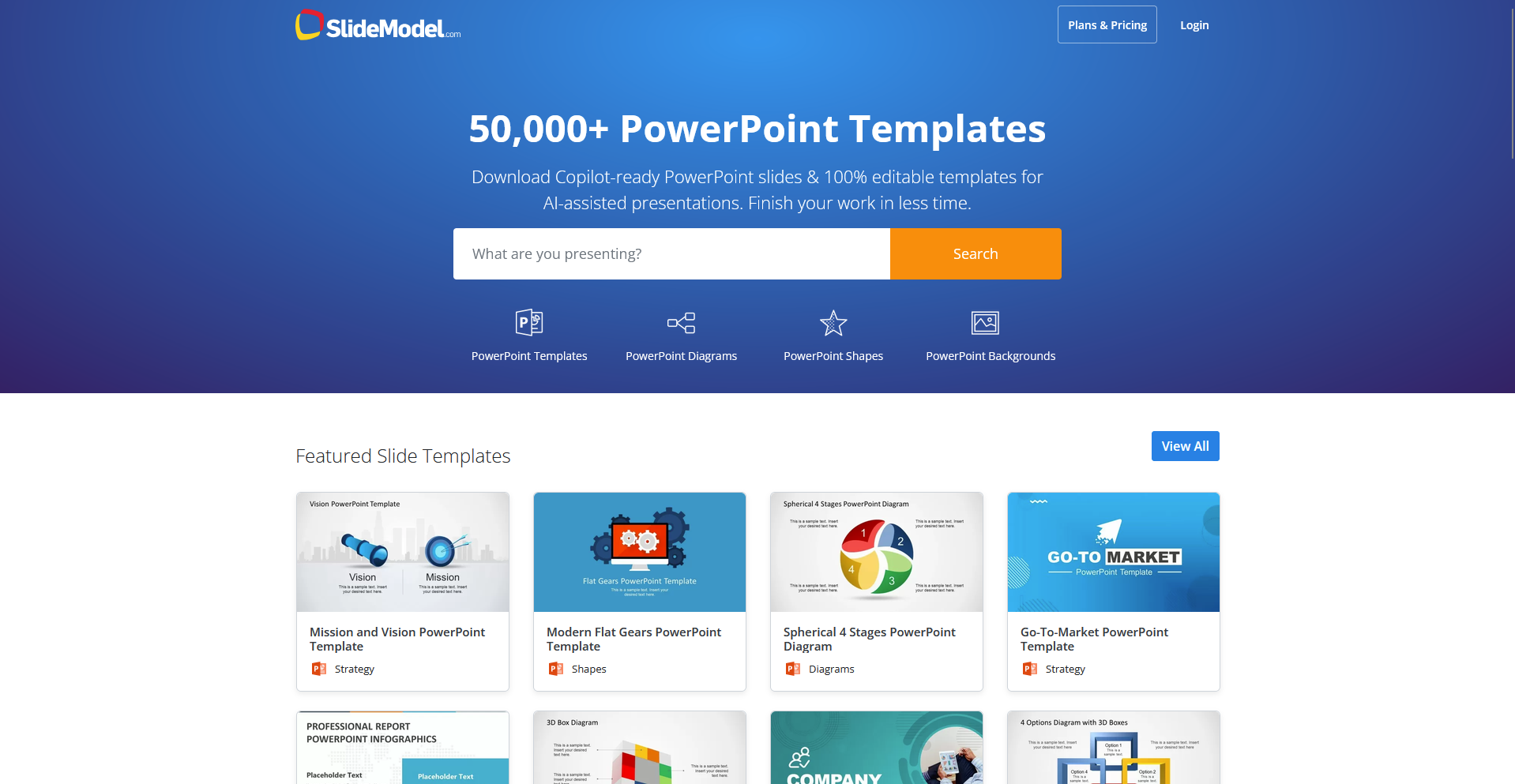
- Best for: Corporate, finance, and formal decks that need a restrained, professional look.
- Free tier: A rotating set of free templates and backgrounds.
- License: Most designs need a subscription. Free ones are clearly marked.
- Watch out for: The free selection is thin next to the paid catalog.
SlideModel is a template site built for corporate and finance decks. Free templates carry a clear tag, so I didn't waste clicks opening a design only to hit a paywall at download. The free catalog is thin, so if you need more than a handful of options, you'll likely need the subscription.
6. Pexels: best for high-res photo and video backgrounds
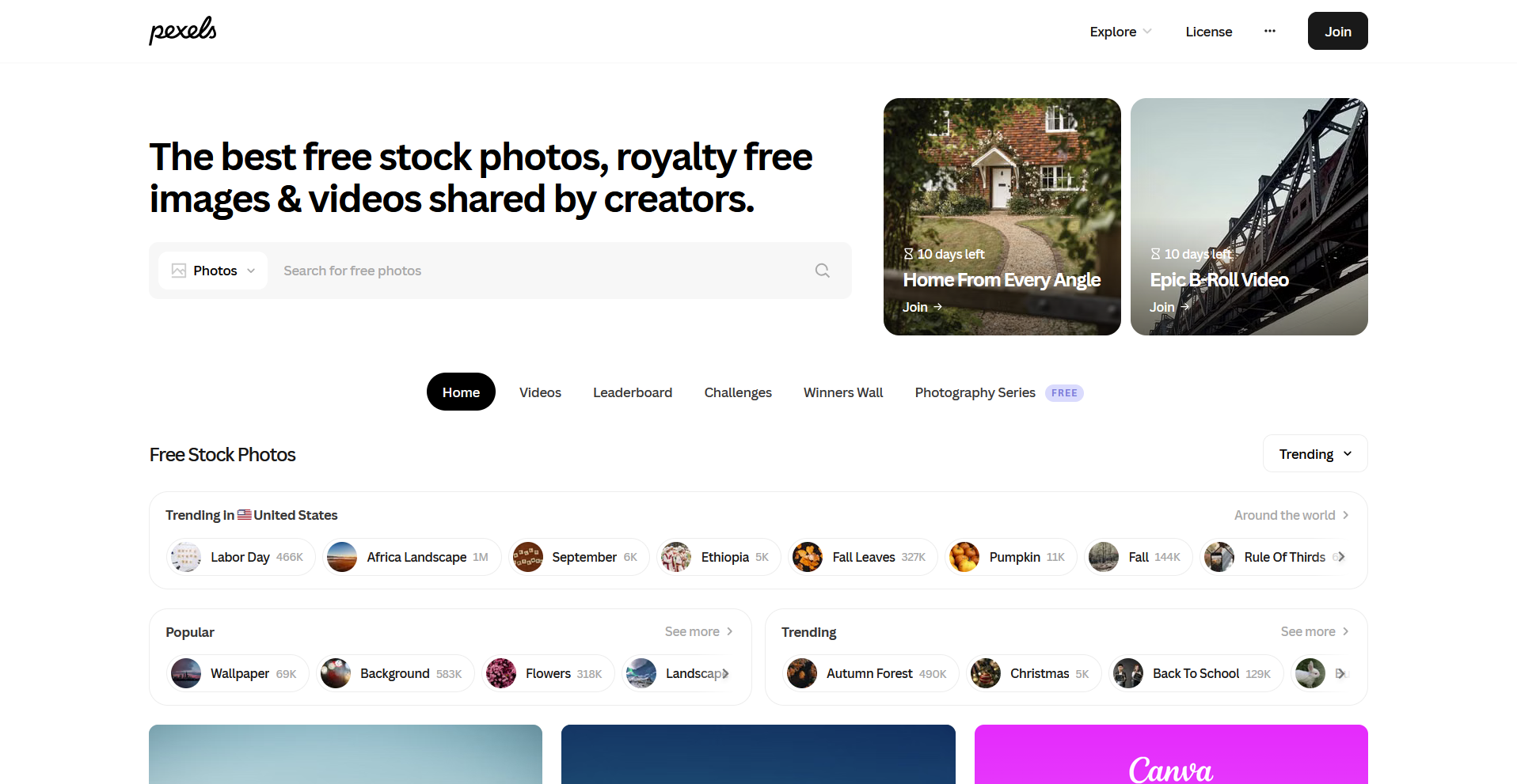
- Best for: Anyone who wants a photo background with a video option too, since Unsplash doesn't offer motion backgrounds.
- Free tier: Fully free, millions of photos and videos.
- License: Free for commercial use, no attribution required.
- Watch out for: Like Unsplash, busy photos need an overlay before you add text.
Pexels works the same way as Unsplash, a photo and video library with no template layer. The search and download needed no login and took me one click, and the video option let me drop a looping clip behind an opening slide. The library leans toward lifestyle and nature shots, so it's a thinner pick if you want abstract gradients.
The best background by presentation type
The right background depends on what you're presenting and who you're presenting to, so match the look to the room and the audience:
| 🎯 Presentation type | ✅ Style that works | 🖼️ Where to get it | 🎨 Color direction |
| Business and formal | Clean, low-saturation, lots of whitespace | SlideModel, Canva business templates | White or dark navy |
| Tech | Dark backgrounds, gradients, abstract geometry | Slidesgo tech, Unsplash gradients, Pexels abstract video | Charcoal, deep blue |
| Creative | Bold color, illustration, texture | Canva, Slidesgo aesthetic | Saturated brand colors |
| Education | Friendly and readable, like a notebook or doodle | SlidesCarnival, Slidesgo education | Warm, high-contrast pairs |
Contrast and readability rules for presentation backgrounds
A background earns its place only if people can read the text on top of it. These are the rules I check before I commit to any background:
- Pick color based on lighting: Use dark text on a light background for bright rooms, and light text on a dark background for dim ones. If you don't know the room ahead of time, high-contrast dark-on-white travels best.
- Test at thumbnail size: Shrink the slide until it's the size of a stamp. If the text still reads there, it'll read from the back row too.
- Cap how much text lands on the slide: The 5-5-5 rule (5 lines, 5 words a line, 5 slides in a row) and the looser 7-7-7 rule both keep a slide skimmable.
- Keep the background clear where the data goes: Busy backgrounds turn charts into mush. Leave the center and lower two-thirds of a data slide plain so your charts and tables stay legible.
- Add an overlay on photos: If you're using an Unsplash or Pexels photo behind text, drop a semi-transparent black or white shape between the image and the words.
💡 Tip: Aim for the kind of contrast you'd get from black text on white paper. That's roughly what accessibility guidelines call for, and it's a good floor for slides too.
How to keep a free background from looking generic
The knock against free backgrounds is that everyone's seen them. Here's what I do to make one look like mine:
- Recolor it to your brand palette: Swap the default colors for your brand's own. I recolored a Slidesgo template's default blue to a client's teal, and it stopped reading as a template the moment the color changed.
- Crop or zoom a stock photo: Cut in on one section of the frame instead of using the full image, so it doesn't read as the same wide shot others may have grabbed.
- Add an overlay or a single accent shape: A thin color bar or one geometric shape breaks up a plain background without adding clutter.
- Swap the default font: Many templates ship with a generic sans-serif. Pull in a clear and legible font pairing that matches your brand.
- Use one background family for the whole deck: Pick one background family and use it on every slide, so the deck reads as a single design.
- Pair it with your own chart style: A background looks a lot less templated once real data and your own chart colors sit on top of it.
Build your presentation around your analysis
A data slide is one of the hardest slides to get right. The chart has to be accurate, the background has to stay out of its way, and the two only work together once the numbers behind them are solid.
Build the analysis in one tool and hunt down a background in another, and the two may not match by the time you hit slide 10. We built Julius to close that gap, since good backgrounds for presentations mean nothing if the chart sitting on top of them is wrong.
Julius is an AI workspace that lets you turn a question into a finished chart and a finished deck. That's the gap between the analysis and the slide we built it to close.
Here's how Julius helps:
- Data search: Ask a question in plain English, and Julius pulls public and web data into a usable dataset, no upload needed.
- Connect your own data: Connect the sources you already use to work with your own numbers instead of starting from a blank spreadsheet.
- Slides built in: Take the analysis straight into a presentation with Julius's AI Presentation Maker, so the chart and the deck come from the same place.
Ready to build the deck before you pick the background? Try Julius for free today.
Frequently asked questions
What is a good background for a presentation?
A good presentation background is simple, high in contrast, and stays out of the way of your content. A solid color or a subtle gradient usually works better than a busy photo, since it keeps the focus on your text and charts.
Where can I get free presentation backgrounds?
You can get free presentation backgrounds from websites like SlidesCarnival, Slidesgo, Unsplash, Pexels, Canva, and SlideModel. SlidesCarnival, Unsplash, and Pexels are the most generous, since all three offer a fully free tier with no signup required.
What color background is best for a presentation?
Dark navy or white works best for formal and business decks, while charcoal or deep blue suits tech decks presented in dim rooms. Whatever you pick, keep high contrast between your background and text so it reads clearly from the back row.
Are Unsplash images free for commercial presentations?
Yes, Unsplash images are free for commercial use and don't require attribution. Still, avoid photos with identifiable people or visible logos in sensitive or client-facing decks, since those uses can raise separate privacy or trademark concerns.
Should you use an image or a solid color background?
Use a solid color or gradient background for data-heavy slides so your charts stay readable, and save image backgrounds for title and section slides. When you do use an image, add a text overlay so your words don't disappear into it.