PowerPoint Graph Templates for Data Visuals
A chart should explain a change, comparison, relationship, or outlook, not merely decorate a number. Compare six ways to build a presentation around data.
Browse the collection
Explore PowerPoint Graph Templates
Review complete formats for general analysis, KPI reviews, finance, marketing, sports performance, and concise executive takeaways.
Choose by question
Start with what the audience needs to see in the data
The best graph is determined by the analytical question. Trends need time in order. Comparisons need a stable baseline. Relationships need enough observations to be meaningful. Forecasts need assumptions and uncertainty.
The featured collection demonstrates several chart types in one narrative. Choose a specialist deck when the analysis belongs to a specific operating context such as finance, marketing, team performance, or an executive brief.
- Options
- 6 analytical presentation formats
- Best for
- Trends, comparisons, drivers, and forecasts
- Format
- Editable widescreen slides
Compare the options
Choose a deck that gives the numbers context
All six options can contain charts. What changes is the business question, supporting narrative, and level of detail surrounding the visual evidence.
Best for
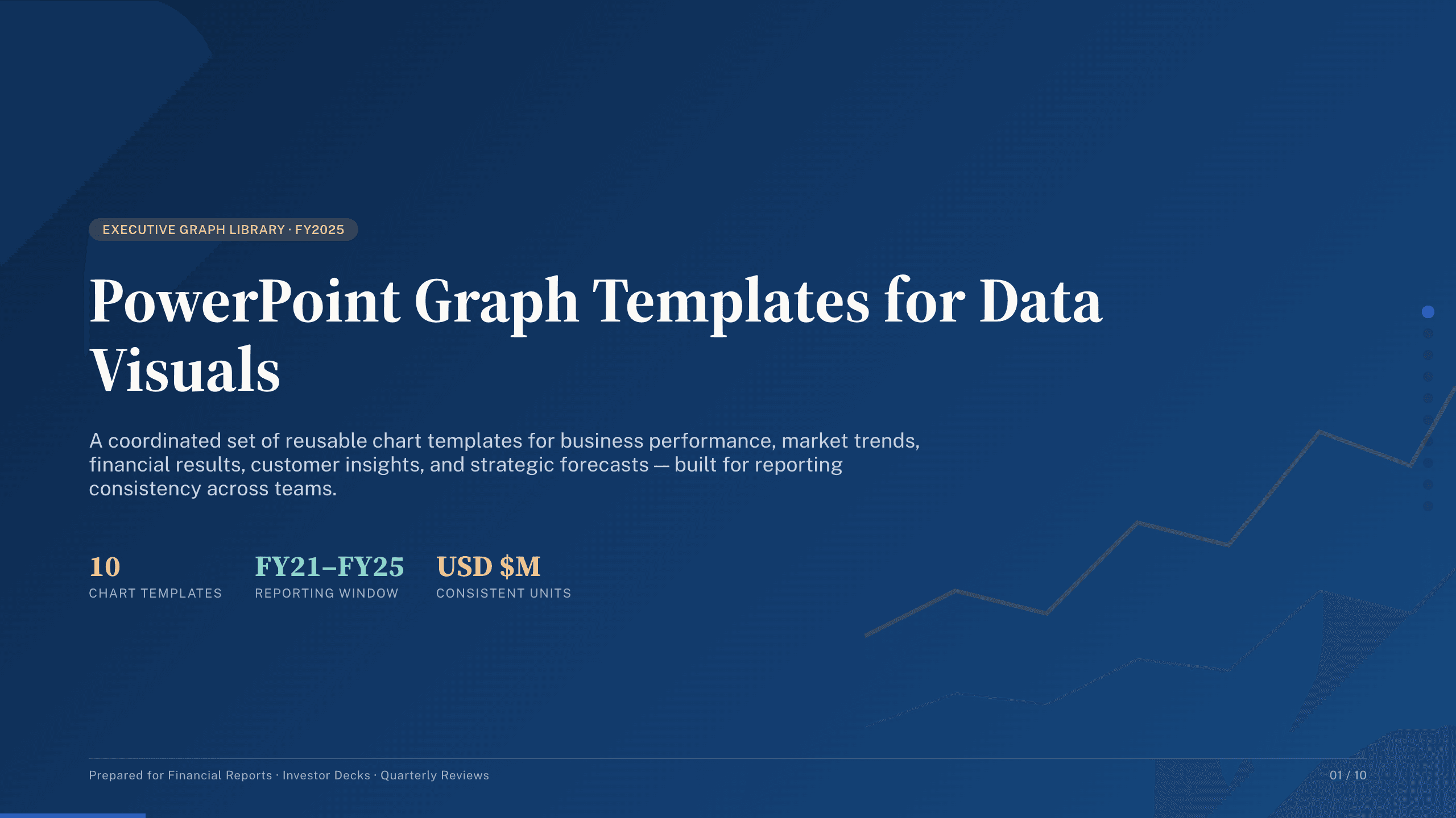
A multi-chart analysis or reporting pack
PowerPoint graph collection
Compare performance, revenue, product growth, regions, mix, customer growth, relationships, forecasts, and the final takeaway in one sequence.
Preview this collection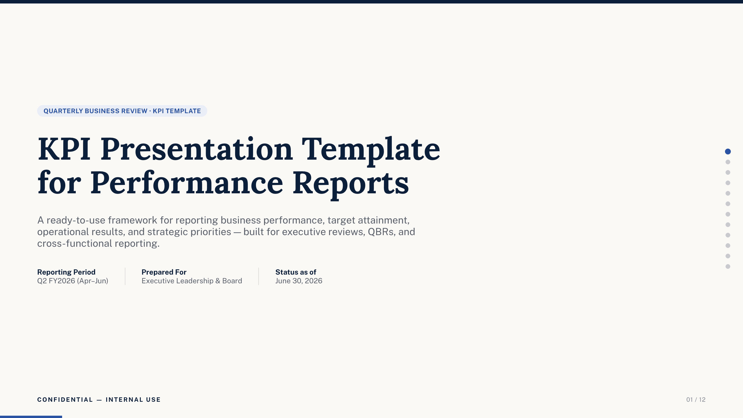
Best for
Operating reviews and scorecards
KPI Presentation Template
Connect a defined objective to a small measure set, targets, current performance, drivers, owners, corrective actions, and review cadence.
View template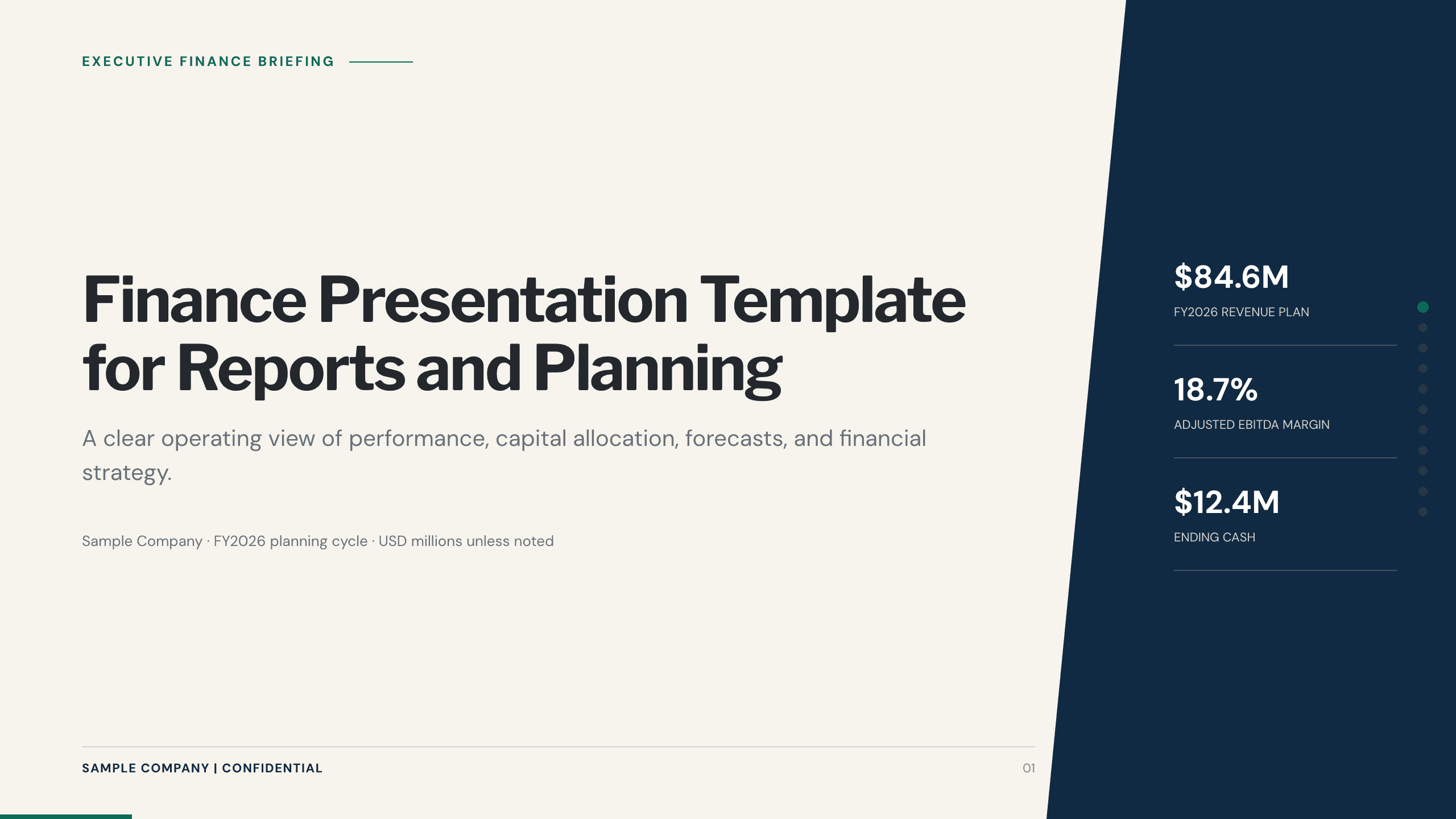
Best for
Financial results and planning
Finance Presentation Template
Build the story around revenue, margin, cost, cash, variance drivers, forecast, scenarios, risk, and management action.
View template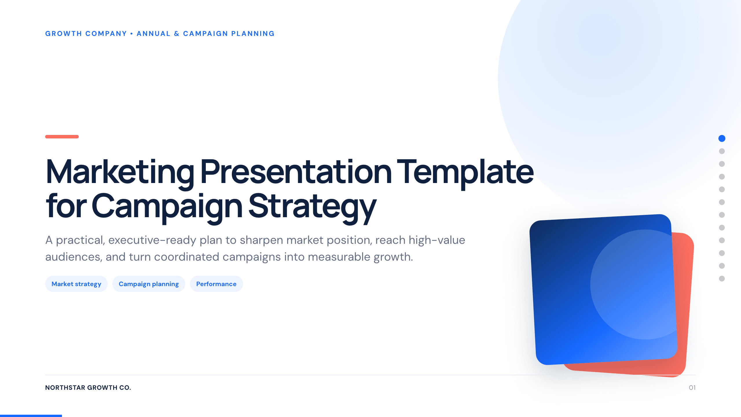
Best for
Campaign performance and marketing reviews
Marketing Presentation Template
Place channel and campaign results alongside the audience, objective, creative idea, calendar, budget, expected outcomes, and next steps.
View template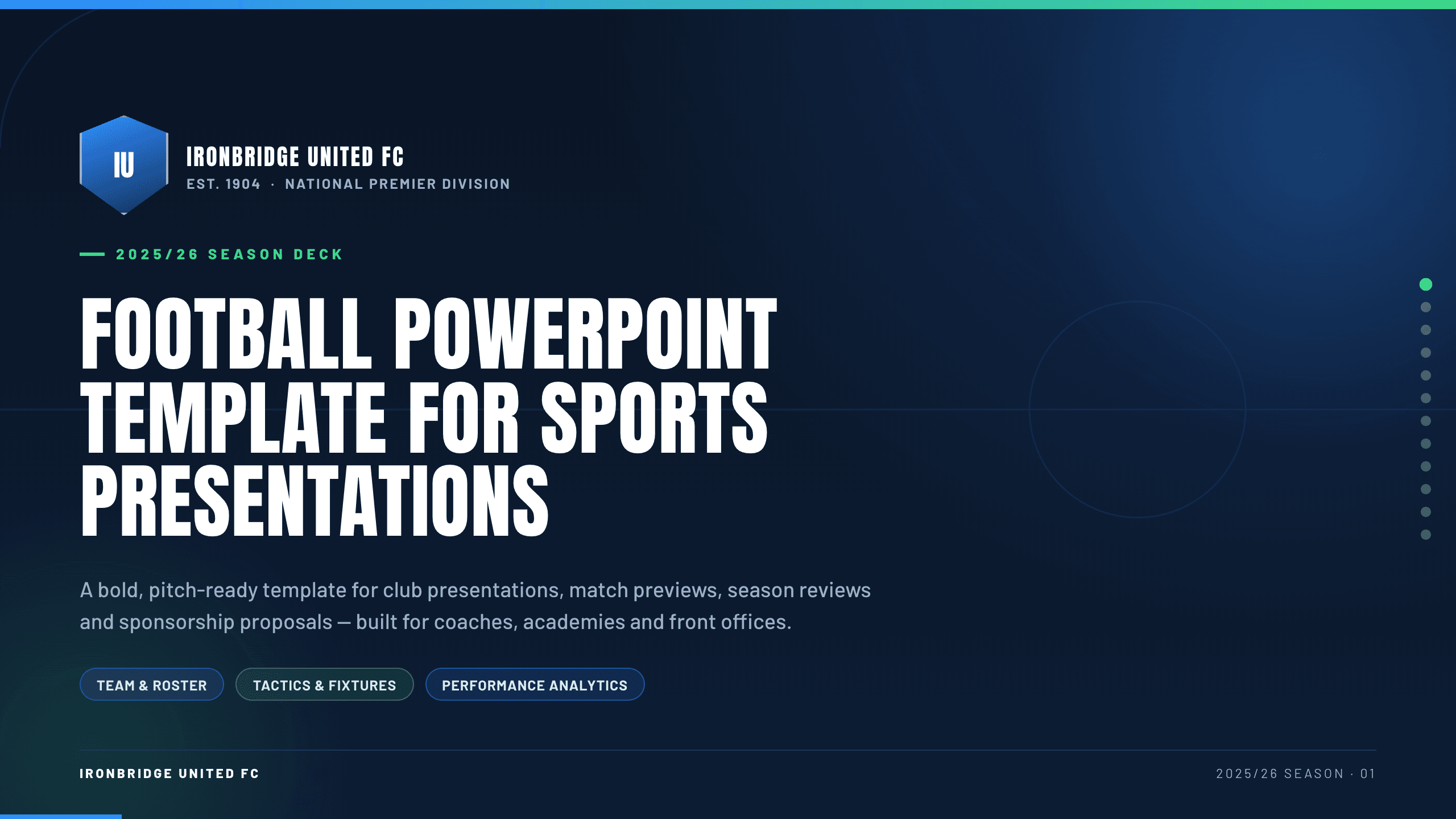
Best for
Team and player performance analysis
Football PowerPoint Template
Use team-specific visuals and language for match, player, training, opposition, and season measures that coaches can act on.
View template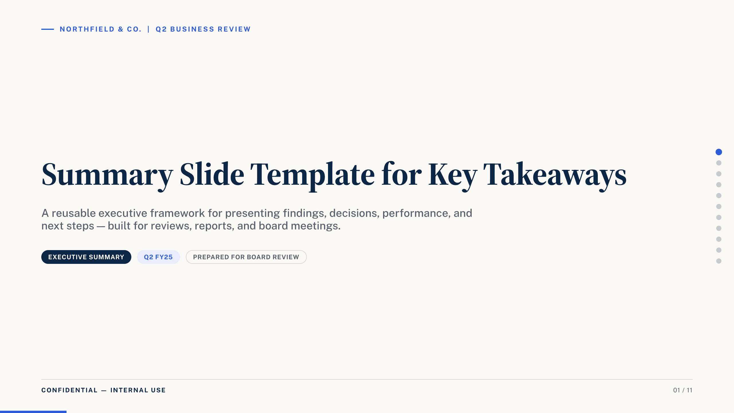
Best for
Executive takeaways and closing slides
Summary Slide Template
Distill a larger analysis into the headline, a small set of evidence, implications, and the decisions or actions that follow.
View templateMake the choice
Choose the analytical question before the chart type
Write the sentence you hope the audience will say after seeing the graph. Then choose the deck that provides the context needed to support that sentence honestly.
- 1
Use the collection to compare several views
It works when the narrative needs trends, categories, mix, relationships, forecasts, and a final synthesis rather than one recurring metric set.
- 2
Use a domain deck when context changes the meaning
Finance, marketing, and sports formats place the measures beside the decisions, vocabulary, and operating rhythm of that audience.
- 3
Use a KPI or summary deck when action matters most
These options keep targets, exceptions, implications, ownership, and next steps closer to the evidence.
Customize a design from PowerPoint Graph Templates with Julius AI
1
Compare the complete previews
Open the live 16:9 decks and choose the structure that best fits your audience and presentation goal.
2
Add your content and direction
Give Julius AI your source material, evidence, audience, constraints, and desired outcome.
3
Review and export
Check the narrative, facts, and design, then export an editable version to PowerPoint for final delivery.